







LightningChart JS v.3.4.0 has been released!
Learn more about the latest performance improvements & new chart types!
Palleted line series
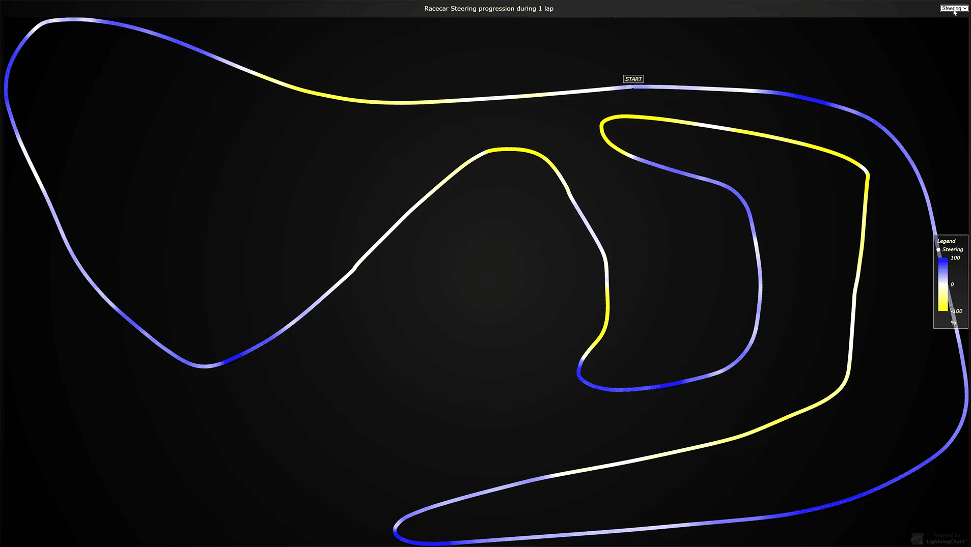
We’ve now launched the 3 different palleted lines features: X palleted line, Y palleted line, and the Value palleted lines.
These visualizations are generally desired for painting lines that exceed some threshold differently, or some region of line differently. In this visualization type, the color can dynamically change based on a separate user-supplied dataset, or X/Y coordinates. Here are some interactive examples of an X palleted line example and a Y palleted line example.
Notice that using the paletted line coloring doesn’t have any detrimental effect on performance for the line series visualizations, the performance continues to be the highest in LightningChart JS v3.4.
Below you can see an example of the Value palleted lines:
Line charts visualization improvements
Now in LightningChart JS v3.4, all the 2D line visualizations will now look visually smoother and sharper. The difference can be spotted immediately without having to apply any zooming.
Here you can see the old smoothness of a line series example (left) VS the new rendering smoothness of the same example (right).
New geographical data visualization examples
One of the new possibilities of geographical data visualizations is to use the Google Static Maps API together with LightningChart JS to add any XY data visualization feature on top of the maps.
Another visualization added is the drill-down Covid-19 map dashboard that showcases a combination of both a map chart and XY features that implement multi-dimensional data visualization.
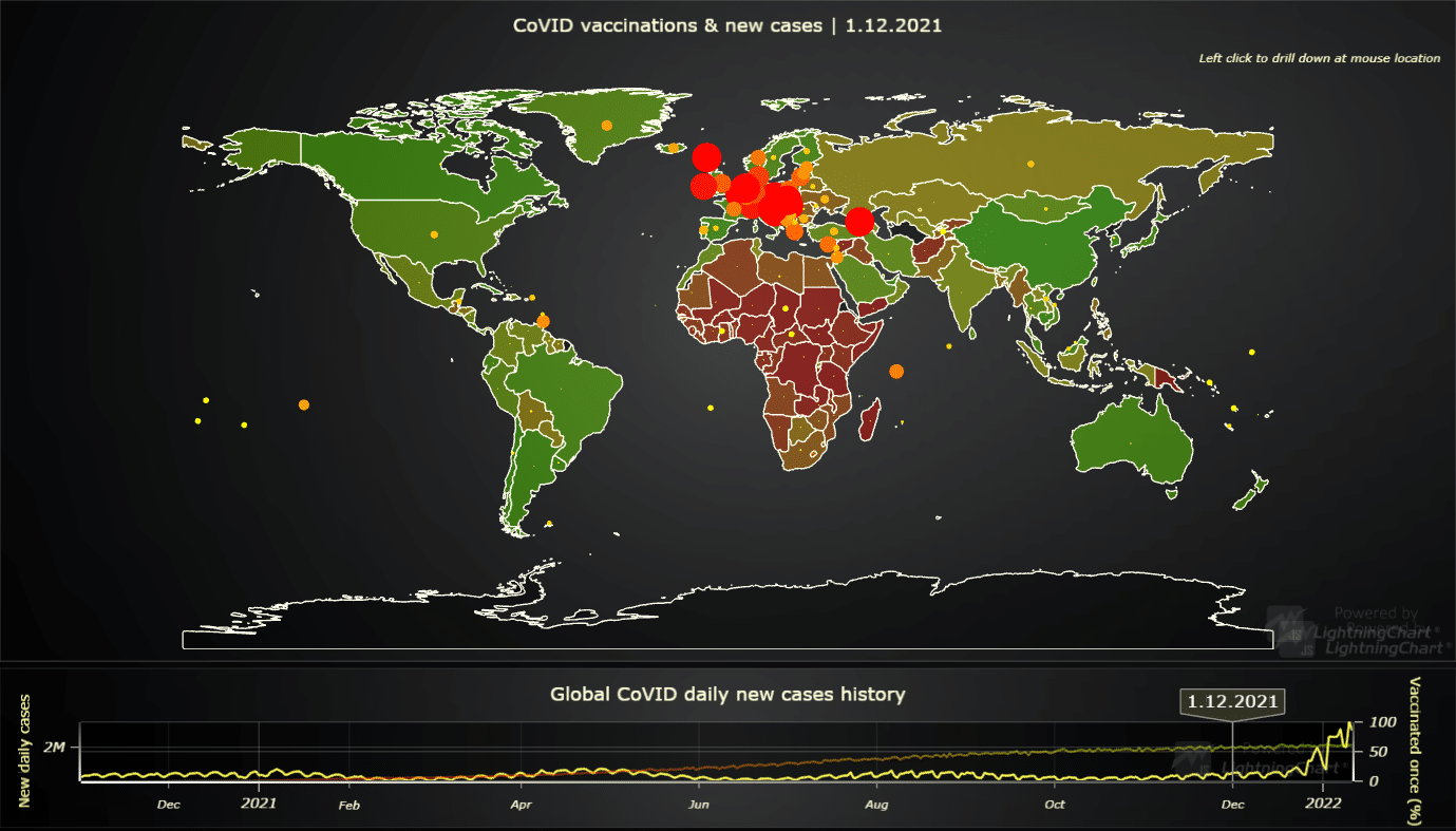
Lastly, we’ve added the animated Covid-10 vaccination coverage chart which showcases XY features on top of a map chart.
LightningChart JS v3.4 official support for data gaps in 2D line charts
Data gaps are a very common term in data visualization. For example, in trading, there are generally no data points during the time when stock offices are closed. Sometimes, these “gaps” are specifically removed in charts, like below for example.
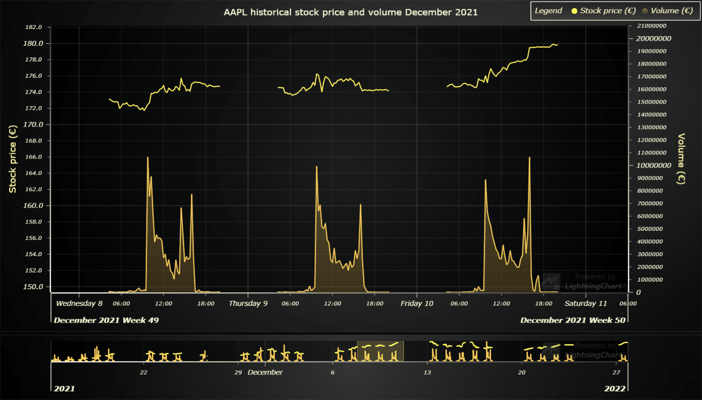
LightningChart JS v3.4 has several new additions, changes, and improvements that can be seen in the ChangeLog.
Not using LightningChart JS yet?
Start with the free community license & develop your project with the ultimate state-of-the-art features!
See more news
Announcement: Baumer as LightningChart customer
Enabling High-Performance Visualization of Industrial Sensor Data with LightningChartDiscover how Baumer uses LightningChart to configure and visualize data from a wide variety of industrial sensors and create responsive, data-rich visualization...
Best Python Charting Library in 2026
Python's charting ecosystem is large, overlapping, and regularly misunderstood. Most comparison guides stop at Matplotlib, Plotly, and Seaborn. This one goes further: it covers what happens when your datasets grow large, your update rates increase, or your chart types...
Best TradingView Charting Library Alternative
TradingView's charting libraries are the most visible option for fintech developers. Visibility is not the same as capability. This guide is for developers who have hit the wall on candle count limits, watermark restrictions, branding requirements, real-time...
Which JavaScript Chart Library Do AI Coding Agents Actually Recommend, and Does It Matter?
In this article Why AI coding agents have strong library preferences What the defaults actually are (and the data behind them) When the defaults work fine When they quietly fail you What to do instead: giving your agent better information The keyword angle nobody is...



If you have any questions, feel free to contact us!



©LightningChart Ltd 2026. All rights reserved.