







LightningChart JS v.5.1 has been released!
The v.5.1 release includes new chart examples, new features, visual improvements, and React updates.
Mesh Model 3D
We’re introducing the new Mesh Model 3D chart type for rendering complex 3D geometries at high performance. The 3D Mesh Models are colored with the PaletteFill by the vertex values. Here are some examples:
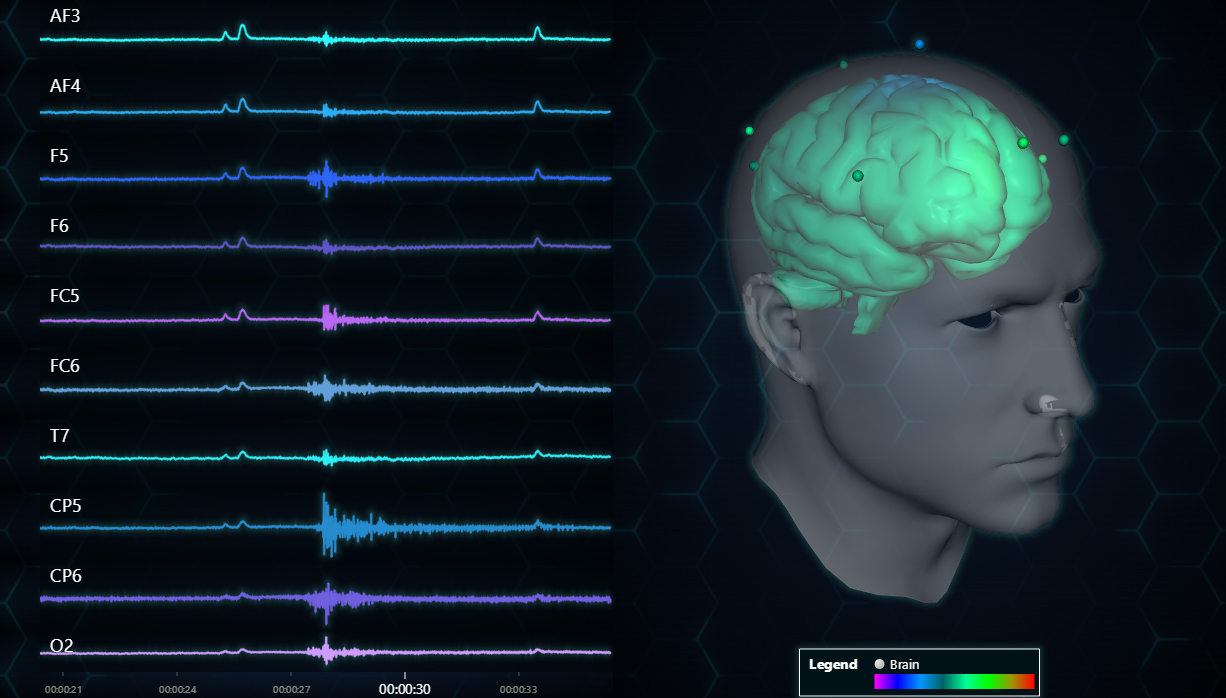
3D Mesh Model of an EEG data real-time visualization.
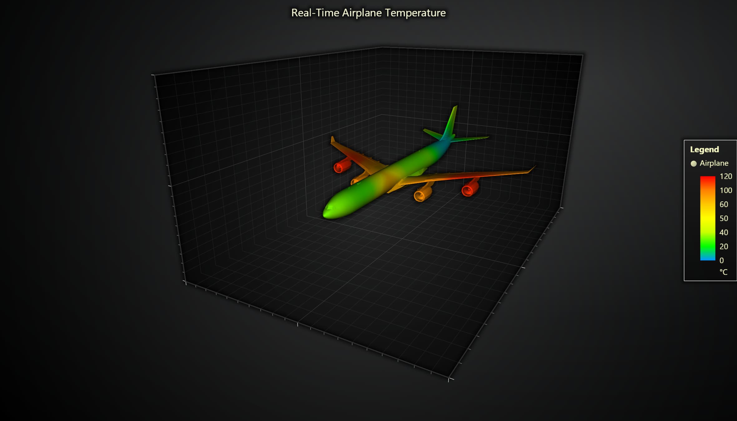
A 3D Mesh Model showcasing dynamic coloring.
Bar Charts
We’re adding two new bar charts: stacked and grouped bar charts. Stacked bar charts are useful when comparing different categories within total values. In the next example, we can see the mobile OS market share and easily visualize the share of different OS’ over the years.
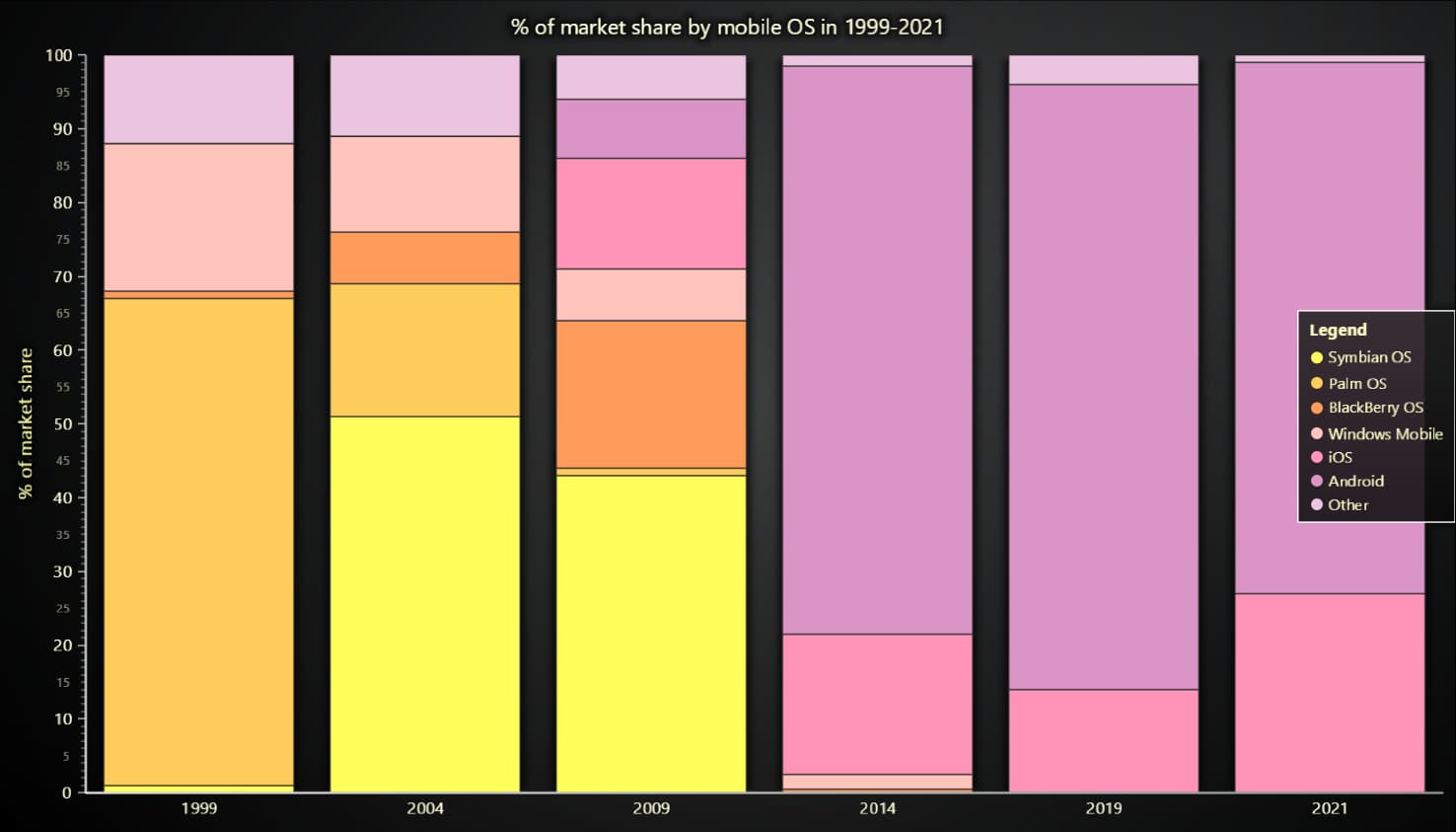
JavaScript stacked bar chart.
New features
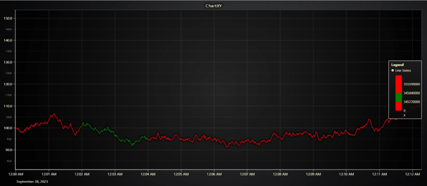
The Percentage-based Color LookUp Tables will make it possible to automatically color the initial/smallest value (e.g., 0) as red, the final/largest (e.g., 100) value as green, and the middle values as an interpolation of red-green.
Percentage LUTs are currently a supported feature of PointSeries, Heatmap series, and Surface series only. We currently recommend to use Percentage LUTs for static use cases-only (not real-time data updates).
// Example use code
New PaletedFill ({
	lut: new LUT({
	steps: [
		{ value: 0, color: ColorCSS(‘red’) },
		{ value: 1, color: ColorCSS(‘green’) },
],
percentageValues: true,
interpolate: true,
}),
})
Axis Interval Restriction API (Beta)
This feature allows the restriction for Axis intervals to stay within the specified range/limit. This helps to
- prevent zooming outside the visible dataset
- prevent zooming beyond a threshold position
- prevent zooming too far in/out
There are 3 ways to use the Axis Interval Restriction API features:
// Example 1, prevent zooming outside active data set
Axis.setIntervalRestrictions((state) => ({
	startMin: state.dataMin,
	endMax: state.dataMax,
}))

// Example 2, set max zoom in level (intervalMin)
Axis.setIntervalRestrictions({ intervalMin: 10 })

// Example 3, set max zoom out level (intervalMax)
Axis.setIntervalRestrictions({ intervalMax: 1000 })
Axis Default Interval API (Beta)
This feature does the same as the familiar Axis.setInterval() method but remembers the configuration and restores it whenever the user zooms to fit. It is recommended for applications that programmatically configure the default view for either the X/Y axis or both. For example:
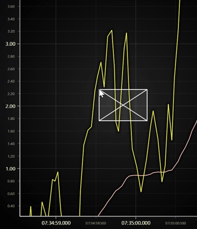
For example:
chart.getDefaultAxisX().setDefaultInterval({ start: 0, end: 100 })This feature is also recommended for configuring the scrolling axis. This way, the user zoom-to-fit will restore the original scrolling axis interval instead of displaying the entire history.
chart.getDefaultAxisX()
	.setScrollStrategy(AxisScrollStrategies.progressive)
	.setDefaultInterval(state => ({ end: state.dataMax, start: (state.dataMax ?? 0) – 10_000, stopAxisAfter: false }))
Date Time Axis – UTC mode (Beta)
We have added an optional flag for the Data Time Axes that change the tick placement to be done in the UTC (universal time coordinates) as opposed to the client’s local time zone. This can be used to ignore any local daylight saving/time-zone differences and ensures that the ticks are placed the same wherever they are viewed.
Note, that enabling UTC mode does not automatically change the label formatting which may still act based on the client’s local time zone.
// Example code of using Intl.DateTimeFormat API for UTC formatting
const utcFormatter = new Intl.DateTimeFormat (undefined, {
})
timeZone: 'UTC',
hour: '2-digit',
minute: '2-digit',
hour12: false,
})
const unknown Timezone Formatter = (timestamp: number) => {
return utcFormatter.format(timestamp)
}
chart
.getDefaultAxisX()
.setTickStrategy (AxisTickStrategies.DateTime, (ticks) =>
ticks
.setUTC(true)
.setFormatting(undefined, unknownTimezoneFormatter, unknownTimezoneFormatter)
.setCursorFormatter (unknown TimezoneFormatter),
)
Heatmap position & scale run-time modification
We have added new methods to all the static and scrolling heatmaps and surface series:
- setStart
- setStep
- setEnd
Previously, these properties could only be specified when the series was created and could not be modified afterward.
Improved LUT precision
Based on users’ feedback, we fixed some precision problems when using dynamic coloring using LUT in various series types.
React Updates
We have updated the React boilerplate for using the newer versions of LightningChart JS v.5.x and added a list of best practices and optimizations when developing with React. Read more at LCJS – React framework documentation.
@arction/react-time-series-chart
We’re now introducing @arction/react-time-series-chart which is a powerful open-source React component for interactive and heavy-duty Time Series Charts. See more information on GitHub.

Get started with LightningChart JS v.5.1
Sign up for a 30-day free trial and get started with LightningChart JS v.5.1. Check the documentation for more information.
See more news
LightningChart .NET v.12.6.1
LightningChart .NET v.12.6.1 is out now!Features of LightningChart® .NET version 12.6.1In this release we added new features, made several improvements and fixed dozens of errors. We upgraded target framework (from .NET 8.0 to 10.0), added Universal-Data-Parser...
Trend Lines in Trading
Trend lines are among the simplest yet most powerful tools in technical analysis. They help traders visualize market direction, identify potential support and resistance levels, and make more informed trading decisions. Despite their simplicity, trend lines remain a...
Announcement: Baumer as LightningChart customer
Enabling High-Performance Visualization of Industrial Sensor Data with LightningChartDiscover how Baumer uses LightningChart to configure and visualize data from a wide variety of industrial sensors and create responsive, data-rich visualization...
Best Python Charting Library in 2026
Python's charting ecosystem is large, overlapping, and regularly misunderstood. Most comparison guides stop at Matplotlib, Plotly, and Seaborn. This one goes further: it covers what happens when your datasets grow large, your update rates increase, or your chart types...



If you have any questions, feel free to contact us!



©LightningChart Ltd 2026. All rights reserved.