


LightningChart JSCreate a JavaScript Stacked Bar Chart with LightningChart JS
TutorialLightningChart JS provides Stacked Bar Charts for creating data applications easily with customizable features.
Written by a human | Updated on April 23rd, 2025
JavaScript Stacked Bar Chart
Stacked bar charts are very useful in scenarios where we see large groups of data from different categories, or values from each other. We can see how a category is divided into segments, from the largest to the smallest in relation to the total amount. There are two types of stacked bar charts:
The simple stacked bar chart places each value in a segment next to each other consecutively. The total value of the bar is the total of the segment. It is ideal for comparing total quantities between segments.

Example of a simple JavaScript stacked bar chart.
The 100% stacked bar chart shows the total percentage of each category for each segment and is represented by the percentage of each value against the total quantity of the segment. This makes it easier for us to see the percentage differences in the amounts of the groups.

Example of a full JavaScript stacked bar chart.
Depending on the objective of data analysis, we can assess the usefulness of each one depending on our visualization requirements. In such cases, JavaScript stacked bar charts are easy to understand by any type of user. Another feature of the JavaScript stacked bar chart is to display the data in multicolor bars where each bar represents a primary category and each color represents a secondary dimension. This allows us to facilitate queries of the relationships between the secondary dimensions of the categories of each segment and their relationship.
Project Overview
In this article, we will explain the 100% stacked bar chart and create a stacked bar chart using LightningChart JS and Node JS. Remember that you can download the template for this project and experiment with it.
 Download the project to follow the tutorial
Template Setup
1. Download the template provided to follow the tutorial.
2. After downloading the template, you’ll see a file tree like this:

3. Open a new terminal and run the npm install command
CHART.ts
Today the most recent versions are LightningChart JS 5.1.0 and XYData 1.4.0. I recommend that you review the most recent versions and update them. This is because some LightningChart JS tools do not exist in previous versions.
In the project’s package.json file you can find the LightningChart JS dependencies:
"dependencies": {
"@arction/lcjs": "^5.1.0",
"@arction/xydata": "^1.4.0",
"webgl-obj-loader": "^2.0.8",
}
1. Importing libraries
We will start by importing the necessary libraries to create our chart.
// Import LightningChartJS
const lcjs = require('@arction/lcjs')

const { lightningChart, BarChartSorting, LegendBoxBuilders, Themes } = lcjs
2. Add license key (free)
Once the LightningChart JS libraries are installed, we will import them into our chart.ts file. Note you will need a trial license, which is free. We would then add it to a variable that will be used for creating the JavaScript Stacked Bar Chart object.
let license = undefined
try {
    license = 'xxxxxxxxxxxxx'
} catch (e) {}
3. Properties
LightningChart JS gives you the possibility to fully customize the chart object properties. Some of the properties that we will use to create this JavaScript stacked bar chart are the following:
const barChart = lightningChart({license: license})
    .BarChart({
        theme: Themes.cyberSpace,
    })
    .setTitle('% of market share by mobile OS in 1999-2021')
    .setValueLabels(undefined)
    .setCursorResultTableFormatter((builder, category, value, bar) => {
        builder.addRow('OS:', bar.subCategory).addRow('Share:', String(value), '%')
        return builder
    })
– Theme: defines the look and feel of your JavaScript stacked bar chart. Note that you must specify the color theme of the chart components beforehand.
– setCursorResultTableFormatter: Configure formatting of the cursor’s on-hover ResultTable when pointing at this series. The result table will be shown as a popup with the data values.

Each line is generated as a row (.addrow) and we can format it as we want with the text we need. The subCategory and Value properties correspond to the data assigned to our chart. SubCategory contains the name of the categories or groupings of the chart. Value contains the value of each bar stacked by category.
.setCursorResultTableFormatter((builder, category, value, bar) => {
        builder.addRow('OS:', bar.subCategory).addRow('Share:', String(value), '%')
4. Categories and Stacked bars
To add categories and stacked bars to our JavaScript stacked bar chart, we will use the setDataStacked function. This function allows us to add the horizontal axis groupings and the categories that will belong to each grouping. The values within the values array will correspond to the grouping according to their consecutive order, for example, the value 51 will correspond to group 2004. Each category will be stacked on top of the other, but the values will be sorted relative to their position and the matching group.
barChart.setDataStacked(
    ['1999', '2004', '2009', '2014', '2019', '2021'],
    [
        { subCategory: 'Symbian OS', values: [1, 51, 43, 0, 0, 0] },
        { subCategory: 'Palm OS', values: [66, 18, 1, 0, 0, 0] },
        { subCategory: 'BlackBerry OS', values: [1, 7, 20, 0.5, 0, 0] },
        { subCategory: 'Windows Mobile', values: [20, 13, 7, 2, 0, 0] },
        { subCategory: 'iOS', values: [0, 0, 15, 19, 14, 27] },
        { subCategory: 'Android', values: [0, 0, 8, 77, 82, 72] },
        { subCategory: 'Other', values: [12, 11, 6, 1.5, 4, 1] },
    ],
)
5. LegendBox
Lastly, we will add the legend box to indicate the categories by color and hide the ones we want when we click on them.
const legend = barChart
    .addLegendBox(LegendBoxBuilders.VerticalLegendBox)

    .setAutoDispose({
        type: 'max-width',
        maxWidth: 0.3,
    })
legend.add(barChart)
The legend box can be added horizontally and vertically. This legend box can be automatically removed when a condition is met, such as exceeding the maximum width relative to the chart size. This is useful when the chart resolution is too small or to free up memory when the chart is too large.

6. Initialize the chart
Lastly, run the npm start command in a terminal to visualize the JavaScript stacked bar chart in your local server.
Conclusion
A JavaScript stacked bar chart is a resource that helps us visualize data more efficiently due to its ability to represent complex datasets easily. Even if this type of chart might not always be used or seen in all dashboard reports, it is a great resource for simplifying the visualization of a lot of data by groups or categories.
In such cases, LightningChart JS offers us a simple and practical chart component: a JavaScript stacked bar chart. Once again, we don’t have to worry too much about the code we will use to develop the charting application.
It is enough to deliver an array of data to our object to create the JavaScript stacked bar chart with all its animations and available controls. Something that I really liked is that the structure of the array of values is based on how the categories are grouped and stacked (using a little imagination):
barChart.setDataStacked(
    ['1999', '2004', '2009', '2014', '2019', '2021'],
    [
        { subCategory: 'Symbian OS', values: [1, 51, 43, 0, 0, 0] },
        { subCategory: 'Palm OS', values: [66, 18, 1, 0, 0, 0] },
        { subCategory: 'BlackBerry OS', values: [1, 7, 20, 0.5, 0, 0] },
        { subCategory: 'Windows Mobile', values: [20, 13, 7, 2, 0, 0] },
        { subCategory: 'iOS', values: [0, 0, 15, 19, 14, 27] },
        { subCategory: 'Android', values: [0, 0, 8, 77, 82, 72] },
        { subCategory: 'Other', values: [12, 11, 6, 1.5, 4, 1] },
    ],
)
On the other hand, the legend box provides the great utility of showing or hiding categories without the need for code. This functionality can help us understand and analyze the displayed data. I hope you liked this article. Thanks!

Omar Urbano
Software Engineer
Continue learning with LightningChart
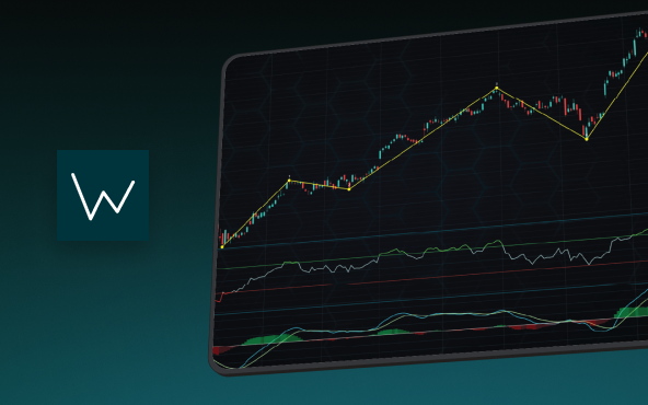
Elliott Wave Theory in Trading
Financial markets often appear chaotic, but many traders believe that price movements follow recurring patterns driven by human psychology. One of the most influential approaches based on this idea is the Elliott Wave Theory. Developed nearly a century ago, it remains one of the most widely studied methods of technical analysis.

The Head and Shoulders Pattern in Technical Analysis
The Head and Shoulders Pattern in Technical Analysis The Head and Shoulders Pattern in Technical Analysis The Head and Shoulders pattern is one of the most recognized and widely used chart patterns in technical analysis. It is considered a reliable reversal pattern...

Best Telerik Charts Alternative in 2026: GPU Performance for WPF, WinForms, and Web
Telerik from Progress is a comprehensive UI component suite covering WPF, WinForms, ASP.NET, Blazor, and JavaScript. The charting components: RadChartView for WPF and WinForms, and Kendo UI Charts for web and Blazor, arrive bundled with the suite purchase. For teams...


If you have any questions, feel free to contact us!
©LightningChart Ltd 2026. All rights reserved.