LightningChart JSTutorial how to create a 2D JavaScript Bubble Chart
TutorialA JavaScript 2D bubble chart is useful when creating data applications that need to visualize 3 or more variables from large datasets.
JavaScript 2D Bubble Chart
In this article, we will create a JavaScript 2D bubble chart using Node JS and LightningChart JS. Remember that you can download the template and use it to experiment with it.
When we are looking for an attractive way to represent our data, we can use the Bubble Chart, which allows us to display the results in a Cartesian plane. We can see that bubble charts are very similar to scatter charts as they show the data as points using Cartesian coordinates. The bubble chart is a rarely used tool but is easy to identify by its appearance, bubble shapes, and differently colored bubbles that help understand the values and relevance of the data.
A JavaScript 2D bubble chart is made up of a two-dimensional plane (X-Y), the bubble size, and we can also represent a fourth value by giving color to the data points (bubbles). Considerations must be taken when handling multiple data in complex proportions, since the graph may have the disadvantage of having too many bubbles, making it hard to understand.
Another consideration is that it may be difficult to locate zero values or negative values within the chart. For these cases, is recommended to previously group the data to reduce the number of bubbles that are shown, as well as use labels for each bubble. Consider that the JavaScript 2D bubble chart is meant for visualizing data with three variables (and the additional color variable).
Project Overview
This project follows the series of developing data applications using Bubble charts. LightningChart .NET and JS offer their versions of bubble charts. Depending on your project requirements, you may choose to develop your data application with LightningChart JS or .NET. Here are more articles on how to create bubble charts:
- JavaScript 3D Bubble Chart
- WPF Bubble Chart
- Angular Bubble Chart (limited compatibility)
But today, we will focus on creating a JavaScript 2D bubble chart using LightningChart JS:
Download the JavaScript 2D Bubble chart template
Template Setup
1. Download the template provided to follow the tutorial.
2. After downloading the template, you’ll see a file tree like this:

3. Open a new terminal and run the npm install command
CHART.ts
Today the most recent versions are LightningChart JS 5.1.0 and XYData 1.4.0. I recommend that you review the most recent versions and update them. This is because some LightningChart JS tools do not exist in previous versions.
In the project’s package.json file you can find the LightningChart JS dependencies:
"dependencies": {
"@arction/lcjs": "^5.1.0",
"@arction/xydata": "^1.4.0",
"webgl-obj-loader": "^2.0.8",
}
1. Importing libraries
We will start by importing the necessary libraries to create our chart.
// Import LightningChartJS
const lcjs = require('@arction/lcjs')

const { lightningChart, BarChartSorting, LegendBoxBuilders, Themes } = lcjs
2. Add license key (free)
Once the LightningChart JS libraries are installed, we will import them into our chart.ts file. Note you will need a trial license, which is free. We would then add it to a variable that will be used for creating the JavaScript 2D Bubble Chart object.
let license = undefined
try {
    license = 'xxxxxxxxxxxxx'
} catch (e) {}
3. Properties
const chart = lightningChart({license: license})
    .ChartXY({
        theme: Themes.cyberSpace,
    })
    .setTitle('Bubble Chart with 3 KPIs and data grouping')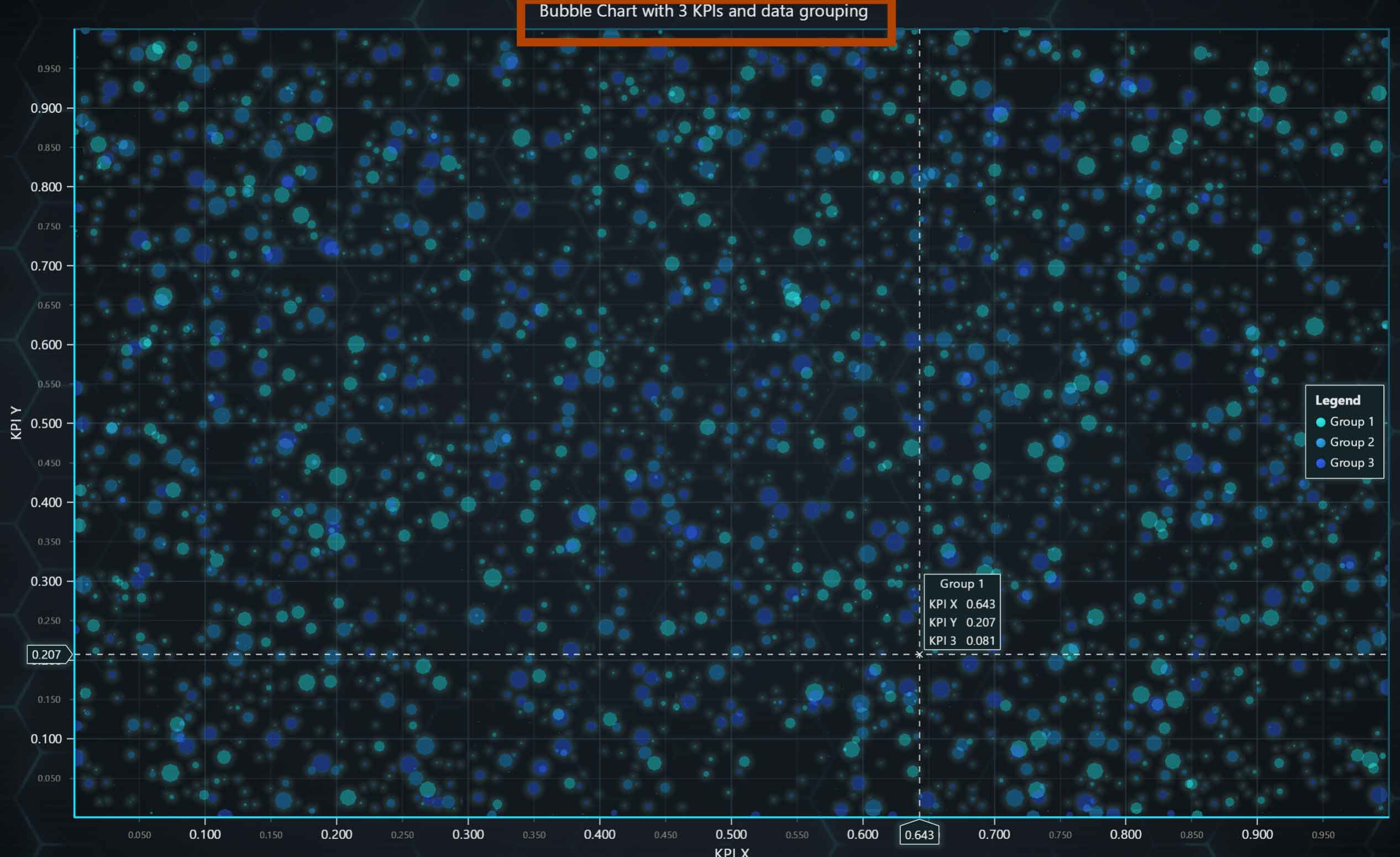
Creating Dataset
const groupsData = new Array(3).fill(0).map((_) => {
    const dataCount = 1_000
    const data = new Array(dataCount)
    for (let i = 0; i < dataCount; i += 1) {
        const x = Math.random()
        const y = Math.random()
        const kpi3 = Math.random()
        // Map 3rd performance indicator value to a point size as pixels.
        const size = 1 + 19 * kpi3 ** 3
        // kpi3 value is also stored in data point for use in cursor formatting
        data[i] = { x, y, size, kpi3 }
    }
    return data
})
We will create an array of three data objects. For each object, one thousand points will be created for the X, Y, KPI3 axis. KPI3 will be a performance value, and the size of each bubble will be determined by performance. The higher the performance, the larger the bubble size.
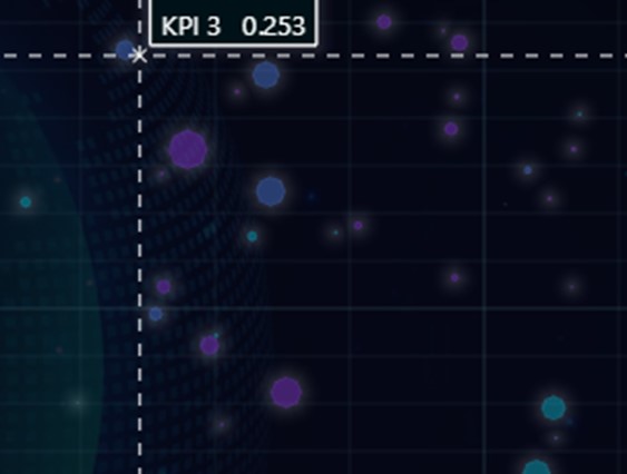
The 4 values of each generated point will be added to their respective object.
Adding PointSeries
const groupsSeries = groupsData.map((data, i) => {
    const pointSeries = chart
        .addPointSeries({ pointShape: PointShape.Circle })
        .setName(`Group ${i + 1}`)
        .setPointFillStyle((fillStyle) => fillStyle.setA(100))
        .setIndividualPointSizeEnabled(true)
        .add(data)
        .setCursorResultTableFormatter((builder, _, x, y, dataPoint) =>
            builder
                .addRow(pointSeries.getName())
                .addRow(pointSeries.axisX.getTitle(), '', pointSeries.axisX.formatValue(dataPoint.x))
                .addRow(pointSeries.axisY.getTitle(), '', pointSeries.axisY.formatValue(dataPoint.y))
                .addRow('KPI 3', '', dataPoint.kpi3.toFixed(3)),
        )
    return pointSeries
})
A series of points is needed to display data in an XY chart type. We will now create a series for each point in our data set for the JavaScript 2D bubble chart (groupsData). For each point, we will use the addPointSeries function. This series type visualizes a list of Points (pair of X and Y coordinates), with configurable markers over each coordinate. The Point Series is optimized for massive amounts of data – here are some reference specs to give an idea:
- A static data set in the tens of millions range is rendered in a matter of seconds.
- With streaming data, even millions of data points can be streamed in every second, while retaining an interactive document.
For each series, we can add a name (setName), a fill style (setPointFillStyle), which can have transparency, color, or both.
As the size of each bubble will be different, we need to enable the setIndividualPointSizeEnabled function, which will respect the size value that we generated in the previous method.
SetCursorResultTableFormatter allows us to create and display a data table by positioning the cursor over the bubble.
Each row is added with addRow, and any type of value that we have within our data point or that has been configured in our code can be added.
Conclusion
Introducing graphics or data visualization elements is very important when highlighting what type of information we want to show. The JavaScript 2D bubble chart is a perfect tool when you have 3 or more variables. The use of bubbles is useful when we need to analyze population or financial values, but as we mentioned in the introduction, this chart can have considerations for development.
The consideration that stands out first is that when we have a huge population of bubbles, it is too complicated to find a specific value or visualize the values of each of them.
Lightning Chart JS allows us to solve that problem, making use of the data table and adding a format that shows us the values of each data point.
The development does not seem to be very complex or extensive, and that is precisely the goal of LightningChart JS 2D Bubble chart. LCJS helps to create the chart as easily as possible, adding complex functionalities without having to worry about its development.
Introduction to Area Graphs
Introduction to Area GraphsArea graphs are a chart type for visualizing data which provides a clear and intuitive representation of data trends and patterns over time or across categories. By utilizing shaded areas, area graphs effectively display the magnitude and...
SQL and LightningChart JS dashboard
Published on April 18th, 2024 | Written by humanSQL Dashboard ApplicationHello! In today's article, we will see work on a small project using several development tools. We will create an SQL Dashboard with data generated in SQL Server and use Angular for web...
Create a JavaScript Stacked Bar Chart
JavaScript Stacked Bar ChartStacked bar charts are very useful in scenarios where we see large groups of data from different categories, or values from each other. We can see how a category is divided into segments, from the largest to the smallest in relation to...

