


LightningChart JSCreate a high-performance JavaScript 3D Bubble Chart
TutorialJavaScript 3D bubble chart supports massive amount of data points and full interactivity.
Written by a human | Updated on April 23rd, 2025
JavaScript 3D Bubble Chart
Hello, I’m Omar and we’ll start with a quick JavaScript charting exercise. We will create a 3-dimensional chart with bubbles for each data point. If this is your first article, it’s a great opportunity to work with Lightning Chart JS download the project, and practice with it. Later you will see a brief explanation for the setup of this template.
What is a JavaScript 3D Bubble chart?
A bubble chart is a type of scatter chart but in this case, data points are represented by simulated bubbles or spheres. This type of chart is used largely for financial studies, data science, and data analysis.
In previous articles, we built a Bubble Chart desktop charting application using WPF and similarly, we created a 3D Bubble chart in Angular, so feel free to check them out.
Scatter plots show how two continuous variables are related by putting one variable on the X axis, and a second on the Y axis. This type of chart is usually represented in a two-dimensional way, that is, two dimensions in a Cartesian plane.
Project Overview
In today’s exercise, we will create a 3D cube that will contain the data points. In two-dimensional charts, each point has a value for the X-axis and the Y-axis. In that case, we will add a value for the Z axis that will give depth to each data point, allowing us to show bubbles within the entire cube.
You will notice that many bubbles will have a similar X-Y value, and if you look only at the front face of the cube, these will be lost due to the overlap of others. By rotating the cube, you will be able to see all the bubbles in better detail, since the Z depth value will allow us to disperse these bubbles within the cube.
You may wonder… how complicated will it be to create 3D objects and bubble-shaped data points. Well, you will be surprised to see that you will only need to use two LC JS properties. The Chart3D and PointShape. These properties allow us to create 3D objects and points with customizable shapes. Let’s get started!
 Download the project to follow the tutorial
Template Setup
1. Download the template provided to follow the tutorial.
2. After downloading the template, you’ll see a file tree like this:

3. Open a new terminal and run the npm install command:
As usual in a NodeJS project, you need to run the npm install command. That would be everything for our initial setup. Let’s code.
CHART.ts
Inside this file, we will have all the logic needed to create our chart, configure animations, and format the data.
1. Declare the constant lcjs that will refer to our @arction/lcjs/xydata libraries.
// Import LightningChartJS
const lcjs = require('@arction/lcjs')
2. Extract required classes from lcjs
const { lightningChart, PointShape, Themes } = lcjs3. Creating the JavaScript 3D bubble chart object
const chart = lightningChart()
    .Chart3D({
        theme: Themes.cyberSpace,
    })
    .setTitle('Bubble Chart with 4 KPIs and data grouping')
Chart3D refers to the JavaScript 3D bubble chart for visualizing data in a 3-dimensional scene, with camera and light source(s). The camera can be moved around according to the user interactions (mouse & touch). It is always oriented to face the center of the scene. The Light source is always located at the location of the Camera and directed towards the center of the Axes. Data can be added to the Chart via various Series types, each with their method of visualization. Check the Chart3D documentation for more information.
Theme refers to the collection of default implementations that you can access by using the Themes property. The Color theme of components must be specified when it is created, and can’t be changed afterwards (without destroying and recreating the component). All properties can be consulted in the Themes documentation.
Creating Data
const groupsData = new Array(3).fill(0).map((_) => {
    const dataCount = 1_000
    const data = new Array(dataCount)
    for (let i = 0; i < dataCount; i += 1) {
        const x = Math.random()
        const y = Math.random() ** 10
        const z = Math.random()
        const kpi4 = Math.random()
        // Map 4th performance indicator value to a point size as pixels.
        const size = 1 + 19 * kpi4 ** 3
        data[i] = { x, y, z, size }
    }
    return data
})
For this example, we will create 4 values, 1 per KPI. Basically, a loop is generated and will create a random value for each KPI. This method will return an array that will be used to generate the points on the chart, assigning the values of each KPI to each axis of the chart. This array will have 3 series and each series will have 1000 data points with 4 values for each KPI.

Creating PointSeries
const groupsSeries = groupsData.map((data, i) => {
    const pointSeries = chart
        .addPointSeries({
            individualPointSizeEnabled: true,
        })
        .setName(`Group ${i + 1}`)
        .add(data)
    return pointSeries
})
The series available in the previously generated array will be configured and its name and data points will be assigned. The PointSeries3D Series type for visualizing a collection of { x, y, z } coordinates by different markers. In a JavaScript 3D bubble chart, the PointSeries3D is optimized for massive amounts of data. Check our latest performance results on GitHub.
For creating the PointSeries3Dseries, we will use the Chart3D.addPointSeries method. Some properties of the PointSeries3D can only be configured when it is created. These arguments are all optional and are wrapped in a single object parameter.
The addPointSeries method will allow us to add a new PointSeries3D to the chart. This series type is for visualizing a collection of { x, y, z } coordinates by different markers.
Adding titles to each axis
chart.getDefaultAxisX().setTitle('KPI X').fit(false)
chart.getDefaultAxisX().setTitle('KPI Y').fit(false)
chart.getDefaultAxisX().setTitle('KPI Z').fit(false)
We can have access to each axis by using the GetDefaultAxis method. Once we have access, we can set some properties like title, or scrolling behaviors.
The classAxis3Dis a three-dimensional Axis that resides inside Chart3D. Can be either X, Y or Z. There is always exactly one Axis3D object for each dimension in a Chart3D. Axes have automatic scrolling logic to fit the attached Series, and this can be modified with Axis.setScrollStrategy(). Axes are associated with a title which can be enabled with Axis.setTitle().
Adding Legend Box
const legend = chart.addLegendBox().add(chart)The Legendboxproperty is a type of UI element that floats inside the chart/component it is created inside. It can be freely moved around with user interactions, as well as positioned in the application code. The purpose of the Legendbox is to describe the series and other visual components of the chart by displaying their names and colors. Hovering over a series’ legendbox entry will highlight that series, and clicking on the entry will toggle that series’ visibility.
Conclusion
Thanks for getting here. A JavaScript 3D bubble chart is a tool that expands the understanding of the dataset being represented in the object. By having the ability to rotate a camera over the object, we can access the Z axis or depth, obtaining a better visualization of the data points and their expansion over the subject of study. That is why JavaScript 3D bubble charts are used in finance, statistics, science, engineering, and more.
Having the ability to analyze the depth to which data expands in a market helps to understand the sensitivity of the issue at hand. LightningChart JS is a library designed for fast and efficient implementation. The most complex part is left to the developer and obtaining or generating the data that the chart will receive.
In this example, we saw 3 important points in the development of a JavaScript 3D bubble chart with LCJS:
- Creation of a chart-type object (3D Chart in this case).
- Assignment of a visual theme.
- Assignment of data points to data series.
In the 3 points listed, we only had to select and assign the corresponding property. The type of chart used was 3D. By selecting this type of chart, the library generates this type of object with 3 dimensions and a rotating camera with zoom properties.
The visual theme is generated by the [Theme] property, which is enough to select a theme within the LightningChart JS catalog. This theme will affect the entire environment, giving a modern or basic look and feel, depending on the presentation style.
And finally, the 3-dimensional data points with a 4th value (point size) were assigned to a data series. The addPointSeries method will be responsible for generating the series and configuring the properties that we need and are supported by LC JS.
Lastly, we have the option to add a legend box. This useful tool allows us to identify the series by color, hide or show the series, and drag the object within the dashboard. There is no need to program this object and just use the addLegendBox method on our chart object.
I invite you to download the template and try LC JS. Remember that an extensive catalog of articles and tutorials will help you expand your knowledge of LC JS and LC .NET. Thank you!

Omar Urbano
Software Engineer
Continue learning with LightningChart
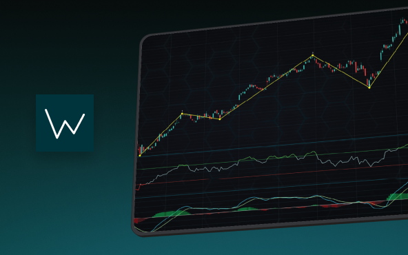
Elliott Wave Theory in Trading
Financial markets often appear chaotic, but many traders believe that price movements follow recurring patterns driven by human psychology. One of the most influential approaches based on this idea is the Elliott Wave Theory. Developed nearly a century ago, it remains one of the most widely studied methods of technical analysis.
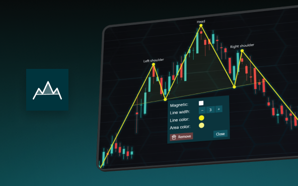
The Head and Shoulders Pattern in Technical Analysis
The Head and Shoulders Pattern in Technical Analysis The Head and Shoulders Pattern in Technical Analysis The Head and Shoulders pattern is one of the most recognized and widely used chart patterns in technical analysis. It is considered a reliable reversal pattern...

Best Telerik Charts Alternative in 2026: GPU Performance for WPF, WinForms, and Web
Telerik from Progress is a comprehensive UI component suite covering WPF, WinForms, ASP.NET, Blazor, and JavaScript. The charting components: RadChartView for WPF and WinForms, and Kendo UI Charts for web and Blazor, arrive bundled with the suite purchase. For teams...


If you have any questions, feel free to contact us!
©LightningChart Ltd 2026. All rights reserved.