LightningChartIntroduction to Area Graphs
ArticleThe power of area graphs and visualizing data with area charts.
Introduction to Area Graphs
Area graphs are a chart type for visualizing data which provides a clear and intuitive representation of data trends and patterns over time or across categories. By utilizing shaded areas, area graphs effectively display the magnitude and proportion of different variables, making it easier to understand complex data sets. Whether you are a data analyst, business professional, or researcher, understanding how to interpret and create area graphs is essential for effective data visualization.
When to use area charts and how to read them?
Area charts are particularly valuable when you want to emphasize the cumulative total of multiple variables over time. They are ideal for displaying part-to-whole relationships and highlighting the proportionate contribution of each category. For example, if you want to visualize the market share of different products over a specific period, an area chart can effectively illustrate the relative sizes of each segment.
Additionally, area charts are great for showcasing trends and patterns in data. By plotting data points over time, you can easily identify whether a variable is increasing, decreasing, or remaining stable. This makes area charts a popular choice for tracking stock market performance, analyzing sales data, and monitoring population growth.

It’s important to understand the basic part of a graph to effectively interpret it. The X-axis represents time or categories, while the Y-axis represents the magnitude or value of the variables being measured. The area between the X-axis and the line segments represents the data points.
When reading an area graph, start by looking at the overall shape and direction of the lines. Are they ascending, descending, or relatively stable? This will give you a general sense of the trend. Next, pay attention to the shaded areas between the lines and the X-axis. These shaded areas indicate the cumulative total of the variables being measured.
By analyzing the steepness or flatness of the lines, you can determine the rate at which the variables are changing. Steeper lines indicate a faster rate of change, while flatter lines suggest a slower rate. Additionally, the distance between the lines at any given point represents the difference or gap between the variables being compared.
Stacked Area Charts
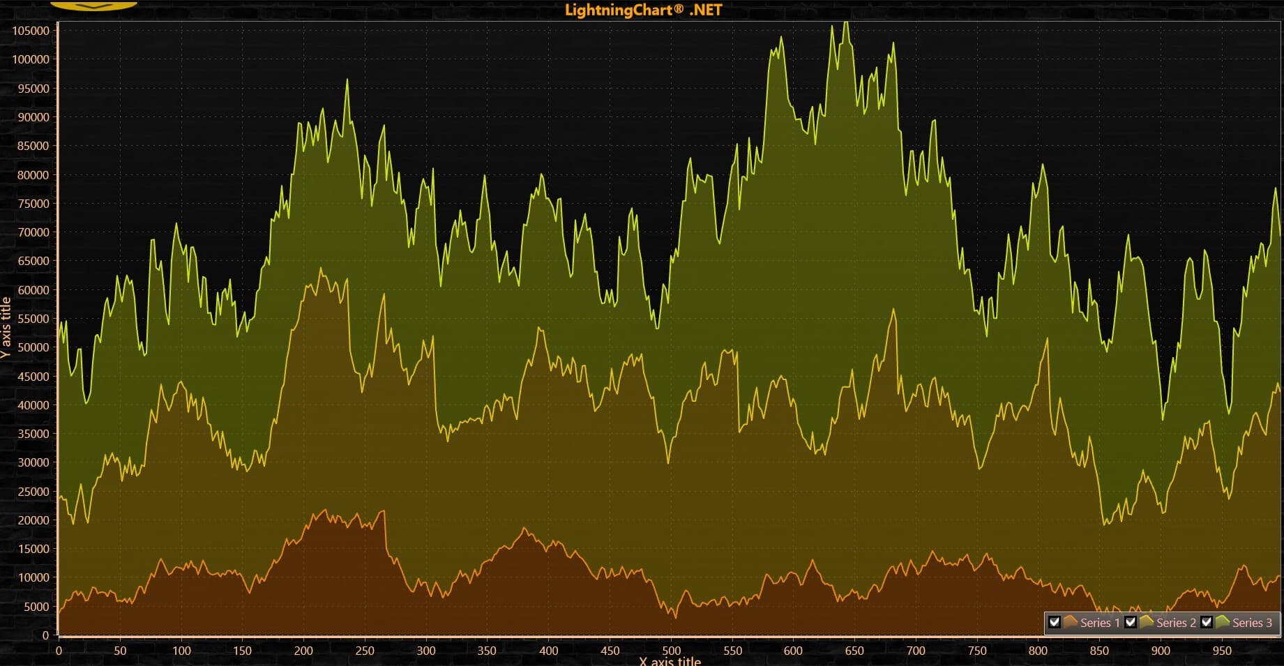
The WPF Stacked Area Chart in the WPF framework is a type of area graph that enables the stacking of multiple variables on top of each other, creating a cumulative visual representation. Each variable is depicted using a different color, and the stacked areas visually display the combined magnitude of all the variables. Each shaded area represents a different variable, and the cumulative height of the areas indicates the total value. This chart is particularly useful when analyzing multiple categories or variables that contribute to a whole.
When reading a WPF Stacked Area Chart, focus on the different shaded areas and their position within the stack. The topmost area represents the variable with the highest value, while the bottommost area represents the variable with the lowest value. By comparing the areas, you can determine the relative contribution of each variable and identify patterns or trends across the stack.
You can see here an example of a WPF stacked area chart created with LightningChart .NET. This type of chart control can be used in different data applications for various industries, it also supports massive amounts of data points. If you’re interested in the development of this application, check how to create a stacked area chart with LightningChart .NET.

WPF Stacked Area Chart with LightningChart .NET
LightningChart .NET empowers developers to create dynamic and informative charts like the WPF Stacked Area Chart with Multiple Series demonstrated in this tutorial. With its intuitive APIs, extensive customization options, and seamless integration with Visual Studio, LightningChart .NET offers a comprehensive solution for data visualization needs in .NET applications.
One of the standout features of LightningChart JS is its high performance, capable of handling millions of data points with smooth and responsive rendering. This makes it ideal for real-time data monitoring and analysis applications where speed and accuracy are crucial.
Mountain Charts
A mountain chart, also known as a stacked line chart or a stacked area chart, is similar to the WPF Stacked Area Chart but with a slight variation. Multiple attributes are included in the Mountain Chart, each attribute is plotted as a line with colour fill, stacked underneath the previous one with a different colour. This graph visually represents peaks and dips, resembling the side of a mountain.
Essentially, mountain charts are the same as line charts, but with the space below the line filled in with colour. They are often referred to as area charts, and they are a popular visual aid used for categorizing and comparing parts of a whole, employing different colours to distinguish the categories.
When analysing a Mountain Chart, pay attention to the peaks and valleys of the curved lines. The highest peak indicates the maximum value within the time range, while the lowest valley represents the minimum value. The width of the shaded area reflects the range of values, with wider areas indicating greater variation. By examining these visual elements, you can pinpoint significant data points and understand the distribution of values over time.
LightningChart JS library offers the Stacked Mountains Chart. Check the Stacked Mountains Chart example made with LightningChart JS. The Stacked Mountains Chart example showcased by LightningChart JS is a powerful visualization tool for displaying complex data sets with multiple categories and values. This charting library offers a highly interactive and customizable environment, perfect for creating stunning visual representations of data.
Example of a mountain chart created with LightningChart JS
Multiple Areas Chart
A Multiple Areas Chart is a variation of the traditional area graph that allows you to compare multiple variables side by side, without stacking them on top of each other. This type of chart is particularly useful when you want to highlight the individual trends and patterns of each variable without emphasizing their cumulative total.
When interpreting a Multiple Areas Chart, focus on the individual shaded areas and their cumulative impact. The position of the areas within the stack indicates their relative contribution, while the width of the shaded areas represents the range of values. By analyzing the shape and pattern of the graph, you can uncover valuable insights and make informed decisions based on the data. LightningChart JS charting component provides Multiple Area Charts. Check out this LightningChart JS interactive example of a Multiple Area Chart.
Example of an area chart that supports multiple areas of data created with LightningChart JS
Key Components of an Area Graph
X and Y-Axes for Time/Categories
The X-axis and Y-axis are essential components of an area graph, providing the framework for visualizing data. The X-axis represents time or categories, depending on the type of data being analyzed. It allows for effective comparison and tracking of trends over a specific period. The Y-axis, on the other hand, represents the values or quantities being measured. It enables accurate measurement and visualization of the data points.
To create an impactful area graph, ensure that the X-axis is labeled with appropriate time intervals or categories. This will help in interpreting the graph accurately and understanding the progression of data over time or across categories. Similarly, the Y-axis should be labeled with the appropriate scale to provide a clear representation of the values or quantities being measured.
Data Points Connected by Line Segments
In an area graph, data points are connected by line segments to create a smooth and continuous representation. Each data point represents a specific value or quantity at a given time or category. The line segments connecting the data points allow for a clear visualization of the progression and trends in the data.
When reading an area graph, pay attention to the slope of the line segments. A steep slope indicates a rapid change in values, while a gentle slope suggests a gradual change. By analyzing the line segments, you can identify significant shifts, compare data points, and draw meaningful insights from the graph.
Shaded Areas
Shaded areas are a defining feature of area graphs, providing a visual representation of the magnitude and proportion of different variables. The shaded area between the line graph and the X-axis represents the data points and their magnitude. The height or width of the shaded area indicates the total value or quantity being measured.
When interpreting shaded areas, focus on their shape, size, and position. A larger shaded area represents a higher value or quantity, while a smaller shaded area suggests a lower value. By comparing the shaded areas, you can identify the relative contribution of each variable and understand the overall distribution of data.
In LightningChart JS, this can be achieved by using the class AreaSeriesPositive and AreaSeriesNegative. Both classes allow the area graph to visualize a set of progressive Points by filling the area between the points’ Y-values and a static baseline value. The AreaSeriesPositive and AreaSeriesNegative classes show data above and below the baseline, respectively.
Conclusion
In conclusion, area graphs stand as indispensable tools for data visualization, offering nuanced insights into complex data sets. Mastering their interpretation and exploring specialized variants empower professionals to communicate data effectively and derive actionable intelligence. Embracing the diversity of area charts and adhering to best practices unlock the full potential of data visualization in decision-making processes.
When it comes to implementing advanced area graphs and ensuring seamless interactivity, LightningChart emerges as a best-in-class charting library. LightningChart’s robust capabilities empower users to create visually stunning and highly interactive area graphs, enhancing the understanding and communication of data insights. Its rich suite of features, including the WPF Stacked Area Chart and Multiple Areas Chart, provides a versatile toolkit for professionals across industries.

SQL and LightningChart JS dashboard
Published on April 18th, 2024 | Written by humanSQL Dashboard ApplicationHello! In today's article, we will see work on a small project using several development tools. We will create an SQL Dashboard with data generated in SQL Server and use Angular for web...

JavaScript 2D Bubble Chart
JavaScript 2D Bubble ChartIn this article, we will create a JavaScript 2D bubble chart using Node JS and LightningChart JS. Remember that you can download the template and use it to experiment with it. When we are looking for an attractive way to represent our data,...

Create a JavaScript Stacked Bar Chart
JavaScript Stacked Bar ChartStacked bar charts are very useful in scenarios where we see large groups of data from different categories, or values from each other. We can see how a category is divided into segments, from the largest to the smallest in relation to...

