LightningChart .NETWPF Bubble Chart
TutorialCreate a WPF bubble chart application with LightningChart .NET
Introduction to WPF Bubble charts
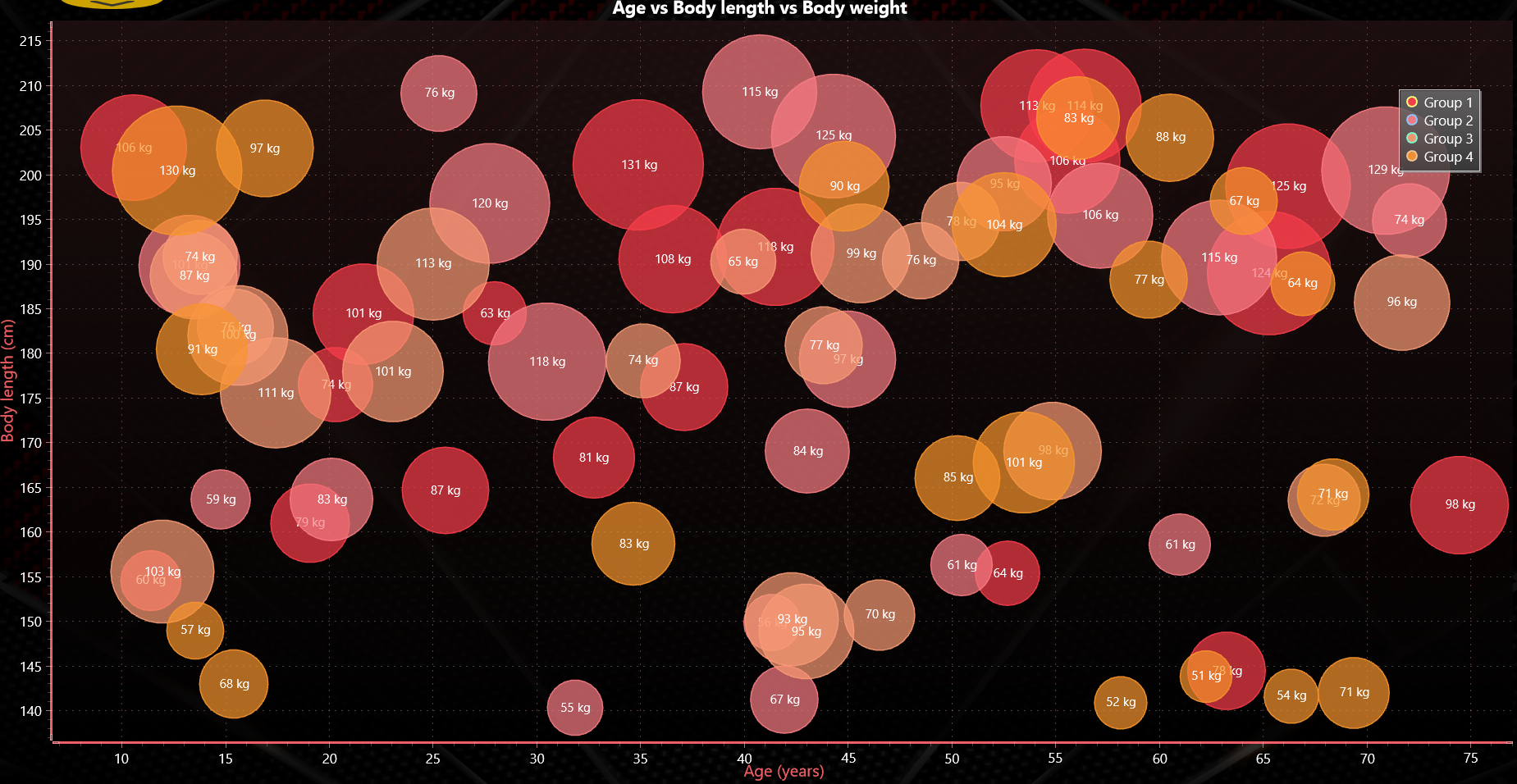
In today’s article, we will create a WPF bubble chart with the help of LC .NET. These graphs show data points in the shape of a bubble and are positioned on a Cartesian plane X-axis and a Y-axis. The size of the bubbles indicates quantities or volumes, comparing them with each other, helping to size the differences between data points.
In this WPF bubble chart example, we will show the relationship between age, body length, and body weight. For this chart, we will use two tools:
- Freeform point line series.
- Event Marker Series.
These tools will help us add values to our axes and the width of each bubble in relation to the Z value. Well, let’s get started!
Project Overview
This WPF bubble chart example is created with SeriesEventMarkers and shows 3-dimensional data for X and Y-axes plus the size of the bubble.
Download the project to follow the tutorial
Local Setup
For this project, we need to take into count the following requirements to compile the project.
- OS: 32-bit or 64-bit Windows Vista or later, Windows Server 2008 R2 or later.
- DirectX: 9.0c (Shader model 3 and higher) or 11.0 compatible graphics adapter.
- Visual Studio: 2010-2019 for development, not required for deployment.
- Platform .NET Framework: installed version 4.0 or newer.
Now go to the next URL and download LightningChart .NET. You’ll then be redirected to a sign-in form where you’ll have to complete a simple sign-up process. When you’re done with the registration process, you’ll have access to your LightningChart account.
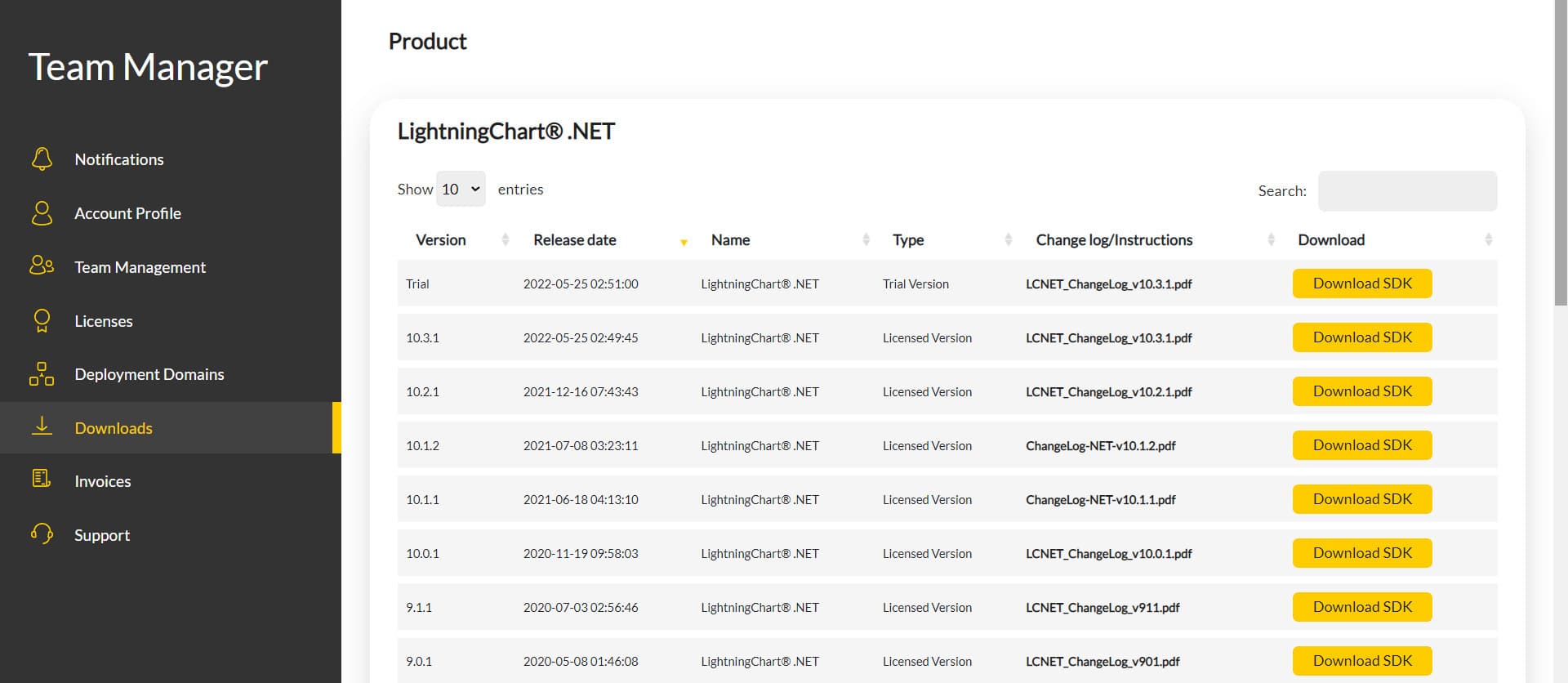
After you sign into your account, you will be able to download the SDK. This SDK will be a “free trial” version, but you will be able to use many important features for this WPF bubble chart tutorial. When you download the SDK, you’ll have a .exe file like this:

The installation will be a typical Windows process, so please continue with it until it is finished. After the installation, you will see the following programs:

License Manager
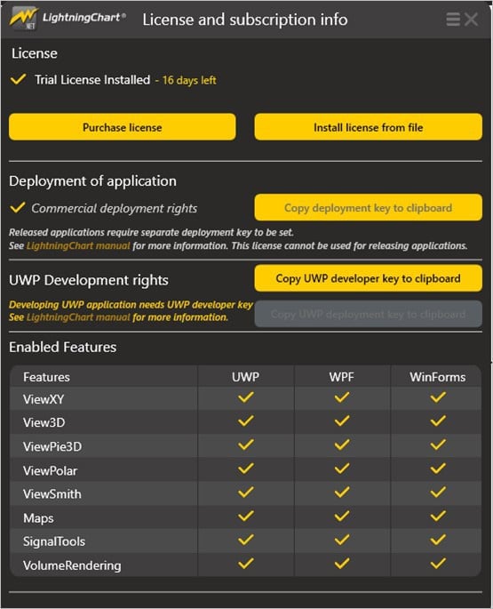
In this application, you will see the purchase options. All the projects that you will create with this trial SDK, will be available for future developments with all features enabled.
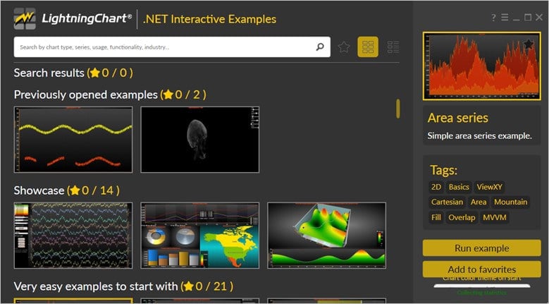
LightningChart .NET Interactive Examples
Now you can see 100+ interactive visualizations available for WPF, WinForms, and/or UWP.
Visual Studio Project
Now let’s work with Visual Studio. The main difference between using the LightningChart visualizer and Visual Studio is that we will be able to analyze and experiment with many features within the source code. In the LC visualizer, select the WPF bubble chart and run the example:

In the top-right zone of the windows, you will see the following options:
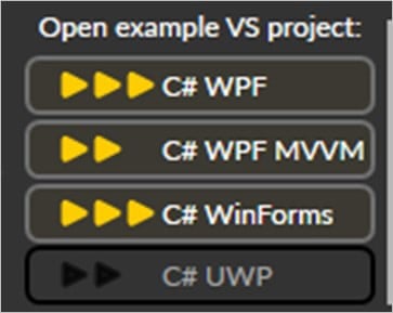
For the trial SDK, we will be able to use the WPF framework. After clicking the framework to use, we will need to specify a folder where the project will be created:
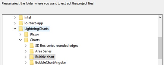
Finally, the WPF bubble chart project will be created and Visual Studio will be opened and ready for executing the digital signal processing filters application.
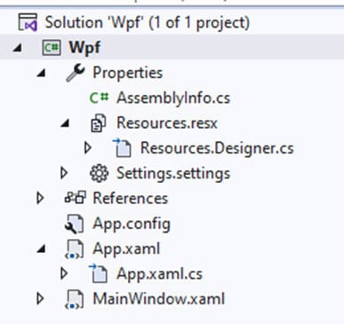
Code Review
The main code will be wrapped inside MainWindow.xaml.cs. Here we will find the code for UI controls.
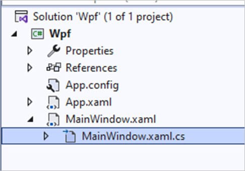
Inside the code, we will check two methods that will create the properties that we need to correctly draw the WPF bubble chart. The interactive example is built with various user controls, to manipulate and change the visual properties of the chart. These controls are not required to generate this graph, so we will focus on the code responsible for generating the object.
CreateChart()
We will start with the InitializeComponent method. This will allow us to load our XAML template and access the objects within it.
InitializeComponent();

_grid = Content as Grid; // Get grid from UI.

CreateChart(); // Create chart.
The CreateChart method will construct the WPF bubble chart object, which will be displayed within an XAML frame. We need to create a LightningChart-type object. This constructor will allow us to create an instance of a chart, specify the type of chart, and access different properties.
_chart = new LightningChart
{
    ChartName = "Bubble chart" // Chart name
}; // Create a new chart.
_chart.Title.Text = "Age vs Body length vs Body weight"; // Title in the top of chart
The BeginUpdate function will allow us to stop drawing the chart, which will allow us to set up the properties that we want to customize. As long as the update is not closed, the chart will not show the changes we make, this will help with the performance of the chart construction.
_chart.BeginUpdate();ViewXY
We need to get the active chart view, or the type of chart that will be created. To create the WPF bubble chart, we use the XY view but there are several types of views available:
- XY
- 3D
- Pie3D
- Polar
- Smith
ViewXY v = _chart.ViewXY; // Get XY viewAdding the LegendBox
Once we have the view, we can have access to all the properties related to the type of view. The LegendBoxes collection will allow us to configure multiple legend boxes, but in this case, we will create one (Index 0). Legend boxes can be placed automatically or manually.
Automatic placement allows them to be aligned to the left/top/right/bottom side of the graph segments, or on margins. Control the position of the Position property. Position options are: TopCenter, TopLeft, TopRight, LeftCenter, RightCenter, BottomLeft, BottomCenter, BottomRight, Manual.
The Offset property shifts the position by a given amount from the position determined by the Position property. To show or hide the checkboxes in the legend box, use the ShowCheckBoxes property. CheckBoxColor and CheckMarkColor can be used to change the appearance of the checkbox while CheckBoxSize controls the size of the box in pixels.
v.LegendBoxes[0].Layout = LegendBoxLayout.Vertical;
v.LegendBoxes[0].ShowCheckboxes = false;
v.LegendBoxes[0].Offset = new PointIntXY(-15, -70);
Setup Axes
To access an axis and configure its properties, we must specify the X or Y collection. In a chart, you can have multiple axes of the same coordinate, but this will affect the appearance and type of the WPF bubble chart. In this case, we will only use one for coordinate (Index 0). ValueType -property controls which value types are used by the axis labels. ValueType has the following options available:
- Number: Regular numeric format for integer and decimal presentation. When
AutoFormatLabelsis disabled,LabelsNumberFormatapplies. Default value.
- Time: For the time of day presentation. When
AutoFormatLabelsis disabled,LabelsTimeFormatapplies.
- DateTime: Date presentation, with optional time of day. When
AutoFormatLabelsis disabled,LabelsTimeFormatapplies here as well, similarly to the Time type.
Scrolling Modes
LightningChart has several scrolling modes, selected using the ScrollMode property:
- None: is the default option. No scrolling is applied when setting the
ScrollPositionto None. This is often the selection to use when not using real-time monitoring.
- Stepping: When the collected data reaches the end of the X axis, the axis with all series data is shifted left by a stepping interval. This shift is executed every time the X-axis end is reached.
- Scrolling: the X-axis is kept stationary until the scrolling gap has been reached, after which the X-axis with all series is continuously shifted left.
Range
Sets the value range of an axis by giving values to Minimum and Maximum properties. The minimum should be less than the Maximum. When trying to set Minimum > Maximum, or vice versa, the internal limiter will limit the values near the other value.
To set both values simultaneously, use SetRange(…) method. Passing Minimum > Maximum in SetRange automatically flips these values so that Minimum < Maximum.
The value range of the Y axis can be scrolled directly by dragging the axis with the mouse when AllowScrolling is enabled.
The Minimum or Maximum can be modified by dragging the scale nib area (end of an axis) up or down when the AllowScaling property is enabled.
Adding Series to the WPF Bubble Chart
Now we need to create a series for the WPF bubble chart. In this case, we are specifying 4 series (SeriesCount). The AddSeries method will create and format de data points (bubbles) and will add each series to the chart (using the view (v parameter)).
int seriesCount = 4; // Add several series

Random random = new Random((int)DateTime.Now.Ticks);

for (int i = 0; i < seriesCount; i++)
{
    AddSeries(DefaultColors.SeriesForBlackBackgroundWpf[i], v, "Group " + (i + 1).ToString(), random);
}
We need colors for the borders and fills of bubbles. The CalGradient tool calculates the gradient color between two colors. The FromArgb tool will return an RGB color using the generated values by DefaultColors.SeriesForBlackBackground. For each series, we will create 20 bubbles, and for each of them, we will create random values to be stored in the data array object.
Color borderColor = ChartTools.CalcGradient(bubbleColor, Colors.White, 50); // Bubble border color.
Color fillColor = Color.FromArgb(150, bubbleColor.R, bubbleColor.G, bubbleColor.B); // Bubble fill color.

int bubbleCount = 20; // Number of bubbles per series.

PointDouble3D[] data = new PointDouble3D[bubbleCount];
for (int i = 0; i < bubbleCount; i++)
{
    data[i].X = 10.0 + rand.NextDouble() * 65.0; // age.
    data[i].Y = 140 + rand.NextDouble() * 70.0; // length cm.
    data[i].Z = data[i].Y / 2.0 - (rand.NextDouble() - 0.5) * data[i].Y / 3.0; // weight kg.
}
A FreeformPointLineSeries can present a simple line, points (scatter), or both as a point line. FreeformPointLineSerie allows drawing line points to any direction from the previous point. All line and point formatting options from PointLineSeries applied. Add the series to the WPF bubble chart by adding FreeformPointLineSeries objects to the FreeformPointLineSeries list.
FreeformPointLineSeries freeformPointLineSeries = new FreeformPointLineSeries(view, view.XAxes[0], view.YAxes[0]);
freeformPointLineSeries.PointStyle.Color1 = fillColor;
freeformPointLineSeries.PointStyle.GradientFill = GradientFillPoint.Solid;
freeformPointLineSeries.PointsVisible = true;
freeformPointLineSeries.LineVisible = false;
freeformPointLineSeries.PointStyle.BorderWidth = 1;
freeformPointLineSeries.PointStyle.BorderColor = borderColor;
freeformPointLineSeries.Title.Text = seriesTitle;
Now we will create the bubbles. Line series have SeriesEventMarkers collection property. It can be used to assign series-specific event markers. The series event markers can be dragged with a mouse to another location while keeping the event marker attached to series values.
To enable this, the marker’s VerticalPosition must be set to TrackSeries. By setting HorizontalPosition to SnapToPoints, the marker aligns itself horizontally to the position of the nearest data point. HorizontalPosition = AtXValue allows placing the marker at any x value. Respectively, VerticalPosition = AtYValue allows setting the marker vertically to any Y-level.
for (int i = 0; i < bubbleCount; i++)
{
    SeriesEventMarker bubble = new SeriesEventMarker(freeformPointLineSeries)
    {
        XValue = data[i].X,
        YValue = data[i].Y
    };
    bubble.Symbol.Width = bubble.Symbol.Height = (float)data[i].Z * 1.2f;
    bubble.Symbol.Shape = SeriesMarkerPointShape.Circle;
    bubble.Symbol.BorderWidth = 1.5f;
    bubble.Symbol.BorderColor = borderColor;
    bubble.Symbol.Color1 = fillColor;
    bubble.Symbol.GradientFill = GradientFillPoint.Solid;
    bubble.Label.VerticalAlign = AlignmentVertical.Center;
    bubble.Label.HorizontalAlign = AlignmentHorizontal.Center;
    bubble.Label.Text = data[i].Z.ToString("0") + " kg";
    bubble.Symbol.Antialiasing = true;
    bubble.AllowUserInteraction = false;

    freeformPointLineSeries.SeriesEventMarkers.Add(bubble); // Add created bubble to collection
}
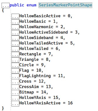
The SeriesEventMarkers gives several shapes, in this case for bubbles, we need the circle shape, but we can experiment with other shapes:
Adding the series to the view
view.FreeformPointLineSeries.Add(freeformPointLineSeries);Enabling the chart update with latest settings
_chart.EndUpdate();Conclusion
We finished with this tutorial. Thanks for getting here. To create a WPF bubble chart of this type, we must remember that we have to work on a Cartesian plane, so we must use the XY view. When creating the series we use a Z value. This Z value serves as a third, non-visible “axis” that affects the X-Y position.
Being a 2D chart, the Z value only helps us generate an alternate value that affects the position of X-Y. To display data, we must create a series. Each series will have its data points and must be added to the chart view.
To create objects with shapes (in this case circles), the SeriesEventMarker object will allow us to create shapes with various shapes. These shapes can have colors, outlines, positions, and text. I hope you liked this article. Bye!

