



Announcing LightningChart JS v8.3
Introducing new product features, visual quality, performance, and dev experience improvements.
New Product Features
LightningChart JS v8.3 introduces new product features. Here’s an overview:
Introducing the Sunburst Chart
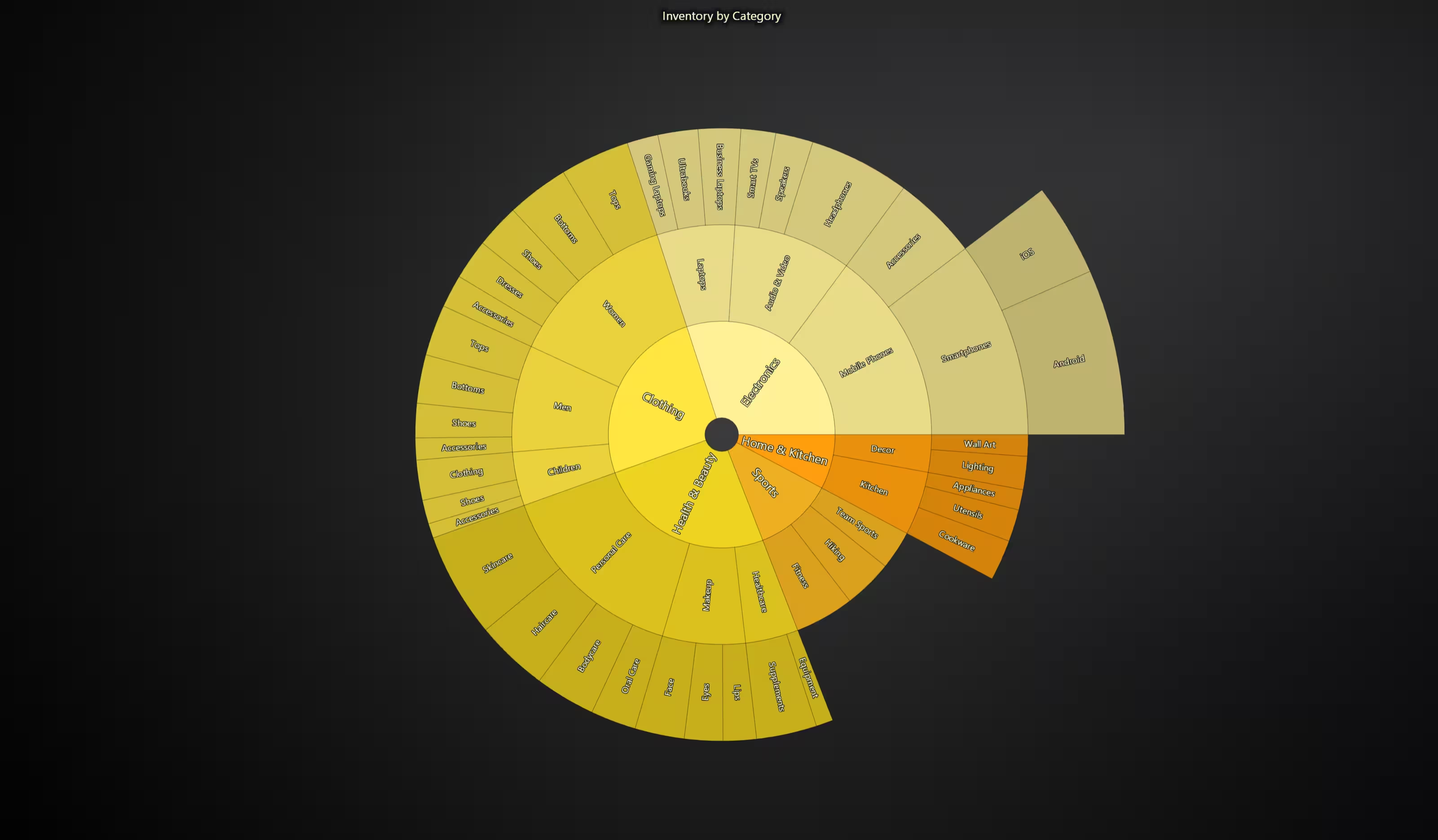
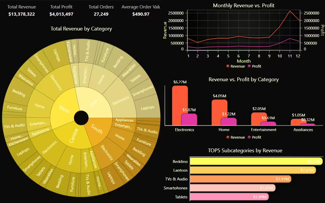
In this 8.3 release, LightningChart JS introduces the sunburst chart used for displaying hierarchical data as a series of aligned rings. Each ring represents a different level in the hierarchy, where each segment is sized proportionally to its value. By introducing the Sunburst chart, LightningChart JS now makes it easier to explore part-to-whole relationships simultaneously across multiple levels.
Built-in Axis Zebra Stripes
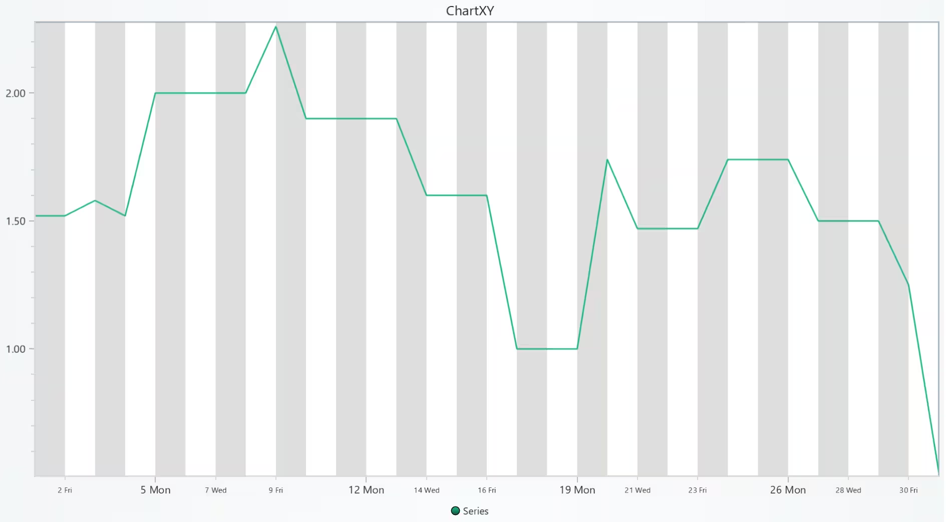
LightningChart JS 8.3 introduces a built-in axis zebra stripes feature that has been requested by some users. Previously, users would have to implement this feature themselves by using Axis bands or other components. The built-in axis zebra stripes highlight axis value progression with a linear stepping pattern.
const oneDay = 24 * 60 * 60 * 1000 // 1 day in milliseconds
axis.setZebraStripes({
    getLayout: () => ({ step: oneDay, start: new Date().getTimezoneOffset() * 60 * 1000 }),
})
Visual Quality Improvements
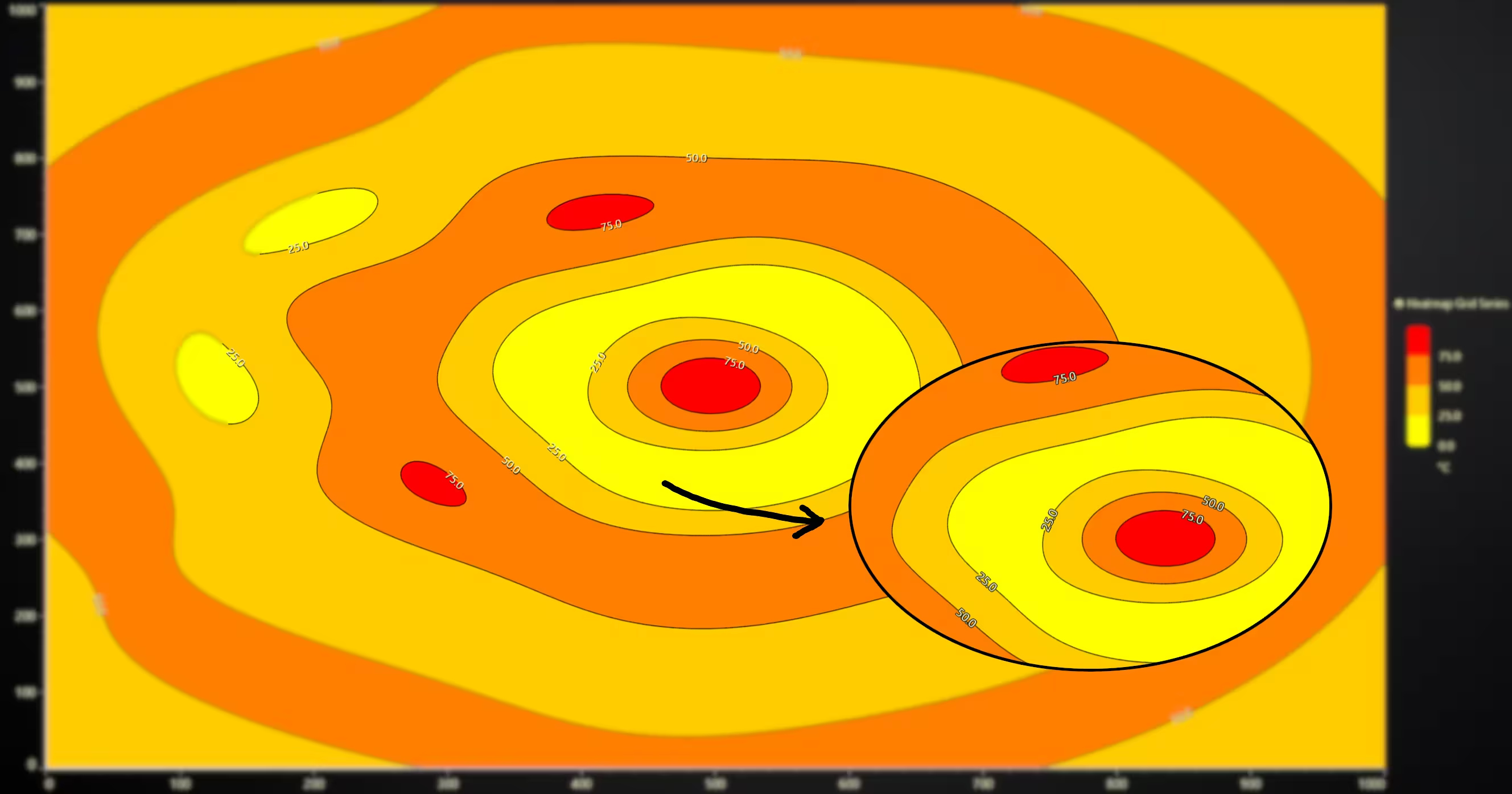
In this release, we are introducing Text Color Contrast Improvements that enhance the engine capabilities for displaying text borders for improved contrast in situations where text is above colorful data. Users can enjoy improved color contrast simply by updating to the latest library version.
Built-in Chart Opacity Filter
We’re introducing a simple method for controlling the global opacity value of specific charts, useful for adding fade-in / fade-out animations. In simple use cases, you could already do this using CSS, but in more complicated apps where shared canvas rendering is used, CSS opacity animations are not an option.
chart.engine.setOpacity(0.5)Performance Improvements
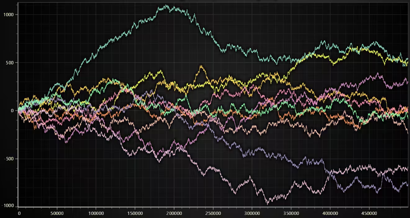
Just when you thought that LightningChart JS could not get any faster, version 8.3 introduces Multi-threading Performance Optimizations as a built-in functionality to make your charts even snappier. With the new multi-threading performance optimizations, it is now possible to load your charts ~6 times faster and delegate all heavy CPU processing to a non-UI thread. In simple terms, multi-threading removes all the lag!
By using multi-threading, we were able to load an absolutely massive data visualization with 40 channels and 10 million data points each in just above 1 second. And you can zoom in/out/reload data without any lag.
Developer Experience Improvements
Rectangle Series Histogram Usability Improvements
This new version adds a convenience method to alter cursor behavior with RectangleSeries to make utilization in Histogram-type (and other) applications easier. Previously, users had to add a custom cursor and position the cursor programmatically to achieve the same.
// Override default cursor in order to position cursor at the top-center of each bar, rather than default position (center of rectangle)

rectSeries.setCursorBehavior({
    location: (info) => ({ x: (info.x1 + info.x2) / 2, y: info.y2 }),
})
New Interactive Examples
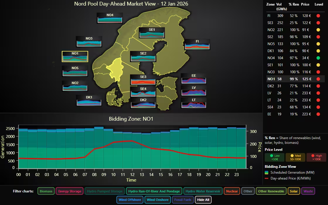
JavaScript Drill-Down Nord Pool Map Dashboard
This dashboard visualizes day-ahead market data from the Nord Pool energy exchange. It provides a geographic overview of the next day’s planned power generation across the Nordic-Baltic region.
Sunburst Chart Dashboard
This dashboard combines a regional map with embedded sparkline-style charts, a sortable summary table with status indicators, a dual-axis chart pairing stacked columns with an overlaid line series on a shared time axis, and a row of toggle chips for filtering.
Get started with LightningChart JS v8.3
To learn more about this release, visit the documentation. To see the full list of changes and improvements, see the full changelog.
See more news
LightningChart .NET v.12.6.1
LightningChart .NET v.12.6.1 is out now!Features of LightningChart® .NET version 12.6.1In this release we added new features, made several improvements and fixed dozens of errors. We upgraded target framework (from .NET 8.0 to 10.0), added Universal-Data-Parser...
Trend Lines in Trading
Trend lines are among the simplest yet most powerful tools in technical analysis. They help traders visualize market direction, identify potential support and resistance levels, and make more informed trading decisions. Despite their simplicity, trend lines remain a...
Announcement: Baumer as LightningChart customer
Enabling High-Performance Visualization of Industrial Sensor Data with LightningChartDiscover how Baumer uses LightningChart to configure and visualize data from a wide variety of industrial sensors and create responsive, data-rich visualization...
Best Python Charting Library in 2026
Python's charting ecosystem is large, overlapping, and regularly misunderstood. Most comparison guides stop at Matplotlib, Plotly, and Seaborn. This one goes further: it covers what happens when your datasets grow large, your update rates increase, or your chart types...



If you have any questions, feel free to contact us!



©LightningChart Ltd 2026. All rights reserved.