







LightningChart JS v.6.0 has been released!
The v.6.0 release includes improvements for cursors and XY axis, new charts, and more.
New cursors
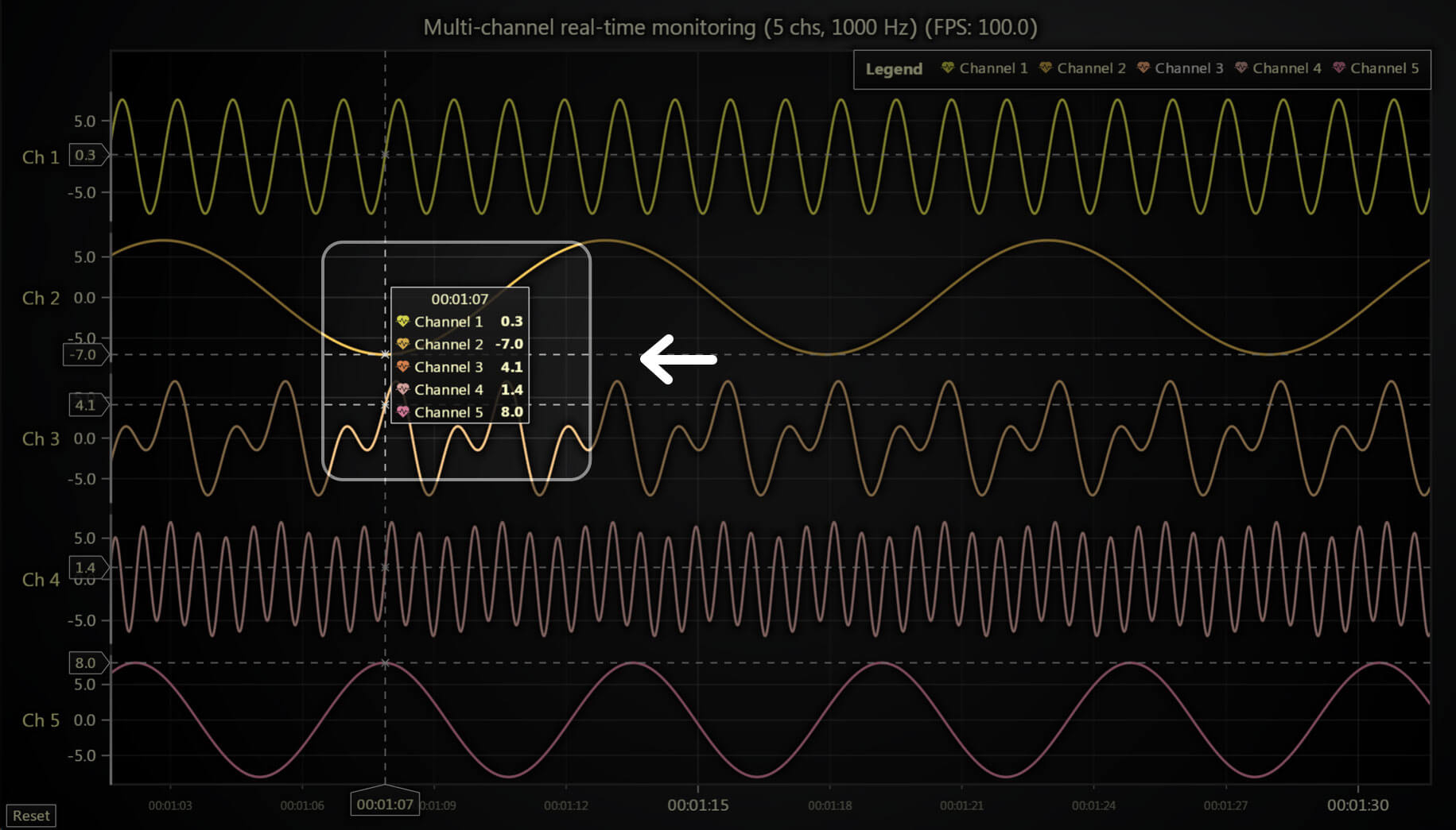
We are excited to announce a fully revamped Cursor API. Many Cursor related APIs are completely reworked with a few key motivations in mind:
- Built-in support for displaying multiple values at once.
- Better default cursor formatting, reducing the need for users to exactly specify what the cursor should display in almost every application.
- Cursors in 3D charts with all series types.
The v6.0 version is a backward incompatible release, mainly due to the change in Cursor APIs. For this reason, users will have to eventually go through the migration steps to port their old cursor API usage to the new version.
As one of the key improvements was to reduce the amount of code required to configure cursors, we strongly suggest completely commenting out / removing your current Cursor API usage and seeing how the new cursors behave out of the box. In many cases, the new cursors should do exactly what you want out of the box.
If you need to tweak the cursor behavior, then please have a look at the new Cursor documentation. If you encounter any issues with the migration, please read the migration guide.

Cursors for large point clouds
LightningChart JS v.6.0 now enables the cursor functionality for applications that require massive point cloud series. Using the correct configurations, the latest optimizations allow the cursors to work with massive point clouds with tens of millions of data points.

With the extensive changes to cursors, the related APIs were completely reimagined. One major improvement is the enhanced default cursor formatting functionality, along with new convenience APIs, reducing the need for users to override cursor formatting in their applications.
Default formatting now handles most needs, though users can still specify units or custom formatting functions for specific axes if needed. This simplifies development and improves the appearance of applications with enabled cursors. Notably, only 6 out of 145 online examples now use the setCursorFormatting method to override default formatting. Whereas before, most examples had to use the setCursorResultTAbleFormatter method for the cursor to look nice.
New & reworked charts
The gauge charts API has been completely reworked and simplified. Enhancements include a better visual look with rounded edges, clearer value indication, and improved responsiveness in various layouts. A built-in Value Indicator feature now highlights active values with a visual aid and a smooth glow under the value label.

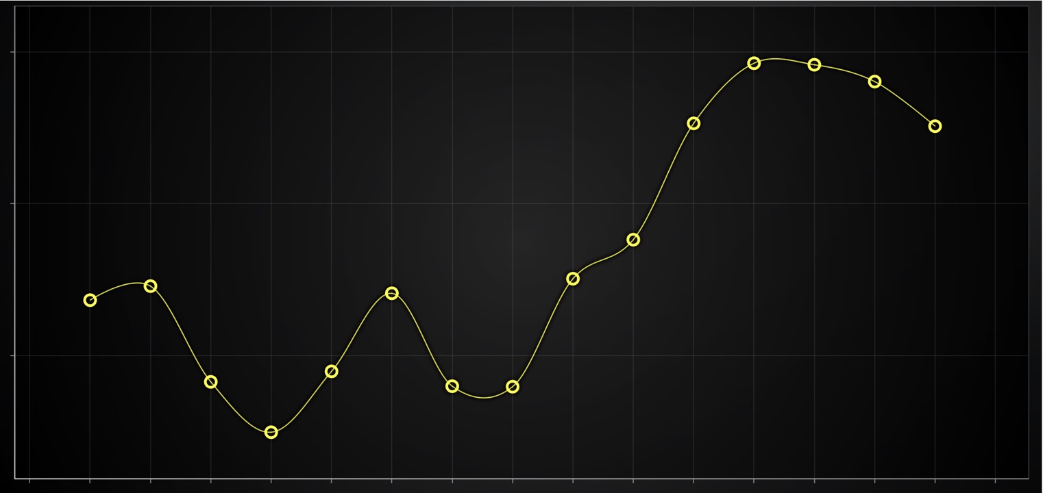
Hollow circle point shape
As requested by users, we have added the PointShapes.HollowCircle as requested by customers. This feature is available for 2D Point and PointLine Series.
New features for XY axis
You can now position the Axis title in different locations using the Axis.setTitlePosition method.

Series clipping mode in stacked axis apps
This new feature gives the ability to control if individual series’ rendering leaks outside their own axis or not by using the method SeriesXY.setClipping. In the following picture, the area series is configured to not leak outside. Previously, all the series were clipped only against the entire chart viewport. As one may imagine, this control possibility is critical for many common use cases.
Event API for Axis titles
We also added a user-interaction API to built-in axis titles. For instance, this may be useful for applying custom actions when the user clicks on the name of an axis.
Improved DateTime Axis Zoom Range
Previously, the DateTime axis was limited to a zoom range of 1 second and it is now upgraded to 1 millisecond. Even though it may sound like a very small thing, this is a quite common issue.
Custom data interaction improvements
User interaction events on a chart now directly report information about the specific data point the user interacted with. This simplifies actions such as:
- Moving a data point when the user drags it with the mouse
- Showing a drill-down view when the user taps on a data point
- Or other custom interactions.
This functionality is not limited to an XY-specific chart and works in all the series types including 3D charts.
More Improvements
As part of the NPM organization rename, @arction will move to @lightningchart. We recommend you remove the @arction/lcjs from package.json and install the latest @lightningchart/lcjs version, check the migration guide for more information.
LCJS-Headless support has been re-added for the LCJS 6.x versions and it is not compatible with the previous LCJS 5.x versions.
Get started with LightningChart JS v.6.0
All in all, LightningChart JS v.6.0 presents several new features, improvements, and chart types that enhance data application development, every previous release can be accessed in the changelog.
See more news
LightningChart .NET v.12.6.1
LightningChart .NET v.12.6.1 is out now!Features of LightningChart® .NET version 12.6.1In this release we added new features, made several improvements and fixed dozens of errors. We upgraded target framework (from .NET 8.0 to 10.0), added Universal-Data-Parser...
Trend Lines in Trading
Trend lines are among the simplest yet most powerful tools in technical analysis. They help traders visualize market direction, identify potential support and resistance levels, and make more informed trading decisions. Despite their simplicity, trend lines remain a...
Announcement: Baumer as LightningChart customer
Enabling High-Performance Visualization of Industrial Sensor Data with LightningChartDiscover how Baumer uses LightningChart to configure and visualize data from a wide variety of industrial sensors and create responsive, data-rich visualization...
Best Python Charting Library in 2026
Python's charting ecosystem is large, overlapping, and regularly misunderstood. Most comparison guides stop at Matplotlib, Plotly, and Seaborn. This one goes further: it covers what happens when your datasets grow large, your update rates increase, or your chart types...



If you have any questions, feel free to contact us!



©LightningChart Ltd 2026. All rights reserved.