


Blog
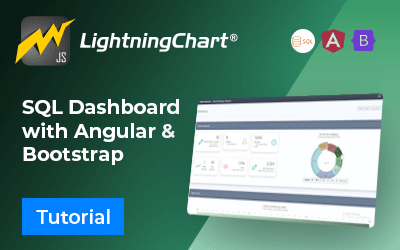
SQL and LightningChart JS dashboard
Written by a human | Updated on April 23rd, 2025SQL Dashboard ApplicationHello! In today's article, we will see work on a small project using several development tools. We will create an SQL Dashboard with data generated in SQL Server and use Angular for web development. In this project, we will create the user interface using Bootstrap. You can...
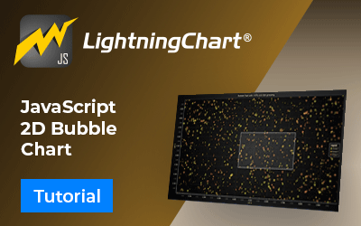
JavaScript 2D Bubble Chart
Written by a human | Updated on April 23rd, 2025JavaScript 2D Bubble ChartIn this article, we will create a JavaScript 2D bubble chart using Node JS and LightningChart JS. Remember that you can download the template and use it to experiment with it. When we are looking for an attractive way to represent our data, we can use the Bubble Chart,...
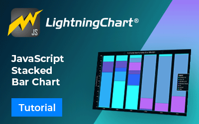
Create a JavaScript Stacked Bar Chart
Written by a human | Updated on April 23rd, 2025JavaScript Stacked Bar ChartStacked bar charts are very useful in scenarios where we see large groups of data from different categories, or values from each other. We can see how a category is divided into segments, from the largest to the smallest in relation to the total amount. There are two...
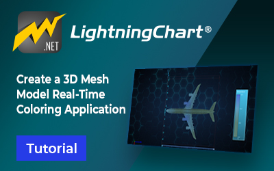
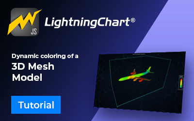
3D Mesh Model Real-Time Coloring
Written by a human | Updated on April 14th, 20253D Mesh Model Real-Time Coloring ApplicationIn this example, we will be using an airplane object for creating a 3D mesh model real-time coloring application. This application example is useful for visualizing simulations or diagnostic data from a 3D model in real-time. For instance, sensors...
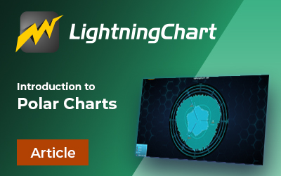
Polar Charts
Written by a human | Updated on April 23rd, 2025Introduction to polar chartsI'm Omar and today we will review the topic of Polar charts. Within the LightningChart article catalog, you can find tutorials for developing this type of chart, for example, how to create a WPF polar radar chart you may have probably seen this type of graph before since...
3D Mesh Model Application in JavaScript
Written by a human | Updated on April 23rd, 2025IntroductionHi again, I'm Omar and in this article, we will create a 3D mesh model using the LightningChart JS library. Usually when we talk about 3D mesh models, we use using LC .NET library, but with the recent release of LightningChart JS v.5.1, 3D mesh models are now available. A 3D mesh model...

JavaScript 3D Bubble Chart
Written by a human | Updated on April 23rd, 2025JavaScript 3D Bubble ChartHello, I'm Omar and we'll start with a quick JavaScript charting exercise. We will create a 3-dimensional chart with bubbles for each data point. If this is your first article, it's a great opportunity to work with Lightning Chart JS download the project, and practice with...
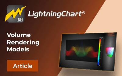
Volume Rendering with LightningChart
LightningChart offers VolumeModel tool for volume data visualization via Direct Volume Rendering. VolumeModel takes the volume data inside, and visualize it. Our volume rendering engine is based on the Volume Ray Casting.

Aeronautical Charts
Written by a human | Updated on April 14th, 2025Introduction to aeronautical chartsIn this article, we will review a topic a little different than our usual .NET and JS development tutorials. We will review the topic of aeronautical charts, their functions, regulations, and some examples. For inland traffic, various traffic rules must be taken...

Temperature Monitoring Application
Written by human on February 19th, 2024Temperature sensor applicationsReal-time temperature monitoring applications are an essential tool for engineers and developers in industrial sectors. Temperature monitoring applications use temperature sensors, thermal sensors, and telemetry to record and transmit real-time data from different machinery for...


If you have any questions, feel free to contact us!
©LightningChart Ltd 2026. All rights reserved.