


LightningChart JSCreating a JavaScript DataGrid Monitoring Application
TutorialDiscover how to enhance your LightningChart JS charting applications by implementing the cutting-edge DataGrid component.
Written by a human | Updated on April 10th, 2025
JavaScript DataGrid Monitoring Application
In this article, we will carry out an exercise of an XY chart that updates in real-time using the new LC JS DataGrid monitoring component. DataGrid is an additional LightningChart JS component aimed to be used as a standalone monitoring control or within dashboards.
It features an unlimited number of columns and rows, supports multiple data formats, and is compatible with all LC JS visualizations.
What is the purpose of data grid?
In this application, the DataGrid monitoring object will allow us to display data within a table, but share visual properties that the LightningChart library provides us with. This application simulates high-speed incoming real-time data displayed within the scrolling line chart and the data grid as well.
The information can be complicated to detect from the data grid at such a high input rate. To facilitate this, the cells of the data grid can be color-coded similarly to a heatmap. In these types of cases, the data grid allows you to display data that traditional line graphs cannot, for example, complementary measurements such as temperature, transmission latency, etc.
Hello!
In this article, we will carry out an exercise of an XY chart that updates in real-time using the new LC JS DataGrid monitoring component.
DataGrid is an additional LightningChart JS component aimed to be used as a standalone monitoring control or within dashboards.
It features an unlimited number of columns and rows, supports multiple data formats, and is compatible with all LC JS visualizations.
What is the purpose of data grid?
In this application, the DataGrid monitoring object will allow us to display data within a table, but share visual properties that the LightningChart library provides us with.
This application simulates high-speed incoming real-time data displayed within the scrolling line chart and the data grid as well.
The information can be complicated to detect from the data grid at such a high input rate.
To facilitate this, the cells of the data grid can be color-coded similarly to a heatmap.
In these types of cases, the data grid allows you to display data that traditional line graphs cannot, for example, complementary measurements such as temperature, transmission latency, etc.
Project Overview
This datagrid tutorial is an example of a real-time monitoring use case using LightningChart JS DataGrid monitoring. This program simulates the fast-moving real-time data. Then, data is shown in a DataGrid and a scrolling line chart.
Note: the DataGrid component is an additional component for LightningChart JS. To use DataGrid, you require a license. For more information, visit the LightningChart JS pricing.
Example of a real-time monitoring use case using LightningChart JS DataGrid monitoring.
This program simulates the fast-moving real-time data. Then, data is shown in a DataGrid and a scrolling line chart.
Note: the DataGrid component is an additional component for LightningChart JS.
To use DataGrid, you require a license. For more information, visit the LightningChart JS pricing.
 Download the project to follow the tutorial
Local Setup
1. Download the initial template that will help us get started with this example.
2. After downloading the template, you’ll see a file tree like this:

3. Open a new terminal and run the npm install command:
As usual in a NodeJS project, you need to run the npm install command. That would be everything for our initial setup. Let’s code.
As usual in a NodeJS project, you need to run the npm install command.
That would be everything for our initial setup. Let’s code.
CHART.ts
Inside this file, we will have all the logic needed to create our chart, configure animations, and format the data.
1. Declare the constant lcjs that will refer to our @arction/lcjs library.
const lcjs = require('@arction/lcjs')
const xydata = require('@arction/xydata')
2. Extract required classes from lcjs
const { AxisScrollStrategies, AxisTickStrategies, lightningChart, LegendBoxBuilders, Themes } = lcjs
const { createProgressiveTraceGenerator } = xydata
3. Data Grid requires a license to make it work.
Once you have a DataGrid license, you will have to specify this in a LightningChart instance. For more information, visit the DataGrid pricing page.
const lc = lightningChart({
    license: `0000-XXXXXXXXXXXXXXXXXXXXXXXXXXX-XXXXXXXXXXXXXXXXXXXXXXXXX-XXXXXXXXXXXXXXXXXXXXXXXX`
  })
4. Creating the Dashboard
const dashboard = lc.Dashboard({
    theme: Themes.cyberSpace,
    numberOfRows: 1,
    numberOfColumns: 2,
})
The dashboard will be the container of the chart objects created inside this Dashboard.
- Theme. Refers to the appearance of the dashboard. The UI properties will be applied to all the dashboard charts objects. Read more in the Themes documentation.
- numberOfRows. The dashboard can be divided into grids where each grid can contain a chart. If we assign one row, this means that the dashboard will not have any horizontal divisions, but if we assign more than one column, the dashboard will be divided vertically.
5. createChartXY()
const chartXY = dashboard
    .createChartXY({
        columnIndex: 0,
        rowIndex: 0,
        columnSpan: 1,
        rowSpan: 1,
    })
    .setTitle('ChartXY')
The XY-type of the chart will allow us to generate a 2-axis graph. In order to create it, it is necessary to assign a dashboard to it.
To assign an XY-type chart, we use the createChartXY function on the previously created dashboard object.
- columnIndex. The column index helps us to specify in which column the chart will be displayed. If our dashboard has two columns (counting the index 0), and we assign the index zero, this chart will be displayed in the first column on the left.
- rowIndex. The same columnIndex logic applies to the rows.
- setTitle. Name of the chart to be displayed at the top.
6. Configuring the XY chart
We need to configure the X axis… so we need to start by getting the X axis. The tick strategy will give the chance to specify the time behavior. In this example, I specified the initial time as zero and made a calculation by using the minutes and seconds. You can change this value according to your requirement. For more information, check the AxisTickStrategies documentation.
6. Configuring the XY chart
We need to configure the X axis… so we need to start by getting the X axis.
The tick strategy will give the chance to specify the time behavior.
In this example, I specified the initial time as zero and made a calculation by using the minutes and seconds.
You can change this value according to your requirement. For more information, check the AxisTickStrategies documentation.
const timeOriginDate = new Date()
timeOriginDate.setHours(0)
timeOriginDate.setMinutes(0)
timeOriginDate.setSeconds(0)
const timeOrigin = timeOriginDate.getTime()
chartXY
    .getDefaultAxisX()
    .setTickStrategy(AxisTickStrategies.Time, (ticks) =>
        ticks.setTimeOrigin(((timeOriginDate.getHours() * 60 + timeOriginDate.getMinutes()) * 60 + timeOriginDate.getSeconds()) * 1000),
    )
    .setScrollStrategy(AxisScrollStrategies.progressive)
    .setInterval({ start: -10 * 1000, end: 0, stopAxisAfter: false })
    .setAnimationScroll(false)
We can configure the behavior of the scrolling by using the scroll strategy class.
Read more in the AxisScrollStrategies documentation.
7. Creating the DataGrid
const dataGrid = dashboard.createDataGrid({
        columnIndex: 1,
        rowIndex: 0,
        columnSpan: 1,
        rowSpan: 1,
    })
    .setTitle('DataGrid')
    .setColumnWidth(0, { min: 140 })
    .setColumnWidth(1, { min: 140 })
    .setColumnWidth(2, { min: 140 })
Creating a basic DataGrid component is very simple. We can use the same logic we used for creating previous XY charts articles. We can create the columns we need by using the setTableContent function.
Creating a basic DataGrid component is very simple.
We can use the same logic we used for creating previous XY charts articles.
We can create the columns we need by using the setTableContent function.
dataGrid.removeCells().setTableContent(dataGridContent)The dataGridContent parameter is an array object:
const dataGridContent = [['Time', 'Value', 'Moving Average']]With the length property, we can specify the number of rows we want in our grid:
dataGridContent.length = Math.min(dataGridContent.length, 25)8. Creating the data
createProgressiveTraceGenerator()
    .setNumberOfPoints(10 * 1000)
    .generate()
    .setStreamBatchSize(1)
    .setStreamInterval(20)
    .toStream()
    .forEach((p) => {
        const sample = {
            // TimeTickStrategy interprets values as milliseconds (UNIX timestamp).
            // Exactly same as JavaScript Date APIs.
            x: Date.now() - timeOrigin,
            y: p.y,
        }

        lastNSamples.push(sample.y)
        if (lastNSamples.length > smaPeriodSize) {
            lastNSamples.shift()
        }
        const sma = lastNSamples.reduce((prev, cur) => prev + cur, 0) / lastNSamples.length

        // Add new data point to XY line series.
        seriesValue.add(sample)
        seriesSMA.add({ x: sample.x, y: sma })
To create and refresh the values in our data grid, we can use the createProgressiveTraceGenerator method (included in the XY data library). The generator creates random data with a progressive X-axis and a random Y-axis.
A progressive trace data generator generates data points that have a progressive X-axis. Notice that the data are always derived from the previous point. To update the XY chart, we need to send the autogenerated data. As you can see, there are two objects:
- seriesSMA. This object will update the SMA (Simple Moving Average). That object was created outside the trace generator:
To create and refresh the values in our data grid, we can use the createProgressiveTraceGenerator method (included in the XY data library).
The generator creates random data with a progressive X-axis and a random Y-axis.
A progressive trace data generator generates data points that have a progressive X-axis.
Notice that the data are always derived from the previous point.
To update the XY chart, we need to send the autogenerated data.
As you can see, there are two objects:
- seriesSMA. This object will update the SMA (Simple Moving Average). That object was created outside the trace generator:
const seriesSMA = chartXY
    .addLineSeries({
        dataPattern: {
            pattern: 'ProgressiveX',
        },
        automaticColorIndex: 3,
    })
    .setDataCleaning({ minDataPointCount: 1 })
    .setName('Moving average')
The difference between the SMA and the standard series is that the Y value is reduced to show a different line. That is in order to distinguish both series, otherwise, the SMA series would be identical to the standard series by having the same X and Y coordinates.
The difference between the SMA and the standard series is that the Y value is reduced to show a different line.
That is in order to distinguish both series, otherwise, the SMA series would be identical to the standard series by having the same X and Y coordinates.
- seriesValue. The series value or standard series corresponds to the main line (blue). This series only needs the X and Y coordinates.

9. Adding values to the DataGrid Monitoring application
dataGridContent.splice(1, 0, [
            `${sampleDateTime.toLocaleTimeString('en-US', {
                hour: 'numeric',
                minute: 'numeric',
                second: 'numeric',
                hour12: false,
            })}:${milliSeconds(sampleDateTime)}`,
            `${sample.y.toFixed(2)}`,
            `${sma.toFixed(2)}`,
        ])
With the splice function, we can replace the current values in the table of the DataGrid monitoring app.
- The first function corresponds to the time column.
- The second column corresponds to the values (Y-axis).
- The third column is the SMA average value.
The entire process will be reproduced until the number of points end. The number of points was specified in the properties of the trace generator which can basically work as a loop function.
createProgressiveTraceGenerator()
    .setNumberOfPoints(10 * 1000)
Final DataGrid Monitoring Application
To visualize the final DataGrid Monitoring application, run the npm start command. It will give you the local host URL path to visualize the chart in your browser.
Conclusion
The addition of the DataGrid component to LightningChart JS has been really helpful. With the DataGrid monitoring featured within our chart, we can display values organized in a table, which will inherit the properties of the LC JS library. This will allow us to adjust the visual style and data behavior of the grid.
For example, in this DataGrid Monitoring exercise, we didn’t have to create a JavaScript pivot table and use a traditional loop to update it since our table already worked in a tandem with our XY chart. An important point to mention is the importance of optimizing the DataGrid monitoring, which ultimately works as a complimentary component instead of being a foreign object to the library.
By doing this, we can stay away from using embedded code and outside frameworks that might not function well with our LightningChart JS application.
The addition of the DataGrid component in the new LightningChart JS v.4.0.0 has been really helpful.
With the DataGrid monitoring featured within our chart, we can display values organized in a table, which will inherit the properties of the LC JS library.
This will allow us to adjust the visual style and data behavior of the grid.
For example, in this DataGrid Monitoring exercise, we didn’t have to create a JavaScript pivot table and use a traditional loop to update it since our table already worked in a tandem with our XY chart.
An important point to mention is the importance of optimizing the DataGrid monitoring, which ultimately works as a complimentary component instead of being a foreign object to the library.
By doing this, we can stay away from using embedded code and outside frameworks that might not function well with our LightningChart JS application.

Omar Urbano
Software Engineer
Continue learning with LightningChart
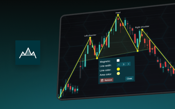
The Head and Shoulders Pattern in Technical Analysis
The Head and Shoulders Pattern in Technical Analysis The Head and Shoulders Pattern in Technical Analysis The Head and Shoulders pattern is one of the most recognized and widely used chart patterns in technical analysis. It is considered a reliable reversal pattern...
Best Telerik Charts Alternative in 2026: GPU Performance for WPF, WinForms, and Web
Telerik from Progress is a comprehensive UI component suite covering WPF, WinForms, ASP.NET, Blazor, and JavaScript. The charting components: RadChartView for WPF and WinForms, and Kendo UI Charts for web and Blazor, arrive bundled with the suite purchase. For teams...
Streaming Data Visualization with WebSockets (2026): The Complete Tutorial
Every WebSocket tutorial on the internet shows the same thing: a server sends a random number every second, a chart updates. It works. The demo looks great. Then you deploy to production, your IoT sensors push 800 updates per second across twelve channels, and the...


If you have any questions, feel free to contact us!
©LightningChart Ltd 2026. All rights reserved.