


LightningChart JSEasily create an electron JS DataGrid heatmap monitoring app
TutorialLearn how to upgrade your LightningChart JS applications with the unique Heatmap feature of the DataGrid component.
Written by a human | Updated on April 10th, 2025
JavaScript Monitoring DataGrid Heatmap
In our previous articles, we worked on TypeScript projects and as we know, we need a web browser to visualize all those projects. In other cases, you may need to create a standalone application (an application that runs locally on a computer).
“For example, in medical services, it’s not safe to use web applications due to the risk of network problems. So, a local application might be a more stable option.” Now we will do an exercise that could be very helpful for web developers. In this project, we will use web tools like HTML, CSS, jQuery, and TypeScript with the support of Node JS and Electron JS.
We will create a DataGrid heatmap application which can be particularly useful for visualizing large amounts of data, as they can quickly reveal patterns that might be difficult to see in traditional tabular or chart-based formats.
To create the DataGrid Heatmap application, we will use Electron JS which helps us to compile and execute our web application as a desktop application. So, if you prefer to work with web technologies, this could be a great option to create a desktop application with all the visual benefits that CSS and HTML could give us.
“Facebook Messenger, Twitch, and Microsoft Teams are some popular examples of Electron projects.” Visit the Electron JS site for more information
Project Overview
A DataGrid heatmap monitoring charting application is a software tool that allows users to visualize, track, and analyze data in a grid format using color-coded heatmaps. Data are frequently shown as tables in this sort of application, with each row denoting an object or entity and each column denoting one of the item’s attributes or metrics.
The heatmap attribute can be seen with the metrics visualized using a color gradient, where higher values are represented by darker colors and lower values by lighter colors. Heatmaps help users quickly identify trends and patterns in their data by highlighting areas of high and low values in the grid.
Note: the DataGrid component is an additional component for LightningChart JS. To use DataGrid, you require a license. For more information, visit the LightningChart JS pricing.
 Download the project to follow the tutorial
Local Setup
1. Download the initial DataGrid Heatmap template that will help us get started with this example.
2. After downloading the template, you’ll see a file tree like this:
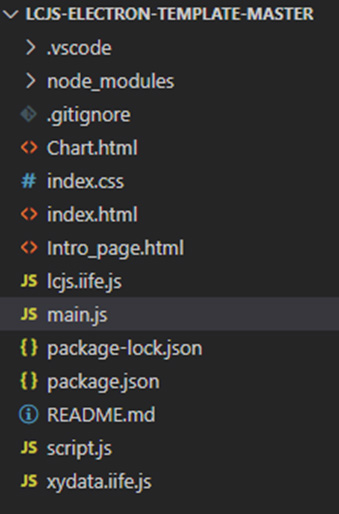
As you can see, we have CSS and HTML files. Also, we have two IIFE.js files that contain functions provided by LightningChart that will help us to create our DataGrid Heatmap.
3. Open a new terminal and run the npm install command:
As usual in a NodeJS project, you need to run the npm install command.
4. Install Electron JS
Use the following command to install Electron JS. For more information, visit the official Electron JS website.
$ npm i -D electron@latestHTML Files
In our index.html we will have a simple HTML template. In this file, the content will be displayed.
1. Importing CSS style sheet.
<head>
    <meta charset="utf-8">
    <title>Electron JS Template</title>
    <link rel="stylesheet" href="index.css">
</head>
2. Body
When the HTML files are loaded, automatically the intro() function will be executed. The intro function will display “welcome” content for our project. Also, we have a navigation bar with two buttons. One button will return to the intro content and the other will execute and display our DataGrid Heatmap chart.
<body onload="intro()">
    <nav id='menu'>
        <ul>
          <li><a>LightningChart</a></li>
          <li><a onclick="intro()">Intro</a></li>
          <li><a onclick="Chart()">Chart</a></li>
        </ul>
    </nav>

    <div class="header">
    <h2>LC JS ElectronJS Template</h2>
    </div>
    <div class="section" id="target"></div>
    <div class="descs" id="desc"></div>
</body>
We will see two divs… “section” div will contain our chart… and “descs” div will show a description.
3. Chart.html / intro.html
These are the simplest HTML files with text and HTML tags. These files will contain a description of our modules displayed.
main.js
In this file, we will make use of Electron JS and it will work as a controller for our chart function.
1. Import app and BrowserWindow modules from Electron.
- BrowserWindow: This will help us to modify the aspect and behavior of the windows in the application. See more in the BrowserWindow documentation.
- app: Contains events that will help to control the application (open, close, sessions, etc.). See more in the app documentation.
const { app, BrowserWindow } = require("electron");
const path = require("path");

function createWindow() {
  const win = new BrowserWindow({
    width: 1000,
    height: 1000,
    webPreferences: {
      preload: path.join(__dirname, "script.js"),
    },
  });

  win.loadFile("index.html");
}
2. [Create window]
From the code above, createWindow creates a constant named “win”, this will be the main windows that will be initialized at the beginning. We can also assign the width/height properties. Inside the [webPreferences], we assign the “script.js” file to be preloaded before the rest of the files. This script will always have access to node APIs. Finally, the function “loadFile” will use our index.html as the initial view.
3. Function Chart
Now we must create the function that will communicate the HTML index view with our chart js. [Chart]: is the function specified in the “onclick” event of the button located in the nav bar. [Chart] will call the function [Chart], located in the “script” file. This file is in charge to construct our chart.
function Chart() {
  Chart();
}
script.js
Here we have the JS code that will modify the content of our Electron app window.
1. [intro]
This function will load the intro HTML template inside the “target” div, located in the index.html file.
function intro() {
  document.getElementById("desc").innerHTML = "";
  document.getElementById("target").style.cssText = "";
  document.getElementById("target").innerHTML =
    '<object  style = "width:100%" data="Intro_page.html" ></object>';
}
2. Building the chart
const {
  AxisScrollStrategies,
  AxisTickStrategies,
  emptyLine,
  synchronizeAxisIntervals,
  lightningChart,
  LegendBoxBuilders,
  UIElementBuilders,
  UIOrigins,
  Themes,
} = lcjs

const { createProgressiveTraceGenerator } = xydata

  document.getElementById("desc").innerHTML = "";
  document.getElementById("target").innerHTML = "";
  document.getElementById("target").style.cssText = "height: 600px;";
3. DataGrid
Data Grid requires a license to make it work. Once you have a license, you will have to specify this in a LightningChart instance:
const lc = lightningChart({
    license: `0000-XXXXXXXXXXXXXXXXXXXXXXXXXXX-XXXXXXXXXXXXXXXXXXXXXXXXX-XXXXXXXXXXXXXXXXXXXXXXXX`
  })
4. Creating the dashboard
const dashboard = lc
  .Dashboard({
    container: "target",
      theme: Themes.turquoiseHexagon,
      numberOfColumns: 1,
      numberOfRows: 2,
  })
  .setRowHeight(0, 1)
  .setRowHeight(1, 0.4)
The dashboard will be the container of the charts objects created inside this Dashboard.
- Theme: Look and Feel for the dashboard. The UI properties will be applied to all the dashboard charts objects. See more information on the Themes documentation.
- numberOfRows: The dashboard can be divided into grids. Each grid can contain a chart. If we assign 1 row, this means that the dashboard will not have a horizontal division, but if we assign more than one column, the dashboard will be divided vertically.
5. Configuring the chart and DataGrid Heatmap
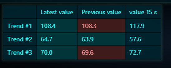
const chartXY = dashboard.createChartXY({ columnIndex: 0, rowIndex: 0 }).setTitle('Real-Time Chart + DataGrid')

const dataGrid = dashboard
  .createDataGrid({ columnIndex: 0, rowIndex: 1 })
  .setTitle('')
  .setColumnContent(0, ['', ...exampleTrends.map((trend) => trend.name)])
  .setRowContent(0, ['', 'Latest value', 'Previous value', 'value 15 s'])
To create an XY chart in our dashboard, we need to use the “createChartXY” function. The location is specified by the column and row indexes. To create a DataGrid heatmap in our dashboard, we can use a similar process but using the “createDataGrid” function.
6. XY Series
const seriesXYList = exampleTrends.map((trend) =>
  chartXY
      .addLineSeries({ dataPattern: { pattern: 'ProgressiveX' } })
      .setDataCleaning({ minDataPointCount: 1 })
      .setName(trend.name),
)
A series will be created for each value in the array trend parameter. Those values will be generated later.
- addLineSeries: Method for adding a new LineSeries to the chart. This series type visualizes a list of Points (pair of X and Y coordinates), with a continuous stroke. LineSeries is optimized for massive amounts of data. Read more in the addLineSeries documentation.
- setDataCleaning: Disable automatic data cleaning. Read more in the setDataCleaning documentation.
7. Configuring the X-axis
const axisX = chartXY
  .getDefaultAxisX()
  .setScrollStrategy(AxisScrollStrategies.progressive)
  .setInterval({ start: -60 * 1000, end: 0, stopAxisAfter: false })
  .setTickStrategy(AxisTickStrategies.Time)

const axisXTop = chartXY
  .addAxisX({ opposite: true })
  .setTickStrategy(AxisTickStrategies.Empty)
  .setStrokeStyle(emptyLine)
  .setMouseInteractions(false)
synchronizeAxisIntervals(axisX, axisXTop)

const indicator15s = axisXTop.addCustomTick(UIElementBuilders.AxisTickMajor).setTextFormatter((_) => '-15 s')
We can have access to the axes in a chart by using the “getDefaultAxis” function. The “axisX” object will help us to synchronize the intervals with the “axisXtop”.
The “indicator15s” object, will be the values shown in the column “values 15s” of the data grid.
- setScrollStrategy: Specify ScrollStrategy of the Axis. This decides where the Axis scrolls based on the current view and series boundaries. Read more in the setScrollStrategy documentation.
- setInterval: Set axis interval. Read more in the setInterval documentation.
- setTickStrategy: The TickStrategy defines the positioning and formatting logic of Axis ticks as well as the style of created ticks. Read more in the setTickStrategy documentation.
- SynchronizeAxisIntervals: Convenience functions for synchronizing the intervals of n amount of ´Axis´. Read more in the synchronizeAxisIntervals documentation.
8. Creating the legend box
const legend = chartXY
  .addLegendBox(LegendBoxBuilders.HorizontalLegendBox, { x: chartXY.getDefaultAxisX(), y: chartXY.getDefaultAxisY() })
  .add(chartXY)

const positionLegend = () => {
  legend.setOrigin(UIOrigins.CenterBottom).setPosition({
      x: (chartXY.getDefaultAxisX().getInterval().start + chartXY.getDefaultAxisX().getInterval().end) / 2,
      y: chartXY.getDefaultAxisY().getInterval().start,
  })
}

chartXY.forEachAxis((axis) => axis.onIntervalChange(positionLegend))
The legend box will help us to hide and show a specific line series, also, it works as an indicator to locate the line series.
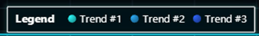
To create and assign a legend box to a chart, we need to use the function “addLegendBox” and the “add” function to specify what chart we want to assign to the legend box. Read more in the addLegendBox documentation. We can select between horizontal and vertical legend boxes by using the LegendBoxBuilders.HorizontalLegendBox / VerticalLegendBox. Read more in the LegendBoxBuilders documentation.
The position in the axes can be specified by sending the X and Y axes objects. The “setOrigin” function sets the position origin of this UIElement and affects how the “position” of UIElement is interpreted. Read more in the setOrigin documentation.
9. Creating the data
Promise.all(
  new Array(exampleTrendsCount).fill(0).map((_) =>
      createProgressiveTraceGenerator()
          .setNumberOfPoints(exampleDataCount)
          .generate()
          .toPromise()
          .then((data) => data.map((xy) => 100 + xy.y)),
  ),
).then((exampleData) => {
  const trendsHistory = exampleTrends.map(() => ({
      previous: 0,
      previous15s: 0,
  }))
  const tStart = Date.now()
To create and refresh the values in our data grid, we can use the createProgressiveTraceGenerator method (included in the XYdata library). Read more about this on the createProgressiveTraceGenerator documentation.
The generator creates random data with a progressive X-axis and a random Y-axis. A progressive trace data generator generates data points that have a progressive Xaxis. The data are always derived from the previous point. The trace generator will be used by the number of trends (exampleTrendsCount).
NPM Start
The explanation and project are ready. The last step is to run our DataGrid Heatmap project and as in the other articles, we just need to run the command “npm start” in our terminal. The difference between a normal TypeScript project and an Electron project is that Node JS will compile our code and publish it on a local server.
To access that local server, we will have to use a web browser. For Electron JS, a windows application will open and we will see our content like a normal PC application.
As we can see, all HTML and CSS properties were applied with no problems. With electron JS we can approach all the benefits that modern websites give us and create modern desktop applications.
Conclusion
In this second exercise, we reintroduced the new LightningChart JS DataGrid Heatmap functionality with a Chart of type XY. The DataGrid component was recently introduced in the LightningChart JS v.4.0. As seen, creating a dynamic data table was as simple as assigning the dataGrid object to our dashboard. The performance was not affected at any time and it worked without problems on Electron JS. This means that the data grids can be displayed in desktop-type applications.
Without a doubt, the DataGrid component is a great functionality for data analysis that works seamlessly with any other LightningChart JS component.

Omar Urbano
Software Engineer
Continue learning with LightningChart
Elliott Wave Theory in Trading
Financial markets often appear chaotic, but many traders believe that price movements follow recurring patterns driven by human psychology. One of the most influential approaches based on this idea is the Elliott Wave Theory. Developed nearly a century ago, it remains one of the most widely studied methods of technical analysis.
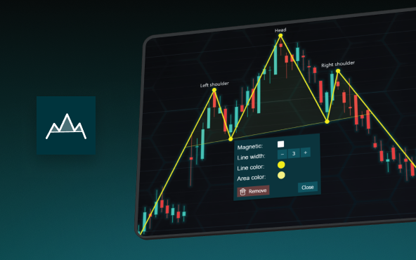
The Head and Shoulders Pattern in Technical Analysis
The Head and Shoulders Pattern in Technical Analysis The Head and Shoulders Pattern in Technical Analysis The Head and Shoulders pattern is one of the most recognized and widely used chart patterns in technical analysis. It is considered a reliable reversal pattern...
Best Telerik Charts Alternative in 2026: GPU Performance for WPF, WinForms, and Web
Telerik from Progress is a comprehensive UI component suite covering WPF, WinForms, ASP.NET, Blazor, and JavaScript. The charting components: RadChartView for WPF and WinForms, and Kendo UI Charts for web and Blazor, arrive bundled with the suite purchase. For teams...


If you have any questions, feel free to contact us!
©LightningChart Ltd 2026. All rights reserved.