






LightningChart Python 1.2 is out now!
Introducing new product features and reworked user interactions.
Product features
This update brings a range of enhancements focused on user experience, visual polish, and performance. Highlights include reworked user interactions, improved visual quality with rounded corners and refined cursor styles, better axis tick layouts, and enhanced text contrast.
We’ve also introduced a new real-time scrolling axis mode, HTML text rendering, and smarter theme scaling. Heatmap and surface series have been improved, alongside general performance and quality-of-life upgrades.
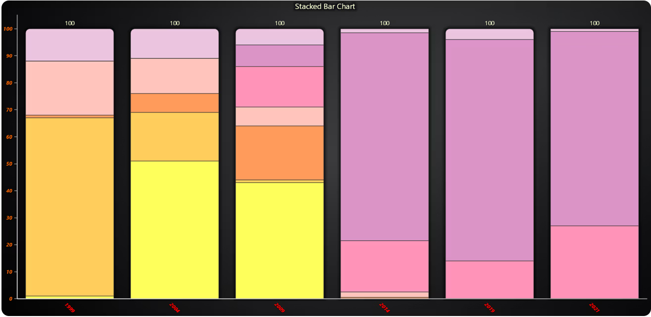
Bar Chart Axis Configuration
We have enhanced the configuration options for tick labels on both the value axis and the category axis in bar charts.
Parallel Coordinate Chart dashboard and solid Coloring
The Parallel Coordinate chart can now be added to dashboards. We have also added a new method to set a solid color fill for all the series.
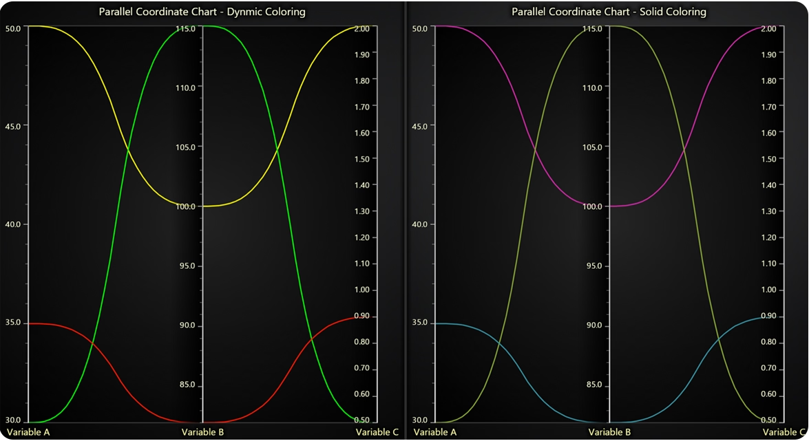
# Dynamic Coloring
chart1.set_lut(
    axis_key='Variable B',
    interpolate=True,
    steps=[
        {'value': 80, 'color': ('red')},  # Red
        {'value': 100, 'color': ('yellow')},  # Yellow
        {'value': 112, 'color': (0, 255, 0)},  # Green
    ],
)

# Solid Coloring
series1.set_color("#d228a7")
series2.set_color("#87a535")
series3.set_color("#3693a3")
Funnel & Pyramid Charts label positioning
Added a new LabelsInside parameter to Pyramid and Funnel charts, allowing labels to be positioned inside the chart segments.

Other changes
- Zoom Band Chart Axis Interaction Control
Introduced theset_stop_axis_on_interactionmethod for Zoom Band Charts (ZBC). This allows developers to specify whether interacting with the ZBC should stop updates to connected axes, enabling more precise control over chart synchronization behavior.
- Axis Scroll Strategy and Margin Configuration
Theset_scroll_strategymethod now supports both progressive (default) and regressive scrolling behaviors by setting its value toFalse. Additionally, the newset_scroll_marginsmethod allows precise control over the automatic spacing between axis edges and series, improving layout flexibility and visual balance.
- Simplified Color Assignment
Colors can now be specified more easily using standard CSS color names, RGB tuples, or hex strings directly, without requiring the use oflc.Color(). This streamlines styling and improves developer productivity when customizing chart visuals.
- Unified Mouse Interaction Configuration
Several legacy mouse interaction methods have been removed. Developers should now use the newset_user_interactionsmethod to configure, tweak, or override the default set of built-in user interactions. This method provides a centralized way to manage interactions, many of which are optional or mutually exclusive, offering greater flexibility and control over user experience.
- HTML Text Rendering Option for Charts
A newhtml_text_renderingparameter is now available when creating charts. This allows developers to choose between WebGL-based and HTML-based text rendering, offering greater flexibility in balancing performance and text clarity depending on the rendering context.
- Theme Scaling for Chart Elements
A newtheme_scaleparameter is now available during chart creation. This feature allows automatic scaling of font sizes, tick lengths, element paddings, and other visual components to ensure consistent and visually balanced chart layouts across different display contexts.
LightningChart Python
Ready to start with LightningChart Python data visualization library? Select from Data Scientist or Software Developer licenses, and get started developing Python projects at the best performance.
See more news
LightningChart .NET v.12.6.1
LightningChart .NET v.12.6.1 is out now!Features of LightningChart® .NET version 12.6.1In this release we added new features, made several improvements and fixed dozens of errors. We upgraded target framework (from .NET 8.0 to 10.0), added Universal-Data-Parser...
Trend Lines in Trading
Trend lines are among the simplest yet most powerful tools in technical analysis. They help traders visualize market direction, identify potential support and resistance levels, and make more informed trading decisions. Despite their simplicity, trend lines remain a...
Announcement: Baumer as LightningChart customer
Enabling High-Performance Visualization of Industrial Sensor Data with LightningChartDiscover how Baumer uses LightningChart to configure and visualize data from a wide variety of industrial sensors and create responsive, data-rich visualization...
Best Python Charting Library in 2026
Python's charting ecosystem is large, overlapping, and regularly misunderstood. Most comparison guides stop at Matplotlib, Plotly, and Seaborn. This one goes further: it covers what happens when your datasets grow large, your update rates increase, or your chart types...



If you have any questions, feel free to contact us!


©LightningChart Ltd 2026. All rights reserved.