







LightningChart JS v.7.0 has been released!
The v.7.0 release includes new product features, visual quality, new chart examples, and more.
New Product Features
LightningChart JS v.7.0 introduces new product features. Here’s an overview:
Changes to built-in interactions:
We’re excited to introduce the latest version of LightningChart JS with new intuitive interactions for a seamless development experience:
- A double-click zoom-to-fit interaction
- Automatically built-in smart interaction schemes selected based on chart structure
- Better touchscreen interactions
- More convenient interactions on scrolling axis applications
Introducing the setUserInteractions
We are introducing a new API allowing a more detailed interaction behavior configuration
- Choose which axes are affected by interactions (X, Y, or both)
- Enable interactions based on Ctrl, Shift, or Alt key combinations
- Adjust pan & zoom sensitivity based on your application requirements
- Explore new interactions like Pagination, Zoom Restore, Keyboard controls, and 3D axis modifications
// Right mouse click on Y axis title
chart.axisY.title.addEventListener('contextmenu', (event) => {}) // Drag & drop something over chart series area chart.seriesBackground.addEventListener('drop', (event) => {})
// Hover pointer over a data point
pointSeries.addEventListener('pointermove', (event, dataPoint) => {
})
// dataPoint.x, dataPoint.y, dataPoint.id
Changes to custom interactions
- Simplified API – Now follows the familiar
addEventListener/removeEventListenersyntax for easier implementation. - Consistent cross-device interactions – Previous mouse, touch, and drag interactions are now consistent across all devices.
- Right-click support – Added
contextmenuevent handling for improved interaction options. - Expanded interaction tracking – Now includes chart titles, axis titles, map regions, and more.
- Drag & drop support – Enables moving elements within the chart or integrating external HTML elements, such as swapping axes or adding data sources.
For more information, check the API documentation.
// Right mouse click on Y axis title
chart.axisY.title.addEventListener('contextmenu', (event) => {}) // Drag & drop something over chart series area chart.seriesBackground.addEventListener('drop', (event) => {})
// Hover pointer over a data point
pointSeries.addEventListener('pointermove', (event, dataPoint) => {
})
// dataPoint.x, dataPoint.y, dataPoint.id
Text Series
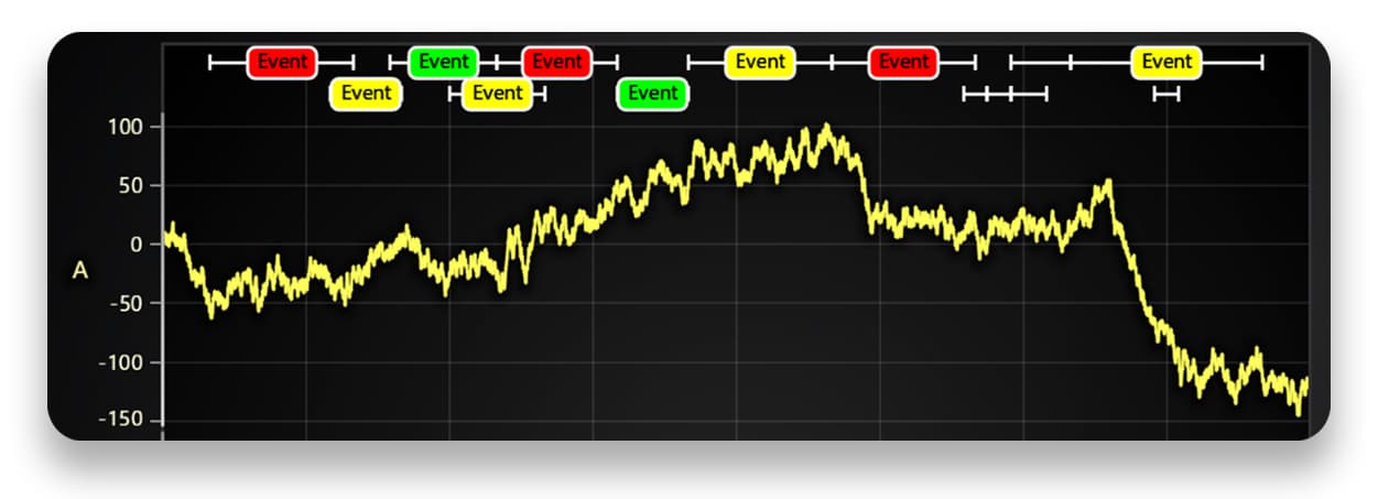
A new, more efficient API for displaying text inside ChartXY improves performance and usability. It supports viewport clipping and offers convenient methods for adjusting text sizes and boundaries, making it a suitable replacement for chart.addUIElement() in many cases.
ChartXY layout change event
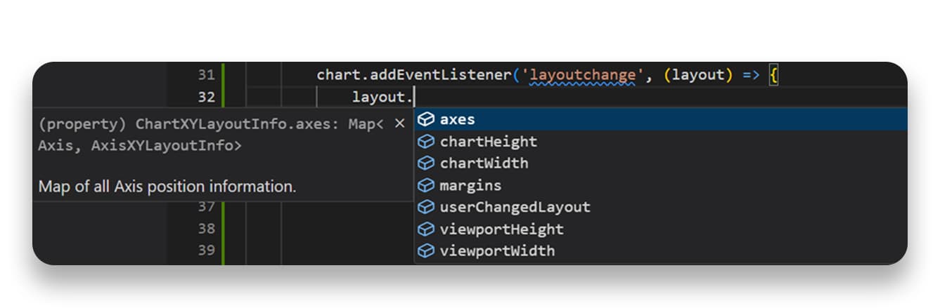
A new convenience API offers detailed insights into the structure, layout, and positions of ChartXY elements. It is particularly useful for static aspect ratio applications or aligning UI elements with chart components like axes.
Other Product Features
- A built-in .OBJ 3D model parser is now included, ensuring better compatibility where open-source tools fall short. This update also introduces material support for per-part coloring and shading, enhancing visual accuracy and customization.
-
Stacked Bar Charts now support sum label functionality, allowing users to choose which labels to display—individual subcategory values, the total sum of all subcategories, or both.
Visual Quality Improvements
Rounded corners in UI elements – Legends, cursors, rectangle series, bar charts, and treemap charts now feature rounded corners for a more modern and visually appealing design.
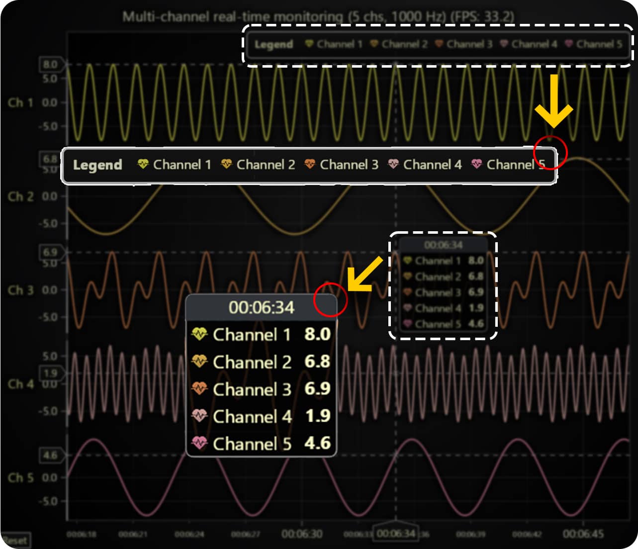
Other improvements include:
- Improved cursor readability – A separate header background has been added to cursors, making built-in cursor information clearer and easier to read.
- Cursor color adapts to data points – When using per-data-point colors, the cursor will now display the color of the specific data point it is hovering over, improving visual context.
Axis tick layout and display improvements
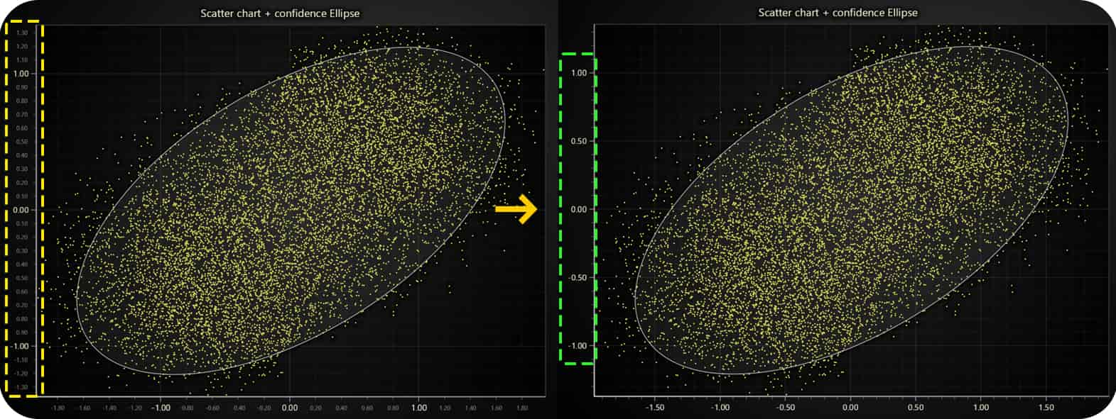
- Fewer displayed ticks for clarity – The number of ticks has been reduced to minimize visual clutter while maintaining readability.
- Improved small-axis tick display – Previously, very small axes sometimes showed only one unreadable tick; now, the system optimizes tick placement for better visibility.
- Tick labels stay within chart bounds – By default, tick labels are now constrained within the chart container to prevent them from being cut off in compact chart layouts.
- Simplified tick label colors – Built-in themes now use a single uniform color for tick labels instead of separate dimmer/brighter variations, creating a cleaner look.
Improved bar chart label fitting and added text shadows
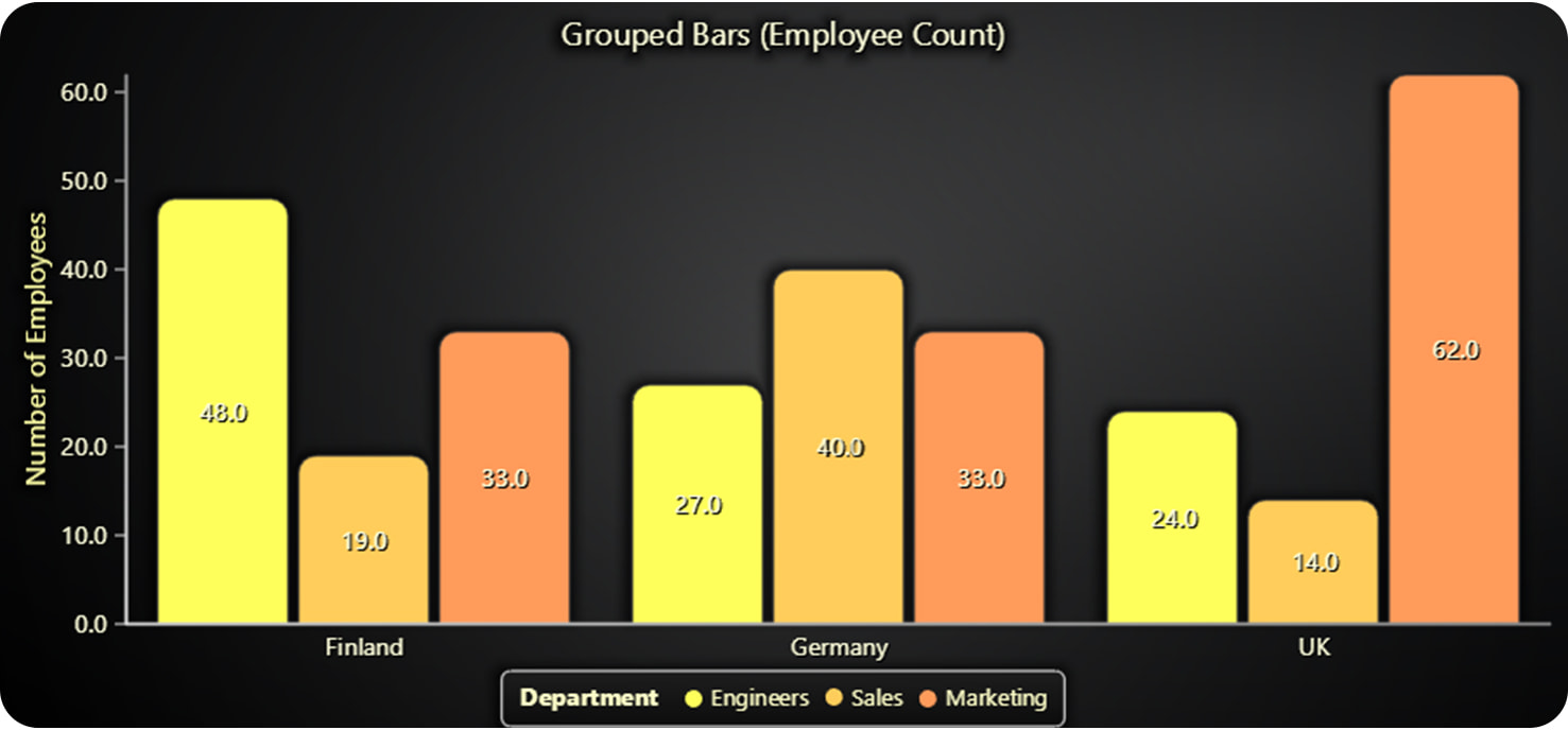
- Improved label fitting – The previous algorithm was overly conservative, limiting the number of displayed labels. Now, more labels can be shown without causing overlaps.
- Enhanced text readability – Subtle text shadows have been added to various chart types, making labels clearer and easier to read.
New Chart Examples
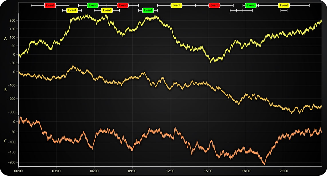
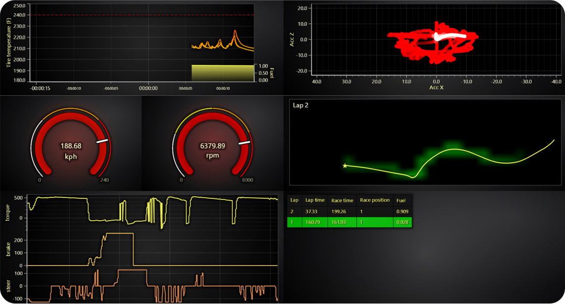
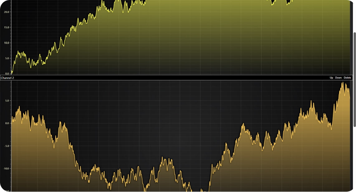
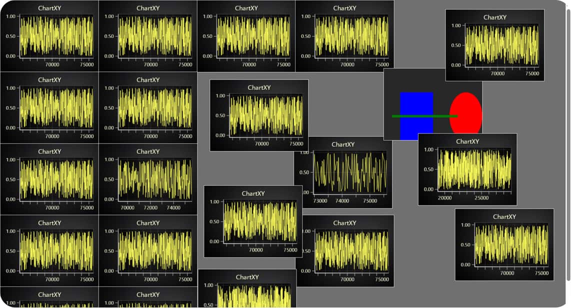
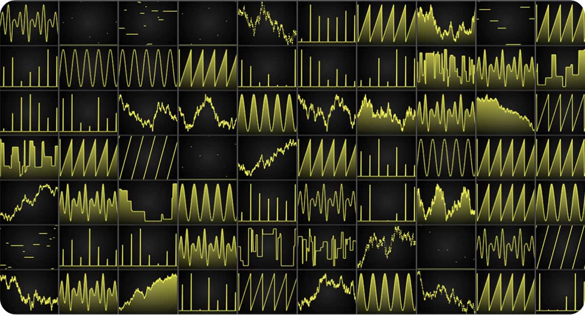
Other improvements
- Solve nearest from axis coordinate: A new signature for
PointLineAreaSeries.solveNearestnow allows finding the nearest data point based on an axis coordinate, whereas previously, it only supported solving from a client coordinate.
const nearestSample = series.solveNearest({ x: Date.now(), y: 0 });
console.log(nearestSample?.x, nearestSample?.y);- Heatmap and Surface series improvements: XY Heatmap series now support attachment to high-precision axes, making time-series heatmap use cases more convenient by allowing direct use of UTC timestamps as heatmap coordinates. Additionally, the
invalidateValuesandgetSampleCountmethods have been added to 3D scrolling surface series, aligning them with similar methods in 2D scrolling heatmap series. This makes switching between 2D and 3D visualizations seamless and significantly enhances the usability of 3D surface series in streaming applications.
Get started with LightningChart JS v.7.0
LightningChart JS 7.0 is a backward incompatible version release. This means some previous API syntaxes have changed and may require users to change their application code when upgrading. For more information, consult the migration guide.
See more news
LightningChart .NET v.12.6.1
LightningChart .NET v.12.6.1 is out now!Features of LightningChart® .NET version 12.6.1In this release we added new features, made several improvements and fixed dozens of errors. We upgraded target framework (from .NET 8.0 to 10.0), added Universal-Data-Parser...
Trend Lines in Trading
Trend lines are among the simplest yet most powerful tools in technical analysis. They help traders visualize market direction, identify potential support and resistance levels, and make more informed trading decisions. Despite their simplicity, trend lines remain a...
Announcement: Baumer as LightningChart customer
Enabling High-Performance Visualization of Industrial Sensor Data with LightningChartDiscover how Baumer uses LightningChart to configure and visualize data from a wide variety of industrial sensors and create responsive, data-rich visualization...
Best Python Charting Library in 2026
Python's charting ecosystem is large, overlapping, and regularly misunderstood. Most comparison guides stop at Matplotlib, Plotly, and Seaborn. This one goes further: it covers what happens when your datasets grow large, your update rates increase, or your chart types...



If you have any questions, feel free to contact us!


©LightningChart Ltd 2026. All rights reserved.