






LightningChart Python has been released!
A dedicated data visualization library for Python programming language.
Introducing LightningChart Python
We are excited to announce the release of a dedicated data visualization library for Python that will deliver the signature lightning-fast speed and responsiveness of LightningChart components.
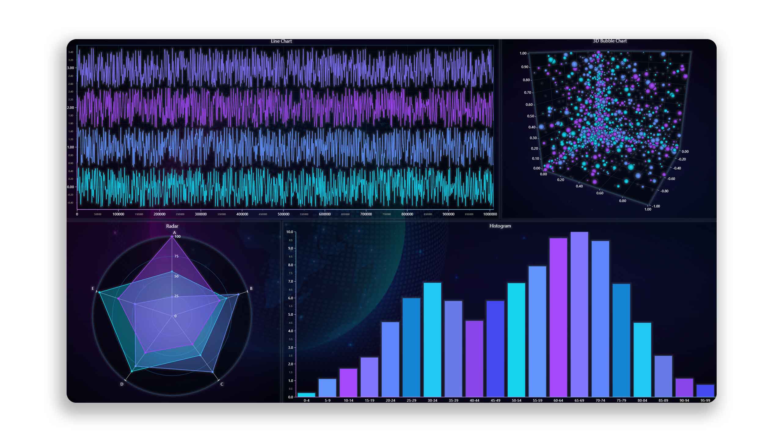
LightningChart Python delivers high-performance 2D and 3D charts for data analysis and software application development and can be used to enhance your Python projects to a new visual experience.
Features
LightningChart Python helps you add interactivity and responsiveness at the highest performance when dealing with massive static datasets and dynamic real-time streamed data. LightningChart Python is powered by WebGL-rendered graphics that help deliver the smoothest visualization experience of millions of data points.
Data scientists, researchers, and educators can now seamlessly integrate LC Python into their standalone scripts or notebook environments. LC Python can be used with data science modules like Numpy and Pandas. LC Python also allows the creation of dashboards featuring multiple chart types and provides extensive control for customization options.
Regarding application development, LC Python can be used within GUI frameworks such as PyQt and PySide for embedding interactive and dynamic charts into your Python software.
Get LightningChart Python
Feedback
We highly appreciate any feedback you provide us during the Beta stage. Please let us know your comments and requests to improve LC Python via email to [email protected]
See more news
LightningChart .NET v.12.6.1
LightningChart .NET v.12.6.1 is out now!Features of LightningChart® .NET version 12.6.1In this release we added new features, made several improvements and fixed dozens of errors. We upgraded target framework (from .NET 8.0 to 10.0), added Universal-Data-Parser...
Trend Lines in Trading
Trend lines are among the simplest yet most powerful tools in technical analysis. They help traders visualize market direction, identify potential support and resistance levels, and make more informed trading decisions. Despite their simplicity, trend lines remain a...
Announcement: Baumer as LightningChart customer
Enabling High-Performance Visualization of Industrial Sensor Data with LightningChartDiscover how Baumer uses LightningChart to configure and visualize data from a wide variety of industrial sensors and create responsive, data-rich visualization...
Best Python Charting Library in 2026
Python's charting ecosystem is large, overlapping, and regularly misunderstood. Most comparison guides stop at Matplotlib, Plotly, and Seaborn. This one goes further: it covers what happens when your datasets grow large, your update rates increase, or your chart types...



If you have any questions, feel free to contact us!


©LightningChart Ltd 2026. All rights reserved.