







LightningChart JS new release!
We have updated our product again with new features and some serious performance improvements to our already impressively powerful charting library!
Here is a summary of version 2.2.0 improvements and additions:
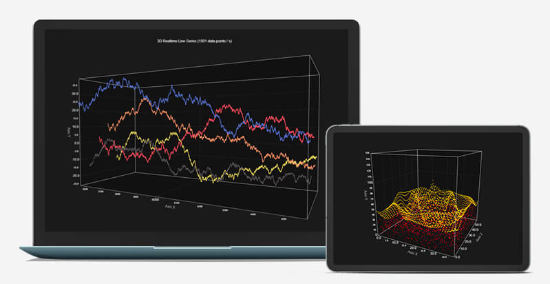
We have made a lot of changes for our 3D Charts!
These include major improvements for 3D Charts performance, including:
- Major improvements to 3D Point Series and Line Series performance, over 1000 x faster than previous version, with live data!
- 3D Box Series performance has been improved.
- 3D Axis Tick and Gridline performance improvements.
But it’s not just about the performance in 3D charts, we also enhanced other aspects:
- 3D Line Series visuals have been updated.
- 3D Charts now have their own background to help distinguish the Chart area from the background.
- 3D Charts Camera automatic fitting mode – This setting changes the camera distance to always fit the entire chart in the view.
- 3D Charts Bounding Box style can now be changed.
Other improvements to our charting library
In addition to the 3D Charts changes, the rest of our library has gotten some love as well:
- General performance improvements
- Improved IntensitySeries Zooming and Panning performance
- Themes changes:
- Added possibility to change the Result Table Formatter for IntensitySeries. This works in the same way as other series.
- Wireframes were added to heatmaps in version 2.1.0, but was omitted from the changelog there.
– New Color Palette generation for themes that were added in 2.1.0
– Axis Tick Gridline visibility has been tweaked, making the experience with new themes better
Refined Interactive examples
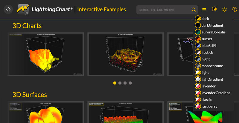
Interactive Examples for LightningChart JS has gotten some new changes also:
- Changed previous 3D Scatter Series and Line Series examples to better ones
- Added new real-time 3D examples for 3D Line Series and Point Series
- Changed previous IntensitySeries examples to use new version of xydata (version 1.4), making the example code clearer and easier to understand
- New examples added for XY Charts:
– Several Axes XY
– Mesh Circle
– Bar Chart Race
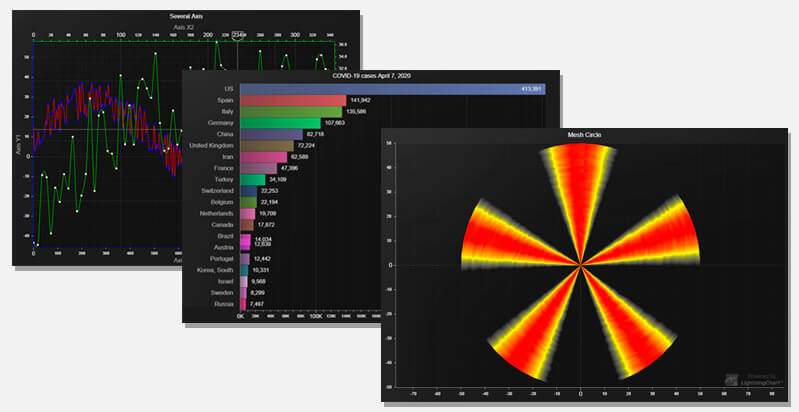
We have also some interesting performance news to share and info about changes made to our JS performance demo, more about that tomorrow so keep tuned in!
Happy Coding!
See more news
LightningChart .NET v.12.6.1
LightningChart .NET v.12.6.1 is out now!Features of LightningChart® .NET version 12.6.1In this release we added new features, made several improvements and fixed dozens of errors. We upgraded target framework (from .NET 8.0 to 10.0), added Universal-Data-Parser...
Trend Lines in Trading
Trend lines are among the simplest yet most powerful tools in technical analysis. They help traders visualize market direction, identify potential support and resistance levels, and make more informed trading decisions. Despite their simplicity, trend lines remain a...
Announcement: Baumer as LightningChart customer
Enabling High-Performance Visualization of Industrial Sensor Data with LightningChartDiscover how Baumer uses LightningChart to configure and visualize data from a wide variety of industrial sensors and create responsive, data-rich visualization...
Best Python Charting Library in 2026
Python's charting ecosystem is large, overlapping, and regularly misunderstood. Most comparison guides stop at Matplotlib, Plotly, and Seaborn. This one goes further: it covers what happens when your datasets grow large, your update rates increase, or your chart types...



If you have any questions, feel free to contact us!