WPF and .NET Line Charts Performance Comparison
LightningChart® 10.1.1 vs. SciChart v6.3.0.13629
September, 2021.
A pick from results

Foreword
There are only a few truly high-performance charting add-ons for .NET. Based on the manufacturers’ claims as well as performance results in official websites, LightningChart and Competitor are the top 2 charting libraries.
There is plenty of empty claims that dozens of charting packages are ‘high-performance’ but only real hardware accelerated charts (GPU-accelerated charts) can provide the best rendering performance. This test is purely using hardware accelerated charts.
In 2015, Competitor made a performance comparison against LightningChart, with false information, which LightningChart team fixed and rectified with fixed performance comparison: https://lightningchart.com/lightningchart-and-scichart-benchmark/
It was clear that LightningChart was faster. Today, Competitor is still claiming they have the “World’s fastest WPF charts”, which according to running the Competitor’s demos, and suspected and verified by the customers, doesn’t seem true at all. So, to clarify this confusion for the users and customers, we were practically forced to make a new comparison to show users a real proof of which chart is The Fastest In The World.
This test has been made as a stress test most demanding line charts applications, which are progressing real-time charts, such as medical ECG, EEG, ExG, telemetry, vibration monitoring and instrumentation applications.
LightningChart API is available for WPF, Windows Forms and UWP (Universal Windows Platform). Competitor API is only available for WPF. Therefore, this test is for WPF charts only, but LightningChart API performance in WinForms and UWP are nearly identical, if not even better.
LightningChart® SampleDataBlockSeries vs Competitor FastLineRenderableSeries
In LightningChart® .NET v.10.1.1 a new, super-fast, line series was introduced, called SampleDataBlockSeries. The data is stored as memory blocks, which disposes old data and appends new data, easier on memory and CPU.
SampleDataBlockSeries rendering scientific data visualization algorithms were designed to take better benefit from GPU computation power, freeing up more CPU resources for other processes and tasks.
According to the Competitor’s documentation and examples, the FastLineRenderableSeries, with Visual Xccelerator engine with Impossible mode enabled is the most performant way to render progressing line charts with the resampling mode enabled.
Therefore, Visual Xccelerator rendering engine was enabled (which should use DirectX) + Impossible Mode ON, and all tips (for optimizing application) from Competitor’s developers have been followed. However, we did one exception regarding ResamplingMode.
We run all the set of tests with set to ResamplingMode ‘None’ or ‘Auto’. The rendering result (see chart image) of ResamplingMode.None should be comparable to LightningChart rendering (because LightningChart does not do any resampling or downsampling internally but has way more intelligent algorithms to correctly optimize the rendering).
Demanding Test Application
The following test compares these two high-performance line series in practical tests. This scientific data visualization test was performed with a standalone SampleDataBlockSeries demo application made by the LightningChart team. Copyright LightningChart Ltd, 2022, All rights reserved.
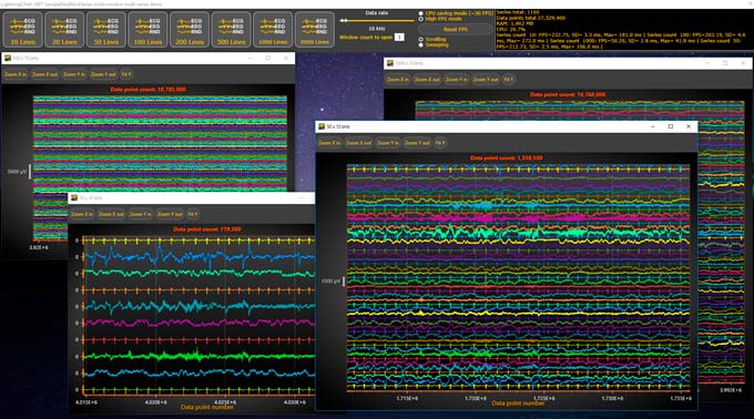
The application consists of a header bar and the test application allows opening dozens of chart windows at once. The data rate is adjustable, starting from 1000 Hz (1000 data points/sec) for each series. Each window can be opened with a preferred series count between 10 – 2000.
The data read from a .CSV file consisted of real ECG, EEG, and then random data every 3rd series.
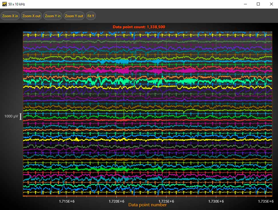
In the following image, the main focus is only based on the scrolling mode, as the Competitor does not have a Sweeping mode built-in feature (as LightningChart does).
The X-axis length was set to hold 10 seconds of data. The line width was set to 1.5 pixels.
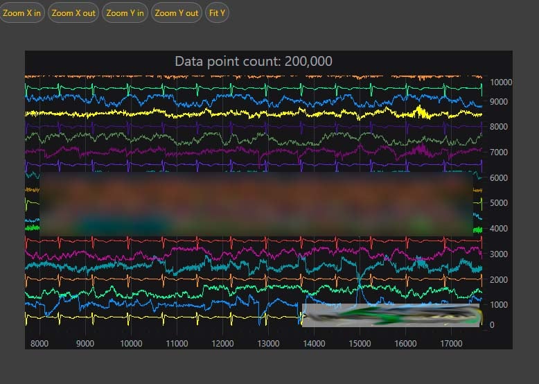
Competitor in Scrolling view.
Device Hardware & Operating System Specifications

AMD Ryzen 5 2600 Six-Core (12 logical CPUs), ~3.8GHz
Memory: 64 GB RAM
GPU: NVIDIA GeForce GTX 1070, 8 GB
Windows 10 64-bit OS

Intel(R) Core(TM) i5-1035G1 CPU @ 1.00GHz (logical 8 CPUs), ~1.2GHz
Memory: 20 GB RAM
GPU: NVIDIA GeForce MX110, 2 GB
Windows 10 64-bit OS
Performance Test Legend
The test was performed in two modes:
- CPU-saving mode
- High-FPS mode
Parameters measured or analyzed
FPS
refers to the chart refresh rate. A smooth scrolling requires stable 30 FPS or more, the higher value of frames/sec the better.
RAM Consumption
CPU Load
Measured in %. A lower value is better. Also observe the FPS rate produced with this CPU load. Discussed further in CPU load / refresh rate parameter.
Standard Deviation (SD)
Standard deviation of Refresh intervals measured in milliseconds. A lower value is better, and it indicates a smoother data-scrolling experience.
Relative standard deviation (RSD) / coefficient of variation (CV)
A standardized measure of dispersion. A lower value is better and indicates a smoother data-scrolling experience.
CPU load / refresh rate
Demonstrates the CPU load compared to the number of frames rendered. A lower value is better.
Maximum delay in Refreshes
The delay between refreshes was measured in milliseconds. A lower value is better.
Desktop with High FPS mode
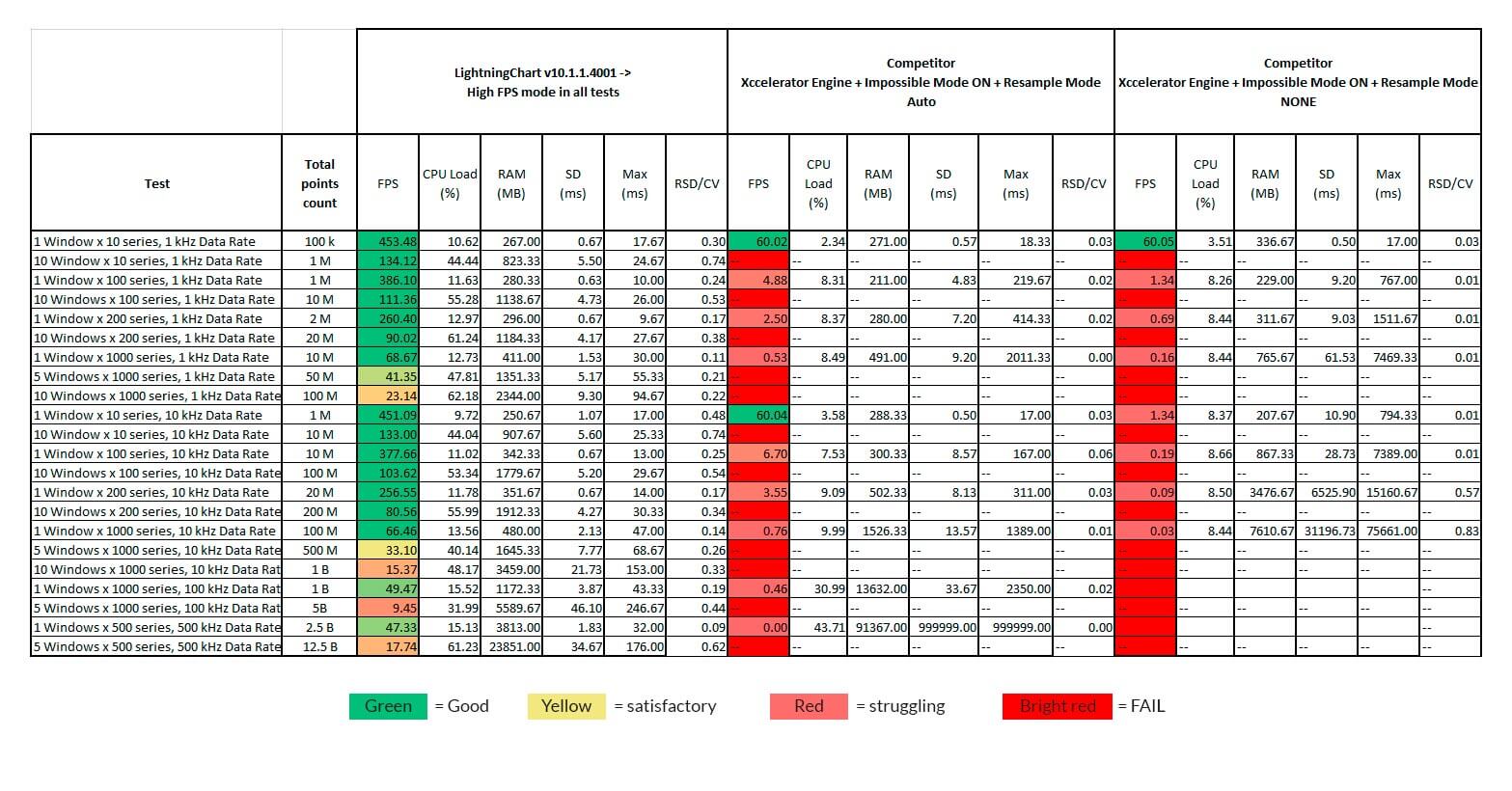
Results prove that:
- LightningChart can render billion data points on a mid-level desktop PC with at least 30 FPS, with 1000 series.
- LightningChart renders 1 million data points at extremely fast 450 FPS. SD and RSD remain low for an extremely smoother scrolling experience.
- LightningChart’s CPU/frame rate is the lowest in the test results.
- Competitor’s performance deteriorates fast if more than 1 M data points need to be rendered.
- Competitor does not tolerate more than 10 series counts and the performance declines quickly as the series count goes from 10 to 100.
- In this context, the competitor’s low RCD is meaningless as 0.1-5 FPS is not the high-performance expected by users.
- When downsampling is not used, the competitor struggles even more.
- LightningChart maintains a stable RAM usage through all the tests.
In this test, how many times faster LightningChart is?
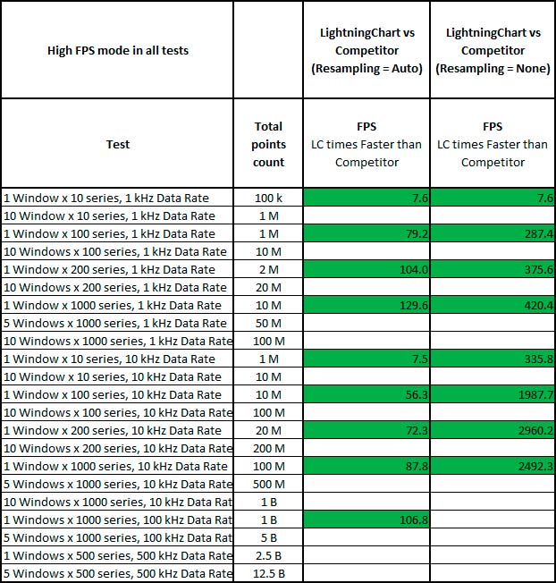
Green = LightningChart is faster Brown = no significant difference Red = Competitor is faster
(The empty rows are due to the Competitor’s failure to produce any measurable values.)
- When the Competitor’s resampling is disabled, LightningChart can render about 3000 times faster.
- When the Competitor’s resampling is enabled, LightningChart is 130 times faster in an application where data points amount to 100’s millions or several billions.
in a desktop CPU saving mode device and, in a laptop with high-FPS mode.
Downsampling and misleading performance claims
After verifying the Competitor’s “billion points” demo, we found out that it provides highly misleading information as is purely impossible to make it render with such claimed data rates and refresh rates presented in their video.
In the “billion points” demo, the Competitor is downsampling/resampling the prefilled dataset. The downsampling / resampling is being used also throughout the entire test. The random data generated, hides the issues produced by downsampling/resampling for users who do not pay attention to this.
Performance Tricks of the Competitor
Trick 1. Prebuffered data being resampled.
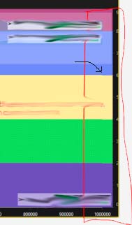
Competitor Resampling is Off. Still data shape switches after prebuffered region.
Trick 2. Downsampling/Resampling
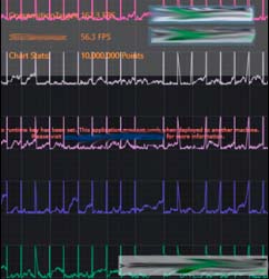
The used data contains peaks at regular intervals. Downsampling/Resampling is very coarse and it is missing peaks and producing diagonal line transitions.
Using downsampling/resampling is a trick to improve performance but it shouldn’t be used for any real application!
Trick 3. FPS Calculator Lags
The FPS calculator lags behind for some time so it gives a very high FPS but even the chart cannot clearly update with such claimed data rate. Even when pushing the data in a rate the chart cannot update at all, the FPS rate shows high.
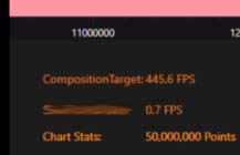
When downsampling/Resampling is disabled, the rendering goes unusable with 10 million data points and 50 million data points, 0.7 FPS is shown, and CompositionTarget shows 445.6 FPS. The chart actually cannot render even with 0.7 FPS, but 0.3 FPS or similar.
Trick 4. Faulty rendering algorithms
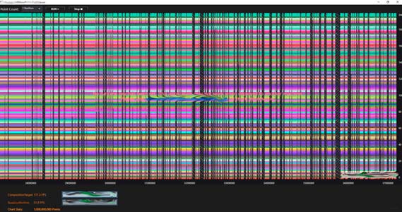
The rendering Competitor uses may save computer resources, but apparently line rendering is not working, and it is skipping data blocks. Resampling is enabled.
Conclusion of the Test
The Competitor is a fast hardware accelerated library but LightningChart being up to 3000 times faster, outperforms the Competitor in all tests. So, even when the Competitor resampling has been enabled, LightningChart still is 130 times faster.
LightningChart’s SampleDataBlockSeries is the optimal scientific data visualization series type to visualize scrolling/sweeping real-time data. Additionally, the SampleDataBlockSeries uses less RAM and CPU resources, provides a higher FPS rate, and a significantly better responsiveness to user interactions.
Unlike the Competitor, LightningChart’s performance is real, needing no gimmicks or tuning special flags to produce the correct rendering output. The Competitor suffers from an erroneous rendering algorithms and disadvantages produced by resampling. The Competitor doesn’t work in a multi-window solution using several dispatchers, so we couldn’t measure and compare performance in that scenario.
LightningChart® is an extreme and the World’s fastest charting library, providing simply unmatched performance for serious medical, telemetry, finance, science, and engineering apps. It includes built-in sweeping mode and works perfectly in multi-window and multi-dispatcher environments.
