


LightningChart JSCreating a React JS Gap Trading Chart for Stock Gap Analysis
TutorialStep-by-step tutorial how to create a trading data gap chart for gap analysis.
Written by a human | Updated on April 11th, 2025
React JS Gap Trading Chart
Hi again, this is Omar with another React JS article. This time we’ll execute an interesting React JS exercise using LightningChart JS and the Gap Trading Chart. A gap trading chart is widely used in stock trading for gap analysis. Let us get started by reviewing some concepts.
Gap trading refers to a type of trading strategy that benefits from price differences. These differences usually happen in financial markets, e.g., stock markets, FOREX, etc.
How to detect a gap in stock prices?
Simply put, the gap occurs when the price has a high difference between the closing and opening prices of an asset. The closing price refers to that of the previous day while the opening price considers the following day’s price. This “big” difference creates a “gap” in the asset price which is then reflected or plotted in the chart.
Why are data gaps in trading important?
Gap traders look for gaps in the price chart and aim to profit from them by buying or selling assets. As you can imagine, this technical analysis is a constant operation that processes live data in real-time charts. For measuring gaps accurately, charting applications must integrate only the best-performing components. To support a high-performance stock gap analysis, LightningChart JS features a dedicated Data Gaps Trading chart.
Project Overview
For this article, we’ll be using React JS which is widely known for being a framework created by Facebook. React JS has a great emphasis on implementing user interfaces. When focusing more on the UI, use React JS for the view layer, using the model-view-controller pattern. The article will begin with the initial setup of our React project. Then, we will do a brief implementation of LightningChart JS to show the use of libraries within this project.
 Download the project to follow the tutorial
Installing React JS
In order to install React JS using commands, you will need to have Node JS and the NPM command interface installed. In previous Node JS articles, we have explained how to install it. Additionally, you can visit the official NPM documentation page. Already having NPM installed, we can execute the React JS installation command. First, we need to open a command prompt as administrator and run the following command:
npm i -g create-react-appThe above command will download the complete react library. Once React is installed, we will see a list of React commands that serve as a confirmation of a successful installation.

Creating the React project
We are going to make a React application and we will initiate it by using the following command prompt:
npx create-react-app lc-react-appThe name of our project will be “lc-react-app” but you can change the name to your own liking.

Once the project has been established, the location where it has been saved will be visible. It is suggested to copy and paste the project to a place that is easy to get to.

Project Configuration
Before we begin, we’ll need to install the LightningChart JS library. Open your React project with visual studio code:

Your project should resemble the image provided. Now open a new terminal so you can install LightningChart JS.
npm i @arction/lcjsThe “npm i @arction/lcjs” command will install the LightningChart JS library into our project. By executing the command npm start, we can compile and view our page on a local server.
The “npm i @arction/lcjs” command will install the LightningChart JS library into our project.
By executing the command npm start, we can compile and view our page on a local server.

Trading Gap Chart
Before we start coding our React JS gap chart, we have to understand the files we will work on. Unlike Angular where our views and logic are grouped by component, React starts with a simpler structure.
Before we start coding our React JS gap chart, we have to understand the files we will work on.
Unlike Angular where our views and logic are grouped by component, React starts with a simpler structure.

The first thing we will see will be two JS files, index.js, and App.js. These files have a default naming but can be renamed according to your needs.
The index file will contain the code that allows us to render the view created by the App.js file. App.js contains our logic in charge of building the object to render. The CSS files will modify the style of the objects generated within their corresponding JS files.
When we create a React project, an App.test.js file is generated. This file corresponds to our App.js file and can be used to test our code using the “npm test” command. The basic idea is that there is a .test file for each generated JS file.
The first thing we will see will be two JS files, index.js, and App.js.
These files have a default naming but can be renamed according to your needs.
The index file will contain the code that allows us to render the view created by the App.js file.
App.js contains our logic in charge of building the object to render.
The CSS files will modify the style of the objects generated within their corresponding JS files.
When we create a React project, an App.test.js file is generated.
This file corresponds to our App.js file and can be used to test our code using the “npm test” command.
The basic idea is that there is a .test file for each generated JS file.
TradingChart.js
For this project, we will create a new file called TradingChart.js. This file will contain the code that will generate our trading gap chart. To keep our chart code organized, we do it separately instead of embedding everything within the App.js file.

Importing classes
We’ll start by importing the necessary LightningChart JS classes. The way to import components is the same as that used in Angular.
import { lightningChart, LegendBoxBuilders, Themes, AxisTickStrategies, emptyLine} from '@arction/lcjs'
import React, { useRef, useEffect } from 'react'
import data from './data.json'
The data.json is the file that contains all the data required to be displayed on this JavaScript gap chart.
Creating Chart object
Now we have to create an object that contains our chart and can be exported to other instances as well.
const Chart = (props) => {
    const { id } = props
    const chartRef = useRef(undefined)

    useEffect(() => {
Using the Effect Hook allows you to run side effects like fetching, direct DOM updating, and timers. Inside the “useEffect” function, we’ll encapsulate all of our trading chart logic.
Creating the Dashboard
Now, in order to create more than one chart within the same instance, you need to create a dashboard-type object. A dashboard can have multiple rows and columns, dividing it into grids that can contain a separate chart. In this case, we only need one column and two rows, which means it will be two horizontal charts.
Creating the Dashboard
Now, in order to create more than one chart within the same instance, you need to create a dashboard-type object.
A dashboard can have multiple rows and columns, dividing it into grids that can contain a separate chart.
In this case, we only need one column and two rows, which means it will be two horizontal charts.
const dashboard = lightningChart()
      .Dashboard({
        numberOfColumns: 1,
        numberOfRows: 2,
        theme: Themes.auroraBorealis,
        container: id
      })
      .setRowHeight(0, 1)
      .setRowHeight(1, 0.2);

    const chart = dashboard
      .createChartXY({ columnIndex: 0, rowIndex: 0 })
      .setTitle("AAPL historical stock price and volume December 2021");
If we assign the theme property to the dashboard, it will apply to all the charts in it.
Create the LineSeries
Now, we need to create a line series for the chart:
chart.getDefaultAxisY().setTitle("Stock price (€)");

    const seriesClose = chart
      .addLineSeries({
        dataPattern: {
          pattern: "ProgressiveX",
        },
      })
      .setName("Stock price (€)")
      .setCursorInterpolationEnabled(false)
      .setCursorResultTableFormatter((builder, series, x, y, dataPoint) =>
        builder
          .addRow(series.getName())
          .addRow(series.axisX.formatValue(dataPoint.x))
          .addRow(`${series.axisY.formatValue(dataPoint.y)} €`)
      );
addLineSeries: this is a method for adding a new LineSeries to the chart. This series type visualizes a list of Points (pair of X and Y coordinates), with a continuous stroke. LineSeries is optimized for massive amounts of data – here are some reference specs to give an idea:
- A static data set in the tens of millions range is rendered in a matter of seconds.
- With streaming data, even millions of data points can be streamed every second, while retaining an interactive document.
ProgessiveX: Each consecutive data point has increased X coordinate.
setCursorInterpolationEnabled: Set if cursor admits solved data points along series by default. Learn more about this property.
setCursorResultTableFormatter: Configure formatting of Cursor ResultTable when pointing at this series. Learn more about this property.
Creating the axis “volume” for the trading chart:
const axisVolume = chart
      .addAxisY({ opposite: true })
      .setTitle("Volume (€)")
      .setTickStrategy(AxisTickStrategies.Numeric, (ticks) =>
        ticks
          .setMajorTickStyle((major) => major.setGridStrokeStyle(emptyLine))
          .setMinorTickStyle((minor) => minor.setGridStrokeStyle(emptyLine))
);Opposite: Configure the Axis on the opposite side to the default configuration (right).
setTickStrategy: Set the TickStrategy of the Axis. The TickStrategy defines the positioning and formatting logic of Axis ticks as well as the style of created ticks.
Adding Area Series to the Y-axis:
const seriesVolume = chart
      .addAreaSeries({ yAxis: axisVolume })
      .setName("Volume (€)")
      .setCursorInterpolationEnabled(false)
      .setCursorResultTableFormatter((builder, series, position, high, low) =>
        builder
          .addRow(series.getName())
          .addRow(series.axisX.formatValue(position))
          .addRow(`${series.axisY.formatValue(high)} €`)
      );
This is a method for adding a new AreaSeries to the chart. This type of graph is used to show the area between a fixed starting point and a given line of data. AreaSeries is optimized for large amounts of data. Learn more about the AreaSeries property.
Adding a start date to the X-axis.
The results will be adjusted on this X-axis. The strategy for the axis tick will be of the “datetime” type, starting from the original date.
const dateOrigin = new Date("2021-01-01");
    const dateOriginTime = dateOrigin.getTime();

    const axisX = chart
      .getDefaultAxisX()
      .setTickStrategy(AxisTickStrategies.DateTime, (ticks) =>
        ticks.setDateOrigin(dateOrigin)
      )
      // Set preset X default view.
      .setInterval(
        new Date("2021-12-07 20:00:00").getTime() - dateOriginTime,
        new Date("2021-12-11 06:00:00").getTime() - dateOriginTime,
        false,
        true
      );

      chart
      .addLegendBox(LegendBoxBuilders.HorizontalLegendBox)
      .add(chart);

      dashboard
      .createZoomBandChart({ axis: axisX, columnIndex: 0, rowIndex: 1 })
      .setTitle("");
setInterval: Set the scale interval of the axis. The interval value will be the result of the origin date in milliseconds minus the December time in milliseconds.
CreateZoomBandChart
dashboard
      .createZoomBandChart({ axis: axisX, columnIndex: 0, rowIndex: 1 })
      .setTitle("");

        var mydata = data;
        const dataGapThresholdX = 1 * 60 * 60 * 1000; // 1 hour as milliseconds
        const closeDataXY = [];
        const volumeDataXY = [];
        let xPrev;
        for (let i = 0; i < mydata.length; i += 1) {
          const p = mydata[i];
          if (xPrev !== undefined) {
            const xGap = p.time - xPrev;
            if (xGap > dataGapThresholdX) {
              // There is a gap in the data set between data points [i - 1] and [i]
              // Disconnect the series at this point by adding an extra data point with NaN value between these two data points.
              closeDataXY.push({ x: p.time - dateOriginTime, y: Number.NaN });
              volumeDataXY.push({ x: p.time - dateOriginTime, y: Number.NaN });
              i += 1;
            }
          }
          closeDataXY.push({ x: p.time - dateOriginTime, y: p.close });
          volumeDataXY.push({ x: p.time - dateOriginTime, y: p.volume });
          xPrev = p.time;
        }
        seriesClose.add(closeDataXY);
        seriesVolume.add(volumeDataXY);
Creating values for data: A loop is created over the data stored in data.json. A variable xGap is created whose value is the value of the current time in milliseconds minus the previous time. This variable is validated. If it is greater than one hour, it signifies a gap in the data set.
The gap is located between data points [i – 1] and [i]. The series is disconnected at this point by adding an additional data point with NaN value between these two data points. The result will be stored in the array of closeDataXY and volumeDataXY. In turn, it will be assigned to the line and area series created before.
Return function
The Return() function will destroy the graphic when the component is unmounted. The chart will be stored within a container (id). The class name “chart” will be used to apply the CSS class located in the App.css file.
return () => {
        // Destroy chart.
        console.log('destroy chart')
        chartRef.current = undefined
        }
    }, [id])

    return <div id={id} className='chart'></div>
}

export default Chart
To render our chart object, we need to import it into our App.js file:
import React, { useEffect, useState } from 'react';
import './App.css'
import Chart from './TradingChart'

const App = (props) => {
  return <div className='fill'>
    <Chart id='chart'/>
  </div>
}

export default App
The App constant will return the Chart object. We can apply a CSS Class for the body too. The CSS class is located in the App.css file. The App constant will be exported to the index.js file.
Importing App.js
import React from 'react';
import ReactDOM from 'react-dom/client';
import './index.css';
import App from './App';
import reportWebVitals from './reportWebVitals';

const root = ReactDOM.createRoot(document.getElementById('root'));
root.render(
  <React.StrictMode>
    <App />
  </React.StrictMode>
);
The last step is to import our App.js into index.js. The way to import/export objects between JS files is similar in almost all cases. For Index files, we need to apply some react properties because here is where we will manipulate the DOM. About React Strict Mode: Strict mode checks are run in development mode only. They do not impact the production build.
Conclusion
We have now finished our React JS data gap trading chart. Although it was an extensive and detailed tutorial, we could understand the logic behind this type of trading chart application. This tutorial aims to help React developers easily create their own stock gap applications. By using this template, developers can reduce the production time when building similar applications.

Omar Urbano
Software Engineer
Continue learning with LightningChart
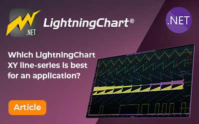
Choosing the right XY line series
LightningChart .NET features 10 different line series. Read more about their characteristics and functionalities and choose the best for your app.

JavaScript Refreshing Spectrum Chart
Written by a human | Updated on April 10th, 2025JavaScript Refreshing Spectrum Chart Hello again, this time I bring a quick but helpful tutorial on how to create a JavaScript refreshing spectrum chart. A spectrum chart is commonly used in reading and plotting...
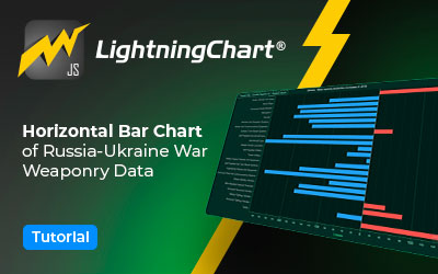
Horizontal Bar Chart of Russia-Ukraine War Weaponry Data
Written by a human | Updated on April 10th, 2025 JavaScript Horizontal Bar Chart In this article, we aim to respectfully create a JavaScript horizontal bar chart that simulates the weaponry usage on recent war conflicts. While the data have been taken from Kaggle and...


If you have any questions, feel free to contact us!
©LightningChart Ltd 2026. All rights reserved.