


LightningChart JSJavaScript Horizontal Bar Chart
TutorialUsing a JavaScript horizontal bar chart to simultaneously compare negative and positive values
Written by a human | Updated on April 10th, 2025
JavaScript Horizontal Bar Chart
In this article, we aim to respectfully create a JavaScript horizontal bar chart that simulates the weaponry usage on recent war conflicts. While the data have been taken from Kaggle and seem to be accurate, data have also been manipulated to sometimes show negative values. This was done in order to show both positive and negative values in the same chart, as you’ll see once the chart is done.
Project Overview
Today we will create a customized version of the Horizontal Bar Chart. I tried to add more features, like UI controls and description checkboxes with more details of the data. In this code, we will work with interfaces, arrays, JSON data, and more LightningCharts JS properties. As for the data, we will work with real data related to the military weaponry of Russia and Ukraine’s 2022 war. You can find the data on Kaggle. Let’s start!
 Download the project to follow the tutorial
Template Setup
- Please, download the template that is provided in this article.
- You will see a file tree like this one:

3, Please, open a new terminal.
4, As usual in a Node JS project, we will have to run our NPM Install command.
This would be everything for our initial setup. Let’s code.
CHART.ts
Inside this file, we will have all the logic needed to create our chart, configure animations, and format the data.
1. Import the JSON files:
import RussData from './Russia.json'
import UkraineData from './Ukraine.json'
2. Declare the constant lcjs that will refer to our @arction/lcjs library.
3. Extract required classes from lcjs.
const lcjs = require('@arction/lcjs')

// Extract required parts from LightningChartJS.
const {
    lightningChart,
    SolidFill,
    SolidLine,
    ColorRGBA,
    emptyLine,
    AxisTickStrategies,
    AutoCursorModes,
    UIOrigins,
    UIElementBuilders,
    Themes,
    UILayoutBuilders,
    UIBackgrounds
} = lcjs
4. We need to map the JSON data, for that we will need to use interfaces.
“The interface is a structure that defines the syntax of the classes to follow. Classes that derive from an interface must follow the structure provided by its interface.”
interface details {
    model: string,
    sub_model: string,
    manufacturer: string,
    losses: number
}

interface categories {
    category: string;
    value: number;
    details: details[];
}
Also, those interfaces will help us to store all data into arrays in an easier way. The arrays RussArr/UkraineArr will contain the mapped data for each country.
const RussArr: categories[] = [];
const UkraineArr: categories[] = [];
var AddRandomNegativeValues = 0;
var NegativeMultiplier = 300;
The [AddRandomNegativeValues] variable, will work as a flag to simulate negative bars. [NegativeMultiplier] will help to generate random negative numbers.
5. Now we’ll map the [RussData].
if you remember, the [RussData] contains the JSON object from the JSON file. The [cat] variable will contain the root name of each category inside the JSON object. The losses variable will sum up the losses of each member inside the array category. This variable will work as a total for the category.
RussData.forEach(function (value) {
    const arrDetails: details[] = [];
    var losses = 0;

    var cat =  Object.getOwnPropertyNames(value).toString();
    value[cat].forEach(function (value) {
        losses = losses + value["losses_total"];

        var sub_model = value["sub_model"] ;
        if(sub_model === '')
        {
            sub_model = 'No Specified';
        }
        const a2: details = {
            model: value["model"],
            sub_model: sub_model,
            manufacturer: value["manufacturer"],
            losses: value["losses_total"]
        }

        arrDetails.push(a2);
    });

    const a1: categories = {
        category: cat,
        value: losses,
        details: arrDetails
    };

    RussArr.push(a1);
});
Inside the [details] ([a2]), each member will be stored. Finally, we will generate a category assigning the [cat] value, the sum of all losses, and the [details] array. All this process will be executed for all array members in the JSON object. The same process works for Ukraine, the only difference is the source data and the object result.
6. We need to create the dashboard.
The dashboard will be the “main panel” where the charts will be displayed.
const dashboard = lc.Dashboard({
    numberOfColumns: 1,
    numberOfRows: 1
  })
7. Now we will start with the chart object.
The following description applies to both charts. The main difference is the name of the chart object.
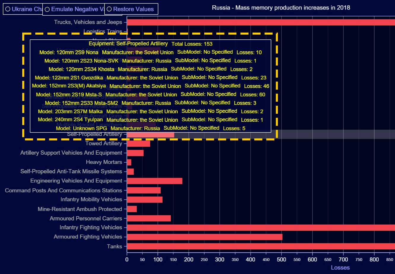
chart.setTitle('Russia - Mass memory production increases in 2018')
        .setAutoCursorMode(AutoCursorModes.onHover)
        .setMouseInteractions(true)

    const bars = []
First, we need to specify the name of the chart (Russia).
- With the [setAutoCursorMode] property, we will be able to attach UI properties to the chart when the cursor is ‘onHover’.
- [setMouseInteractions] === true, will enable all the mouse behaviors (zoom, drag, scroll).
- The [bars] array will contain all the bars generated by the code.
addChartUIOptions(chart,0,100).addOption( 'Ukraine Chart', () =>
    openChart(UkraineArr,chart,'UkraineChart')
    )

    addChartUIOptions(chart,7,100).addOption( 'Emulate Negative Values', () =>
        AddRandomNegativeValues = 1
    )

    addChartUIOptions(chart,18,100).addOption( 'Restore Values', () =>
        AddRandomNegativeValues = 0
    )
Using the [addOption] function located within [addChartUIOptions] function, we can add Check Boxes. Those boxes can be used to execute a specific function to modify the current UI.

For this project, I created three options:
- Chart Selector: Switch to the second chart.
- Emulate Negative Values: The source data does not contain negative values, but if you want to see the negative bars, you can enable this feature to generate random negative values.
- Restore Values: Restore the bars with the real source data.
- [ConfigureChartUI]: This function will construct all the UI properties for both charts. The chart parameter will contain the current chart object, and all the changes inside the function will be applied to this object.
- The bars array (Bars Metadata) will be used to create the graphic object in the chart.
var conf = configureChartUI(chart,bars);

    const addValues = (_entry) => {
        for (const val of _entry) {
            bars.push(conf.add(val))
        }
    }

    const addValue = (_entry) => {
        bars.push(conf.add(_entry))
    }

    return {
        addValue,
        addValues,
        chart
}- [addValues]: This method will send the array data to the [add] method (inside [configureChartUI]). The data of each array category will be added to a bar object. Finally, the chart object will return the entire constructed object.
8. UI functions.
- [addChartUIOptions]: This function will attach the UI checkboxes to the chart object. Also, we can add properties to the check box generator.
function addChartUIOptions(chart, XPos, YPos) {

    const group = chart.addUIElement(UILayoutBuilders.Column
        .setBackground(UIBackgrounds.Rectangle)
    )
    group
        .setPosition({
            x: XPos,
            y: YPos
        })
        .setOrigin(UIOrigins.LeftTop)
        .setMargin(10)
        .setPadding(4)
        .setAutoDispose({
            type: 'max-height',
            maxHeight: 0.30,
        })

    const btnOptions = []
    const addOption = (label, onEnabled, defaultSelection = false) => {
        const checkBox = group.addElement(UIElementBuilders.CheckBox)
            .setText(label)

        if (defaultSelection) {
            checkBox.setOn(true)
            onEnabled()
}- [openChart]:
function openChart(entry,chart,chartName){

    chart.dispose()

    let newEntry = JSON.parse(JSON.stringify(entry))

    if(AddRandomNegativeValues === 1)
    {
        newEntry.forEach(element => {
            element.value = element.value - Math.floor(Math.random() * NegativeMultiplier)
        });
    }
    if(chartName === 'RussiaChart')
    {
        RussiaChart(newEntry).addValues(newEntry)
    }
    if(chartName === 'UkraineChart')
    {
        UkraineChart(newEntry).addValues(newEntry)
    }
}
This function will be executed by the chart selection check box. If we click on the [Emulate Negative Values] check box, this will set the value of the [AddRandomNegativeValues] variable to one. That flag will start the modification of the array data, subtracting values with a randomly generated number. This function clones the array data (entry) because if we modify the current array object, the values will stay modified until the app is updated.
- [configureChartUI]: In this function, we will find all the chart construction properties. First, we can specify a color for negative and positive bars.
// flat red fill style for positive bars
    const flatRedStyle = new SolidFill().setColor(ColorRGBA(242, 67, 79))
    // flat blue fill style for negative bars
    const flatBlueStyle = new SolidFill().setColor(ColorRGBA(42, 171, 240))
    const rectangles = chart.addRectangleSeries()

    const band = chart.addRectangleSeries()
        .setMouseInteractions(false)
        .setCursorEnabled(false).add({
            x: 0,
            y: 0,
            width: 0,
            height: 0
        })
        .setFillStyle(new SolidFill().setColor(ColorRGBA(255, 255, 255, 50)))
        .setStrokeStyle(emptyLine)
.dispose()- [addRectangleSeries]: Method for adding a new RectangleSeries to the chart. This series type visualizes a collection of rectangles.
chart.setAutoCursor(cursor => cursor
        .setResultTableAutoTextStyle(false)
        .disposePointMarker()
        .disposeTickMarkerX()
        .disposeTickMarkerY()
        .setGridStrokeXStyle(emptyLine)
        .setGridStrokeYStyle(emptyLine)
        .setResultTable((table) => {
            table
                .setOrigin(UIOrigins.CenterBottom)
                .setTextFillStyle(new SolidFill({
                    color: ColorRGBA(255, 255, 0)
                }))
                .setPosition({
                    x: 90,
                    y: 90
                })
        })
    )
We can specify the behavior of the mouse when this is ‘onHover’ on the chart. Depending on the type of chart, the behaviors can change. In this case, I specified the color and position of the text box displayed by the mouse.
- [setCursorResultTableFormatter]: This function let us create a data table to be shown by the mouse. A data table will be created for each bar. I specified a format by concatenating values with strings:
rectangles.setCursorResultTableFormatter((builder, series, figure) => {
        // Find cached entry for the figure.
        const entry = bars.find((bar) => bar.rect == figure).entry
        builder.addRow('Equipment: ' + entry.category, 'Total Losses: ' + String(entry.value))
        entry.details.forEach(function(value) {
            builder.addRow('Model: ' + String(value.model), 'Manufacturer: ' + String(value.manufacturer), 'SubModel: ' + String(value.sub_model), 'Losses: ' + String(value.losses));
        })
        // Parse result table content from values of 'entry'.
        return builder;
    })
Here you can see how strings and values are concatenated. When hovering on individual bars, the tooltip is displayed.
- Axes properties: We can add UI properties to each axis. To get an axis object, we need to use the function [getDefaultAxis].
const axisX = chart.getDefaultAxisX()
        .setMouseInteractions(false)
        .setInterval(-100, 100)
        .setTitle('Losses')

    // Y-axis of the series
    const axisY = chart.getDefaultAxisY()
        .setMouseInteractions(false)
        .setScrollStrategy(undefined)
        // Disable default ticks.
        .setTickStrategy(AxisTickStrategies.Empty)

    //Add middle line
    const constantLine = axisX.addConstantLine()
    constantLine.setValue(0)
        .setMouseInteractions(false)
        .setStrokeStyle(new SolidLine({
            thickness: 2,
            fillStyle: new SolidFill({
                color: ColorRGBA(125, 125, 125)
            })
        }))
getDefaultAxis: Gets the Y axis.
- setScrollStrategy: Specify ScrollStrategy of the Axis. This decides where the Axis scrolls based on the current view and series boundaries.
- setTickStrategy: The TickStrategy defines the positioning and formatting logic of Axis ticks as well as the style of created ticks.
const add = (entry) => {
        // Create rect dimensions.
        const rectDimensions = {
            x: 0,
            y: y - figureThickness,
            width: entry.value,
            height: figureThickness
        }
        // Add rect to the series.
        const rect = rectangles.add(rectDimensions)
        // Set individual color for the bar.
        rect.setFillStyle(entry.value > 0 ? flatRedStyle : flatBlueStyle)

        // Set view manually.
        axisY.setInterval(
            -(figureThickness + figureGap),
            y + figureGap
        )

        // Add custom tick, more like categorical axis.
        axisY.addCustomTick(UIElementBuilders.AxisTick)
            .setValue(y - figureGap)
            .setGridStrokeLength(0)
            .setTextFormatter(_ => entry.category)
            .setMarker(marker => marker
                .setTextFillStyle(new SolidFill({
                    color: ColorRGBA(170, 170, 170)
                }))
            )
        y += figureThickness + figureGap
Finally, we have the last function. The [add] function will help us to construct each bar. We can attach figure properties, values from the array member, colors, etc. The width of the bar will be equal to the [value] node of the array member. If the value is less than zero, the fill color will be red.
NPM Start
Now, all you need to do to visualize the JavaScript horizontal bar chart is to open a new terminal and run the npm start command. You’ll get a URL path to http://localhost:8080/. Follow the path and visualize the project in your browser. Note: in case of getting an error when running the npm start command, try reinstalling an older version of NodeJS.
Final Application
As stated at the beginning of this JavaScript horizontal bar chart project, the chart visualizes data from two different variables (Russia and Ukraine weaponry data). However, regardless of the data, the chart aims to visualize variable x and the variable y’s positive and negative values, in the same chart as a method of comparison.
This can be done by selecting “emulate negative values” from the radial UI buttons. This JavaScript horizontal bar chart is a mere exercise but a strong visualization how to visualize positive and negative data simultenaously.

Omar Urbano
Software Engineer
Continue learning with LightningChart
Elliott Wave Theory in Trading
Financial markets often appear chaotic, but many traders believe that price movements follow recurring patterns driven by human psychology. One of the most influential approaches based on this idea is the Elliott Wave Theory. Developed nearly a century ago, it remains one of the most widely studied methods of technical analysis.

The Head and Shoulders Pattern in Technical Analysis
The Head and Shoulders Pattern in Technical Analysis The Head and Shoulders Pattern in Technical Analysis The Head and Shoulders pattern is one of the most recognized and widely used chart patterns in technical analysis. It is considered a reliable reversal pattern...

Best Telerik Charts Alternative in 2026: GPU Performance for WPF, WinForms, and Web
Telerik from Progress is a comprehensive UI component suite covering WPF, WinForms, ASP.NET, Blazor, and JavaScript. The charting components: RadChartView for WPF and WinForms, and Kendo UI Charts for web and Blazor, arrive bundled with the suite purchase. For teams...


If you have any questions, feel free to contact us!
©LightningChart Ltd 2026. All rights reserved.