


LightningChart JSJavaScript Map Chart Library
TutorialLearn how to create some of the most powerful Map charts using LightningChart JS
Written by a human | Updated on April 11th, 2025
JavaScript Map Chart Library
In today’s data-driven world, visualizing data on a map has become an essential tool for many businesses and organizations. With the rise of JavaScript as a dominant language in web development, the demand for interactive and customizable map charts has also increased significantly.
That’s where a reliable JavaScript Map Chart Library comes into play. With this library, developers can create stunning and informative map charts that allow users to explore and analyze data in a geographic context.
In this article, we’ll take a closer look at the features and capabilities of a LightningChart JavaScript Library and explore how it can be used to create rich and interactive map charts for a variety of applications.
Whether you’re visualizing sales data, tracking assets, or analyzing demographic trends, a LightningChart JavaScript Library can help you bring your data to life on a map. So, let’s dive in and explore the world of map charts in JavaScript!
What are Map charts?
A map chart is a powerful visualization tool that allows you to display data on a geographic map. It allows you to visualize data points and trends in a geographic context and can be useful for a wide range of applications such as sales analysis, asset tracking, and demographic mapping.
Map charts can display data in various forms such as points, and areas, and can also support zooming, panning, and other interactive features. Using a map chart library, you can create interactive maps that allow users to explore and analyze data dynamically and engagingly.
You can customize your map to highlight specific regions or continents, and add various data layers to create rich, informative visualizations. Whether you’re a business owner looking to analyze sales data, a public health professional tracking disease outbreaks, or a researcher studying demographic trends, a map chart can help you gain valuable insights from your data.
With its ability to display information in a geographic context, a map chart is an essential tool for anyone working with location-based data. A map chart is a visualization of the geographic region of the world map. It contains the data from the provided data source.
We can create or show different regions in map charts through some programmatical formatting. With a map chart, we can also highlight specific regions or continents. Map charts can be especially useful for displaying the global population, and covid vaccination or for showing any country-specific or region-specific figures.
LightningChart JS Map Charts
With LightningChart JS, a map chart can be created in two different ways:
· LightningChart.Map – (stand-alone chart)
· Dashboard.createMapChart – (chart inside the dashboard)
The LightningChart Map Chart is a powerful tool for visualizing geographic data. It provides developers with multiple ways to highlight regions on the chart, including strokes, color fills, or color fills with strokes, with the option to add a legend box for detailed information.
This charting library offers support for 9 distinct map types, each of which shows a unique region of the globe. Additionally, the library allows for further customization by dividing regions such as nations, states, territories, and provinces into different map types.
With LightningChart Map Chart, developers have the flexibility to create highly customized and interactive maps that meet the needs of their specific projects. LightningChart map chart provides multiple ways to highlight regions on the chart, like strokes, color fill, or color fill with stroke with an optional legend box for detailed information.
Map Types in LightningChart JavaScript Library 9 distinct map types are supported by LightningChart Map Chart, each of which shows a different region of the globe.
Distinct types of regions, such as nations, states, territories, provinces, etc., can also be divided into different map types. To create a map chart, developers can choose from a selection of 9 distinct map types, each of which offers a unique view of the global landscape.
A map chart is created by selecting one of the 9 available map types which are as follows:
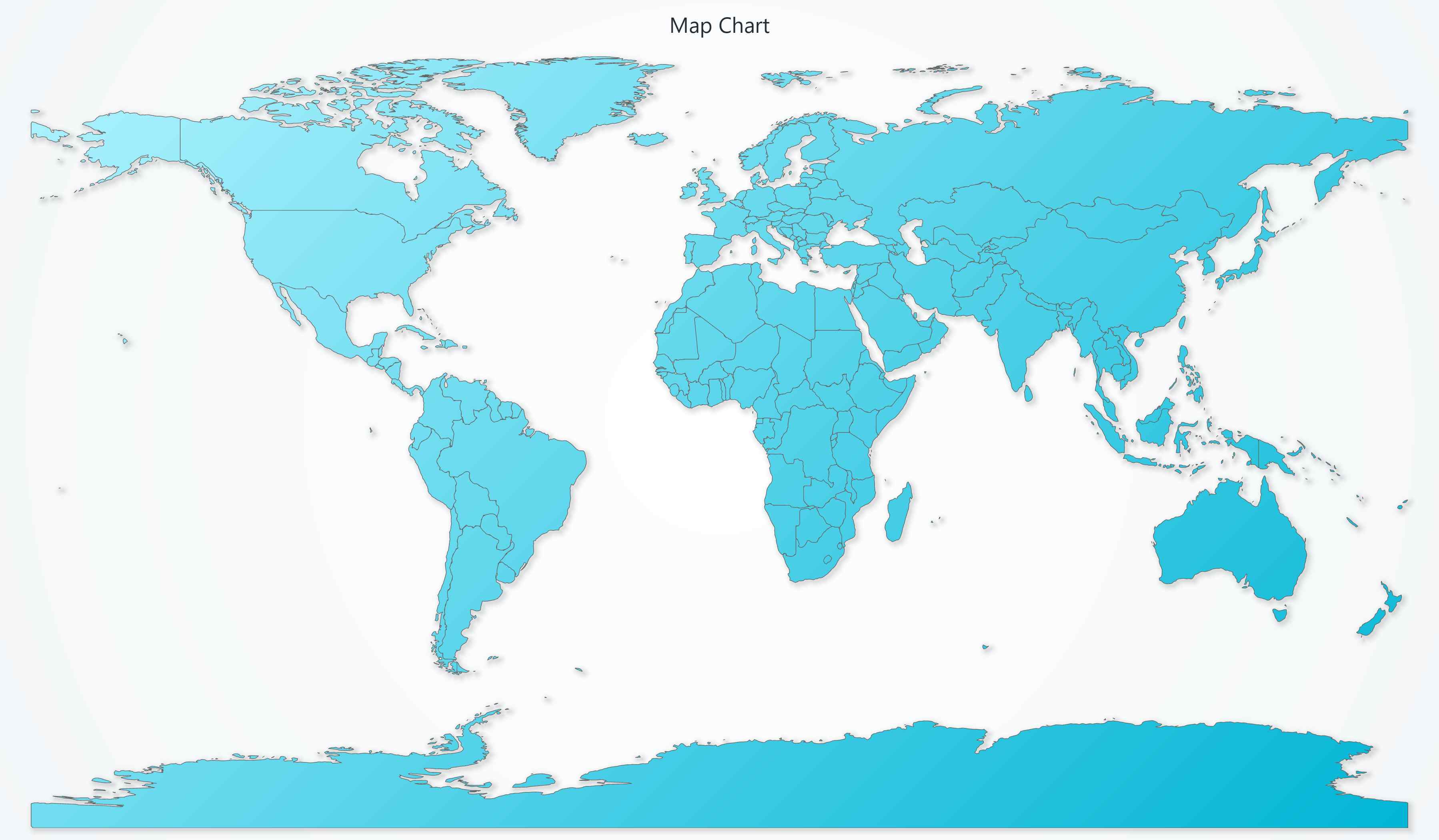
· MapTypes.World – Map of the entire world, regions as countries.
· MapTypes.Europe – Map of Europe, regions as countries.
· MapTypes.Africa – Map of Africa, regions as countries.
· MapTypes.Asia – Map of Asia, regions as countries.
· MapTypes.NorthAmerica – Map of North America, regions as countries.
· MapTypes.SouthAmerica – Map of South America, regions as countries.
· MapTypes.Australia – Map of Australia, regions as Australian territories.
· MapTypes.USA – Map of the United States of America, regions as states.
· MapTypes.Canada – Map of Canada, regions as Canadian territories and provinces.
Creating a Map Chart
Creating a map chart with LCJS is extremely easy with the help of a type argument.
const MapChart= lightningChart().Map({
  type: MapTypes.World, // <-- Select MapType here
});
With the help of the above code snippet, we can create a world map chart.
Likewise, you can also create other available types of map charts or you can simply refer to the interactive example of map charts available on our website under the interactive example section.
Datasets required for creating a map chart contain Country code along with its value. Here is a dataset example that represents how to add datasets to the map chart.
const populationData = [
  { "Country Code": "ALB", Value: 2866376 },
  { "Country Code": "AUT", Value: 8840521 },
  { "Country Code": "BLR", Value: 9483499 },
];

const regionValuesData = populationData.map((item) => ({
  ISO_A3: item["Country Code"],
  value: item["Value"],
}));
Adding data to the map chart can be done using the invalidateRegionValues() method. This method is flexible and can be used in a variety of ways.
MapChart.invalidateRegionValues(regionValuesData);
			Or
// Example, set value of "Finland" region to `0`.
 MapChart.invalidateRegionValues([
     { value: 0, ISO_A3: 'FIN' }
 ])
1. Dynamic Coloring in map chart
The user experience can be improved by applying dynamic coloring. Areas or regions in the chart can be highlighted using a specific stroke or solid fill colors.
We can style the map chart with two style properties i.e., ‘setFillStyle’ or ‘setStrokeStyle’
How to fill color in different regions
FillStyle
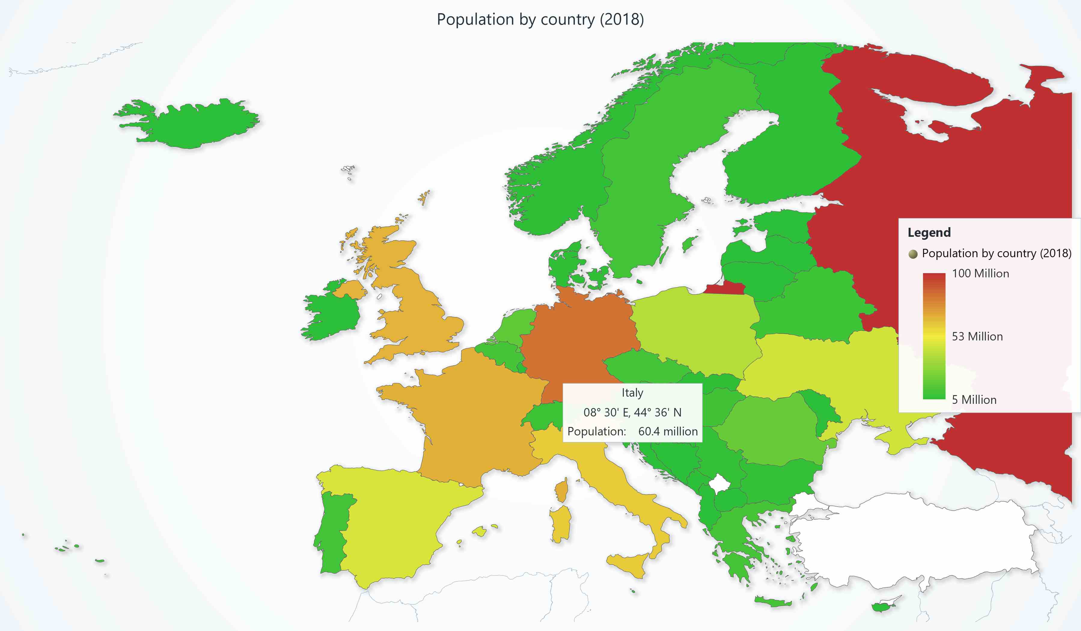
Dynamic region coloring can be done with fill style with PalletedFill. When using this property, each data point or pixel can be colored individually and configured using different combinations.
Depending on the data, it can be customized with color steps or color ranges from 0 to 100. This will display lighter to darker colors.
// Example, enable dynamic region coloring based on a color look-up table.
MapChart.setFillStyle(new PalettedFill({
lut: new LUT({
interpolate: true,
steps: [
{ value: 0, color: ColorRGBA(255, 0, 0) },
{ value: 100, color: ColorRGBA(0, 255, 0) }
]
})
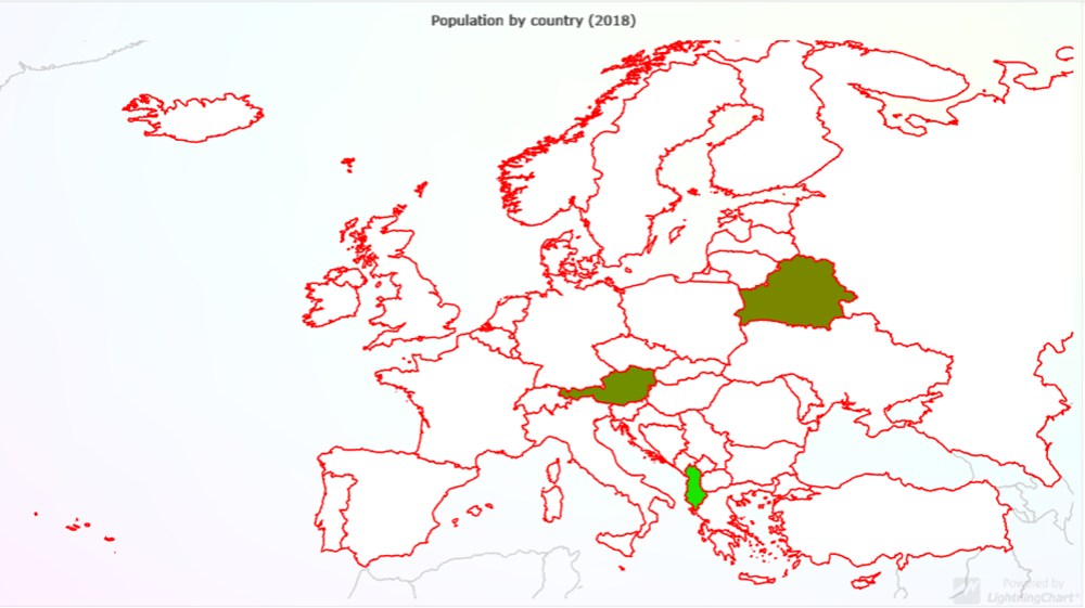
}))Adding borders/strokes to different regions
strokeStyle: For setting stroke style to the regions of the map chart we can use the setStrokeStyle() method
// Example, solid region stroke
 MapChart.setStrokeStyle(new SolidLine({
     thickness: 2,
     fillStyle: new SolidFill({ color: ColorRGBA(255, 0, 0) })
 }))
In the above code, we have applied RGB values for the red color stroke to the chart.
2. Real-time map dashboard:
Multiple charts can be simultaneously displayed within a dashboard. This makes it easy to divide the charts across the screen. Here’s an example of a map chart dashboard:
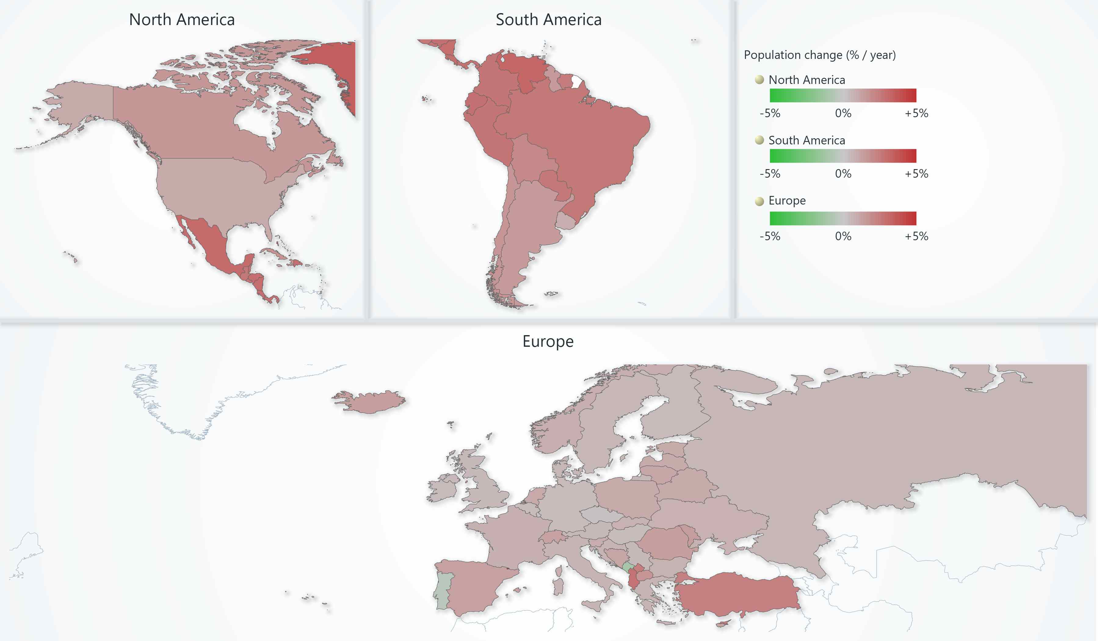
As you can see, we can also use the dashboard to show multiple regions separately along with other statistical data. This can be used to show the population growth in specific regions for a specified year range.
Data can be easily downloaded with a simple fetch request when the application starts. Every time the active year changes, map region data is quickly invalidated in real-time with the ‘invalidateRegionValues’ method.
To create a real-time map chart, we need a dataset with 3 values i.e. country code, year, and population.
// Code snippet setting region values for all 3 map charts.
let year = 2005;
const regionValuesData = populationData.map((item) => ({
  ISO_A3: item["Country Code"],
  value: item[year],
}));
chartEurope.invalidateRegionValues(regionValuesData);
chartSA.invalidateRegionValues(regionValuesData);
chartNA.invalidateRegionValues(regionValuesData);
3. Animated COVID Vaccination Coverage Chart
Map charts allow us to create advanced charts such as a COVID vaccination coverage chart.
This type of chart shows the percentage of vaccinations covered around the world. The intensity values range from 0 to 100 following the color specified within the code.
To get this kind of functionality in the map chart, we need to overlap LCJS ChartXY on top of MapChart.
For this, we need to create an overlay on ChartXY and set both the ‘div’ to position absolute. This is quite simple to develop and can be used offline.
// Minimal working code for overlaid and synchronized MapChart and ChartXY.
const divMap = document.createElement("div");
document.body.append(divMap);

const divOverlay = document.createElement("div");
document.body.append(divOverlay);

const mapChart = lightningChart()
  .Map({
    type: MapTypes.World,
    container: divMap,
  })
  .setTitle("");

const chart = lightningChart()
  .ChartXY({
    container: divOverlay,
  })
  .setMouseInteractions(false)
  .setBackgroundFillStyle(transparentFill)
  .setSeriesBackgroundFillStyle(transparentFill);
chart.engine.setBackgroundFillStyle(transparentFill);
chart
  .getDefaultAxes()
  .forEach((axis) =>
    axis.setTickStrategy(AxisTickStrategies.Empty).setStrokeStyle(emptyLine)
  );

mapChart.onViewChange((view) => {
  const { latitudeRange, longitudeRange, margin } = view;
  chart
    .getDefaultAxisX()
    .setInterval(longitudeRange.start, longitudeRange.end, false, true);
  chart
    .getDefaultAxisY()
    .setInterval(latitudeRange.start, latitudeRange.end, false, true);
  chart.setPadding(margin);
});

divMap.style.width = "100vw";
divMap.style.height = "100vh";
divMap.style.position = "absolute";
divMap.style.left = "0px";
divMap.style.top = "0px";
mapChart.engine.layout();

divOverlay.style.width = "100vw";
divOverlay.style.height = "100vh";
divOverlay.style.position = "absolute";
divOverlay.style.left = "0px";
divOverlay.style.top = "0px";
chart.engine.layout();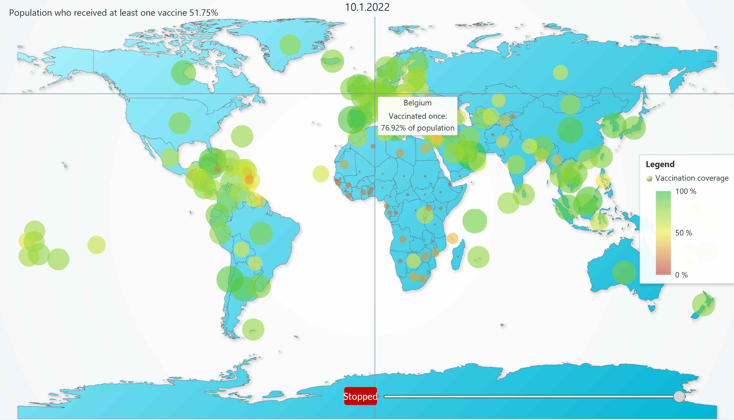
4. JavaScript Animated Geo Temperature Chart
Geo data can be visualized in a 2D heatmap to show temperatures of a specific world region. In this chart, we need to place a picture of a map over a 2D heatmap. Then, we need to add data points in regular latitude and longitude steps.
The visualization can be done by laying a predefined picture of a map under the heatmap, which is styled with transparent colors. This approach is simple, but only suitable when the geographical view is predefined.
If we use high-resolution pictures of a map, then zooming and panning can also be enabled.
To use a background image on the chart we can use.
// Load picture of USA map.
const bgImg = new Image()
bgImg.crossOrigin = ''
bgImg.src = document.head.baseURI + 'examples/assets/1110/usa.png'

// Style Chart series background as the picture.
chart.setSeriesBackgroundFillStyle(
  new ImageFill({
    source: bgImg,
    fitMode: ImageFitMode.Stretch,
  }),
)
Conclusion
In conclusion, the use of map charts is essential for visualizing geographic data in a meaningful and impactful way. The LightningChart Map Chart library offers a user-friendly set of APIs and multiple map types that allow developers to easily create customized, interactive maps that suit their specific needs.
With the ability to apply dynamic coloring, fillStyle, and strokeStyle, developers can highlight and draw attention to specific areas or regions on their maps. The power of map charts is particularly valuable when dealing with data related to people, populations, or region-specific trends, such as vaccination rates or demographic changes.
The LightningChart Map Chart library offers an ideal platform for visualizing and exploring this kind of data, enabling developers to uncover new insights and make more informed decisions.
Overall, a map chart is an important tool for any developer looking to represent and analyze geographic data compellingly and engagingly.

Shreya Jadhav
LightningChart Team

Sumeet Koyande
LightningChart Team
Continue learning with LightningChart

React Charting Performance
Here's a scenario that plays out across development teams every few months. Someone builds a React dashboard, picks Recharts or Victory because they're popular, the devs love them, and the first demo looks great. Then the dataset gets bigger. Or the data starts...

Javascript Charting Library comparison 2026
Every year someone publishes a listicle of JavaScript charting libraries. They screenshot a demo, note the GitHub stars, paste in the npm install command, and call it a day. Then you follow their recommendation, get six months into your project, and discover that your...

Visualizing 10 Million Data Points in the Browser (2026): The Technical Deep-Dive
Ten Million Data Points in the Browser: How WebGL Makes Mass Datasets Interactive Ten million data points. That number used to mean a database problem, not a front-end problem. Now research teams want to explore it interactively in a browser. Trading desks want...


If you have any questions, feel free to contact us!
©LightningChart Ltd 2026. All rights reserved.