LightningChart JSCreate a 2D & 3D JavaScript Spectrogram Application
TutorialUsing NodeJS, TypeScript, & LightningChart JS, you'll create a spectrogram vibration charts application.
JS Spectrogram Application
Hello, in this article we will create a JS dashboard with 2D and 3D spectrogram charts. The purpose of creating this project is to explain how to create a vibration analysis application that allows us to check sound waves using 2D and 3D spectrogram charts that LightningCharts JS provides us with its “lcjs” library.
Vibration analysis is of great importance in detecting errors and/or faults in industrial equipment (just to mention one example). I once worked in the industry and I remember that it was possible to detect failures in relief valves, air coolers, and compression elements, simply by listening to the intensity of the sound they generated.
With the vibration charts application that we are going to build next, we will see an audio file corresponding to a similar case. I recommend looking at the following LightningCharts articles, where you can see more information and an excellent use case:
Project Overview
Today, you’ll be creating a spectrogram application for vibration analysis featuring 2D and 3D JavaScript charts as follows:
 Download the project to follow the tutorial
Local Setup
In the previous article (Creating a pie chart with LightningChart JS and NodeJS), we created a pie chart from scratch using Typescript, Node JS y LightningCharts JS.
For this article, we will use the same project for creating a vibration charts application, so I recommend you download the template from that article or jump straight and get this project’s template. Using Visual Studio Code,
1. Create the file [dashboard.ts]
2. Add the file [audio2ch.json]
3. Open a new terminal and execute the command [npm install]
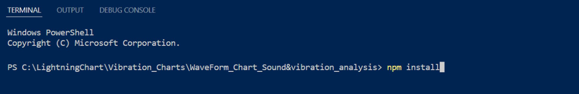
Once the above is done, the libraries we need to compile our project will be installed. Inside these libraries, there will be a @arction/lcjs library, which contains classes that will help us build our chart.
Coding Dashboard, Color Palettes, & Channels List
We will start our spectrogram application with our [dashboard.ts] file.
1. Import the JSON file, which will contain two-byte arrays.
One is channel 1 and the other is channel 2. Now, add the necessary classes inside a constant to be able to use them more easily.
import data from './audio2ch.json';

 const lcjs = require("@arction/lcjs");
 const {
   lightningChart,
   LUT,
   ColorHSV,
   PalettedFill,
   emptyLine,
   AxisScrollStrategies,
   AxisTickStrategies,
   Themes,
 } = lcjs;
2. Create the following constants:
const historyMs = 27 * 1000;
 // Sampling rate as samples per second.
 const sampleRateHz = 35
const sampleIntervalMs = 1000 / sampleRateHz- [historyMS] = will affect the speed (Milliseconds) in which the sound wave will be analyzed (the lower the value, the higher the speed).
- [sampleRateHZ] = Samples per second.
- [sampleIntervalMS] = Affects the frames per second in which the audio waveform is displayed on the chart.
3. Dashboard for the spectrogram app
Create the dashboard on which the spectrogram charts for vibration analysis will be displayed:
// Create empty dashboard and charts.
 const dashboard = lightningChart()
   .Dashboard({
     numberOfColumns: 2,
     numberOfRows: 2,
     theme: Themes.auroraBorealis ,
   })
   .setRowHeight(0, 1)
.setRowHeight(1, 2);4. Create the color palette for the audio wave:
const lut = new LUT({
       steps: [
         {
           value: 0,
           color: ColorHSV(0, 1, 0),
           label: `-100`,
         },
         {
           value: 255 * (1 / 6),
           color: ColorHSV(270, 0.84, 0.2),
           label: `-88`,
         },
         {
           value: 255 * (2 / 6),
           color: ColorHSV(289, 0.86, 0.35),
           label: `-77`,
         },
         {
           value: 255 * (3 / 6),
           color: ColorHSV(324, 0.97, 0.56),
           label: `-65`,
         },
The LUTSteps collection specifies colors and their corresponding values to describe the location and color of a transition point in a gradient. Each is represented as an even object {value: number, color: Color}.
5. Create a list of channels
In our JSON file, we have two-array bytes, each one corresponding to a channel, therefore, we will create two lists with their properties.
let channelList = [
       {
         name: "Channel 1",
         data: data.ch2,
         columnIndex: 0,
       },
       {
         name: "Channel 2",
         data: data.ch2,
         columnIndex: 1,
       },
];- name: Name of the channel. This property can be used as the title of the chart.
- data: Assigns the byte array that we want to assign to each channel.
- columnIndex: Specifies the column within the dashboard, where our chart will be placed.
Spectrogram Application
The code explained below will be executed inside a .map function, which means that the objects in the dashboard will be created according to the number of channels that exist in our [channelList] object.
let channelListConf = channelList.map((channel) => {

       const rows = channel.data[0].length;

       const chart2D = dashboard
         .createChartXY({
           columnIndex: channel.columnIndex,
           rowIndex: 0,
         })
         .setTitle(`${channel.name} | 2D audio spectrogram`);

       chart2D
         .getDefaultAxisX()
         .setTickStrategy(AxisTickStrategies.Time)
         .setScrollStrategy(AxisScrollStrategies.progressive)
         .setInterval(-historyMs, 110);
       chart2D.getDefaultAxisY().setTitle("Frequency (Hz)");
➡️getDefaultAxisX = Get a reference to the default X-Axis of the ChartXY.
This will always return a reference to the X-Axis that is closest to the vibration charts (starting from the bottom).
All methods below [getDefaultAxisX] will affect only the X-axis. (Same logic in case you need to reference to Y-axis [getDefaultAxisY]). Read more about the getDefaultAxisX and getDefaultAxisY
➡️setTickStrategy = It shows the time values of our sound wave in milliseconds. Read more about AxisTickStrategies
➡️ setScrollStrategy = Assigns a scrolling behavior on the specified axis. Read more about setScrollStrategy
➡️setInterval = Sets the axis scale interval. Parameters may change depending on the chart type.
In this case, the start scale value is obtained from the [historyMs] constant. 0 is equal to the end value of the scale. Read more about setInterval
➡️setTitle = Title displayed on the specified axis.
These same properties will be applied to the 3D vibration charts:
chart3D
         .getDefaultAxisX()
         .setTickStrategy(AxisTickStrategies.Time)
         .setScrollStrategy(AxisScrollStrategies.progressive)
         .setInterval(-historyMs, 0);

       chart3D
         .getDefaultAxisY()
         .setTitle("Intensity (Db)")

       chart3D.getDefaultAxisZ().setTitle("Frequency (Hz)");
We will assign the type of vibration charts that we need for the representation of the audio wave, in this case, we’ll be using a 2D and 3D spectrogram, This visualization is done in real-time and simulates audio metrics for vibration charts applications that measure, analyze, and display them in real-time:
const heatmapSeries2D = chart2D
         .addHeatmapScrollingGridSeries({
           scrollDimension: "columns",
           resolution: rows,
           step: { x: sampleIntervalMs, y: rowStep },
         })
         .setFillStyle(new PalettedFill({ lut }))
         .setWireframeStyle(emptyLine)


       const surfaceSeries3D = chart3D
         .addSurfaceScrollingGridSeries({
           scrollDimension: "columns",
           columns: Math.ceil(historyMs / sampleIntervalMs),
           rows,
           step: { x: sampleIntervalMs, z: rowStep },
         })
         .setFillStyle(new PalettedFill({ lut, lookUpProperty: "y" }))
         .setWireframeStyle(emptyLine);
For our 2D chart, we will use the [addHeatmapScrollingGridSeries] class. Learn more about this property in the LightningChart JS documentation.
This class will allow us to use the HeatmapGrid chart to represent our audio waveform. For our 3D vibration charts, we will use the [addSurfaceScrollingGridSeries] class. Learn more about this property.
Configuring Infinite Transmission
setInterval(() => {
       // Push 1 new sample to all channels and series.
       const samples = channelListConf.map(channel => channel.data[iSample % channel.data.length])
       iSample += 1
       bufferIncomingSamples(samples, (appendSamples) => {
        channelListConf.forEach((channel, i) => {
          channel.heatmapSeries2D.addIntensityValues([appendSamples[i]]);
          channel.surfaceSeries3D.addValues({ yValues: [appendSamples[i]] });
         });
       })
     }, sampleIntervalMs)
The [setInterval] function Configures infinite streaming from a set of static data. It makes use of the [bufferIncomingSamples] function, which is responsible for guaranteeing a static sampling rate, even if the input data may vary.
This is done by skipping samples that are too frequent and duplicating samples that are too far apart. The precision can be set simply by changing the value of [sampleRateHz].
const historyMs = 27 * 1000;
 // Sampling rate as samples per second.
 const sampleRateHz = 35
const sampleIntervalMs = 1000 / sampleRateHz[bufferIncomingSamples]:
const bufferIncomingSamples = (sample, clbk) => {
       const tNow = performance.now()
       if (lastSample === undefined) {
           clbk(sample)
           lastSample = { sample, time: tNow, i: 0 }
           tFirstSample = tNow
           return
       }

       let nextSampleIndex = lastSample.i + 1
       let nextSampleTimeExact = tFirstSample + nextSampleIndex * sampleIntervalMs
       let nextSampleTimeRangeMin = nextSampleTimeExact - sampleIntervalMs / 2
       let nextSampleTimeRangeMax = nextSampleTimeExact + sampleIntervalMs / 2
       if (tNow < nextSampleTimeRangeMin) {
           // Too frequent samples must be scrapped. If this results in visual problems then sample rate must be increased.
           // console.warn(`Skipped too frequent sample`)
           return
       }
       if (tNow > nextSampleTimeRangeMax) {
           // At least 1 sample was skipped. In this case, the missing sample slots are filled with the values of the last sample.
           let repeatedSamplesCount = 0
           do {
               clbk(lastSample.sample)
               repeatedSamplesCount += 1
               nextSampleIndex += 1
               nextSampleTimeExact = tFirstSample + nextSampleIndex * sampleIntervalMs
               nextSampleTimeRangeMin = nextSampleTimeExact - sampleIntervalMs / 2
               nextSampleTimeRangeMax = nextSampleTimeExact + sampleIntervalMs / 2
           } while (tNow > nextSampleTimeRangeMax)

           clbk(sample)
           lastSample = { sample, time: tNow, i: nextSampleIndex }
           // console.warn(`Filled ${repeatedSamplesCount} samples`)
           return
       }
       // Sample arrived within acceptable, expected time range.
       clbk(sample)
       lastSample = { sample, time: tNow, i: nextSampleIndex }
     }
    //});
Spectrograms For Vibration Measuring & Monitoring
Spectrograms are only one example of charts that you can use to monitor and visualize vibration data. Other vibration charts include multi-channel data monitoring chart, audio visualization, or the spectrogram XY projection chart.
In the process of vibration analysis, vibration charts display the data collected through several sensors connected to the machinery. Those sensors, which can include triaxial accelerometers, log the data that later in the analysis process, will help detect anomalies in the machines’ structure and functionality.
The ultimate goal of using vibration charts for visualizing vibration data is to assure that industrial machinery data is being constantly monitored, helps detect functionality problems, and helps apply preventive and corrective maintenance.
LightningChart JS supports the development of vibration analysis applications by delivering the highest-performance vibration charts that can process billions of data points in real-time thanks to advance WebGL rendering and GPU acceleration technologies.
FAQs
What are vibration charts?
Vibration charts are used to visualize vibration data from machinery logged via different types of sensors. These data are processed in real-time and help engineers to identify structural problems and weaknesses in machinery. Learn more about vibration analysis.
What other charts can I create with LightningChart JS?
There are more than 100 chart types that can be created with LightningChart JS, including 2D and 3D, you can visit our interactive examples to see more.
Is LightningChart JS free?
LightnignChart JS offers both non-commercial and commercial licenses. If you want to use the library for free for non-commercial purposes, get the Community license.
LightningChart JS
LightningChart JS is an advanced JavaScript charting library featuring 100+ charts that can be easily integrated into cross-platform applications that demand high-performance charts with fast rendering and large dataset processing of several billions of data points.

Omar Urbano
Software Engineer
Continue learning with LightningChart
If you have any questions, feel free to contact us!