


LightningChart Python v 2.1 is out now!
Introducing DataGrid, scrollable dashboards, new legend panels, heatmap min-max aggregations, and more.
New features
LightningChart Python v 2.1 introduces several new features, including a new Container component for creating advanced dashboard layouts. The release also introduces the DataGrid component, advanced event handling capabilities, and more. Here’s the summary:
DataGrid
LightningChart Python introduces a new high-performance DataGrid component to present metrics, KPIs, and mini-trends right inside a grid. The cells support text, numbers, and spark charts (line, area, bar, win-loss, pie) with markers, bands, and thresholds. In addition, DataGrid provides full control over fonts, paddings, borders, and colors.
Container
This new version introduces the Container feature, offering a flexible alternative to Dashboard. The Container feature enables scrollable multi-chart layouts with custom dimensions. With Container, you can create dashboards that exceed the viewport height, specify exact pixel or CSS-based sizing (such as 100vw, 200vh), and build tall, scrollable data exploration views.
This is particularly useful for applications requiring extensive vertical layouts, such as multi-panel monitoring dashboards or comprehensive data analysis reports, where users can scroll through multiple visualizations seamlessly.
LegendPanel
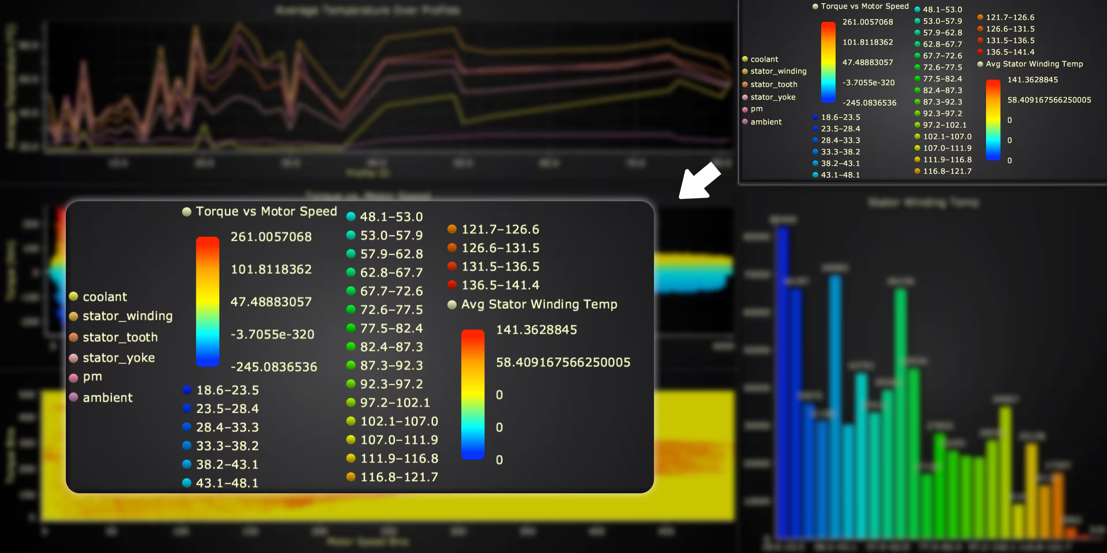
This version introduces the Legend Panel feature, which allows you to create dedicated legend areas inside dashboards and containers, push entries from series, add text boxes, and control visuals.
Heatmap min-max aggregation
Introducing support for the built-in heatmap aggregation for dense datasets, where multiple data points map to a single screen pixel. You can enable min-max aggregation to ensure that peak values remain visible at all zoom levels. This is critical for monitoring applications where outliers can not be missed.
Heatmap/3D Surface contours
In this release, the 3D surface series now supports customizable contour lines based on either height or intensity values. You can define per-level thresholds with adjustable line thickness and color to highlight critical ranges directly on the surface. This is perfect for terrain visualizations, simulation analysis, and any scenario where value bands need to stand out clearly.
New event listener methods
LightningChart Python now supports event listeners, enabling fully interactive charts that react to user actions. You can attach Python callbacks with add_event_listener(...) to handle clicks, pointer movement, cursor hits, layout changes, and more. Events are streamed live from the browser to Python, so your application can interact with users in real-time. Some of the new methods include pointer and click events, viewchange, and resize.
New TranslateCoordinate system
All the chart types now support a single translate_coordinate() method that converts between coordinate systems (axis, world, relative, client, bars, polar). You can replace multiple specific methods with one unified API that handles all transformations. This is perfect for interactive features, custom overlays, event handling, and any scenario that requires coordinate conversions between data space and screen pixels.
Drill-down method for TreeMap charts
Now, TreeMap charts support programmatic drill-down navigation with the new set_drill_down_node() method. Previously, navigating into nested nodes required user interaction through the UI. Now you can programmatically control the focused view, enabling automated presentations, guided tours, and dynamic view updates based on external events.
Other Improvements
There are three major improvements in this release: tick labels methods, heatmap flat array input, and better palette coloring methods. Here’s the summary:
Improved axis/tick labels methods for the ChartXY, BarChart, PolarChart, and Parallel Coordinate series
Now, all the charts’ axes support comprehensive tick label customization methods that work consistently across ChartXY, BarChart, PolarChart, and Parallel Coordinate Chart. For example, you can control the font family, size, weight, style, color, rotation, and alignment.
You can also control advanced numeric formatting, including units, scaling, precision, and display formats (percentage, currency, thousands, scientific notation). It is possible to apply the styles to individual axes or all axes at once, with full support for major/minor ticks, shadows, margins, and tick line styling.
This is useful for creating professional visualizations with branded typography, localized number formats, and precisely aligned labels that match your design requirements.
Heatmap flat array input
The XY heatmap grid series now supports intensity data in both traditional 2D matrix format and optimized flat array format. Previously, flat data from files or APIs required conversion to nested arrays, adding processing overhead and memory usage for large datasets.
The new flat format eliminates this step by passing your data directly as a 1D list or NumPy array. NumPy arrays are automatically converted to efficient TypedArrays under the hood, enabling blazing-fast data loading perfect for real-time visualization, large scientific datasets, FFT calculations with web workers, and any workflow where data arrives in a linearized format.
Improved palette coloring methods
The palette coloring methods now support advanced formatting options for LUT (Look-Up Table) legends. Previously, only value, color, and label were supported. Now you can customize how values are displayed in legends and cursors with precision control, units, scaling, and formatting operations.
Get LightningChart Python 2.1
Ready to start with LightningChart Python data visualization library? Select from Data Scientist or Software Developer licenses, and get started developing Python projects at the best performance.
See more news
LightningChart .NET v.12.6.1
LightningChart .NET v.12.6.1 is out now!Features of LightningChart® .NET version 12.6.1In this release we added new features, made several improvements and fixed dozens of errors. We upgraded target framework (from .NET 8.0 to 10.0), added Universal-Data-Parser...
Trend Lines in Trading
Trend lines are among the simplest yet most powerful tools in technical analysis. They help traders visualize market direction, identify potential support and resistance levels, and make more informed trading decisions. Despite their simplicity, trend lines remain a...
Announcement: Baumer as LightningChart customer
Enabling High-Performance Visualization of Industrial Sensor Data with LightningChartDiscover how Baumer uses LightningChart to configure and visualize data from a wide variety of industrial sensors and create responsive, data-rich visualization...
Best Python Charting Library in 2026
Python's charting ecosystem is large, overlapping, and regularly misunderstood. Most comparison guides stop at Matplotlib, Plotly, and Seaborn. This one goes further: it covers what happens when your datasets grow large, your update rates increase, or your chart types...



If you have any questions, feel free to contact us!
©LightningChart Ltd 2025. All rights reserved.