


LightningChart .NETWater Level Measurement Data Application
TutorialImplementation of a water level measurement data visualization application in WPF using LightningChart .NET.
Written by a human | Updated on April 24th, 2025
Water Level Measurement WPF Application
In this article we will talk about the measurement of various properties of water. We will study the theory and explain ways to implement an analysis on each concept, with the help of programming in C# language and the LightningChart .NET library. In this article you will find 4 .NET projects, each dedicated to the property of water. I will explain the logic, methods, and the idea on which each project was based.
The base programming of each project was generated with the help of the interactive examples tool of LC .NET, so you can generate them from scratch or experiment with some other examples in the application catalog. Each project has modifications in the code (in relation to the subject of study). Before starting with the content, I recommend that you read the installation section of the interactive examples.
Project Overview
Today we will create a WPF water level measurement application using LightningChart .NET.


 Download the project to follow the tutorial
Local Setup
For this project, we need to consider the following requirements to compile the project.
- OS: 32-bit or 64-bit Windows Vista or later, Windows Server 2008 R2 or later.
- DirectX: 9.0c (Shader model 3 and higher) or 11.0 compatible graphics adapter.
- Visual Studio: 2022 for development, not required for deployment.
- Platform .NET Framework: installed version 8.0 or newer.
Now go to the next URL and download LightningChart .NET. You’ll then be redirected to a sign-in form where you’ll have to complete a simple sign-up process to get access to your LightningChart account.

After signing in to your account, you can download the SDK “free trial” version that allows you to use important features for this water level measurement application. When you download the SDK, you’ll have a .exe file like this:

The installation will be a typical Windows process, so please continue with it until it is finished. After the installation, you will see the following programs:

License Manager
In this application, you will see the purchase options. All the projects that you will create with this trial SDK, will be available for future developments with all features enabled.

LightningChart .NET Interactive Examples
You can see 100+ interactive visualizations for WPF, WinForms, and/or UWP.

How to measure & visualize pH values in the water?

Measuring the pH of water is essential for a variety of applications, including environmental monitoring, agriculture, aquaculture, and water treatment. pH is measured on a scale from 0 to 14, with values below 7 indicating acidity, values above 7 indicating alkalinity, and a value of 7 representing neutrality.
The alkalinity of water refers to its ability to neutralize acids, so bicarbonates, carbonates, and to a lesser extent hydroxides are present. Alkalinity is measured by the concentration of ions and is commonly expressed in milligrams per liter (mg/L) of calcium carbonate (CaCO₃). The higher the alkalinity level, the more resistant the water will be to changes in pH, which is important for the health of aquatic ecosystems and for applications such as water treatment. When water has low alkalinity, it can be more susceptible to pH changes, affecting the health of the ecosystem and its treatment.
Acidity refers to the concentration of hydrogen ions (H⁺) in a solution and is an indicator of how acidic a liquid is. A solution is considered acidic if it has a pH less than 7. Acidity can affect various properties of water, as well as its ability to support life. Neutrality refers to a condition in which a solution has a pH equal to 7, which generates a balanced state between acids and bases. In this state, the concentration of hydrogen ions (H⁺) is equal to that of hydroxide ions (OH⁻).
To measure the pH of water, two tools can be used, a pH meter or pH test strips. A pH meter can be a tool with a digital display or an analog needle indicator, which will show numbers (digital) or simply indicate the pH color (analog). pH strips are strips that are coated with reagents that change color depending on the acidity or alkalinity level of the sample.
Visualization of pH Levels
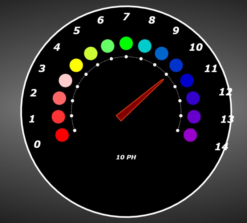
The LC .NET tool offers us a wide variety of charts, from which we can choose one and modify it to suit our needs. For this type of measurement, I decided to use a gauge chart:

In the project, modifications were made to the interface properties with the aim of making the gauge chart similar to a pH meter:

In this chart the number of points was set to 15 (0-14), assigning a color based on the pH color scale to each point.

Below the needle, a label will be displayed with the current value. The way this type of chart works is by means of degrees, where the smallest angle corresponds to 180 with a limit value of 320 degrees. This range is divided between the 15 pH points. In this way, the needle will be positioned at the point we need.
Let’s suppose that you obtain the alkalinity value from a sensor. This value should be converted to a degree based on the parameters mentioned. With this, you could measure the alkalinity using a file or data set obtained previously. In this type of chart, two gauges are handled, one external and one internal. Therefore, it is necessary to configure both:
CreateGaugeScale1(): This method creates the external gauge, creating a point object (PolarEventMarker), for each pH scale. Visual properties are also assigned, in this case, the geometric shapes are hidden, leaving only the text visible:
int pointCounter = 15;
double newAngle = 200f;
double angleStep = 220f / (pointCounter - 1);
int gaugeValue = 0;

for (int i = 0; i < pointCounter; i++)
{
    // marker used for speed value
    {
        //Create scale label
        PointShapeStyle label = new PointShapeStyle(_chart);
        EventMarkerTitle title = new EventMarkerTitle(_chart)
        {
            Text = gaugeValue.ToString(),
            Color = Color.FromArgb(255, 255, 255, 255),
            Font = new WpfFont("Verdana", 18f, true, true)
        };

        //Create major tickmarker for each label
        PolarEventMarker majorTickMarker = new PolarEventMarker(_chart.ViewPolar, _gaugeScale, label, newAngle, _tickmarkAmplitude + 45, title, new PointInt(0, 0));
        majorTickMarker.Label.VerticalAlign = AlignmentVertical.Center;
        majorTickMarker.Symbol.Shape = Shape.Circle;
        majorTickMarker.Symbol.Height = 0;
        majorTickMarker.Symbol.Width = 0;
_chart.ViewPolar.Markers.Add(majorTickMarker);CreateGaugeScale2(): Points are created in the same way, but instead of hiding the geometric shapes, they are kept, assigning a circle as the default shape. The texts are hidden, and the color is assigned to each circle:
int pointCounter = 15;
double newAngle = 200f;
double angleStep = 220f / (pointCounter - 1);
int gaugeValue = 0;

for (int i = 0; i < pointCounter; i++)
{
    // marker used for RPM value
    {
        int miles = (int)(gaugeValue * 0.62137);
        //Create scale label
        PointShapeStyle label = new PointShapeStyle(_chart);
        EventMarkerTitle title = new EventMarkerTitle(_chart)
        {
            Text = string.Empty
        };

        //Create major tickmarker for each label
        PolarEventMarker majorTickMarker = new PolarEventMarker(_chart.ViewPolar, _gaugeScale, label, newAngle, _tickmarkAmplitude + 45, title, new PointInt(0, 0));
        majorTickMarker.Label.VerticalAlign = AlignmentVertical.Center;
        majorTickMarker.Symbol.Shape = Shape.Circle;
        majorTickMarker.Symbol.Height = 40;
        majorTickMarker.Symbol.Width = 40;
        majorTickMarker.Symbol.Color1 = phColors[i];
        majorTickMarker.Symbol.Color2 = phColors[i];
        majorTickMarker.Symbol.Color3 = phColors[i];
_chart.ViewPolar.Markers.Add(majorTickMarker);- The phColors[] array contains a list of colors in order of their alkalinity and acidity scale:
Color[] phColors = new Color[15]
{
    Color.FromArgb(255, 255, 0, 0),    // pH 0: Strong acid (Red)
    Color.FromArgb(255, 255, 51, 51),  // pH 1: Acidic (Light Red)
    Color.FromArgb(255, 255, 102, 102),// pH 2: Acidic (Light Pink)
    Color.FromArgb(255, 255, 204, 204),// pH 3: Mildly acidic (Pale Pink)
    Color.FromArgb(255, 255, 255, 0),  // pH 4: Neutral (Yellow)
    Color.FromArgb(255, 204, 255, 51), // pH 5: Slightly alkaline (Light Yellow)
    Color.FromArgb(255, 102, 255, 102),// pH 6: Mildly alkaline (Green)
    Color.FromArgb(255, 0, 255, 0),    // pH 7: Neutral (Green)
    Color.FromArgb(255, 0, 204, 204),  // pH 8: Slightly alkaline (Cyan)
    Color.FromArgb(255, 0, 102, 204),  // pH 9: Alkaline (Light Blue)
    Color.FromArgb(255, 0, 51, 204),   // pH 10: Alkaline (Blue)
    Color.FromArgb(255, 0, 0, 204),    // pH 11: Strongly alkaline (Dark Blue)
    Color.FromArgb(255, 51, 0, 204),   // pH 12: Very strong alkaline (Indigo)
    Color.FromArgb(255, 102, 0, 204),  // pH 13: Extremely strong alkaline (Purple)
    Color.FromArgb(255, 153, 0, 204)   // pH 14: Very extreme alkaline (Violet)
};
How to measure & visualize hardness values in the water?
Water hardness is primarily due to the presence of dissolved calcium and magnesium ions. Measuring water hardness is essential to understanding water quality and its implications for domestic use and environmental health.
Hardness in water can have a negative impact on pipes, affect the effectiveness of cleaning and hygiene products, and affect aquatic life. To measure water hardness, there are measurement kits, including test strips, a digital or analog tester and a kit of chemical solutions for hardness analysis.
Types of hardness:
- Temporary hardness: Caused primarily by bicarbonate minerals (calcium bicarbonate and magnesium bicarbonate) that can be removed by boiling water, which precipitates these minerals.
- Permanent hardness: caused by calcium and magnesium sulfates and chlorides, which cannot be removed by boiling water.
Effects of hardness:
- Domestic impact: Hard water can cause scale buildup in pipes and appliances, reducing efficiency and lifespan. It can also affect soap efficiency, making it difficult to produce suds.
- Environmental impact: Hardness can influence aquatic life, as certain species thrive at specific hard levels.
Visualization of Hardness Levels
To measure water hardness, there is a standard scale on which we can base ourselves to choose a chart:
- Soft Water:
- 0 to 60 mg/L (ppm)
- Minimal scaling and soap usage.
- Moderately Hard Water:
- 61 to 120 mg/L (ppm)
- Some scaling may occur, and soap may be less effective.
- Hard Water:
- 121 to 180 mg/L (ppm)
- Noticeable scaling, and decreased soap lathering.
- Very Hard Water:
- Over 180 mg/L (ppm)
- Significant scaling and reduced effectiveness of soaps and detergents.
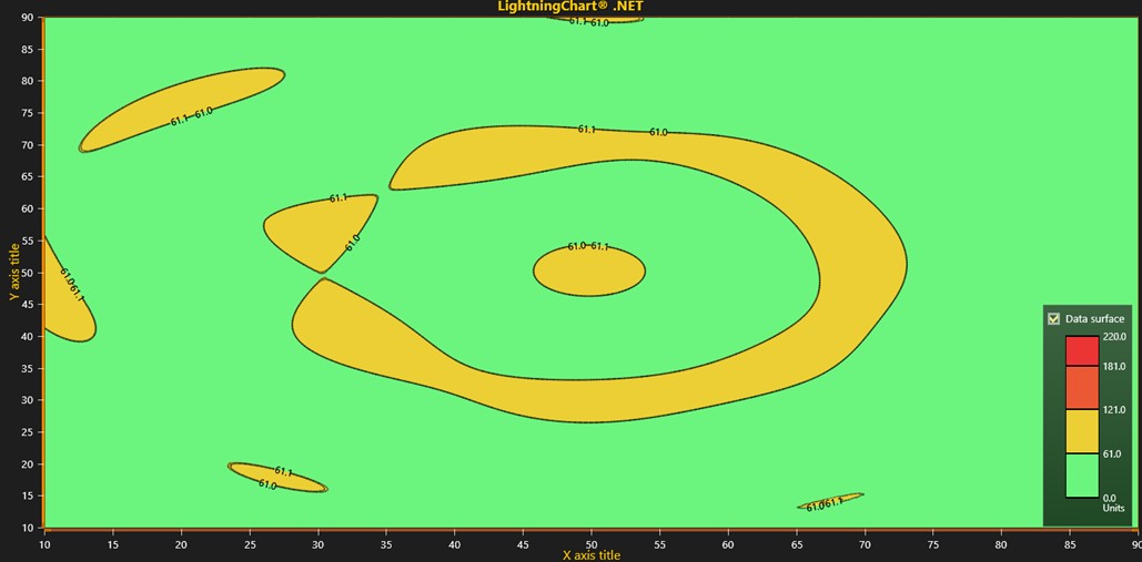
The colors used for each scale are green, yellow, orange, and red. Red represents the highest level of hardness and green is the lowest level of hardness. Based on this information, I decided to use a heat map chart:

Although it is used to show temperature levels, it can also help us represent hardness levels, thanks to the ability to display different colors. Assuming we are analyzing a lake, a river area, an ocean, etc., we would have an aerial view of the area, and we could see the lowest and highest hardness zones:

As you can see, in this example we show mostly mild hardness levels. It is worth mentioning that the data is generated randomly, but in a real case study, you would need a data set with X-Y coordinates. Each data point is a pixel whose color is assigned based on the hardness scale.

In the image above, we can see how the scale goes from green to yellow when reaching or exceeding the value of 61. To create a heatmap, we need to make use of the IntensityGridSeries class:
_intensityGrid = new IntensityGridSeries(_chart.ViewXY, _chart.ViewXY.XAxes[0], _chart.ViewXY.YAxes[0])
{
    Fill = IntensityFillStyle.Paletted,
    ContourLineType = ContourLineTypeXY.ColorLine
};
_intensityGrid.ContourLineStyle.Color = Colors.Black;
_intensityGrid.ContourLineLabels.Visible = true;
_intensityGrid.SetRangesXY(10, 90, 10, 90);
_intensityGrid.SetSize(columns, rows);
_intensityGrid.ValueRangePalette = CreatePalette(_intensityGrid, 100, 255);
_intensityGrid.Title.Text = "Data surface";
_intensityGrid.AllowUserInteraction = false;
This class is now ready to create a heatmap (or in this case the hardness water map), and we only need to assign the X-Y axis ranges, the grid size, and the color palette. The color palette is generated with the help of “Steps”. Each step is equal to a color and a range value:
private ValueRangePalette CreatePalette(IntensityGridSeries ownerSeries, int yRange, int alpha)
{
    ValueRangePalette palette = new ValueRangePalette(ownerSeries);
    DisposeAllAndClear(palette.Steps); // Remove existing palette steps.
    palette.Steps.Add(new PaletteStep(palette, Color.FromArgb(255, 108, 245, 126), 0));
    palette.Steps.Add(new PaletteStep(palette, Color.FromArgb(255, 108, 245, 126), 61 * yRange / 100.0));
    palette.Steps.Add(new PaletteStep(palette, Color.FromArgb(255, 235, 207, 52), 61.1 * yRange / 100.0));
    palette.Steps.Add(new PaletteStep(palette, Color.FromArgb(255, 235, 207, 52), 121 * yRange / 100.0));
    palette.Steps.Add(new PaletteStep(palette, Color.FromArgb(255, 235, 89, 52), 121.1 * yRange / 100.0));
    palette.Steps.Add(new PaletteStep(palette, Color.FromArgb(255, 235, 89, 52), 181 * yRange / 100.0));
    palette.Steps.Add(new PaletteStep(palette, Color.FromArgb(255, 235, 52, 52), 181.1 * yRange / 100.0));
    palette.Steps.Add(new PaletteStep(palette, Color.FromArgb(255, 235, 52, 52), 220 * yRange / 100.0));
    palette.Type = PaletteType.Uniform;
    return palette;
}
To generate the data, the following code block is used:
IntensityPoint[,] dataIntensity = new IntensityPoint[columns, rows];

double[,] data = WaterDropSurfaceDataGenerator.Generate(
    iSize, //size as nodes, in both X and Y
    new double[] { 0.2, 0.5, 0.7 }, //Drop X positions in scale 0...1
    new double[] { 0.6, 0.5, 0.3 }, //Drop Z positions in scale 0...1
    new double[] { 15, 50, 3 }, //Amplitudes, as Y axis values
    47, //Offset level (mid-Y)
    25); //Volatility, wave generating density

//Set Y values for nodes
for (int iNodeX = 0; iNodeX < columns; iNodeX++)
{
    for (int iNodeY = 0; iNodeY < rows; iNodeY++)
    {
        //Set data surface Y
        dataIntensity[iNodeX, iNodeY].Value = data[iNodeX, iNodeY];
    }
}

_intensityGrid.Data = dataIntensity;
_chart.ViewXY.IntensityGridSeries.Add(_intensityGrid);
The code generates simulated data of a water surface affected by droplets and organizes it into a matrix for visualization in a chart. The simulation considers several factors, such as the position of the drops and their amplitudes, to create a data set that represents what the water surface would look like in response to these drops. To use real data, you would need to generate a matrix with the hardness values for each region of a water surface.
How to measure & visualize solids values in the water?
Measuring solid values in water generally refers to determining the concentration of suspended or dissolved solids in a water sample. For the measurement of solids, 3 concepts can be used:
- Total suspended solids (TSS): Measures the weight of suspended particles in a water sample. It is usually expressed in milligrams per liter (mg/L).
- Total dissolved solids (TDS): Includes all substances dissolved in water, such as salts, minerals, and organic matter, also expressed in mg/L.
- Sedimentable solids: Refers to the portion of solids that will settle out of the water column during a specific period, usually measured in milliliters per liter (mL/L).
To measure these values, filtration, evaporation or the use of instruments such as turbidity and conductivity meters can be used. Each method can provide information on water quality and help assess environmental impacts.
Visualization of Solids’ Levels
Solids in water can be categorized into 5 basic groups:
- Total Suspended Solids (TSS)
- Total Dissolved Solids (TDS)
- Settleable Solids
- Volatile Solids
- Fixed Solids
Therefore, we can use a bar chart to show each category and its values in a case study. We will use a 3D chart:

This interactive example will allow us to generate a 3D chart with multiple study samples, each with the 5 categories that we are going to show. The interesting thing about this interactive example is the user controls that it generates, allowing us to change the shape of the bars (cylinders, pyramids, cones, etc.).

The interactive examples application creates a 100% functional project, and therefore, we will only need to create our series and configure our labels:

The axis configuration is where we will begin to modify and add the legends we need:
//Setup primary x-axis
_chart.View3D.XAxisPrimary3D.SetRange(0, 5);
_chart.View3D.XAxisPrimary3D.AutoDivSpacing = false;
_chart.View3D.XAxisPrimary3D.MajorDiv = 1;
_chart.View3D.XAxisPrimary3D.Title.Text = "Solids grouped by water sample";

//Setup primary y-axis
_chart.View3D.YAxisPrimary3D.SetRange(0, 30);
_chart.View3D.YAxisPrimary3D.Title.Text = "Values";
The categories will be text strings within an array, this with the objective of mapping each one of them:
string[] Categories =
new string[]
{
    "Total Suspended Solids (TSS)",
    "Total Dissolved Solids (TDS)",
    "Settleable Solids",
    "Volatile Solids",
    "Fixed Solids"
};
In order to create a bar chart, it will be necessary to use the BarSeries3D class:
for (int i = 0; i < seriesLength; i++)
{
    BarSeries3D barSeries = new BarSeries3D(_chart.View3D, Axis3DBinding.Primary, Axis3DBinding.Primary, Axis3DBinding.Primary)
    {
        Shape = shapes[i],
        BarWidth = 2 * ((i % 2) + 1)
    };
    barSeries.BarDepth = barSeries.BarWidth;
    barSeries.Material.DiffuseColor = diffuseColors[i];
    barSeries.Material.SpecularColor = specularColors[i];
    barSeries.Material.SpecularPower = 20;
    barSeries.BaseLevel = 0;
    barSeries.Title.Text = Categories[i];
    _chart.View3D.BarSeries3D.Add(barSeries);
}
One bar will be created for each element of the series Length array, i.e. 5 bars. The values are generated randomly using mathematical calculations. If you need to use real data, you just need to replace the calculation with the value from some data source.
BarSeriesValue3D[] values = new BarSeriesValue3D[addSeriesLength];

for (int i = 0; i < addSeriesLength; i++)
{
    values[i] = new BarSeriesValue3D(i + 1, 10f + 1f * Math.Sin(_x + seriesIndex * 10.0 + i / 100.0), 20, "");
}
_x += 0.025f;
How to measure & visualize conductivity values in the water?
Water conductivity values indicate the water’s ability to conduct electric current, which is generated by the presence of ions, such as salts and minerals.
- Units: Conductivity is typically measured in micro siemens per centimeter (μS/cm) or milli siemens per centimeter (mS/cm).
Based on the results of the study, it can be determined whether the water is fresh, brackish, or salty.
- Freshwater: Typically ranges from 50 to 1500 µS/cm. Lower values typically indicate higher purity and lower ion concentrations.
- Brackish water: Ranges from 1500 to 30,000 µS/cm, indicating a mix of fresh and salt water.
- Saltwater: Typically exceeds 30,000 µS/cm, reflecting high salt concentrations.
The importance of knowing conductivity levels allows us to know if aquatic life is at risk if the water quality is good enough for consumption, or if the contamination is too high for agricultural or industrial use. To measure conductivity, you need some tools or materials:
- Conductivity meter: This is the most common tool, designed specifically to measure electrical conductivity in liquids.
- Water sample: the water you want to measure (for example, from a stream, lake, or tap).
- Calibration solution: a standard solution with known conductivity to calibrate the meter.
- Clean container: to hold the water sample.
Visualization of Conductivity Levels
We can use several types of graphs to measure water conductivity:
- Line chart: Great for showing changes in conductivity over time. You can plot time on the x-axis and conductivity readings on the y-axis to visualize trends.
- Bar chart: Useful for comparing conductivity levels between different water samples or locations. Each bar can represent a different sample, making it easier to see variations.
- Scatter chart: If you want to analyze the relationship between conductivity and another variable (such as temperature or salinity), a scatter graph can help visualize any correlations.
- Heat map: If you have many data points at different locations or times, a heat map can show variations in conductivity levels visually, with color gradients representing different conductivity values.
Since we already made use of heatmap and bar graphs, I decided to use the line chart. This is because we can analyze conductivity levels within a given period. The zoom bar chart allows us to analyze the line in an overview mode and in detailed mode.
The analysis example is based on a single day data set, where we can see the variations in conductivity across different hours of the day. To start, we need to set up our axes:
// Set axes.
_chart.ViewXY.XAxes[0].ValueType = Arction.Wpf.Charting.AxisValueType.DateTime;
_chart.ViewXY.XAxes[0].RangeChanged += ExampleZoomBar_RangeChanged;
_chart.ViewXY.XAxes[0].Title.Text = "Water conductivity over time";
_chart.ViewXY.YAxes[0].Title.Visible = false;
The X-axis will be of the DateTime type, which will allow us to visualize time ranges. We can assign a title below the X-axis. Now we need to create our point series, to which we will add data points. The PointCount value is a limit of data points that we can set. The values are generated randomly, but if you need to use real data, you will only need a dataset with the date and conductivity values, add them to an array, and assign them to the X-Y elements of the point series.
// Set data to PointLineSeries.
SeriesPoint[] data = new SeriesPoint[PointCount];
for (int i = 0; i < PointCount; i++)
{
    data[i].X = _xValues[i];
    data[i].Y = _yValues[i];
}

PointLineSeries pointLineSeries = new PointLineSeries(_chart.ViewXY, _chart.ViewXY.XAxes[0], _chart.ViewXY.YAxes[0])
{
    Points = data
};
Finally, we add the name to our line series, which will be displayed in the legend box of our chart:
pointLineSeries.Title.Text = "Water Conductivity";
_chart.ViewXY.PointLineSeries.Add(pointLineSeries);
How to measure & visualize potability values in the water?

Potability of water refers to the quality of water that makes it safe for human consumption. This implies that water must be free of contaminants and pathogens that can cause diseases. Drinking water must have a pleasant taste, smell, and appearance and comply with specific public health regulations. The quality of water will depend on the set of results obtained through various tests.
Within these tests or measurements, we will find the examples we saw above (pH, Total Dissolved Solids (TDS), Hardness, Conductivity), but there are other tests that will help certify the condition of the water. Below are some other conditions to consider:
- Coliform Bacteria: The presence of coliforms in water is used as an indicator of water quality and potential contamination by fecal matter.
- Nitrates: Nitrates are chemical compounds that consist of nitrogen and oxygen (NO₃⁻). They are commonly found in fertilizers, as well as in some natural water sources. Nitrates are an important nutrient for plants, but excessive levels in water can pose health risks.
- Lead: Lead is a heavy metal that can be harmful to human health, particularly when it contaminates drinking water. It is often found in pipes, plumbing fixtures, and solder used in older buildings.
- Chlorine: Chlorine is a chemical element commonly used for disinfecting water supplies and treating wastewater. It is effective in killing bacteria, viruses, and other pathogens, making it an essential part of water treatment processes.
As we mentioned above, the potability level of the water is confirmed based on the results of all the measurements mentioned above. This means that tools for reading pH, conductivity, hardness, and solids will be needed (digital or analog meters or pH or hardness strips, etc.).
Visualization of Potability Levels
With the projects shown above, we can get an idea of the various tools that LC .NET offers. The set of results shown in each chart can help us confirm the potability level. LC .NET allows us to work with WPF, which means that we can use different charts within the same project and generate a dashboard that allows us to show all the results at the same time.
Conclusion
Water measurement is just one case study that can be developed with technological applications, such as LC .NET and Visual Studio. All the charts used in this article can be used for other case studies since LC .NET is not limited to a single type of data.
LC .NET will only ask for a data set with numeric values, text, or dates, depending on the type of data to be analyzed. I invite you to acquire the interactive examples tool of LC .NET, where you will be able to see the wide catalog of 2D and 3D charts that the application offers.
You will be able to generate a WPF project of each chart and experiment with it. There are many .NET articles that you can consult. I recommend that you look at the articles on dashboards, with which you will be able to get an idea of how to use multiple charts in the same view. I hope this new article format has been to your liking.
Bye!

Omar Urbano
Software Engineer
Continue learning with LightningChart

How to Create a Strip Chart
Written by a human | Updated on April 9th, 2025What is a Strip chart application and what are the modern equivalents to it? Before computers exist or were taking their first steps, a Strip chart was a way to visualize an analog electrical signal. Voltage was...
Data Visualization Template for Electron JS | LightningChart®
Updated on April 4th, 2025 | Written by humanAre you already building cross-platform applications with Electron JS? In some of our previous articles, we’ve worked on TypeScript projects where we created pie charts and vibration chart applications. And as we...
Bar chart race JavaScript
Updated on April 14th, 2025 | Written by humanBar chart race JavaScript When I wrote this article, the COVID-19 pandemic was at its peak point. Today, things are much better thanks to vaccinations that continued their steady positive global effect. With this bar...


If you have any questions, feel free to contact us!
©LightningChart Ltd 2026. All rights reserved.