


LightningChart JS TraderOptions Trading Data Application
TutorialLightningChart JS Trader implementation for creating a 3D bubble chart & 3D bar chart for Options Trading.
Written by a human | Updated on April 23rd, 2025
Options Trading Data Application
This is the second part of a series of Options Trading articles. In the first Options Trading article, I described the theories behind Options Trading and guided an implementation for the 3D Line Series, and a second chart featuring the DataGrid component.
In this article, we will create a bubble chart and a bar chart for options traders. I decided to implement the two charts within the same project, to show how simple and powerful Lightning Chart JS can be when working with 3D rendering.
Additionally, we will add three extra controls: Data Grid, HTML Annotations, and Legend Boxes. The three controls will affect our chart’s behavior and display each data point’s values.
For the DataGrid component, we will add the double-click mouse event for displaying a table when double-clicking on a series of points within our charts. The legend box will have extra functions, such as generating a gradient bar based on the minimum and maximum values of each series and coloring the 3D bars.
The annotation HTML elements will update the chart with Call and Put data. These controls will execute the main method, sending their label information as a parameter.
As we have seen in previous charts, to create 3D points, we will need a series of 3D points, that, unlike a “normal” series of points, they allow us to add a Z value to our data points. This gives depth to each one of them and makes them compatible with our 3D chart component.
In the case of bars, we will use the Surface Grid 3D tool to create shapes based on a 3D mesh. To explain the logic of the data concerning the Surface Grid 3D, we will have to delve into the code, as it can be slightly confusing to explain otherwise.
What is LightningChart JS Trader?
LightningChart JS Trader is a high-performance fintech-oriented library that leverages proprietary LightningChart technology. The LC JS Trader charts have all the rendering power of LightningChart, allowing billions of data points to be displayed on charts, and are more than 1.5 million times faster in real-time streaming use cases than the average chart control.

LC JS Trader features advanced technical chart types including candlestick charts, bar charts, line charts, mountain price charts, Kagi, Renko, Point and Figure, and Heikin-Ashi. LightningChart JS Trader also allows us to have a detailed visualization of our data in a tabular format thanks to the additional component DataGrid, that we will use in the development of the second chart.
Project Overview
In this options trading data application exercise, I used a dataset obtained from Kaggle. I had to do a little Excel work to filter the 5 corporations that I considered important in the technology field. I took the values of time, call, put, volume, and premiums.
- Time – Time when this ticker was caught in the flow.
- C/P – Call or Put trade?
- Volume – The number of shares traded now when this contract was caught.
- Premiums – The total money spent on this contract.
These values were converted to a JSON object, which is a very common data type when working with datasets from an API. Several web pages help you create these JSON files, so it will not be a problem for you if you want to add other flags. If you’ve downloaded the project, you can find the Excel worksheet from which you can generate your dataset for the chart.

 Download the project to follow the tutorial
Template Setup
I highly recommend reading the first part of this article. Several features of this options trading data application project were implemented in the first part, so we will focus on code blocks that are new or different from the first project.
1. Download the template provided to follow the tutorial.
2. After downloading the template, you’ll see a file tree like this:

3. Open a new terminal and run the npm install command. It is important to keep the configuration in the tsconfig.json file. This configuration will help you to import JSON files as data objects.
The series of JSON files contains the datasets for our charts. If you open one of these files, you’ll see the following values:

- Time – Time when this ticker was caught in the flow.
- C/P – Call or Put trade?
- Volume – The number of shares traded now when this contract was caught.
- Premiums – The total money spent on this contract.
The volume will take care of our Y axis, or the verticality of our elements shown in the chart. The prems will be in charge of our Z axis, meaning, that the greater the number of money spent on a contract, the deeper it will be located concerning the front of our chart (or Z axis value 0). Let’s code.
3D Charts Implementation
Today the most recent versions are LightningChart JS 5.2.0 and XYData 1.4.0. I recommend that you review the most recent versions and update them. This is because some LightningChart JS tools do not exist in previous versions.
In the project’s package.json file you can find the LightningChart JS dependencies:
"dependencies": {
"@arction/lcjs": "^5.2.0",
"@arction/xydata": "^1.4.0",
}
Importing libraries
We will start by importing the necessary libraries to create our chart.
import { AxisTickStrategies, ColorRGBA, LUT, LegendBoxBuilders, PalettedFill} from "@arction/lcjs"
import SeriesAPPL from './SeriesAPPL.json';
import SeriesMSFT from './SeriesMSFT.json';
import SeriesNVDA from './SeriesNVDA.json';
import SeriesORCL from './SeriesORCL.json';
import SeriesTSLA from './SeriesTSLA.json';

// Import LightningChartJS
const lcjs = require('@arction/lcjs')

// Extract required parts from LightningChartJS.
const { lightningChart, Themes } = lcjs
Add license key (free)
Once the libraries are installed, we will import them into our chart.ts file. Note you will need to request a LightningChart JS Trader trial license, which is free. We would then add it to a variable that will be used for creating the chart object.
let license = undefined
try {
    license = 'xxxxxxxxxxxxx'
} catch (e) {}

const lc = lightningChart ((
	license: license,
))
Creating Containers
In this Project, we will use HTML containers. Containers are HTML components like DIVS that will display a chart inside them. LC JS generates a default component called “chart”, which we must assign as the “parent” container.
const exampleContainer = document.getElementById('chart') || document.body
if (exampleContainer === document.body) {
    exampleContainer.style.width = '100vw'
    exampleContainer.style.height = '100vh'
    exampleContainer.style.margin = '0px'
}
exampleContainer.style.display = 'flex'
exampleContainer.style.flexDirection = 'row'
If you noticed, the way we assign properties is the traditional way JavaScript uses when creating HTML components.
Creating DIVs
Now we will create two new DIVs, one for our 3D chart and the other for our DataGrid.
const containerChart1 = document.createElement('div')
const containerChart2 = document.createElement('div')
exampleContainer.append(containerChart1)
exampleContainer.append(containerChart2)
containerChart1.style.flexGrow = '1'
containerChart1.style.height = '100%'
containerChart2.style.width = '20%'
containerChart2.style.height = '100%'
Creating the chart
We will create two LC JS objects (3D Chart and DataGrid). Each one has been assigned to a container with the help of the container property.
Theme: is a collection of default implementations of the color theme of components. See Theme documentation.
The chart variable will allow us to access the 3D chart. In this way we can add or have access to its components, for example, add legend boxes:
let chart = lightningChart({license:license})
    .Chart3D({
        theme: Themes.cyberSpace,
        container: containerChart1
    })

const dataGrid = lightningChart({license:license})
    .DataGrid({
        container: containerChart2,
        theme: Themes.cyberSpace,
    })
Legend Boxes
We will add two legend boxes to the options trading data application. The first one will control the series of points and the second one will show the range or intensity of colors based on the minimum and maximum values as well as control the vertical bars.
let legendBoxPoints = chart
.addLegendBox(LegendBoxBuilders.VerticalLegendBox);

let legendBoxSurface = chart
.addLegendBox(LegendBoxBuilders.HorizontalLegendBox);
Series & Axes
We will need basic configurations for our series to generate dynamic properties, such as color, names, or data sources. We will create the following array:
const seriesConf = [
    {
        name: 'Apple',
        data: SeriesAPPL,
        colors: [
            { color: ColorRGBA( 0, 0, 0, 0 ) },
            { color: ColorRGBA( 245, 40, 145 ) },
            { color: ColorRGBA( 189, 40, 145 ) },
            { color: ColorRGBA( 110, 40, 145 ) }
        ],
    },
    {
        name: 'Microsoft',
        data: SeriesMSFT,
        colors: [
            { color: ColorRGBA( 0, 0, 0, 0 ) },
            { color: ColorRGBA( 245, 40, 25 ) },
            { color: ColorRGBA( 189, 40, 25 ) },
            { color: ColorRGBA( 110, 40, 25 ) }
        ]
    },
In this array, we will have an element for Apple, Microsoft, Oracle, Tesla, and NVidia. Each one will have a data set corresponding to the imports we made at the beginning of these options trading data application implementation.
The Colors property will be the color palette shown in the bars. If you notice, we have four RGBA colors that will generate the gradient effect according to the range of values. If you want to have greater ranges, you can add more colors.
Setting up axes
Each axis must have a brief configuration so each one can work with different types and ranges of values. Later, we will manipulate the ranges of the Y-axis to change depending on whether we choose Put or Call. The X-axis will use date data thus we will need to use the time strategy.
This strategy will create a dynamic axis to adjust automatically to the zoom applied to the chart. For example, at first, we may only view months and when we zoom in, we will visualize days, hours, etc.
The setInterval property will allow us to establish start and end ranges to our X-axis. Since I already know that my data is greater than June 2021 and less than August 2022, I assigned a range with a margin of error. This range can be dynamic, obtaining the minimum and maximum value of the data set for the dates.
Later I will show you how to do it with the Y-axis but the X and Z-axes will be on your own for practice. The title can be hard-coded as there is no need to change it afterward.
chart.getDefaultAxisX().setTitle('Date')
.fit(false)
.setTickStrategy(AxisTickStrategies.DateTime)
.setInterval({
    start: new Date(2021, 4, 1).getTime(),
    end: new Date(2022, 8, 30).getTime(),
})

let axisY = chart.getDefaultAxisY().setTitle('Volume')
.setTickStrategy(AxisTickStrategies.Numeric)
.fit(false)
.setInterval({
    start: 0,
    end: 30000,
})
chart.getDefaultAxisZ().setTitle('Premiums').fit(false)
formatSeries()
This method will map all the datasets and series at the beginning of the application and when we choose between trading operation types (Call-Put). The title of the chart will be updated with the operation type argument. “Call” is specified as the default value:
function formatSeries(optionType:string)
{
    chart.setTitle("Volume and Premiums totals by date (2021-2022), Trading method: " + optionType)

    if(resultmap !== null)
    {
        resultmap.map(seriesAndData => {
            seriesAndData.series.dispose();
            seriesAndData.surface.dispose();
        })
    }
If we click on “put” option, the format series will be executed with this operation type and vice versa.
The resultMap variable will contain series data, if this is not null, all series will be removed (because a previous process created all of them and they can be duplicated).
resultmap.map(seriesAndData => {
            seriesAndData.series.dispose();
            seriesAndData.surface.dispose();
        })
formatSeries().PointLineSeries()
We will create a loop for each series in our array. This loop will format the data points, configure the legend boxes, and add the double-click function to each series. First, we will filter the series dataset by option type (Call/Put). To do this, we will use the argument sent to the formatSeries() method.
resultmap = seriesConf.map(serie => {

        var filteredByOptionType = serie.data.filter(item => item.OptionType === optionType);
        let points = [];
        const dataGridContent = [['Date', 'Vol', 'Prems']]

        filteredByOptionType.map((element) => {
            const x = getTime(element.Time);
            const y = element.Vol;
            const z = element.Prems;
            const size = 10;
            points.push({ x, y, z, size });
            dataGridContent.push([element.Time, element.Vol.toString(),element.Prems.toString()])
        });
The dataGridContent variable will contain the columns of the DataGrid component. Once the data set is filtered, it will be mapped and create a point for each element in the dataset.
Each point is an element with X, Y, and Z values which will be added to the “points” array. We will also assign a size value in pixels for our point. We will seize this mapping to add these points to the dataGridContent variable. This variable will be used later for the DataGrid object.
Create series of points
const series = chart
        .addPointSeries({
            individualPointSizeEnabled: true,
        })
        .setName(serie.name)
        .add(points)
The addPointSeries function will create a series of points within our 3D chart. The individualPointSizeEnabled property allows assigning different sizes to each point. The name of the series will be taken from the name property found in the seriesarray. The add function adds the dataset of points that we created in the previous step. If a dataset has the correct format, there should be no problems adding it to our series. Now we will extract some of the values that will help us later:
let YPoints = [];
        let ZPoints = [];
        let XPoints = [];

        points.map((point) => {
            YPoints.push(point.y);
            ZPoints.push(point.z);
            XPoints.push(point.x);
        });

        var minY = Math.min.apply(Math, YPoints.map(function(o) { return o; }));
        var maxY = Math.max.apply(Math, YPoints.map(function(o) { return o; }));
        var minX = Math.min.apply(Math, XPoints.map(function(o) { return o; }));
        var maxX = Math.max.apply(Math, XPoints.map(function(o) { return o; }));
        var minZ = Math.min.apply(Math, ZPoints.map(function(o) { return o; }));
        var maxZ = Math.max.apply(Math, ZPoints.map(function(o) { return o; }));
We will obtain the minimum and maximum values of each axis. These values will help us establish ranges and map the location of each point in our 3D mesh.
Setting Points on the Grid
We will now place each data point on the 3D object’s mesh. This procedure will change some values depending on the maximum and minimum values of the series in the process. To understand the following process, we must visualize the work field. To do this, we have to view the 3D object from above, using only the X-axis and Z-axis.

First, we need to set a range to the Z-axis. We know that our maximum value is close to 1,000,000 and the minimum value is close to 0. So, I’ll divide the maximum value by 10,000. I do this division to reduce the number of cells in our grid so that it is easier to locate each point and we do not have to use hundreds of thousands of empty cells.
Each grid row is equal to an array with a limit of our Z range. So, we need to know how many rows our X-axis has. Since our X-axis uses dates as values, we will need to know how many days our series has:
let surfaceDataY = [];

        let ZRange = Math.round(maxZ/10000);
        let daysRange = getDays(numberToDate(minX),numberToDate(maxX));

        for (let i = 0; i <= daysRange; i++) {
            let childArray = Array.from({length: ZRange}, () => null)
            surfaceDataY.push(childArray);
        }
The getDays function will give us a number of days based on the minimum and maximum values of the X-axis. The numberToDate function will convert a date into a numerical value, which will be sent to getDays. Now we will create an array for each day of the X-axis. This array will have empty values, which will be updated in the next block of code.
The surfaceDataY array will become our data source. Now, we have to use the points objects that contain the values of each data point in the series.
points.map((point) => {
            let pointDay = getDays(numberToDate(minX),numberToDate(point.x));

            for (let i = 0; i <= surfaceDataY[pointDay].length; i++)
            {
                if(i == Math.round(point.z/10000))
                {
                    for (let j = 5; j <= 20; j++)
                    {
                        surfaceDataY[pointDay][i-j] = point.y
                    }
                }
            }
        })
We need to know how many days there are from the minimum value of X to the value of X of the point in process. Inside a loop, we will validate each cell until we find the value of our point within the range of Z.
For example, we already know that our Z range is 100 (1,000,000/10,000), so if a point has a value of 60 for Z, and 10 for the X axis (10 days), it will be in cell 60 of our Z axis on day 10 of our X axis.
Inside the loop, we have a second loop that assigns the Y value of the point to a range of nearby points to create a wider and better visible bar. You may be wondering, if my Z range is much less than the maximum Z value, how does this axis still show the actual values?
Well, this is where we configure the Surface Grid:
const surface = chart
        .addSurfaceGridSeries({
            dataOrder: 'columns',
            columns: daysRange,
            rows: ZRange,
            start: { x: minX-(1000 * 60 * 60 * 24), z: minZ },
            end: { x: maxX+(1000 * 60 * 60 * 24), z: maxZ+100000},
        })
        .setName(serie.name)
        .invalidateHeightMap(surfaceDataY);
The “start” and “end” properties will have the actual values of our data set. In this case, “start” will have the minimum X-Y values, while “end” will have the maximum values. The additions and subtractions of X-Z serve to give a slight extra range to the axes so that the points and bars are not too close to the limits.
Now, we have the “rows” property, this is where we specify the limit of each row, therefore, we will specify the Z range that we have created. The number of columns will be equal to the number of days.
For example, if we want a 10-day grid with a depth of 50 cells, this is where we would specify those values and those values would serve us in the previous process.
It is important to mention that the greater the number of cells in a grid, the shapes we create will have a better definition. Something like in video games… the greater the number of pixels, the more detailed the object we control will look. In this exercise, we have very few data points, so I decided to create a grid with a lower resolution.
Double-Click Event
We’re almost done, we just need to add the double-click function to our series:
series.onMouseDoubleClick((_, event) => {
            dataGrid.setTitle("Dataset: " + serie.name + " - "+optionType);
            dataGrid.setTableContent(dataGridContent)
        });
We will use the onMouseDoubleClick event. This event will execute the code within the event, by clicking twice on our point series. If we wanted to add it to the Surface Grid, instead of using the series object, you would have to use the Surface object. This event will change the title of the data grid, concatenating the name and option type.
It will also add the dataGridContent object (this object contains the values of each point, and each one was added in the data point mapping). The data grid will be displayed automatically when new data is received.
Your content goes here. Edit or remove this text inline or in the module Content settings. You can also style every aspect of this content in the module Design settings and even apply custom CSS to this text in the module Advanced settings.
Legend Box Gradients
surface.setFillStyle(
            new PalettedFill({
                lookUpProperty: 'y',
                lut: new LUT({
                    steps: [
                        { value: 0, color: serie.colors[0].color },
                        { value: 50, color: serie.colors[1].color},
                        { value: maxY/2, color: serie.colors[2].color },
                        { value: maxY, color: serie.colors[3].color }
                    ],
                    interpolate: true
                })
            }),
        )
Each surface grid series will be assigned a fill style, which can be applied to an axis. The gradient of this fill style can be oriented vertically, horizontally, or in depth. In our case, we will apply the gradient to the Y axis, starting from a value of 0 and extending to the highest value in a vertical direction.
To create this gradient, we will use the LUT (Lookup Table) tool. LUT is a style class that describes a table of colors with associated lookup values (numbers). Instances of LUT, like all LCJS style classes, are immutable. This means that instead of modifying the current object, their setters return a new object with the desired modifications.
The gradient will consist of four colors: the first color at value 0, the second at value 50, the third at half the maximum Y value, and the fourth at the maximum Y value. These colors are specified in the corporate array. The first color will be transparent to ensure that the bases of the surface grid remain uncolored, while only the bars are colored.
Finishing the Chart
We finally finished setting up a series. This configuration will be applied to each series since this process is contained within a loop. Every time a series is ready, it will be added to our ISeries interface:
var result: ISeries = {
            series: series,
            surface: surface,
            points: points,
            YMaxValues: maxY
        };

        return result;
    });
In our interface, we will have the Series object and the Surface object. These objects will help us validate and restart the chart every time we change the Call or Put option. Outside the loop we will find the following code:
const max = resultmap.sort((a, b) => parseInt(b.YMaxValues, 10) - parseInt(a.YMaxValues, 10));
    axisY.setInterval({
        start: 0,
        end: max[0].YMaxValues,
    })
This code will obtain the maximum value among the 5 series (once the loop is finished) and will configure this value as the top of the Y axis. This way, when we switch between Put or Call, the Y-axis will adjust to the maximum value of that set of series.
Annotation Controls
The annotations are HTML elements that will help us with additional features for our chart. We need to create HTML components.

const annotationMenu = document.createElement('div')
chart.engine.container.append(annotationMenu)
annotationMenu.style.position = 'absolute'
annotationMenu.style.display = 'flex'
annotationMenu.style.flexDirection = 'row'
annotationMenu.style.margin = '50px'
The annotationMenu will be an HTML div that will contain the HTML buttons. We can specify some CSS properties to the new HTML component by using the style interface. Now we need to add the buttons. As you can see, there is an array with two objects. We will create a span component for each of them, and this span will work as a button.
[
    { color: '#2596be', label: 'Call' },
    { color: '#063970', label: 'Put' },
].forEach((item) => {
    const option = document.createElement('span')
    annotationMenu.append(option)
    option.innerText = item.label
    option.style.color = "#ffffff"
    option.style.textAlign = "center"
    option.style.height = '25px'
    option.style.width = '50px'
    option.style.fontFamily = 'Segoe UI'
    option.style.backgroundColor = item.color
    option.style.marginRight = '10px'
    option.style.border = `solid ${chart.getTheme().isDark ? 'white' : 'black'} 1px`
    option.style.borderRadius = '5px'
    option.style.cursor = 'pointer'
    option.draggable = true
    option.onclick= () => {
        formatSeries(item.label);
    }
})
We can access the onClick event. This event will trigger the formatSeries() method by sending the operation type taken from the label property.
Final Application
To initialize the options trading data application project, open a new terminal to run the NPM START command and open the localhost link.
Conclusion
We’ve reached the end of this second (and final) part of creating options trading data applications. If you haven’t read the first part of Options Trading Charts, I highly recommend you do it. Both projects complement each other very well, and you could even add a line chart to this bubble and bar chart!
In both options trading data application projects, you’ll notice that the implementation of annotations, legend boxes, and HTML containers is consistent. This allows you to create dynamic functions and use them as global tools across your projects.
Creating charts is relatively simple; the real challenge lies in creating a dataset with the correct format and values. The Surface Grid is perhaps the most complex chart to manipulate due to its intricate data mapping and the logic of a point mesh. If your dataset has many points, your Surface Grid may take on more complex shapes. In this example, the dataset had few values, so I limited it to bars for each point.
The development of this options trading data application charts project was guided by the LC JS documentation, so any questions or properties you want to add can be consulted there. One of my favorite parts was assigning colors to each series to create a gradient effect based on the data.
LC JS offers many functionalities, such as automatically creating ranges based on the number of steps in a LUT, defining the behavior of each axis during zooming, and creating a consistent look and feel by simply assigning a theme. These features facilitate faster, more efficient, and modern-looking deployments.
Thanks for reading, and goodbye!

Omar Urbano
Software Engineer
Continue learning with LightningChart
Visualizing 10 Million Data Points in the Browser (2026): The Technical Deep-Dive
Ten Million Data Points in the Browser: How WebGL Makes Mass Datasets Interactive Ten million data points. That number used to mean a database problem, not a front-end problem. Now research teams want to explore it interactively in a browser. Trading desks want...
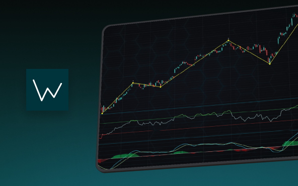
Elliott Wave Theory in Trading
Financial markets often appear chaotic, but many traders believe that price movements follow recurring patterns driven by human psychology. One of the most influential approaches based on this idea is the Elliott Wave Theory. Developed nearly a century ago, it remains one of the most widely studied methods of technical analysis.
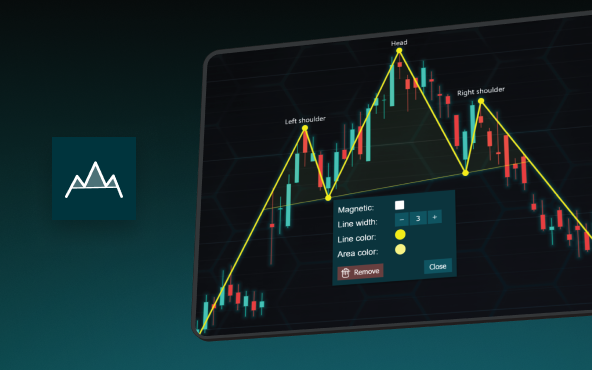
The Head and Shoulders Pattern in Technical Analysis
The Head and Shoulders Pattern in Technical Analysis The Head and Shoulders Pattern in Technical Analysis The Head and Shoulders pattern is one of the most recognized and widely used chart patterns in technical analysis. It is considered a reliable reversal pattern...


If you have any questions, feel free to contact us!
©LightningChart Ltd 2026. All rights reserved.