






Easy Geospatial Data Visualization with Google Maps & LightningChart
ArticleUsing the Google Static Maps API with LightningChart to create geospatial map charts.
Written by a human | Updated on April 10th, 2025
Geospatial Data Visualization
This article showcases and describes a particular use case of LightningChart JS for geospatial data visualization. LightningChart JS is a JavaScript charting tool designed for performance-intensive and real-time charting solutions.
The Google Static Maps API is a software service that makes it easy to embed pictures of maps into websites. We’re going to briefly show how to use the Maps API and combine it with LightningChart JS, allowing the use of any XY data visualization feature above the maps.
Getting started with Google Static Maps is quite easy. The only real obstacle is setting up a Google billing account. Thankfully, Google Maps allow a $200 monthly credit for everyone, so you can try the service without having to worry about costs. You can read more about the service at Google’s developers’ site.
When it comes to actual usage, the Maps API is extremely simple. Below is a minimal HTML code snippet, which already produces a nice-looking map.
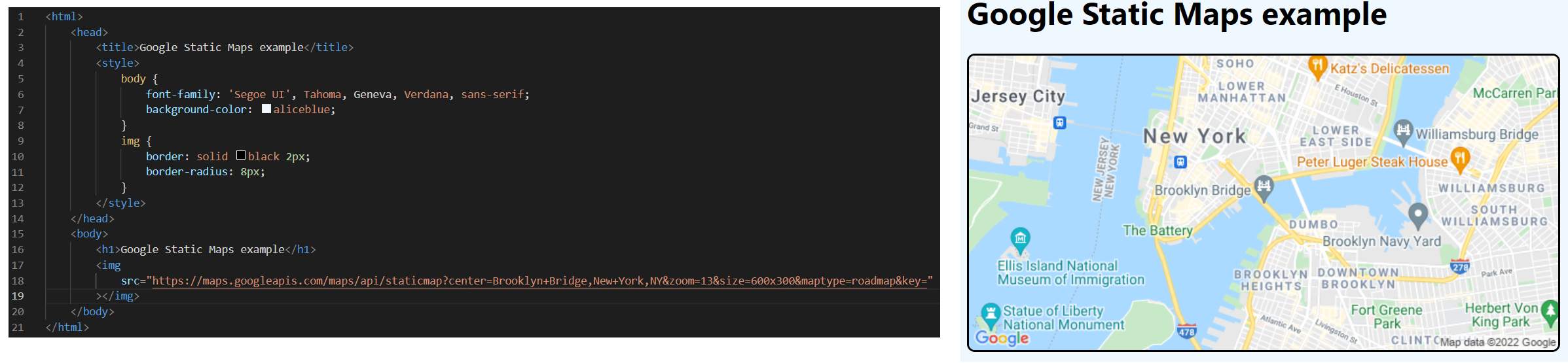
The basic idea is easy to understand – you provide coordinates (latitude/longitude or location name) and in turn receive a picture.

Integration with LightningChart JS
The next step in this use case is to overlay LightningChart XY data visualization features above the map picture. This makes it possible to add any of the 100+ available XY data visualization applications and render geospatial data visualization sets, using features such as scatter series, line series, heat maps, and more.
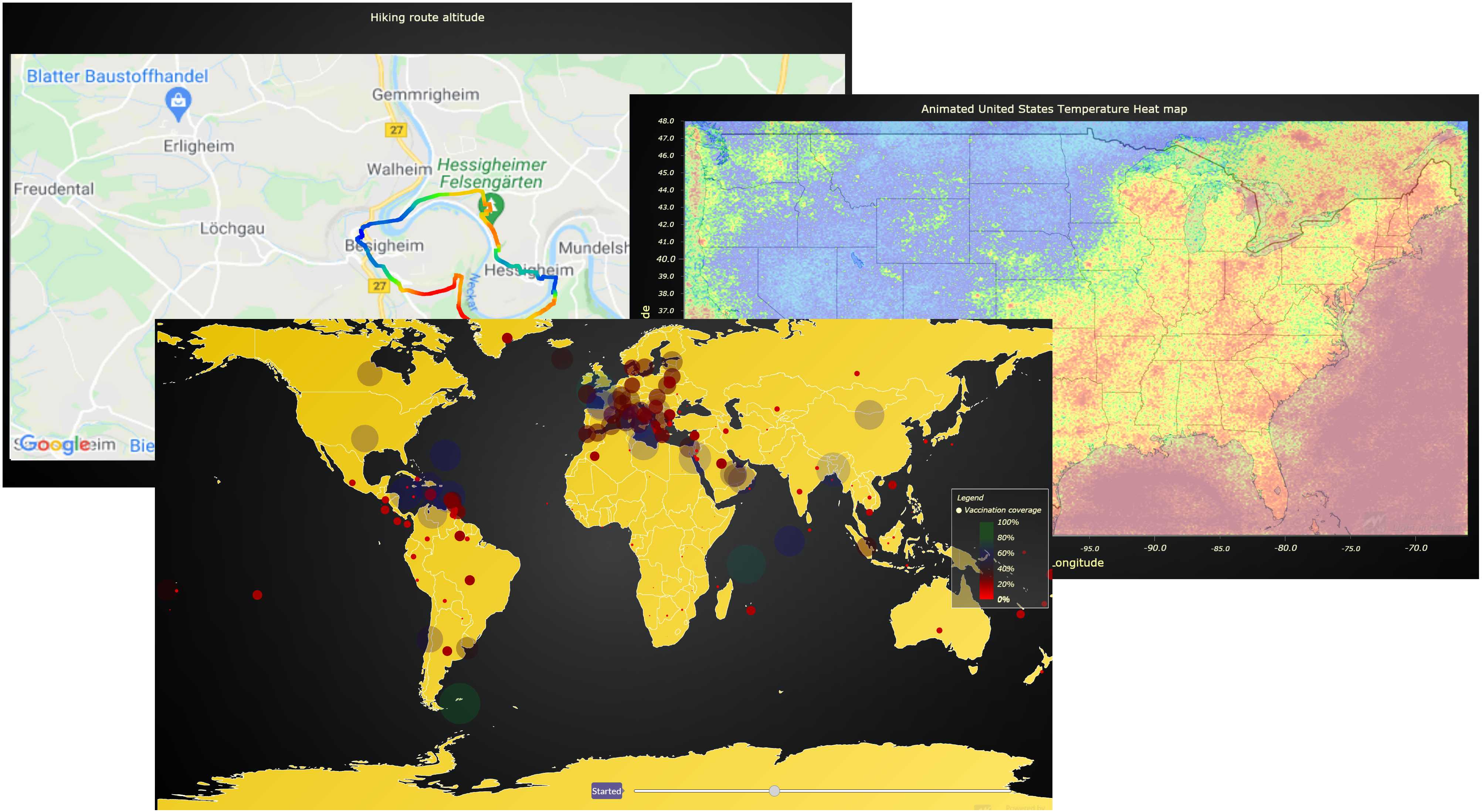
The way to connect LightningCharts and Google Maps is simple. You simply load the Maps picture in JavaScript and assign it to the series background style of a chart. Now we can see the map inside LightningChart JS.

The final step in enabling geospatial data visualization is to configure the chart axis intervals to match the latitude/longitude view of the map picture. With a bit of math, we are able to calculate the coordinates that match any pixel on the map picture from Google.
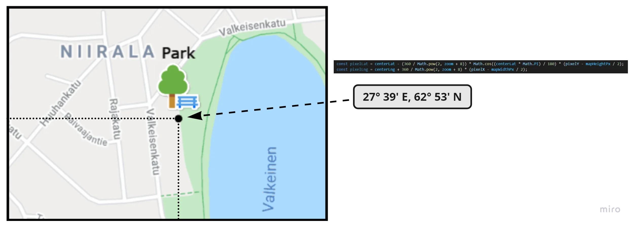
Afterward, we can visualize any location in the world by simply using the latitude/longitude coordinates as XY axis values!

So what is the geospatial data visualization technology good for?
The world is full of solutions for interacting and drawing on maps. In fact, there are so many that it can get you confused if you are a developer who is looking for a simple way to show a map and possibly some data on it.
We believe that the combination of LightningChart JS and Google Static Maps is suited for technically simple projects that should be implementable by senior as well as junior-level experienced developers.
The code referenced in this article is published as an open-source code repository, which anyone can freely experiment with. You can find it on GitHub. If you are new to LightningChart JS and its XY data visualization features, you can learn more on our product page.
For more alternative geospatial data visualization solutions, please check out our map examples gallery. In February 2022 we will be posting a rather large-scale update that will add several new and different items to these map examples, so stay tuned!

Niilo Keinänen
LightningChart JS CTO


Continue learning with LightningChart

Trend Lines in Trading
Trend lines are among the simplest yet most powerful tools in technical analysis. They help traders visualize market direction, identify potential support and resistance levels, and make more informed trading decisions. Despite their simplicity, trend lines remain a...
Best Python Charting Library in 2026
Python's charting ecosystem is large, overlapping, and regularly misunderstood. Most comparison guides stop at Matplotlib, Plotly, and Seaborn. This one goes further: it covers what happens when your datasets grow large, your update rates increase, or your chart types...
Best TradingView Charting Library Alternative
TradingView's charting libraries are the most visible option for fintech developers. Visibility is not the same as capability. This guide is for developers who have hit the wall on candle count limits, watermark restrictions, branding requirements, real-time...



If you have any questions, feel free to contact us!



©LightningChart Ltd 2026. All rights reserved.