


LightningChart JSEasy beginners tutorial for creating a JS Gauge chart
TutorialA simple JS data visualization tutorial that you can complete in 15 min or less
Written by a human | Updated on April 14th, 2025
JavaScript Gauge Chart
In this article, we’ll create a JavaScript gauge chart using LightningChart JS. The implementation of the project will be similar to other articles, such as the donut chart or the pie chart. I strongly recommend you check those and expand your command on creating simple JS charting applications.
Key aspects of gauge charts
Also known as a dial or speedometer chart, this type of chart is easy to understand and implement. Some of its characteristics are:
- Gauge charts focus on a single value and its progress compared to the total value of the measurement of a specific variable.
- It is simple to understand gauge charts thanks to their range and target markers that provide an extra context of what is being measured. That is, visualizing minimum, current, and maximum values.
- A gauge chart can use colors, gradients, and shades to help the user understand and experience.
- Gauge charts are straight to the point, information is simplified, and provides a focus on a single measurement.
As you may already be familiar with this type of chart, let’s begin with the project.
Project Overview
Here you can interact with the gauge chart. In the tutorial, you’ll find all the necessary properties to help you customize the look of it.
 Download the project to follow the tutorial
Local Setup
1. Download the initial template that will help us get started with this example.
2. After downloading the template, you’ll see a file tree like this:

3. Open a new terminal and run the npm install command:
As usual in a NodeJS project, you need to run the npm install command. That would be everything for our initial setup. Let’s code.
CHART.ts
Inside this file, we will have all the logic needed to create our chart, configure animations, and format the data.
1. Declare the constant lcjs that will refer to our @arction/lcjs library.
const lcjs = require('@arction/lcjs')2. Extract required classes from lcjs
const { lightningChart, GaugeChartTypes, Themes } = lcjs3. Creating the chart object
const gauge = lightningChart()
    .Gauge({
        theme: Themes.duskInLapland,
        type: GaugeChartTypes.Solid,
    })
    .setTitle('Annual sales goal')
    .setThickness(200)
    .setDataLabelFormatter(new Intl.NumberFormat('en-US', { style: 'currency', currency: 'USD' }))
    .setAngleInterval(225, -45)
Reviewing some of the parameters:
- Gauge: This is the class that will allow us to create the desired chart type.
- setTitle: determines the text that will be displayed as the title in the dashboard at the top part.
- Theme: here you can specify the theme colors. By default, LightningChart JS has a series of implementations that you can access via Themes. But for more, please refer to the Themes documentation.
- setDataLabelFormatter: This property defines a new number formatter for the data label.
- setThickness: defines the thickness of the gauge chart.
- setAngleInterval: it defines the interval of the gauge expressed in degrees.
4. Creating the gauge chart slices
const slice = gauge
    .getDefaultSlice()
    .setInterval(0, 400000)
    .setValue(329000)
    .setName('2023 sales')
With getDefaultSlice, we’ll call the slices of the gauge chart. setInterval will determine the interval used in the chart. setValue determines the value of the metric slice. And setName defines the name of the chart, for instance, you can use this property to display it in a legend box.
5. Legend box
const legend = gauge
    .addLegendBox()
    // Dispose example UI elements automatically if they take too much space. This is to avoid bad UI on mobile / etc. devices.
    .setAutoDispose({
        type: 'max-width',
        maxWidth: 0.3,
    })
In this step, we’re adding the inner legend box within the chart:
- setAutoDispose: this is a feature for responsiveness. It disposes of example UI elements automatically if they take too much space which helps avoid bad UX on small-screen devices.
- legendBoxBuilder: Collection of available LegendBox builders. To build LegendBoxes you must pass one of these to method: addLegendBox(). This method can be accessed through Charts, Dashboard, Etc.
6. Adding LegendBox
legend.add(gauge)It adds the legend box to the gauge chart.
Conclusion
As with other similar projects, you’ll have to open a new terminal (e.g., in Visual Studio) and run the npm start command. Then you’ll get a URL path to the local host and will be able to visualize your chart in your browser. So, as seen in this article, we created perhaps one of the simplest charts to develop in JavaScript at the beginner level.
However, each chart can have a different complexity depending on your client’s or project’s needs. Luckily, LightningChart JS allows us to perform the gauge chart in an easy way by just using the gauge() method, which shows how really useful the “lc js” library is.
Now think about it, a gauge chart made with pure JS and CSS would take more time to complete without even considering the low performance it will have. In such cases, LightningChart JS works perfectly in conjunction with the application where it needs to be implemented and guarantees only high-performance, great interactivity, and full customization.
Don’t forget about the theme catalog! Themes such as cyberSpace look really cool and modern and can make your chart look amazing without any need for external CSS classes. If you happen to need any extra help with your code, DM me on LinkedIn :)


Omar Urbano
Software Engineer
Continue learning with LightningChart

How to Create a Strip Chart
Written by a human | Updated on April 9th, 2025What is a Strip chart application and what are the modern equivalents to it? Before computers exist or were taking their first steps, a Strip chart was a way to visualize an analog electrical signal. Voltage was...
Data Visualization Template for Electron JS | LightningChart®
Updated on April 4th, 2025 | Written by humanAre you already building cross-platform applications with Electron JS? In some of our previous articles, we’ve worked on TypeScript projects where we created pie charts and vibration chart applications. And as we...
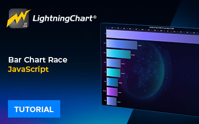
Bar chart race JavaScript
Updated on April 14th, 2025 | Written by humanBar chart race JavaScript When I wrote this article, the COVID-19 pandemic was at its peak point. Today, things are much better thanks to vaccinations that continued their steady positive global effect. With this bar...


If you have any questions, feel free to contact us!
©LightningChart Ltd 2026. All rights reserved.