


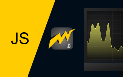
LightningChart JSAudio Signal Visualization
TutorialCreate an audio signal visualization featuring spectrum and waveform analyzers to visualize MP3 audio data using LightningChart JS
Written by a human | Updated on April 24th, 2025
Audio Signal Visualization
In today’s article, we will work with MP3 audio using tools from the Audio Web API to create an audio signal visualization. We will obtain the audio samples and use them to create the line chart data set that will give form to the audio signal visualization.
The audio signal visualization chart above will contain the Spectrum Analyzer on the upper side while the chart on the lower part will be the Waveform Analyzer. But before starting with the code, I think it would be good to get familiar with the concepts.
Spectrum Analyzer
A spectrum analyzer evaluates the strength of an input signal across the frequency range covered by the instrument and is typically presented in an audio signal visualization. Its primary function is to assess the power of the spectrum for both known and unknown signals. Typically, the input signal measured by most spectrum analyzers is electrical.
Waveform Analyzer
A waveform Analyzer is a software tool for visualizing the signal levels of a digital or analog circuit design. Waveform viewers come in two varieties:
- Simulation waveform viewers to display signal levels of simulated design models.
- In-circuit waveform viewers to view signal levels captured in-circuit during debugging or testing hardware boards.
What is a sample?
In signal processing, sampling is the reduction of a continuous-time signal to a discrete-time signal. A common example is the conversion of a sound wave into a sequence of “samples.” A sample is a signal value at a point in time and/or space.
¿How to measure a sample?
Sampling rates are typically measured per second in kilohertz (kHz) or cycles per second.
Project Overview
Here you can find the original audio signal visualization chart of the JavaScript Real-Time MP3 Visualization
 Download the project to follow the tutorial
Template Setup
1. Download the template provided to follow the tutorial.
2. After downloading the template, you’ll see a file tree like this:

3. Open a new terminal and run the npm install command
4. It is important to keep the configuration in the tsconfig.json file. This configuration will help you to import JSON files as data objects.
Getting Started
We recommend you use and update to the most recent versions of LightningChart JS and XYData. This is because some LightningChart JS tools do not exist in previous versions. In the project’s package.json file you can find the LightningChart JS dependencies:
"dependencies": {
"@arction/lcjs": "^5.2.0",
"@arction/xydata": "^1.4.0",
}
1. Importing libraries
We will start by importing the necessary libraries to create our chart.
const lcjs = require('@arction/lcjs')
const { lightningChart, Themes, emptyFill, PalettedFill, LUT, AxisTickStrategies, AxisScrollStrategies, emptyLine, regularColorSteps } = lcjs
2. Add license key (free)
Once the LightningChart JS libraries are installed, we will import them into our chart.ts file. Note you will need a trial license, which is free. We would then add it to a variable that will be used for creating the audio signal visualization object.
let license = undefined
try {
    license = 'xxxxxxxxxxxxx'
} catch (e) {}
Creating Containers
In this Project, we will use HTML containers. Containers are HTML components like DIVS, which will allow us to display a chart inside them. LC JS generates a component by default, called “chart”, which we must assign as the “parent” container.
const exampleContainer = document.getElementById('chart') || document.body
if (exampleContainer === document.body) {
    exampleContainer.style.width = '100vw'
    exampleContainer.style.height = '100vh'
    exampleContainer.style.margin = '0px'
}
The way to handle containers is the same as JavaScript handles HTML components, so, any property that you know could apply to this container.
Creating the charts
const lc = lightningChart({license: license})

const temporaryPanelAtStart = lc.UIPanel({
    container: exampleContainer,
    theme: Themes.cyberSpace,
})
For this type of chart, we need to use the UIPanel class which is a class for a panel that can have UI elements added into it. The container is the same one that we created in the previous steps.
Properties
.Chart3D({
        theme: Themes.cyberSpace,
    })
– Theme: defines the look and feel of your JS treemap chart. Note that you must specify the color theme of the chart components beforehand.
Now, we will create the start label:
const ui = temporaryPanelAtStart.addUIElement().setPadding(12).setText('Click anywhere to start playing audio').setMouseInteractions(false)
temporaryPanelAtStart.onBackgroundMouseClick((_) => startAudioVisualization())
const theme = temporaryPanelAtStart.getTheme()addUIElement: Add a stand-aloneUIElementusing a builder.
onBackgroundMouseClick: Subscribe to the mouse-click event on the Chart background.
We can use the function getTheme, to apply the same look and feel of the chart to this panel. When we click on the background, the startAudioVisualization method will be executed.
Audio Properties Setup
Up to this point, all the previous code is for the initial panel. Now, we will work with the main containers by removing the first panel. To delete an element in LC JS, you need to use the dispose function:
temporaryPanelAtStart.dispose()
    const containerChart1 = document.createElement('div')
    const containerChart2 = document.createElement('div')
    exampleContainer.append(containerChart1)
    exampleContainer.append(containerChart2)
    containerChart1.style.width = '100%'
    containerChart1.style.height = '50%'
    containerChart2.style.width = '100%'
    containerChart2.style.height = '50%'
Now we will create two new containers, one to display the sound frequency and the other to display the line chart of the audio signal visualization dashboard. If you notice, the height of both charts is divided in half, which results in one container above the other horizontally. We will need to upload an MP3 file that, in this example, we will directly collect from LightningChart’s server:
let audio1 = new Audio()
    audio1.crossOrigin = 'anonymous'
    audio1.src = 'https://lightningchart.com/js-charts/interactive-examples/examples/assets/0039/alex-productions-noise.mp3';
    const audioCtx = new (window.AudioContext || window.AudioContext)()
    let audioSource = null
    let analyser = null
The Null variables will help us with the following configuration:
audioSource = audioCtx.createMediaElementSource(audio1)
    analyser = audioCtx.createAnalyser()
    audioSource.connect(analyser)
    analyser.connect(audioCtx.destination)
    analyser.fftSize = 128
    audio1.play()
const bufferLength = analyser.frequencyBinCountThecreateMediaElementSourcemethod of the AudioContext Interface is used to create a new MediaElementAudioSourceNode object, given an existing HTML <audio> or <video> element, the audio from which can then be played and manipulated. More information on Mozilla’s website.
ThecreateAnalyser()method of the BaseAudioContext interface creates anAnalyserNode, which can be used to expose audio time and frequency data and create the audio signal visualizations of mp3 data. See more information.
The connect() method of the AudioNode interface lets you connect one of the node’s outputs to a target, which may be either another AudioNode. See more information. The fftSize property of the AnalyserNode interface is an unsigned long value and represents the window size in samples that are used when performing a Fast Fourier Transform (FFT) to get frequency domain data.
The frequencyBinCount read-only property of the AnalyserNode interface contains the total number of data points available of the AudioContext sampleRate. This is half of the value of the AnalyserNode.fftSize. The two methods’ indices have a linear relationship with the frequencies they represent, between 0 and the Nyquist frequency.
Creating Spectrum Analyzer
The sound frequency of this audio signal visualization will be displayed within an XY chart. XY charts are two-dimensional objects and therefore, any object that we want to display that has X-Y values and is two-dimensional, will have to be used in a chart of this type.
const chartFrequency = lc
        .ChartXY({
            container: containerChart1,
        })
        .setTitle('Alex-Productions - Noise')
        .setTitlePosition('series-right-top')
        .setPadding(30)
        .setMouseInteractions(false)
This audio signal visualization chart will be assigned to container number 1 which we created in the previous step. Now we will color the object of analysis:
const palette = new PalettedFill({
        lookUpProperty: 'y',
        lut: new LUT({
            interpolate: true,
            steps: regularColorSteps(0, 200, theme.examples.spectrogramColorPalette),
        }),
The spectrogramColorpalette property allows us to obtain a color palette for spectrograms in relation to the current theme colors.

For example, the colors on the left spectrogram correspond to the theme lightNature, while the one on the right corresponds to cyberSpace. Custom colors can be assigned using the Steps property which is an array with two values (Y Value, Color):
steps: [
	{ value: 0, label: '0', color: ColorHSV(0) },
	{ value: 127.5, label: '70', color: ColorHSV(120) },
	{ value: 255.0, label: '140', color: ColorHSV(240) },
]
Now, add a line series to the chart that we just created and choose a dotted line and specify its data pattern as progressive X:
const seriesFrequency = chartFrequency
        .addPointLineAreaSeries({ dataPattern: 'ProgressiveX' })
        .setCurvePreprocessing({ type: 'spline', resolution: 10 })
        .setPointFillStyle(emptyFill)
        .setAreaFillStyle(palette)
        .setCursorEnabled(false)
    const axisY = chartFrequency.getDefaultAxisY().setInterval({ start: 0, end: 256 })
    chartFrequency.forEachAxis((axis) => axis.setTickStrategy(AxisTickStrategies.Empty).setMouseInteractions(false))
Data patterns are used to select specific types of datasets that allow powerful performance optimizations and behavioral improvements. For example, the most common is ProgressiveX which means that every sample has a larger X coordinate than the previous one.
setCurvePreProcessing.spline: Interface which can be used to describe a preprocessing mode for Spline series. This is a variant of line series, where the transitions between data points are interpolated with Bezier curves. We will also specify the limit of the Y-axis, which will be 256 samples. The axes will have no strategy since we do not want to display any date or number values (the line chart will take care of this).
Creating the Waveform Analyzer
Now we will create the line chart. The initial setup is like the spectrum chart, so I’ll explain what hasn’t been seen before:
const chartWaveform = lc
        .ChartXY({
            container: containerChart2,
        })
        .setTitle('')
        .setPadding(30)
    const seriesWaveform = chartWaveform
        .addPointLineAreaSeries({
            dataPattern: 'ProgressiveX',
            allowInputModification: false,
        })
        .setMaxSampleCount(100_000)
        .setPointFillStyle(emptyFill)
        .setAreaFillStyle(emptyFill)
        .setCursorEnabled(false)
Container 2 is assigned to this chart. We don’t need Areas or Points, so they will not have color filling. setMaxSampleCount: This allocates the required amount of memory beforehand, which is crucial to obtain the best performance. After 1 million samples are reached, the oldest samples will start dropping out. Alternatively, if you are uncertain about what value to use and don’t want to allocate too much memory up-front, you can start small and automatically increase the buffer size as samples flow.
chartWaveform
        .getDefaultAxisX()
        .setScrollStrategy(AxisScrollStrategies.progressive)
        .setTickStrategy(AxisTickStrategies.Time)
        .setDefaultInterval((state) => ({
            start: (state.dataMax ?? 0) - 5_000,
            end: state.dataMax,
            stopAxisAfter: false,
        }))
        .fit(false)
In this chart, we will display values for the X axis. Since we are going to analyze audio, it is logical to see second-by-second data points of the audio signal visualization. The interval will start at zero and end with the maximum value of the data set that will be assigned later.
Generating Data Points
We will start by declaring some variables that will help us with some properties:
const dataArrayFrequency = new Uint8Array(bufferLength)
    const dataArrayTimeDomain = new Float32Array(analyser.fftSize)
    let tPrev = undefined
    const tFirst = performance.now()
    let framesCount = 0
    const title = chartFrequency.getTitle()
Now we will create the frame() function:
const frame = () => {
        const tNow = performance.now()
        if (tPrev) {
            analyser.getByteFrequencyData(dataArrayFrequency)
            analyser.getFloatTimeDomainData(dataArrayTimeDomain)
            seriesFrequency.clear().appendSamples({
                yValues: dataArrayFrequency,
            })
This function will create the data points with the help of the dataArrayFrequency and dataArrayTimeDomain arrays. This process will be recursive and will be executed as long as the last value exists. The getByteFrequencyData() method of the AnalyserNode interface copies the current frequency data into a Uint8Array (unsigned byte array) passed into it.
The getFloatTimeDomainData() method of the AnalyserNode Interface copies the current waveform, or time-domain, data into a Float32Array array passed into it. Each array value is a sample, the magnitude of the signal at a particular time. For each execution of frame(), the seriesFrequency chart will be updated, cleaning the points and adding the most recently generated ones.
Now we will update the line chart (waveform):
const waveformTimestamps = new Array(dataArrayTimeDomain.length)
                .fill(0)
                .map((_, i, arr) => tPrev + ((tNow - tPrev) * (i + 1)) / arr.length)
            seriesWaveform.appendSamples({
                xValues: waveformTimestamps,
                yValues: dataArrayTimeDomain,
})dataArrayTimeDomain array, calculating the time of the next point based on the current time minus the previous time. Finally, we will update the FPS value of the frequency chart:const fps = 1000 / ((tNow - tFirst) / framesCount)
chartFrequency.setTitle(`${title} - ${fps.toFixed(0)} FPS`)We update the values for the following recursion:
requestAnimationFrame(frame)
        tPrev = tNow
        framesCount += 1
    }
    frame()
Finally, run the NPM START command on a new terminal to open the project on your local host.
Conclusion
We have completed this exercise. The chart is an excellent way to practice working with HTML containers. Additionally, we got some experience loading and analyzing an audio file. Thanks to the Audio Web API, we were able to load the file and extract key properties to generate our data points.
I believe the frame function can serve as a general-purpose tool for any other audio-related projects. On the LightningChart JS side, creating the charts was the easiest part. We just needed to specify the chart type, configure the axes, and add the data sets.
When I began working on this article, I initially thought that manipulating audio would be very complex. However, it turned out to be simpler than I expected. Of course, I had to do some research, but fortunately, the Mozilla site offers clear documentation with easy-to-follow examples.
I hope this exercise has been helpful. See you in the next one, goodbye!

Omar Urbano
Software Engineer
Continue learning with LightningChart
Visualizing 10 Million Data Points in the Browser (2026): The Technical Deep-Dive
Ten Million Data Points in the Browser: How WebGL Makes Mass Datasets Interactive Ten million data points. That number used to mean a database problem, not a front-end problem. Now research teams want to explore it interactively in a browser. Trading desks want...
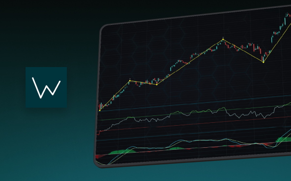
Elliott Wave Theory in Trading
Financial markets often appear chaotic, but many traders believe that price movements follow recurring patterns driven by human psychology. One of the most influential approaches based on this idea is the Elliott Wave Theory. Developed nearly a century ago, it remains one of the most widely studied methods of technical analysis.
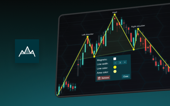
The Head and Shoulders Pattern in Technical Analysis
The Head and Shoulders Pattern in Technical Analysis The Head and Shoulders Pattern in Technical Analysis The Head and Shoulders pattern is one of the most recognized and widely used chart patterns in technical analysis. It is considered a reliable reversal pattern...


If you have any questions, feel free to contact us!
©LightningChart Ltd 2026. All rights reserved.