


Analyzing Economic Indicators with LightningChart Python Trader
Tutorial
Written by a Human
Discover how LightningChart Python Trader simplifies the process of analyzing economic indicators for better trading decisions.
Mikael Virtanen
Data Science Python Developer

Introduction
This article is a demonstration of the charting features included in LightningChart’s Python trader (PT) library. The library will be used to visualize data from Alpha Vantage’s economic indicators API. The process will explain how to operate the API and import data to Python trader, as well as how to generate and customize charts in it.
The API – Alpha Vantage
The Alpha Vantage API provides free access to most of its APIs with a limit of 25 API calls per day. This includes data on stocks, options, forex and crypto from several exchanges, with historical data covering the last 20 years. Both adjusted and unadjusted data are available in their stock API. This demonstration will focus on their commodities API exclusively.
There is a 15-minute delay in the stock data for the free and cheapest premium subscriptions, thus putting one at a disadvantage if wanting visualize data in real-time. Additionally, the limit of 25 calls per day can be problematic when testing the functionality of the API. The premium subscriptions start at $50 / month (75 API calls per minute).
The economic indicators offered by Alphavantage are: Real GDP, Real GDP per capita, Treasury Yield, Federal fund interest rate, CPI, Inflation, Retail sales, Durable goods orders, Unemployment rate, and nonfarm payroll. Depending on the indicator different parameters are available in the API. For example, some of them offer data points in certain time intervals (monthly, quarterly, annual, etc.). It should also be noted that the indicators are based on data from the US.
Plotted variables
Python trader requires Open, High, Low, Close (O, H, L, C) values to work (as well as a date). However, most of the indicators(all?) do not return all of these. Only Price and a date. A workaround for this will be presented later in the article.
API parameters
Not all of these are available for all of the series, and available values also vary.
‘function’ = name of the data series of choice. For example, “REAL_GDP”.
‘interval’ = time interval between data points. Not available for all series. Available options also vary between series. Consult Alphavantage’s documentation for detailed options.
‘datatype’ = In what form the data is given. JSON and CSV are available. Optional defaults to JSON.
‘apikey’ = your api key. Either the free or the premium license.
‘maturity’ = Yield to maturity of the bond. Available in time ranges of 3 months, 2 / 5 / 7 / 10, and 30 years.
LightningChart Python Trader
LightningChart’s Python Trader (PT) provides extensive charting solutions with a high degree of customizability through its easy-to-use UI and built-in functionalities. Since the library is built for Python, it’s also possible to use other Python libraries if necessary.
As with all Lightningchart products, Performance has been a high priority when developing the library, even when working with large amounts of data, thus removing possible bottlenecks in this area.
Overview of the UI

Above is the PT user interface with stock data charted using the default candlestick chart. On the top left are controls used to customize the chart and work with datasets. Here is the explanation for all the UI controls:

Charting features
These are chart types of Python trader provides out of the box.

Chart types can be changed with the the UI or with the set_price_chart_type(chart_type) command. Available ones are ‘CandleStick’, ‘Bar’, ‘Line’, ‘Mountain’, ‘HeikinAshi’, ‘Renko’, ‘Kagi’, and ‘PointAndFigure’. For example, a mountain creating a mountain chart using the following methods:
trader.set_price_chart_type('Mountain')
trader.add_data_array(data)
trader.open()
Chart visuals can be customized using the Python trader UI. Below are available settings for chart and indicator colours, background colour/image etc.


Default chart colours.

Background and indicator colours changed

Chart customization
Customisation can also be done with code, using the built-in methods. The code below changes the background image and the chart colours to the ones seen in the right image. But why use code for customisation, since working with UI is easier?
trader.set_color_theme('cyberSpace')
# Changing the indicator colours for the candlesticks
trader.set_positive_body_color('#0fdf0c')
trader.set_positive_wick_color('#33d7a0')
trader.set_negative_body_color("#f3eb16")
trader.set_negative_wick_color('#b85900')
When the customization is applied on code level there’s no need to change any settings or load a template. Meaning you won’t have to make the changes every time when opening a chart. Python trader supports the use of templates for customization, and these files can be loaded in with code.
However, you still need to manually select the file, and in case you want to share the chart the template file would also need to be shared. When the changes are done in code, only it needs to be shared to get the same results.
Technical indicators
Python trader supports over 100 technical indicators. These include ones such as Relative Strength Index (RSI), Bollinger bands, Moving averages (SMA, EMA etc), Oscillators for money flow and price, Fibonacci retracements, as well as statistical ones like Standard deviation. Technical indicators can be added to a chart easily with the trader UI, their properties (period count, standard dev) can also be changed the same way.

These indicators can also be added and customized via code.
trader.add_simple_moving_average(period_count=14)
trader.add_bollinger_band(period_count=14)
Indicators such as the Fibonacci patterns can be added with the built-in draw tools. Other markers can also be added this way. To see all the indicators, refer to the documentation.

Setting Up Python Environment
First off, make sure that the Python Trader library is installed. You will also need a license key to use it, as well as one for the API.
import requests
from lightningchart_trader import TAChart
license_key_path = "Python-Trader_License_key.txt"
# Load the license key and initializing Python trader
license_key = open(license_key_path).read()
trader = TAChart(license_key)
# api_name is the APi you wish to use for data eg: TIME_SERIES_DAILY. 'ticker' is the ticker specific stock eg: AAPL
# key is your Alphavantage API key
# https://www.alphavantage.co/query?function=api_name&symbol=ticker&apikey=key
api_key_path = "API-key.txt"
# Load the license key
key = open(api_key_path).read()
Get data from the API
def get_data(api_name: str, data_interval: str):
    """Make an API call using the following parameters """
    # API call url, recieved as JSON then converted to a Python dictionary
    call_url = f'https://www.alphavantage.co/query?function={api_name}&interval={data_interval}&apikey={key}'
    api_response = requests.get(call_url).json()
    print(api_response)
    # Parsing the data from the API
    data_list = []
    for entry in api_response['data']:
      date = entry['date']
      # Some entries are empty thus should not be processed.
      if entry['value'] != '.':
         price_data = float(entry['value'])
         # Python trader requires open,high,low,close and a date to work properly.
         # The commodities API doesn't return all of them only single price value and a date
         # This can be circumvented, just remember that some charts/indicators won't work
         # Add the new dictionary to a list
         data_list.append({'open': price_data,
                           'high': price_data,
                           'low': price_data,
                           'close': price_data,
                           'date':date})
    trader.set_chart_title(f'{api_response['name']} data {data_interval}')
    # Import the list of dictionaries to Python Trader
    trader.set_data(data_list)
Next is the API call for the data. The query used in the call consists of the variables discussed previously and is assigned to a variable ‘url’. The requests library is used to make the call, and the json() function turns the returned string into a Python dictionary that can be worked with easily. Before the data can be imported to the trader, it needs to be formatted and converted to a float.
#Function used to get data from the API
def getCommData():
    url = 'https://www.alphavantage.co/query?function='+CAPI_NAME+'&apikey='+apiKey
    #Making the API call
    print(url)
    r = requests.get(url)
    r = r.json()
    print(r)
Using the for loop, go over all items in the dictionary and convert them from string to float. Some of the value fields the API returned were empty and only had ‘.’ In them. The if statement ensures that any fields won’t be entered into the chart.
Python trader requires the values open, high, low, close, and a date to function. The API does not provide all these values. Simply assign the price value to all the fields. Then append the dictionary to the data list. After this, the data is ready to be imported. Finally, set the data list as the chart’s source, and then everything is ready.
Visualizing Economic Indicators
Now, we can start analyzing economic indicators using Alpha Vantage’s API and LightningChart Python.
Mountain chart of gross domestic product between 2002-2025.
Data point interval set for every quarter.

def open_chart1():
    """GDP data"""

    get_data('REAL_GDP', 'quarterly')
    trader.set_color_theme('darkGold')
    trader.set_line_color("#B69E00")
    trader.set_price_chart_type('Mountain')
    trader.open()
Mountain Chart Monthly Intervals
Same as the last chart, but with a yearly instead of a monthly interval. The data is from the first day of each year, which is why the time plot is slightly odd.

def open_chart2():
    """GDP data"""

    get_data('REAL_GDP', 'annual')
    trader.set_color_theme('darkGold')
    trader.set_line_color("#B69E00")
    trader.set_price_chart_type('Mountain')
    trader.open()
Gross domestic product per capita
For this chart, the data starts in 1947. The second chart is the same data but zoomed to only include the period between 2002-2025.


def open_chart3():
    """GDP per capita"""

    get_data('REAL_GDP_PER_CAPITA', 'quarterly')
    trader.set_color_theme('turquoiseHexagon')
    trader.set_line_color("#0EE936")
    trader.set_price_chart_type('Line')
    trader.open()
Inflation Line Chart
A line chart showing inflation data. The series goes all the way back to 1960, but the chart scope is set to 1999-2024 via the Python Trader UI.

def open_chart4():
    """historical inflation"""

    get_data('INFLATION', 'quarterly')
    trader.set_color_theme('turquoiseHexagon')
    trader.set_line_color("#E92F0E")
    trader.set_price_chart_type('Line')
    trader.open()
Mountain Chart of Unemployment
Another mountain chart, this one representing unemployment. Note the massive jump in 2019/2020 caused by COVID. The Fibonacci extension was added via the Python trader draw tool.

def open_chart5():
    """GDP per capita"""

    get_data('UNEMPLOYMENT', 'quarterly')
    trader.set_color_theme('darkGold')
    trader.set_line_color("#00CE6B")
    trader.set_price_chart_type('Line')
    trader.open()
Conclusion
Due to Python Trader needing the OHLC values, plotting data that does not have all of them can be tricky. It is possible to overcome this issue and still make a meaningful visualization. Also, as many of the charts are supposed to calculate differences in price movements, their usage when talking about economic indicators could be unwise. However, the mountain and line charts can still be used alongside the technical indicators and Python Trader’s draw tools.
Continue learning with LightningChart
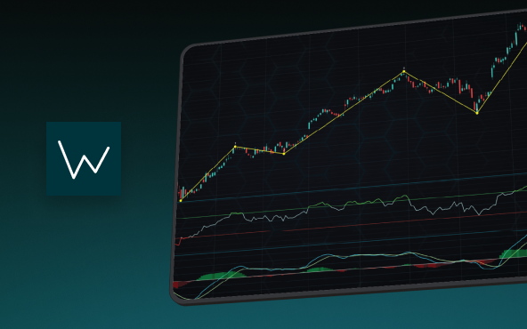
Elliott Wave Theory in Trading
Financial markets often appear chaotic, but many traders believe that price movements follow recurring patterns driven by human psychology. One of the most influential approaches based on this idea is the Elliott Wave Theory. Developed nearly a century ago, it remains one of the most widely studied methods of technical analysis.
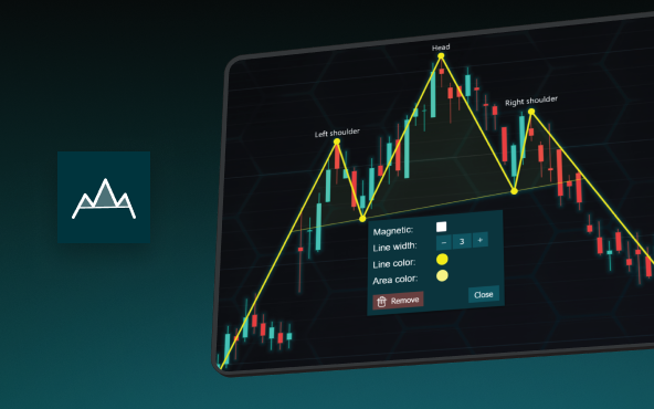
The Head and Shoulders Pattern in Technical Analysis
The Head and Shoulders Pattern in Technical Analysis The Head and Shoulders Pattern in Technical Analysis The Head and Shoulders pattern is one of the most recognized and widely used chart patterns in technical analysis. It is considered a reliable reversal pattern...
Best Telerik Charts Alternative in 2026: GPU Performance for WPF, WinForms, and Web
Telerik from Progress is a comprehensive UI component suite covering WPF, WinForms, ASP.NET, Blazor, and JavaScript. The charting components: RadChartView for WPF and WinForms, and Kendo UI Charts for web and Blazor, arrive bundled with the suite purchase. For teams...


If you have any questions, feel free to contact us!
©LightningChart Ltd 2025. All rights reserved.