LightningChart JSHeatmaps Performance Comparison
ComparisonPerformance benchmark for heatmaps from different JS charting libraries.
Introduction to the JS heatmaps performance comparison
NOTE: This is an older performance comparison document. Please, always refer to the latest LightningChart JS version and the latest performance results.
This benchmarking comparison of different JavaScript heatmaps was performed in early September 2021 and has received multiple updates, the latest in April 2024. This test is a performance comparison between 6 different charting providers that includes charting libraries from major manufacturers who classify their charts as high-performance or the fastest.
The main goal was to demonstrate the performance and data handling abilities of different commercial charting libraries’ heatmaps compared to LightningChart JS heatmaps. The libraries tested were:
- LightningChart JS v.3.3.0
- LightningChart JS v.3.1.0
- Highcharts 9.1.0 (boost module enabled)
- SciChart JS v.1.4.1633
- ECharts 5
- ZingChart 2.9.3
The different test types are repeated with increasing stress levels until the application is no longer responsive. Stress level is defined as the size of the heatmap, which is equal to the number of columns (values along the X-axis) times the number of rows (values along the Y-axis). For example, a 100×100 heatmap will always have 10,000 data points in total.
The wide use of heatmaps is to visualize 3 dimensions by plotting two dimensions to a given X&Y location that will be color-coded based on a 3rd data dimension. The performance comparison was carried out within 2D grid heatmaps that can be categorized into three different types too. These three types are Static, Refreshing, and Appending heatmaps.
The tests were made according to examples and tutorials, and all of them have been carried out under optimal conditions. If you notice any problem, please inform us and we will make the appropriate fixes. Each type of heatmap has particular performance metrics that set a benchmark of success/failure amongst charting libraries. The full test open-source project can be accessed from GitHub.
Hardware & System Specifications

SoC/CPU
RAM
GPU
Screen Resolution
Screen Refresh Rate
Browser
AMD Ryzen 9 5900X processor
32 GB
Nvidia GeForce RTX 3080
2560 x 1440 resolution
165 Hz
Chrome
The device hardware and operating system specifications are considered for programming-oriented devices. These specifications must be taken as a reference.
Static Heatmaps
For Static Heatmaps, the dataset is loaded and rendered based on a colored look-up table. We measure two parameters:
- Frames Per Second (FPS): times the visualization is updated per second. At least 40 FPS (or more), is considered a good real-time performance.
- Load-up Speed: a parameter measured in seconds that tells how many seconds the chart takes to be fully visible to the user once the rendering procedure is initiated.
Performance Results
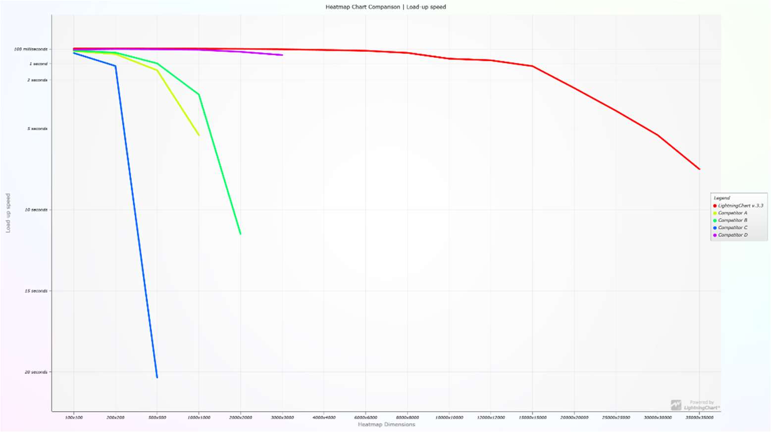
In the next image, the X-axis represents the size of the dataset whereas, the Y-axis represents the loa-up speed. The farther the line lands in the plot, the faster the load-up speed. Each line drawing represents the amount of data that each library is capable of handling, demonstrating by far, that the latest version of LightningChart JS v.3.3.0, can handle the largest amount of data. LightningChart JS v.3.3.0 can handle 35,000 x 35,000 data points, that is, 1,225,000,000 data points.
Table Results
Green = Good. Yellow = satisfactory. Red = struggling
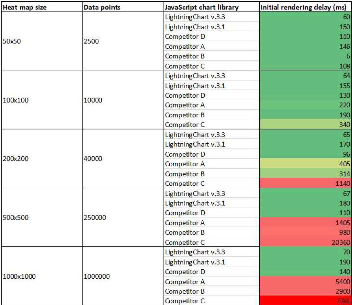
Within the next three images, it can be appreciated the comparison between the different charting libraries for JavaScript Static Heatmaps. In the first image, at a heatmap size of 50 x 50 (2,500 data points), all libraries successfully render, however, at a different initial rendering delay time (measured in ms). LightningChart JS v.3.3 has an initial rendering delay of 60 ms.
The second image demonstrates what are the initial rendering delay times for the six libraries at 36, 64, 100, and 144 million data points. Ultimately, when rendering 144 million data points the only two libraries that remain in the game are both LightningChart JS v.3.3 and v.3.1 with initial rendering delay times of 790 ms and 3340 ms, respectively.

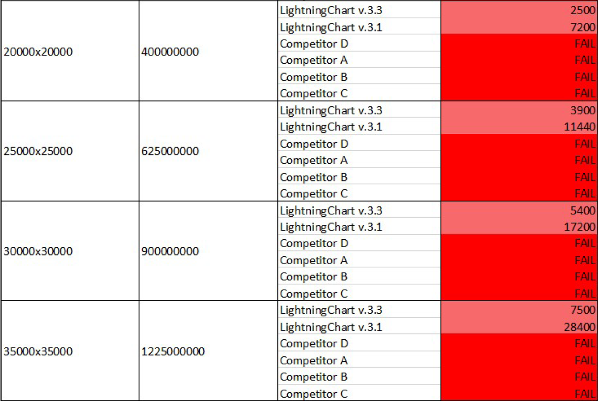
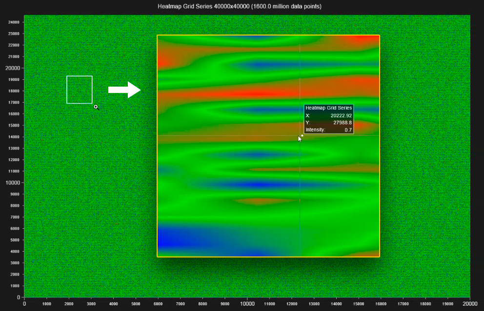
Finally, the last image shows how different JavaScript charting libraries respond to the data-intensive heatmap visualizations when pushed to the limits. When visualizing 1,2 billion data points, LightnigChart v3.3 has an initial rendering delay of 7,500 ms, another library to successfully complete the test is LightningChart JS v.3.1.
Refreshing Heatmaps
For Refreshing Heatmaps, we measured the following parameters:
- Frames Per Second (FPS): times the visualization is updated per second. At least 40 FPS (or more), is considered a good real-time performance.
- CPU usage %: This is a percentage-based value between 0 and 100 which indicates how much processing power the chart uses. Lower values are better.
- Maximum amount of data: Based on the data intake the chart will be able to function with or exceed its capabilities. When exceeding the chart capabilities, the browser may end up crashing or running out of memory.
Performance Results
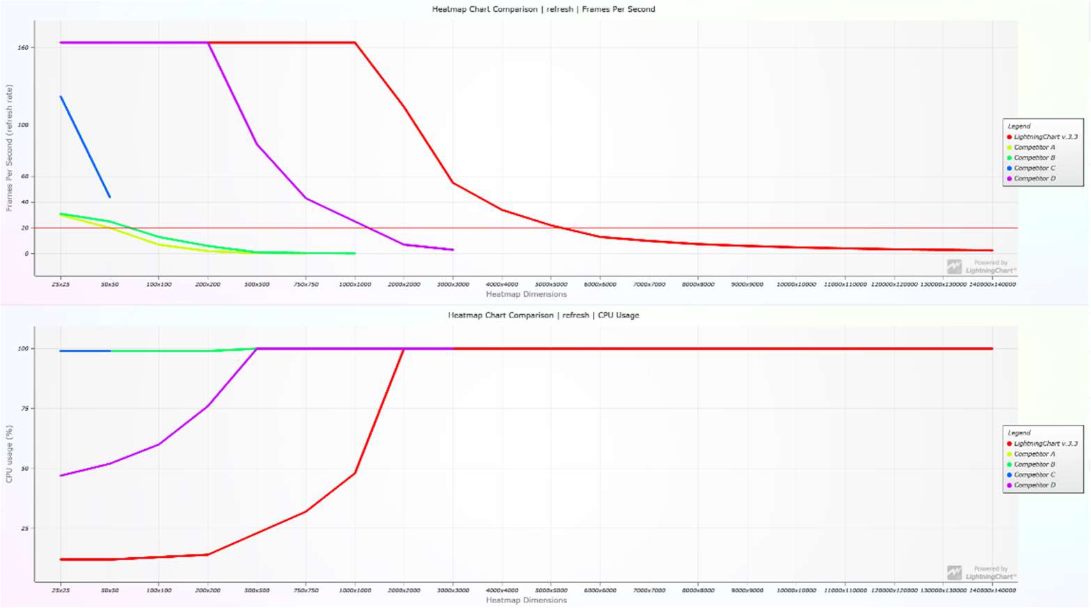
The importance of this test relies on how fast the data can be refreshed, the faster the better. The following two images display LightningChart JS performance against other charting libraries with increasingly heavy real-time heatmap applications.
The next bar chart indicates the Maximum heat map size where the library could function with satisfactory performance. For example, LightningChart JS v.3.3 performed well until 6000×6000 refresh data points.
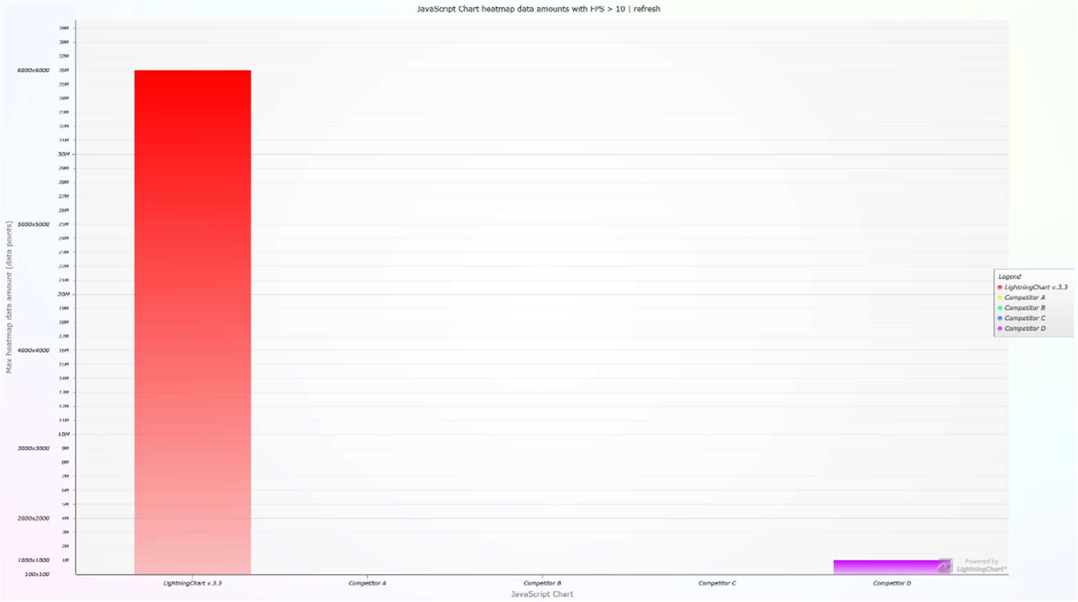
Table Results
Green = Good. Yellow = satisfactory. Red = struggling
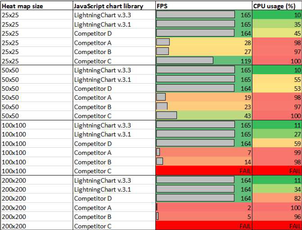
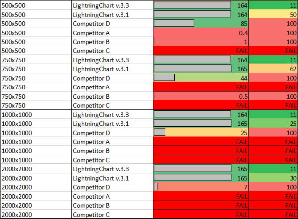
Within the next images, the FPS and CPU are demonstrated as a result of a specified heatmap size. At the beginning of the tests, all the involved charting libraries successfully rendered at different FPS and CPU usage, being LightningChart JS v3.3 and v.3.1 are two of the three libraries with the highest FPS of 164 Hz. LightningChart JS v.3.3 had the lowest CPU usage % with only 12%.
When visualizing 500 x 500 (250 million) data points, both versions of LightningChart and competitor D are the only libraries capable of rendering such a large dataset. Also when visualizing 250 million data points, we can see that the only library capable to continue handling side processes is LightningChart JS v.3.3 as it has the lowest CPU usage % of 23%.

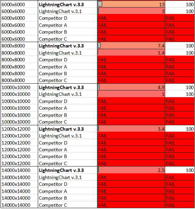
Finally, when pushing the test to the limits and visualizing 14,000 x 14,000 (196 million) data points, the only library capable of rendering such a large dataset is LightningChart JS v.3.3.
Appending Heatmaps
For Appending Heatmaps, we measured the following parameters:
- Frames Per Second (FPS): times the visualization is updated per second. At least 40 FPS (or more), is considered a good real-time performance.
- CPU usage %: This is a percentage-based value between 0 and 100 which indicates how much processing power the chart uses. Lower values are better.
In these tests, the real-time data is streamed into the heatmap and displayed as fast as possible. 1 column is added between every refresh.

The bar chart represents a visualization of the appending heatmap benchmark results. The bar height indicates the maximum heatmap size where the library functioned with satisfactory performance (refresh rate > 10 / second).

Table Results
Green = Good. Yellow = satisfactory. Red = struggling
The third test of this performance comparison for JS libraries shows how appending heatmaps behave to a given amount of data points as well as the FPS rendering and CPU usage.
For instance, at the beginning of the test for the appending heatmaps, all the libraries successfully render with the remarkable observation that competitors A, B, and C have the lowest FPS render.
When referring to CPU usage, competitors A, B, and C are almost at their full capacity of CPU resource consumption at the lowest number of data points in the test, proving their poor performance.
In the second picture, the test is pushed to the extreme when asking the JS libraries to visualize 12,000 x 12,000 (144 million) data points. At this stage, the only remaining player is both LightningChart JS v.3.3 and LightningChart JS v.3.1. with an outstanding FPS of 164 Hz and only 13% of CPU usage. LightningChart JS v.3.1 achieves similar results.
Conclusion
Different chart charting libraries have their strengths and selling points, but LightningChart’s strength is the exceptional rendering performance, allowing it to build advanced and data-intensive applications, visualizing heatmap charts in just about any application. This performance comparison has been made to demonstrate the capabilities that the developer and consequently the end-user, can enjoy when implementing LightningChart JS library into their workflow.
Remarkable observations
In Static Heatmaps, LightningChart JS v3.3:
- is on average, 10x faster than other charting libraries when passing the 500 x 500 threshold.
- can visualize 30,000 x 30,000 (900 million) data points in only 5 seconds.
- can render 2,000x more data than the average non-hardware accelerated competitor.
- can render 100x more data than the closest hardware-accelerated competitor.
In real-time Heatmaps (Refreshing & Appending), LightningChart JS v.3.3:
- can visualize 14,000 x 14,000 data points in refreshing heatmaps without problems or crashing.
- processes 468 million data points per second in refreshing heatmaps when rendering 14,000 x 14,000 data points.
- in appending heatmaps, LightningChart JS visualizes 1.2 billion data points at 140 FPS!
For appending heatmaps, LightningChart JS is 35,000x more efficient than hardware-accelerated competitors’ charts. For appending heatmaps, LightningChart JS is 1,000,000x more efficient than non-hardware accelerated competitors’ charts.
