



Using Scale Breaks in Data Visualization
Starting from LightningChart® .NET version 8, X axes has supported Scale breaks. Scale breaks allow excluding specific X ranges, e.g. inactive trading hours/dates or machinery off-production hours. In effect, scale breaks allow you to visualize the data effectively on situations when part of the data is uninteresting. When scale breaks are used, all the series that have been assigned to the specified X axis, are clipped at the defined break, including axis and labels themselves.
Break Gap width and style can be adjusted freely. One option is set no gap, and thus let the data values jump directly to the new values. This is useful when the breaks are used to remove static data values.
As an example, let’s inspect a case of using scale breaks to visualize a set of trading data. You can find the demonstrated example on our demo application, and modify the settings yourself on the fly, and see the effects instantly.
Example trading data with stock values as a function of time, without any breaks, can be seen in Picture 1. Majority of the time range doesn’t have data as stock exchange has been closed, making it harder to see the essential info.
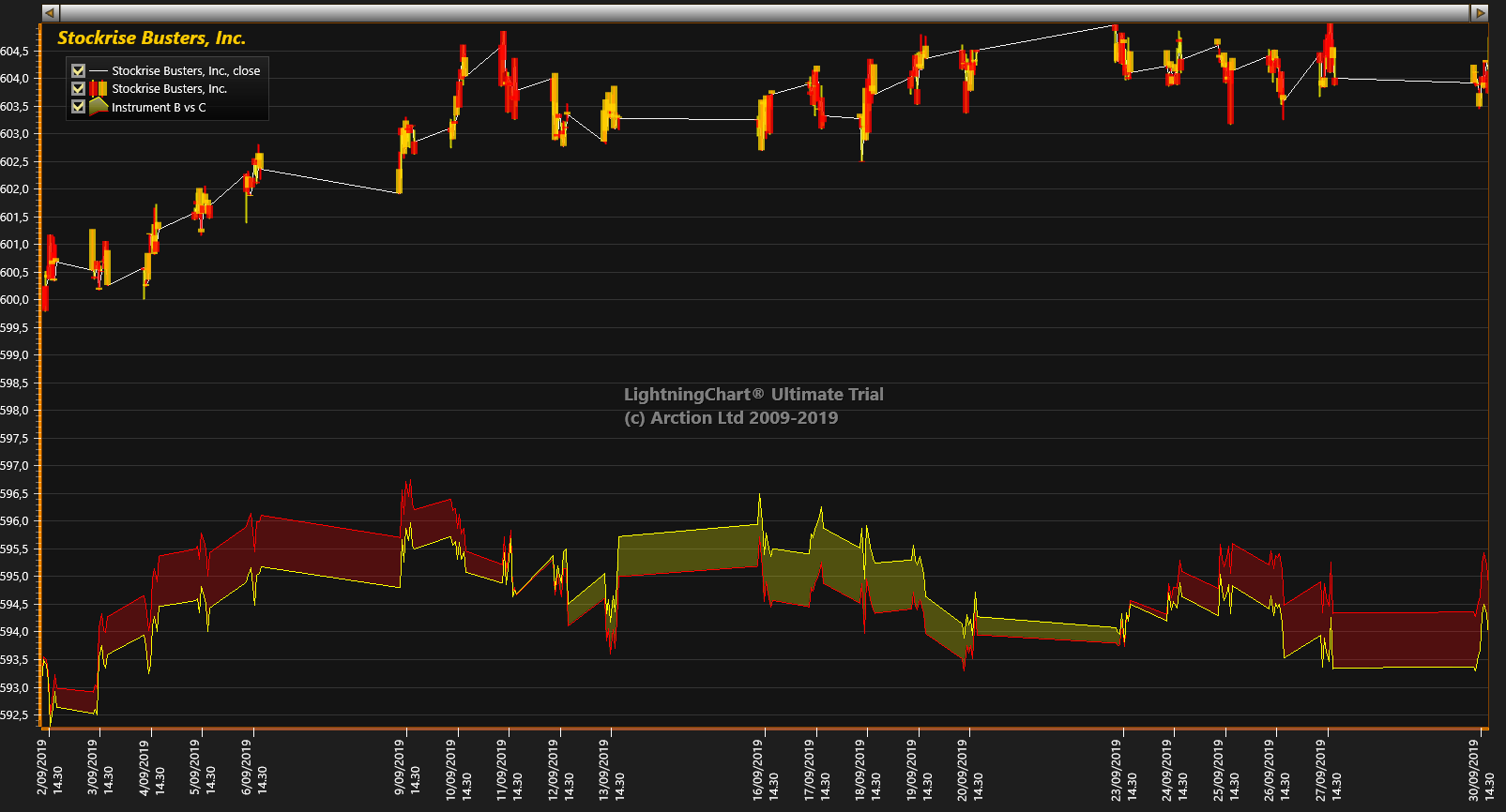
Picture 1. Original trading data where scale breaks haven’t been applied.
By applying scale breaks, as seen on Picture 2, we can hide the uninteresting data and axis labels. As an effect the data is more readable, and more screen space is available for essential data. Gaps on breaks are used to give visual hint for the reader on where the data is cut out. This also gives better readability to the data, as one can see different days more clearly. Data visualization however flows over the gap, so that it looks continuous.

Picture 2. Scale breaks applied to exclude non-active trading hours. Style = Diagonal Line Up, Break Gap Width is 10. PointLineSeries jumping from Close-to-Close values, PointLineSeries = Continuous line over breaks and ScaleBreak = True.
On some cases, as shown on Picture 3, it’s better to cut the data visualization as well at the gap. This way lines are not connected from previous point to next point over the gap. Instead, they continue to their original direction as if no scale break has been defined.
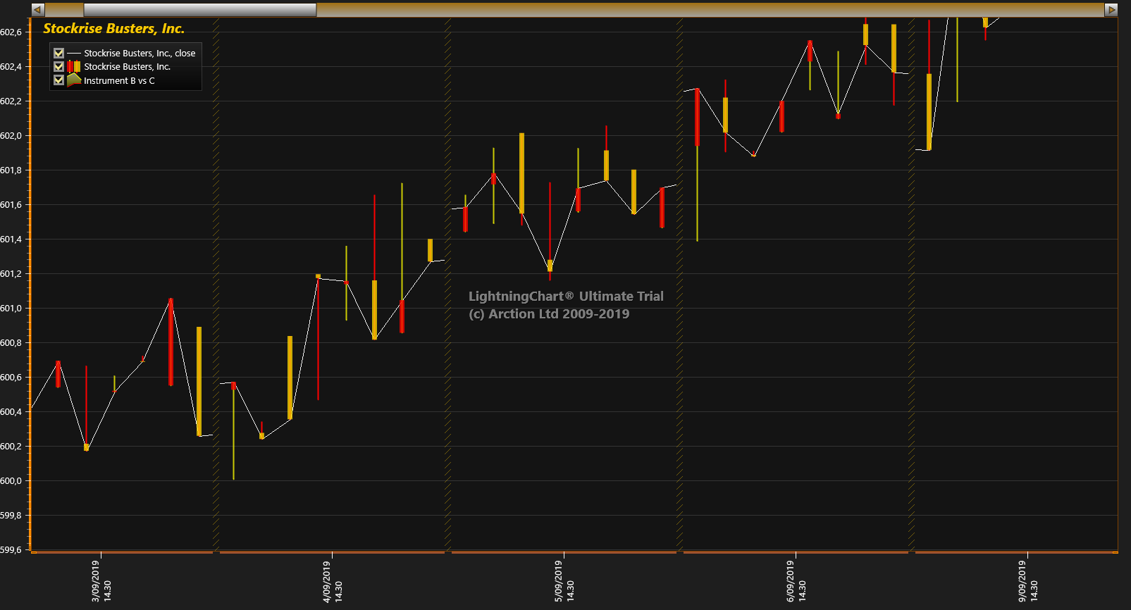
Picture 3. PointLineSeries without continuous line over breaks. Lines are not connected from previous point to next point over the gap. Instead, they continue to their original direction as if no scale break has been defined.
It should be noted that there are some limitations of when ScaleBreaks can be used; Axis breaking is not available with scrolling, nor does it support logarithmic axes, so ScrollMode property must be set to ‘None’ and ScaleType to ‘Linear’.
Scale breaks are configured via ScaleBreaks property of X axis. Just create a new ScaleBreak object and insert it in the collection at the property or use banding to accomplish the same effect. Please check the LC .NET user’s manual for more information on the exact usage of the scale breaks, and all the available properties of it.
Similar data cutting can be accomplished via Data breaking functionality, which cuts the presented line or area in parts, based on the specially interpreted data values. Stay tuned for more information, and happy data visualization.
The LightningChart Team
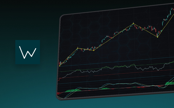
Elliott Wave Theory in Trading
Financial markets often appear chaotic, but many traders believe that price movements follow recurring patterns driven by human psychology. One of the most influential approaches based on this idea is the Elliott Wave Theory. Developed nearly a century ago, it remains one of the most widely studied methods of technical analysis.
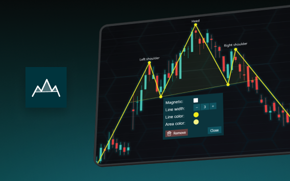
The Head and Shoulders Pattern in Technical Analysis
The Head and Shoulders Pattern in Technical Analysis The Head and Shoulders Pattern in Technical Analysis The Head and Shoulders pattern is one of the most recognized and widely used chart patterns in technical analysis. It is considered a reliable reversal pattern...
Best Telerik Charts Alternative in 2026: GPU Performance for WPF, WinForms, and Web
Telerik from Progress is a comprehensive UI component suite covering WPF, WinForms, ASP.NET, Blazor, and JavaScript. The charting components: RadChartView for WPF and WinForms, and Kendo UI Charts for web and Blazor, arrive bundled with the suite purchase. For teams...





If you have any questions, feel free to contact us!
©LightningChart Ltd 2026. All rights reserved.