


LightningChart JSModern Sweeping Line Chart for Medical Healthcare Data Visualization
TutorialSweeping line charts are widely used in the medical & healthcare industry for identifying patterns and anomalies in a patient's data.
Written by a human | Updated on April 11th, 2025
Sweeping Line Chart for Medical Healthcare
Hi again, today we’ll be creating a Sweeping Line Chart most commonly used in the medical and healthcare industry for displaying changes in a particular variable over time. The medical chart is called “sweeping” because it visually emphasizes the trends and patterns in the data by connecting the data points with a smooth line that “sweeps” across the graph.
The x-axis represents time, usually in chronological order, while the y-axis represents the variable being measured. The line connecting the data points represents the trend in the data over time. In medical research, sweeping line charts are often used to display changes in vital signs, such as blood pressure, heart rate, or respiratory rate, over time.
Medical sweeping line charts are useful for identifying trends, patterns, and anomalies in the data, such as sudden spikes or dips in the variable being measured. They can also help researchers to identify the effectiveness of a particular treatment or intervention over time.
Project Overview
In this article, we will work with XY Charts. An XY chart works with two axes and is a two-dimensional object. By working with the XYData library, we will be able to make use of some animations that will allow us to simulate an ECG reader. We will apply the properties to an array-type object, which will allow us to dynamically create a copy of the same reading. Take a look at the Sweeping Line Chart that we’ll be creating:
 Download the project to follow the tutorial
Local Setup
1. Download the initial template that will help us get started with this example.
2. After downloading the template, you’ll see a file tree like this:

3. Open a new terminal and run the npm install command:
As usual in a NodeJS project, you need to run the npm install command. That would be everything for our initial setup. Let’s code.
CHART.ts
Inside this file, we will have all the logic needed to create our chart, configure animations, and format the data.
1. Declare the constant lcjs that will refer to our @arction/lcjs library.
const lcjs = require('@arction/lcjs')

const { lightningChart, Themes, emptyLine, AutoCursorModes, AxisTickStrategies, ColorHEX, SolidFill, PointShape } = lcjs
2. Extract required classes from lcjs
3. Import the data.json file. This JSON contains the arrays that we will need to feed our chart
import ecgData from './data.json'

const lcjs = require('@arction/lcjs')

const { lightningChart, Themes, emptyLine, AutoCursorModes, AxisTickStrategies, ColorHEX, SolidFill, PointShape } = lcjs
4. CHANNELS array
The number of channels will be specified in the CHANNELS array. You can add the number of channels you need. The properties of one channel will be replicated in the rest of the channel by using a loop
const CHANNELS = [
    { name: 'ECG-1', yMin: -2500, yMax: 2500 },
    { name: 'ECG-2', yMin: -2500, yMax: 2500 },
    { name: 'ECG-3', yMin: -2500, yMax: 2500 },
    { name: 'ECG-4', yMin: -2500, yMax: 2500 },
    { name: 'ECG-5', yMin: -2500, yMax: 2500 },
    { name: 'ECG-6', yMin: -2500, yMax: 2500 },
]
5. Creating the dashboard
const dashboard = lightningChart()
    .Dashboard({
        numberOfColumns: 1,
        numberOfRows: CHANNELS.length,
        theme: Themes.cyberSpace,
    })
.setSplitterStyle(emptyLine)- Theme: Look and Feel for the dashboard. The UI properties will be applied to all the dashboard charts objects. Learn more about it in the Themes documentation.
- numberOfRows: The dashboard can be divided into grids. Each grid can contain a chart. If we assign 1 row, this means that the dashboard will not have a horizontal division, but if we assign more than one column, the dashboard will be divided vertically. In this case, the number of rows will be determined by the number of channels.
6. XY Chart
Now we need to configure some properties of the axes X and Y. We will replicate these properties to each channel from the CHANNELS array.
const channels = CHANNELS.map((info, iCh) => {
    const chart = dashboard
        .createChartXY({
            columnIndex: 0,
            rowIndex: iCh,
        })
        .setTitle(info.name)
        .setTitlePosition('series-left-top')
        .setAutoCursorMode(AutoCursorModes.disabled)
        .setSeriesBackgroundFillStyle(ecgBackgroundFill)
        .setMouseInteractions(false)
        .setSeriesBackgroundStrokeStyle(emptyLine)

    const axisX = chart
        .getDefaultAxisX()
        .setTickStrategy(AxisTickStrategies.Empty)
        .setStrokeStyle(emptyLine)
        .setScrollStrategy(undefined)
        .setInterval({ start: 0, end: X_VIEW_MS, stopAxisAfter: false })

    const axisY = chart
        .getDefaultAxisY()
        .setStrokeStyle(emptyLine)
        .setInterval({ start: info.yMin, end: info.yMax })
        .setTickStrategy(AxisTickStrategies.Empty)
We need to configure the X axis… so we need to start by getting the X axis. The tick strategy will give the chance to specify the time behavior. In this example, I specified the initial time as zero, and make a calculation by using the minutes and seconds. You can change this value according to your requirement. Read more about it in the AxisTickStrategies documentation.
We can configure the behavior of the scrolling by using the scroll strategy class. Read more in the AxisScrollStrategies documentation.
7. Series for old data
We need to create a series to display the old data.
const seriesRight = chart
        .addLineSeries({
            dataPattern: { pattern: 'ProgressiveX' },
            automaticColorIndex: iCh,
        })
        .setName(info.name)
        .setStrokeStyle((stroke) => stroke.setThickness(2))
        .setEffect(false)
8. seriesOverlayRight
The overlay series will work as a divider between the new and the old data. This will be represented as a black rectangle.
const seriesOverlayRight = chart
        .addRectangleSeries()
        .setEffect(false)
        .add({ x1: 0, y1: 0, x2: 0, y2: 0 })
        .setFillStyle(ecgBackgroundFill)
        .setStrokeStyle(emptyLine)
        .setMouseInteractions(false)
And the last series would be the one that will display the new data
const seriesLeft = chart
        .addLineSeries({
            dataPattern: { pattern: 'ProgressiveX' },
            automaticColorIndex: iCh,
        })
        .setName(info.name)
        .setStrokeStyle((stroke) => stroke.setThickness(2))
        .setEffect(false)

    const seriesHighlightLastPoints = chart
        .addPointSeries({ pointShape: PointShape.Circle })
        .setPointFillStyle(new SolidFill({ color: theme.examples.highlightPointColor }))
        .setPointSize(5)
        .setEffect(false)
The seriesHighlightLastPoints will be the point at the end of the line series:

The configuration logic inserts new data points into the sweeping chart. LightningChart JS does not provide built-in functionality for sweep line charts but a high-performance chart can be implemented with a bit of additional application complexity.
9. Register of data points sent to each channel
Here we’ll keep a register of the data points sent to each channel:
let prevPosX = 0
// Keep track of data pushed to each channel.
const channelsNewDataCache = new Array(CHANNELS.length).fill(0).map((_) => [])
const appendDataPoints = (dataPointsAllChannels) => {
10. Tracking the last time position
The last X (time position) is tracked and then set to the range of the sweep axis.
let posX = 0

    for (let iCh = 0; iCh < CHANNELS.length; iCh += 1) {
        const newDataPointsTimestamped = dataPointsAllChannels[iCh]
        const newDataCache = channelsNewDataCache[iCh]
        const channel = channels[iCh]
The incoming data points are timestamped which means that their X coordinates can go outside the range of the sweep axis. Set timestamps in the range of the sweep axis:
const newDataPointsSweeping = newDataPointsTimestamped.map((dp) => ({
            x: dp.x % X_VIEW_MS,
            y: dp.y,
        }))

        posX = Math.max(posX, newDataPointsSweeping[newDataPointsSweeping.length - 1].x)
11. Full sweep check up
Here it is checked if the channel completes a full sweep (or even more than 1 sweep even though it cannot be displayed).
let fullSweepsCount = 0
        let signPrev = false
        for (const dp of newDataPointsSweeping) {
            const sign = dp.x < prevPosX
            if (sign === true && sign !== signPrev) {
                fullSweepsCount += 1
            }
            signPrev = sign
        }
The following algorithm is unable to handle data input that spans multiple full data sweeps. To avoid visual errors, reset the sweep chart and do not process the data. This scenario is triggered by switching tabs or minimizing the sample for long periods of time.
if (fullSweepsCount > 1) {
            channel.seriesRight.clear()
            channel.seriesLeft.clear()
            newDataCache.length = 0
At this point, the sweep has been completed. Data points are copied from the left series to the right series, thus deleting the left series afterward. The new data points are then categorized on both sides.
} else if (fullSweepsCount === 1) {
            const newDataPointsLeft = []
            for (const dp of newDataPointsSweeping) {
                if (dp.x > prevPosX) {
                    newDataCache.push(dp)
                } else {
                    newDataPointsLeft.push(dp)
                }
            }
            channel.seriesRight.clear().add(newDataCache)
            channel.seriesLeft.clear().add(newDataPointsLeft)
            newDataCache.length = 0
            newDataCache.push(...newDataPointsLeft)
If the data count is not major to 1, then the data will be added to the left. While this is extremely powerful, this syntax can fail if it’s called with extremely large arrays of, for instance, 100,000 elements.
} else {
            channel.seriesLeft.add(newDataPointsSweeping)
            newDataCache.push(...newDataPointsSweeping)
        }
12. Highlighting the last data point
const highlightPoints = [
            newDataCache.length > 0
                ? newDataCache[newDataCache.length - 1]
                : newDataPointsSweeping[newDataPointsSweeping.length - 1],
        ]
        channel.seriesHighlightLastPoints.clear().add(highlightPoints)
13. Reallocating old data overlays
What we’ll do here, is moving the overlays of the old data to the right locations.
const overlayXStart = 0
    const overlayXEnd = posX + X_VIEW_MS * 0.03
    channels.forEach((channel) => {
        channel.seriesOverlayRight.setDimensions({
            x1: overlayXStart,
            x2: overlayXEnd,
            y1: channel.axisY.getInterval().start,
            y2: channel.axisY.getInterval().end,
        })
    })

    prevPosX = posX
14. Data streaming
Here we’ll set up the instance for starting the streaming of data.
let tStart = window.performance.now()
let pushedDataCount = 0
const dataPointsPerSecond = 1000 // 1000 Hz
const xStep = 1000 / dataPointsPerSecond
const streamData = () => {
    const tNow = window.performance.now()
In the previous example code, we have set up the data rate to a stable streaming data rate of 1000 data points per second. In a real-case scenario, the data should be pushed in as it is streamed.
const shouldBeDataPointsCount = Math.floor((dataPointsPerSecond * (tNow - tStart)) / 1000)
    const newDataPointsCount = shouldBeDataPointsCount - pushedDataCount
    if (newDataPointsCount > 0) {
        const newDataPoints = []
        for (let iDp = 0; iDp < newDataPointsCount; iDp++) {
            const x = (pushedDataCount + iDp) * xStep
            const iData = (pushedDataCount + iDp) % ecgData.length
            const y = ecgData[iData]
            const point = { x, y }
            newDataPoints.push(point)
        }

        // For this examples purposes, stream same data into all channels.
        appendDataPoints(new Array(CHANNELS.length).fill(0).map((_) => newDataPoints))
        pushedDataCount += newDataPointsCount
    }

    requestAnimationFrame(streamData)
Final Sweeping Line Chart Application
To visualize the final application, run the npm start command. It will give you the local host URL path to visualize the chart in your browser.
Conclusion
Sweeping line charts were recently introduced in the latest update of LightningChart JS v.4.0. As we just saw, the implementation of this type of chart is not merely a built-in feature of the LC JS library but is still possible to create an entire sweeping line chart application for, e.g., medical monitoring.
The use of JavaScript LightningChart Sweeping Line Charts brings a myriad of benefits to any data visualization project. The smooth and responsive line series allows users to effortlessly monitor large amounts of data, providing insights and valuable information at a glance.
All sweeping line chart features are fully customizable and developers can tailor the application to fit their specific needs and requirements, creating visually appealing and engaging representations of their data. Let’s meet again in the next article!

Omar Urbano
Software Engineer
Continue learning with LightningChart
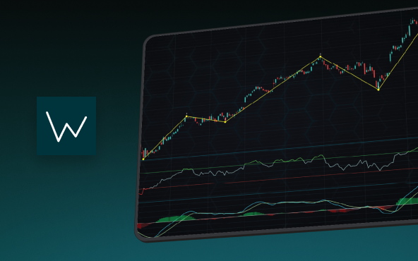
Elliott Wave Theory in Trading
Financial markets often appear chaotic, but many traders believe that price movements follow recurring patterns driven by human psychology. One of the most influential approaches based on this idea is the Elliott Wave Theory. Developed nearly a century ago, it remains one of the most widely studied methods of technical analysis.
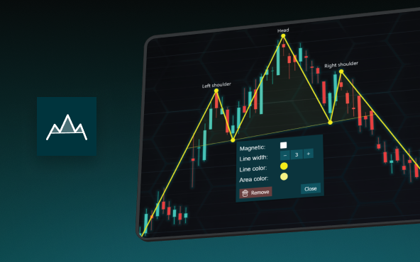
The Head and Shoulders Pattern in Technical Analysis
The Head and Shoulders Pattern in Technical Analysis The Head and Shoulders Pattern in Technical Analysis The Head and Shoulders pattern is one of the most recognized and widely used chart patterns in technical analysis. It is considered a reliable reversal pattern...
Best Telerik Charts Alternative in 2026: GPU Performance for WPF, WinForms, and Web
Telerik from Progress is a comprehensive UI component suite covering WPF, WinForms, ASP.NET, Blazor, and JavaScript. The charting components: RadChartView for WPF and WinForms, and Kendo UI Charts for web and Blazor, arrive bundled with the suite purchase. For teams...


If you have any questions, feel free to contact us!
©LightningChart Ltd 2026. All rights reserved.