


LightningChart PythonMarine Seismic Time-Series Analysis Insights and Visualizations
TutorialCreating a marine seismic time-series analysis in Python using LightningChart
Written by a human | Updated on April 23rd, 2025
Marine Seismic Time-Series Analysis with LightningChart Python
Marine seismic research is a crucial aspect of geophysical exploration that involves studying subsurface geological formations beneath the ocean floor. These studies primarily rely on marine seismic surveys which utilize sound waves to create detailed images of the seabed and the underlying geological structures. The data collected from these surveys are vital for various applications including oil and gas exploration, environmental studies, and geological research.
LightningChart Python

LightningChart is a high-performance charting library designed for creating advanced data visualizations in Python. It offers a wide range of features and chart types, making it ideal for creating complex dashboards and data analysis tools. Key features include high rendering performance, a variety of chart types (e.g., line charts, heatmaps, bar charts), and extensive customization options.
Features and Chart Types to be used in the Project
In this project, we utilize LightningChart to create various visualizations for analyzing marine seismic data. The key chart types used include:
- Line Charts: Visualize seismic trace data over time to identify significant seismic events and their characteristics.
- Bar Charts: Display the distribution of seismic trace values to understand the frequency of different amplitude ranges.
- Real-Time Charts: Monitor seismic data in real time for immediate insights into ongoing seismic activity.
Performance Characteristics
LightningChart excels in rendering large datasets quickly and efficiently, which is crucial for real-time data visualization and handling extensive data typically involved in marine seismic time-series analysis.
Setting Up Python Environment
Installing Python and necessary libraries
To begin with marine seismic time-series analysis, setting up the Python environment is essential. You will need to install the following libraries. Here you can also find the entire GitHub project.
Overview of libraries used
- NumPy: For numerical computations.
- Pandas: For data manipulation and analysis.
- ObsPy: For reading and processing seismic data in SEG-Y format.
- LightningChart Python: For creating high-performance data visualizations.
pip install lightningchart==0.7.0
pip install numpy pandas obspy
Setting up your development environment
1. Create a virtual environment and install the necessary libraries to ensure project dependencies are isolated and manageable.
python -m venv env
source env/bin/activate
pip install -r requirements.txt
2. Using Visual Studio Code (VSCode): Visual Studio Code (VSCode) is a popular code editor offering rich features to enhance your development workflow.
Loading and Processing Data
How to load the data files
Loading and processing seismic data involves several steps. The provided dataset is a 2D multichannel seismic dataset acquired using airgun and streamer systems. The dataset, recorded between November 3, 1989, and November 26, 1989, comprises 31 tracklines covering a distance of 7398 km around Hawaii. This project uses the dataset related to the 16th trackline.
Extracting and Saving Data
The following script reads the SEG-Y file, extracts relevant trace headers and values, and saves them into a CSV file:
import obspy
import pandas as pd

segy_file = 'D:/path/to/your/file.sgy'
st = obspy.read(segy_file, format='SEGY')

valid_keys = [
    'trace_sequence_number_within_line',
    'trace_sequence_number_within_segy_file',
    'original_field_record_number',
    'trace_number_within_the_original_field_record',
    'energy_source_point_number',
    'source_coordinate_x',
    'source_coordinate_y',
    'sample_interval_in_ms_for_this_trace',
    'year_data_recorded'
]

data = []
for tr in st:
    trace_header = tr.stats.segy.trace_header
    trace_data = tr.data
    for i, value in enumerate(trace_data):
        row = {key: trace_header[key] for key in valid_keys if key in trace_header}
        row['trace_value'] = value
        row['sample_number'] = i
        data.append(row)

df = pd.DataFrame(data)
df.to_csv('D:/path/to/output.csv', index=False)
Histogram of Seismic Trace Values
Displays the distribution of trace values with logarithmic scaling to handle the wide range of values effectively.
import lightningchart as lc
import pandas as pd
import numpy as np

lc.set_license('my-license-key')
df = pd.read_csv('output.csv')
hist, bin_edges = np.histogram(df['trace_value'], bins=50)
log_hist = np.log10(hist + 1)
data = [{'category': f'{(bin_edges[i] + bin_edges[i + 1]) / 2:.2f}', 'value': int(hist[i])} for i in range(len(hist))]

chart = lc.BarChart(
    vertical=True,
    theme=lc.Themes.Dark,
    title='Histogram of Seismic Trace Values',
    axis_type='logarithmic',
    axis_base=10
)

chart.set_sorting('disabled')
chart.set_data(data)
chart.open()
The histogram shows the distribution of seismic trace values, indicating the frequency of different amplitude ranges in the dataset. The peak in the center indicates a common baseline of seismic activity.
The tails on both ends suggest the presence of both very high and very low amplitude values, which could correspond to significant seismic events or noise. The logarithmic scaling effectively compresses the wide range of data into a readable format, making it easier to identify patterns and anomalies.
Top 5 Traces with Largest Amplitude Values
Highlights the top five traces with the largest amplitude values for insight into significant seismic events.
import lightningchart as lc
import pandas as pd

lc.set_license('my-license-key')
df = pd.read_csv('output.csv')
df['time_ms'] = df['sample_number'] * df['sample_interval_in_ms_for_this_trace'] / 1000.0

trace_max_amplitudes = df.groupby('trace_sequence_number_within_line')['trace_value'].max()
top_traces = trace_max_amplitudes.nlargest(5).index

chart = lc.ChartXY(
    theme=lc.Themes.Black,
    title='Top 5 Traces with Largest Amplitude Values'
)

chart.get_default_y_axis().dispose()
legend = chart.add_legend()

for i, trace in enumerate(top_traces):
    trace_data = df[df['trace_sequence_number_within_line'] == trace]
    axis_y = chart.add_y_axis(stack_index=i)
    axis_y.set_margins(15 if i > 0 else 0, 15 if i < 4 else 0)
    axis_y.set_title(title=f'Trace {trace}')
    series = chart.add_line_series(y_axis=axis_y, data_pattern='ProgressiveX')
    series.add(trace_data['time_ms'].tolist(), trace_data['trace_value'].tolist())
    series.set_name(f'Trace {trace}')
    legend.add(series)

x_axis = chart.get_default_x_axis()
x_axis.set_title('Time (ms)')
chart.open()
This visualization effectively identifies and displays the seismic traces with the highest amplitude values, crucial for understanding significant seismic events. LightningChart Python provides the possibility to plot each trace on a separate y-axis to avoid overlap and provide a clear view of their respective amplitudes and time-series patterns.
The traces show distinct seismic activities, with sharp peaks representing high-amplitude events. The varied shapes and durations of these peaks can provide insights into the different types of seismic activities or events that were recorded. By focusing on the highest amplitude traces, this visualization helps in pinpointing the most impactful seismic occurrences in the data.
Real-Time Seismic Trace Display
Demonstrates a real-time display of seismic traces, updating the chart with new data every second.
import lightningchart as lc
import pandas as pd
import time

lc.set_license('my-license-key')
df = pd.read_csv('output.csv')
df['time_ms'] = df['sample_number'] * df['sample_interval_in_ms_for_this_trace'] / 1000.0

dashboard = lc.Dashboard(columns=2, rows=3, theme=lc.Themes.Dark)
chart1 = dashboard.ChartXY(column_index=0, row_index=0, column_span=2, row_span=2)
series1 = chart1.add_line_series(data_pattern='ProgressiveX')

x_axis = chart1.get_default_x_axis()
x_axis.set_scroll_strategy(strategy='progressive')
x_axis.set_interval(start=-500, end=0, stop_axis_after=False)
chart1.get_default_y_axis().set_title('Amplitude')
chart1.set_title('Real-Time Seismic Trace Display')

zbc = dashboard.ZoomBandChart(chart=chart1, column_index=0, row_index=2, column_span=2, row_span=1)
zbc.add_series(series1)

dashboard.open(live=True)

def update_chart(trace_number):
    trace_data = df[df['trace_sequence_number_within_line'] == trace_number]
    if not trace_data.empty:
        x_values = trace_data['time_ms'].values.tolist()
        y_values = trace_data['trace_value'].values.tolist()
        series1.clear().add(x_values, y_values)
        chart1.set_title(f'Real-Time Seismic Trace Display - Trace {trace_number}')

for trace_number in df['trace_sequence_number_within_line'].unique():
    update_chart(trace_number)
    time.sleep(1.0)

dashboard.close()
This real-time display provides an interactive way to monitor seismic data as it is processed, making it easier to identify changes and anomalies in the data. The progressive scrolling and live update features allow for continuous observation of seismic activity, which is crucial in marine seismic surveys for real-time decision-making and analysis.
Conclusion
In this article, we demonstrated the process of marine seismic time-series analysis using LightningChart Python. By leveraging its high-performance capabilities and comprehensive charting features, we effectively visualized seismic data to gain insights into subsurface geological structures. The ability to create real-time, interactive visualizations significantly enhances the analysis process, making it more intuitive and accessible.
Using LightningChart Python for visualizing marine seismic data offers numerous benefits, including real-time rendering, extensive customization options, and the ability to handle large datasets efficiently. In our case, the dataset comprised over 38 million rows and more than 14,000 traces.
Despite the vast size of the dataset, LightningChart Python’s efficient rendering engine and advanced data handling capabilities ensured smooth and responsive visualizations. This power and efficiency make LightningChart Python an invaluable tool for geophysical exploration and research, where handling large volumes of seismic data quickly and accurately is crucial.
Benefits of Using LightningChart Python for Visualizing Data
Using LightningChart Python for visualizing marine seismic data offers numerous benefits. Firstly, its high-performance rendering capabilities ensure that even large datasets are processed and visualized quickly, allowing for real-time monitoring and analysis. This is particularly important in marine seismic surveys where timely data interpretation can influence critical decisions.
Additionally, LightningChart Python provides extensive customization options for creating tailored visualizations. Users can easily modify axes, legends, and data series to fit specific needs, enhancing the clarity and effectiveness of the presented data. The library supports a wide range of chart types, from simple line charts to complex 3D visualizations, making it a versatile tool for various analysis requirements.
Furthermore, LightningChart Python’s ability to handle real-time data updates and interactive features enables a more dynamic and engaging analysis process. Users can interact with the data, zoom into specific sections, and continuously monitor changes, making the analysis process more intuitive and responsive to ongoing seismic activities.

Soroush Sohrabian
Software Developer
Continue learning with LightningChart
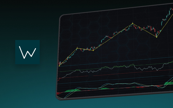
Elliott Wave Theory in Trading
Financial markets often appear chaotic, but many traders believe that price movements follow recurring patterns driven by human psychology. One of the most influential approaches based on this idea is the Elliott Wave Theory. Developed nearly a century ago, it remains one of the most widely studied methods of technical analysis.
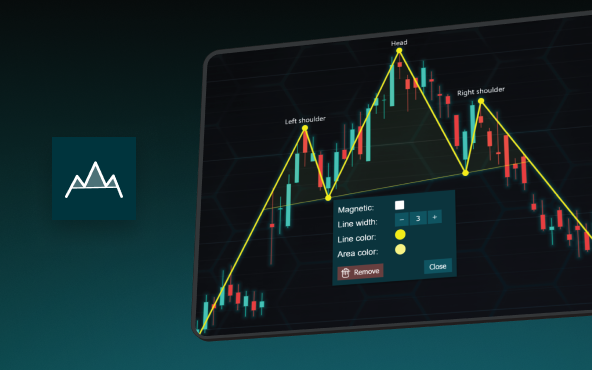
The Head and Shoulders Pattern in Technical Analysis
The Head and Shoulders Pattern in Technical Analysis The Head and Shoulders Pattern in Technical Analysis The Head and Shoulders pattern is one of the most recognized and widely used chart patterns in technical analysis. It is considered a reliable reversal pattern...
Best Telerik Charts Alternative in 2026: GPU Performance for WPF, WinForms, and Web
Telerik from Progress is a comprehensive UI component suite covering WPF, WinForms, ASP.NET, Blazor, and JavaScript. The charting components: RadChartView for WPF and WinForms, and Kendo UI Charts for web and Blazor, arrive bundled with the suite purchase. For teams...


If you have any questions, feel free to contact us!
©LightningChart Ltd 2026. All rights reserved.