






Industrial Alarm Monitoring Application with LightningChart Python
Tutorial
Assisted by AI
Learn how to create a Python industrial alarm monitoring application with real-time and high-performance charts.
Soroush Sohrabian
Software Developer

Introduction to the Project
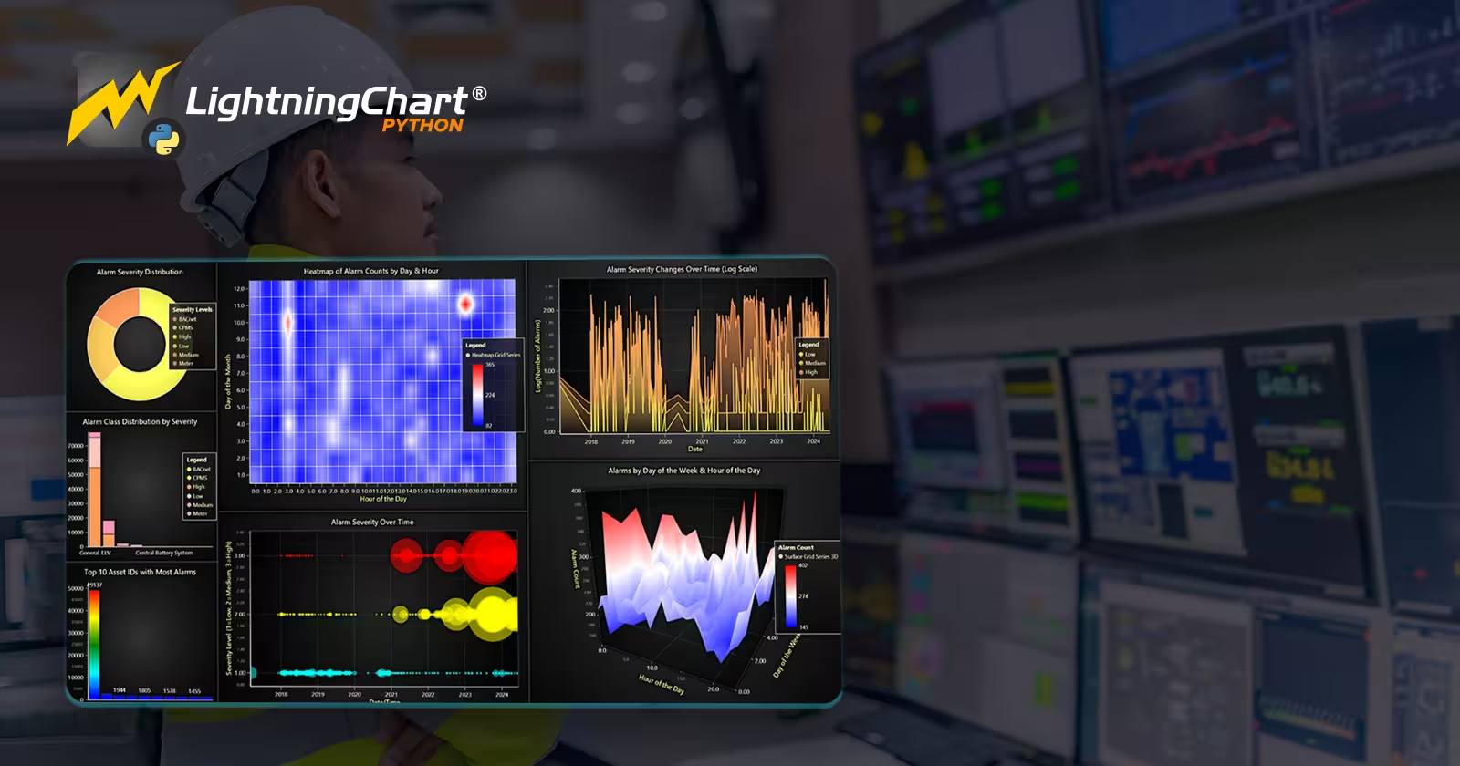
In the industrial field, we always have a huge amount of data through different events like alarms. It is crucial for them to monitor these events to maintain standards, detect anomalies and keeping everything safe. This article demonstrates an industrial alarm monitoring application using LightningChart Python to visualize static and real-time streaming alarm data through different charts and dashboards.
LightningChart Python
LightningChart Python is a powerful visualization library that is capable of visualizing real-time and interactive charts with large datasets efficiently. For this project, LightningChart provided visual insight into alarm severity, machine learning analysis and uncertainty bands through different interesting charts like line series, heatmaps, stacked bar charts, bubble charts, pie chart and 3D area chart.

Setting Up Python Environment
Before running the project, install Python and the other required libraries using:
pip install pandas numpy scikit-learn xgboost shap lightningchart smote-variantsSeveral Python libraries were employed in this article:
- Pandas: For loading, cleaning, and structuring data..
- NumPy: For numerical operations.
- Scikit-learn: Provided machine learning tools like XGBoost for classification, SMOTE for handling imbalanced datasets, Isolation Forest for anomaly detection, and RobustScaler for data normalization.
- LightningChart: To create interactive visualizations.
Setting Up Your Development Environment
- Set up a virtual environment:
python -m venv env
source env/bin/activate # On Windows use `env\Scripts\activate`- Use Visual Studio Code (VSCode) for a streamlined development experience.
Visualizing Data with LightningChart Python
Here are some examples codes and charts that shows how we created key visualizations:
Real-Time Alarm Prediction with XGBoost
In the first row of dashboard, we can see real time prediction chart, it first starts predicting two values and connect them with the red line. after a few seconds it would show actual values with yellow line and at the same time model turns the old red line to orange and start predicting two new values and connecting them. In the right side we have alarm counter and below it we can see level of alarm severity. In the second row we can see the real-time certainty heatmap.
xgb_model = XGBClassifier(random_state=42, use_label_encoder=False, eval_metric='logloss')
xgb_model.fit(X_train_clean, y_train_clean)
y_pred = xgb_model.predict(X_test)
Ensemble Model & Uncertainty Visualization
Here in this dashboard, we can see uncertainty chart for different classes.
seeds = [42, 123, 999, 31415, 2718]
models_list = []
for seed in seeds:
    model_ens = XGBClassifier(random_state=seed, subsample=0.8, colsample_bytree=0.8)
    model_ens.fit(X_boot, y_boot)
    models_list.append(model_ens)
Exploratory Data Visualization Dashboard
Charts in dashboard focus on showing alarm severity in different ways. We have alarm severity distribution in pie chart, stacked bar charts show alarm class distribution, heatmap demonstrates alarms by day and hour, bubble chart showing severity over time and 3D surface chart displaying alarm frequency by day of week and hour.
severity_counts = df["AlarmSeverityName"].value_counts()
pie_chart.add_slices([{'name': sev, 'value': int(count)} for sev, count in severity_counts.items()])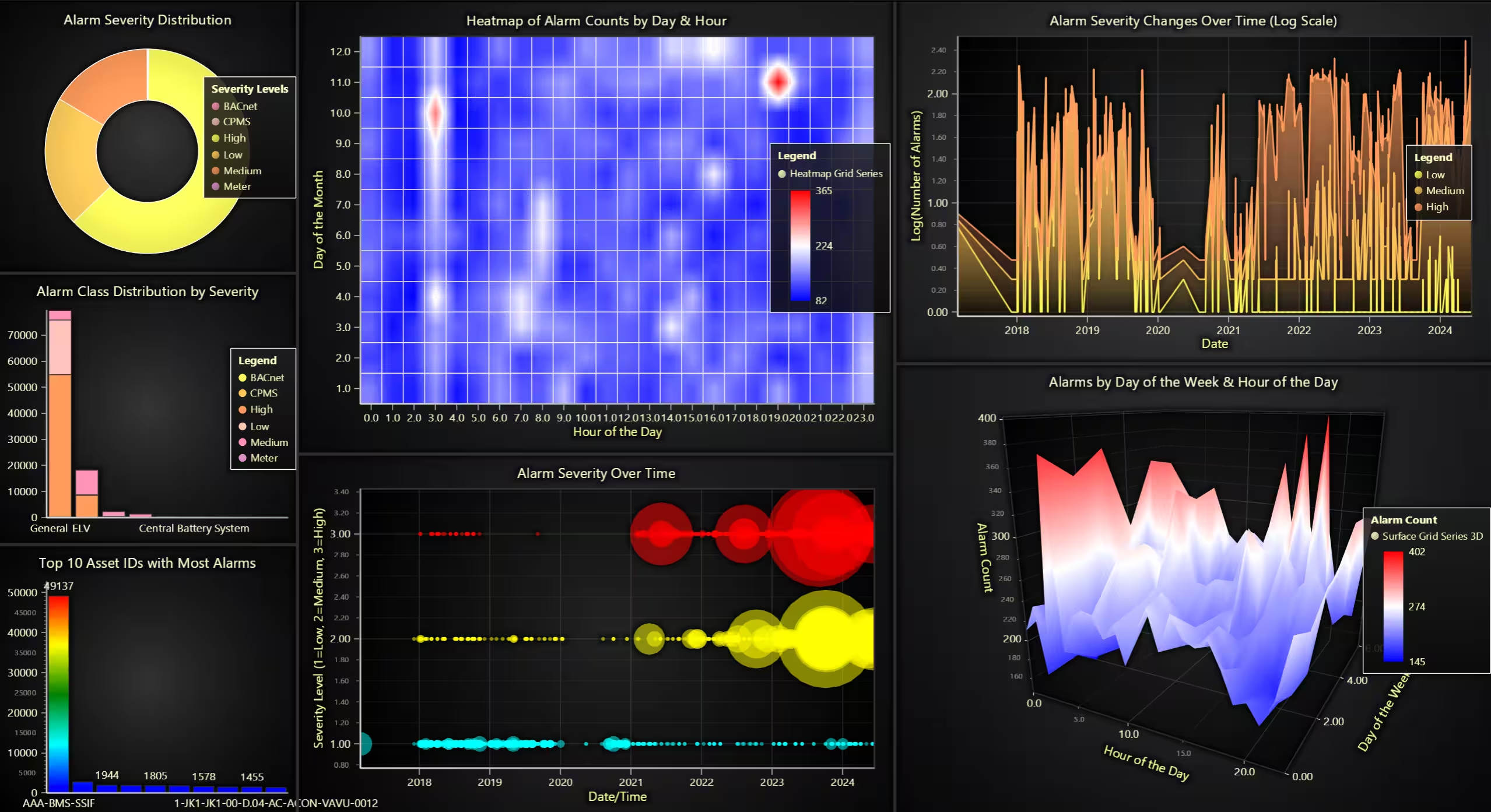
Conclusion
This project demonstrates how we could use LightningChart Python to visualize and monitor industrial alarm data. This approach gives us a powerful insight into system behaviors, alarm severity levels, and maintenance needs. Benefits of LightningChart Python specifically in this project include:
- Real-time visualization capabilities allowing live monitoring.
- Versatile chart options facilitating detailed and multi-dimensional data analysis.
- High-performance rendering suited for complex and large datasets specially in industrial environments.
Continue learning with LightningChart
Best ScottPlot Alternative in 2026: GPU Rendering, 3D Charts, Cross-Language Support
ScottPlot is genuinely excellent for what it is: a free, MIT-licensed, actively developed .NET plotting library with an honest focus on interactive large-dataset display. The GDI+ rasterized renderer — which draws the entire chart as a pixel bitmap rather than...
Using Fibonacci Tools in Trading: A Practical Guide for Market Analysis
Using Fibonacci Tools in Trading: A Practical Guide for Market AnalysisTechnical traders rely on various tools to identify potential support, resistance, and price targets. Among the most widely used are Fibonacci tools, which are based on the mathematical sequence...
Chart.js vs Highcharts vs LightningChart – Which Should You Choose?
If you've been searching for a JavaScript charting library, you already know the problem: comparison articles tend to list features and stop there. Nobody tells you what actually happens at 500,000 data points, or what a Highcharts license costs a team of ten...



If you have any questions, feel free to contact us!



©LightningChart Ltd 2026. All rights reserved.