






Forex Technical Analysis with LightningChart Python
Tutorial
Written by a Human
Apply forex technical analysis to interpret charts, spot trends, and build smarter Python trading applications.
Mikael Virtanen
Data Science Python Developer

Introduction
This article is a short demonstration of LightningChart Python’s charting features. In the process, Forex data will be visualized using different chart types (including Line chart, Bar chart, and others). The data itself consists of the exchange rates of different currencies compared to the EUR.
Dataset
The data for this article was acquired from a Kaggle dataset by Asaniczka. The data set contains over 100 different currencies and their exchange rates to the EUR over a long time period. How far back the data goes varies per currency; some only go till 2015; however, some of them (such as USD) go all the way to 2005. The dataset doesn’t sort the currency-specific data into separate columns by default. Thus, it’s a bit messy when first observed. Luckily, the Python library Pandas makes it very easy to sort the data.
Plotted Variables
- Date: Self explanatory, as stated earlier, the date range of data varies between different currencies.
- Currency: The currency whose exchange rate is compared to the EUR.
- Base currency: EUR
- Currency name: The full name of the currency variable.
- Exchange rate: Exchange rate between, currency and the base currency (EUR)
Libraries used
- LightningChart Python
- Pandas
Pandas will be used to import data. This is done by reading the dataset values and importing them into a data frame, which can easily be worked with before visualization. Pandas might be preinstalled with the Python standard library. If this is not the case, simply run the following command in the terminal. Python also needs to be installed.
pip install pandas
pip install lightningchart
Setting Up Python Environment
The data set is downloaded as a .csv file. This is the code used to process data and import it into charts.
import lightningchart as lc
from lightningchart import Themes
import pandas as pd
import os

license_key_path = "LC-Python_License_key.txt"
# Load the license key and initializing Python
license_key = open(license_key_path).read()# File path to where the dataset is located, os.listdir lists all the files from the directory.
filepath = 'data/project-9/'
rates_csv = os.listdir(filepath)
lc.set_license(license_key)
exchange_dataframe = pd.read_csv(filepath + rates_csv[0])
The rates_csv is a list of files that are in the directory (their names, to be specific). Assuming only the forex dataset is there, it would be the first item in the list. Using the file path and the file name, it can be by Pandas and converted into a data frame. A direct path can be given, thus simplifying the process, but if multiple files are used, this method is superior.
ccFraud_named    = ccFraud_dataframe[['Time', 'Amount', 'Class']]
ccFraud_PCA      = ccFraud_dataframe.iloc[:, 1:29]
ccFraud_PCA_true = ccFraud_dataframe[ccFraud_dataframe.Class == 1].iloc[:, 1:29]

ccFraud_false = ccFraud_named[ccFraud_named.Class == 0].head(492)
ccFraud_true = ccFraud_named[ccFraud_named.Class == 1]
FOREX Technical Analysis & Visualizations
We will now start creating the visualizations.
Line chart USD to EUR rate
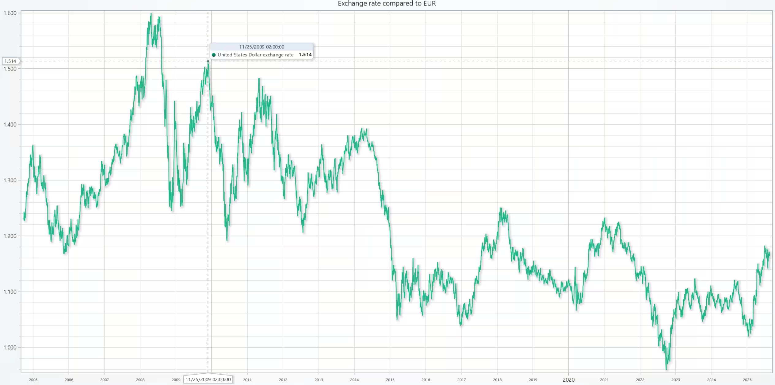
The US dollar exchange rate compared to the Euro.
def chart1():
    """Creates a new line chart"""

    new_chart = lc.ChartXY()
    USD_rate = exchange_dataframe[exchange_dataframe.currency == 'USD']
    name = USD_rate['currency_name'].head(1).to_string(index=False)
    # Set data sourcees for the axis
    x_plot = USD_rate['date'].to_list()
    y_plot = USD_rate['exchange_rate'].to_list()
    # Add a line plot to the chart instance
    new_series = new_chart.add_line_series()
    new_series.add(x_plot,y_plot)
    new_series.set_name(f'{name} exchange rate ')
    new_chart.open()
chart1()
Comparison of Multiple Currency Pair Trends
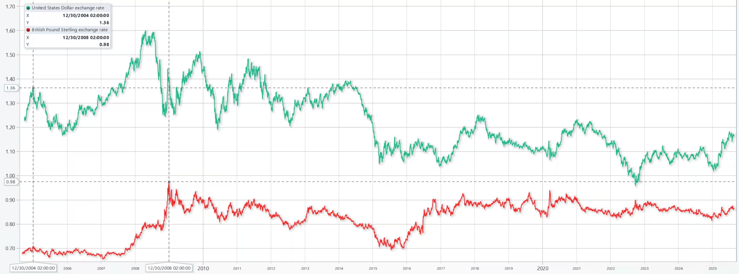
Comparison of the US dollar, Chinese yuan, and the British pound. The line charts compare trends over time.
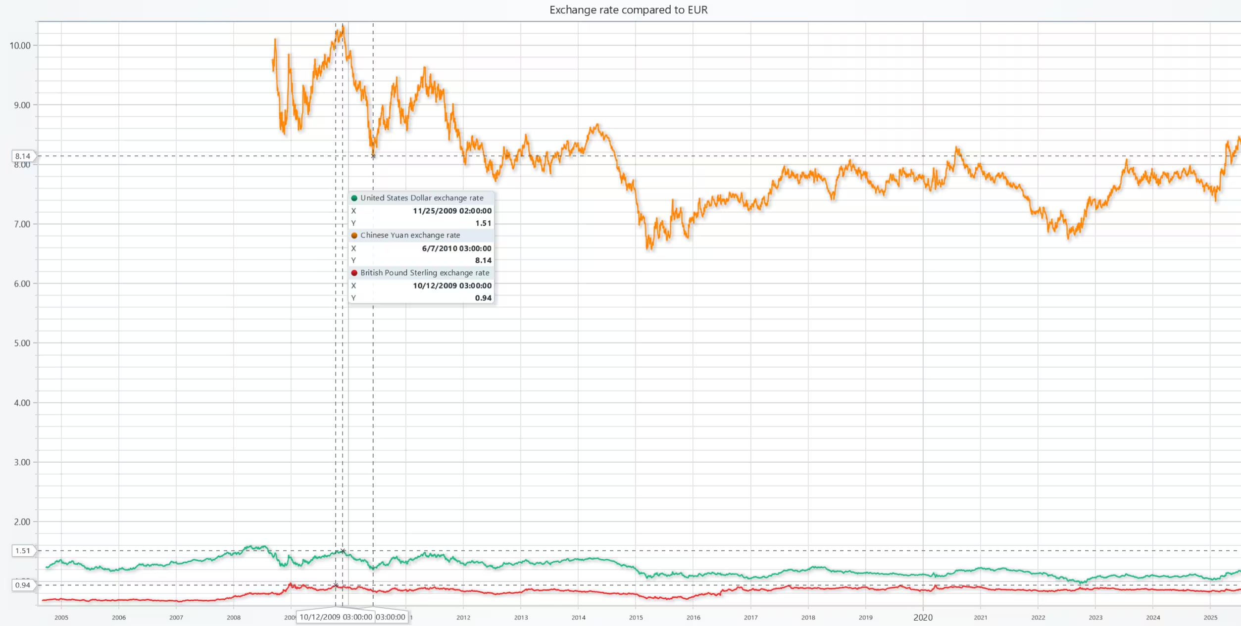
The following image shows the same line charts, but zoomed in at the bottom to better observe the trend.
def chart2():
    "Chart two with multiple currency pairs"

    new_chart = lc.ChartXY()
    set_date_axis(chart_instance=new_chart)

    USD_rate = exchange_dataframe[exchange_dataframe.currency == 'USD']
    CNY_rate = exchange_dataframe[exchange_dataframe.currency == 'CNY']
    GBP_rate = exchange_dataframe[exchange_dataframe.currency == 'GBP']
    rates = [USD_rate, CNY_rate, GBP_rate]

    name = "Exchange rates compared to EUR"
    for cur in rates:
        # Set data sourcees for the axis
        x_plot = cur['date'].to_list()
        y_plot = cur['exchange_rate'].to_list()
        # Add a line plot to the chart instance
        new_series = new_chart.add_line_series()
        new_series.add(x_plot,y_plot)
    new_series.set_name(f'{name} exchange rate ')
    new_chart.open()
chart2()
Exchange rate differences between two currencies, USD and GBP
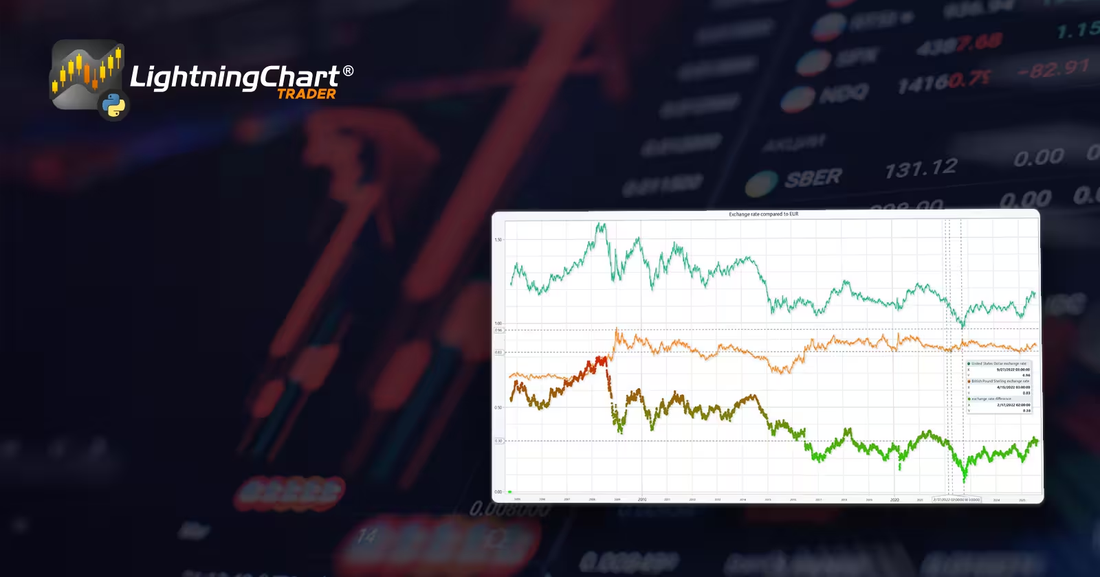
In this chart, a scatter plot was added to measure the exchange rate difference between the two currencies. The scatter plot measures the exchange rate against the EUR, showing how the color mapping gets greener as the difference becomes smaller.
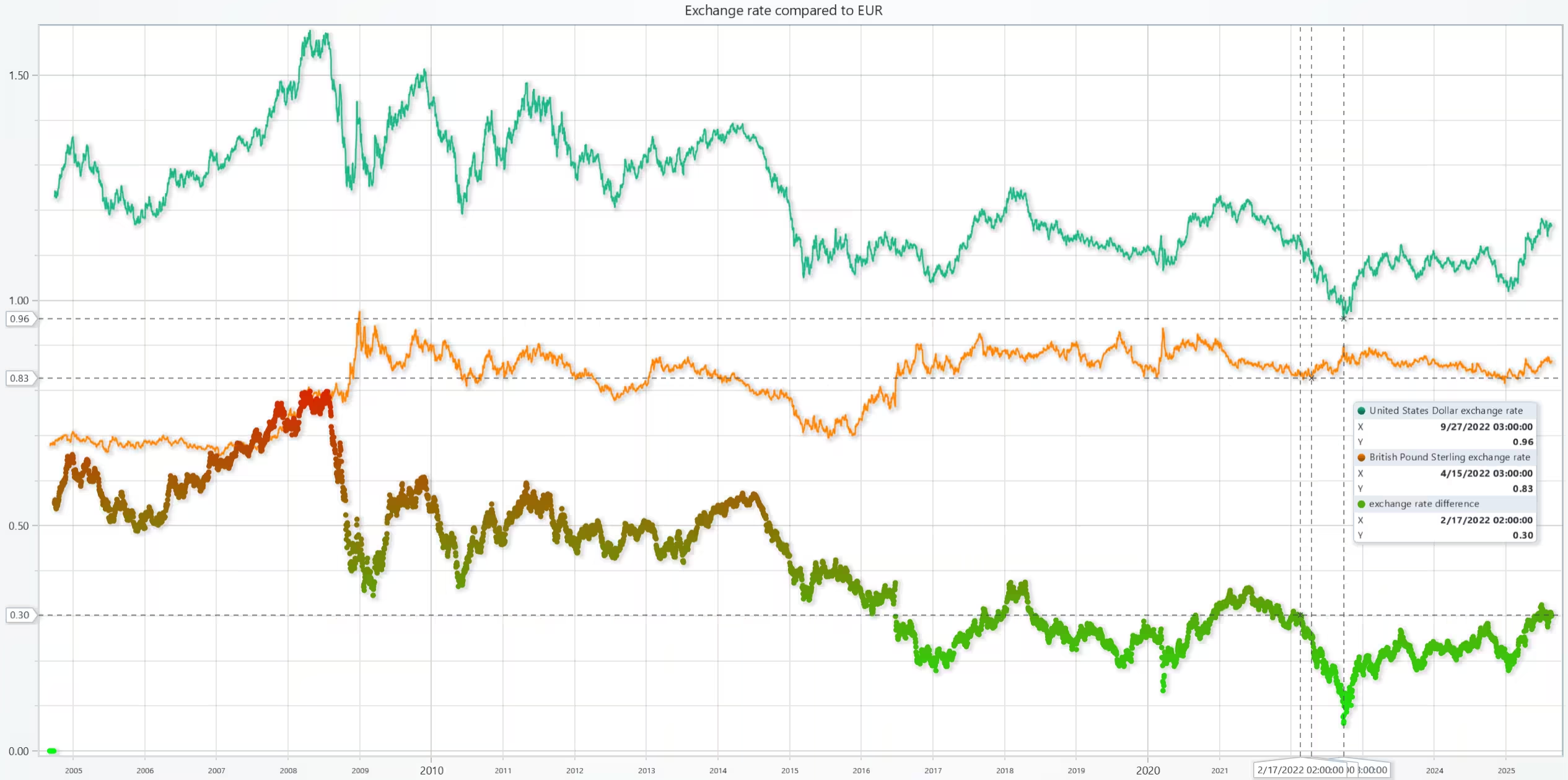
Next is the code used to generate the data for the scatter plot. Note that the method used to match the list sizes is rather crude for the sake of simplicity. In a real-world scenario, a more sophisticated approach would be required and ideally cut the larger list until both match in size.
def chart3():

    new_chart = lc.ChartXY()
    set_date_axis(chart_instance=new_chart)

    conversion_list = []
    USD_rate = exchange_dataframe[exchange_dataframe.currency == 'USD']
    GBP_rate = exchange_dataframe[exchange_dataframe.currency == 'GBP']

    for currency1, currency2 in zip(USD_rate['exchange_rate'], GBP_rate['exchange_rate']):
        conversion_list.append(currency1 - currency2)

    # Due to the exchange rate series being different in length they can't always be inserted right away
    # Insert mock data tot he beginning of the list
    while len(conversion_list) < len(GBP_rate['exchange_rate']):
        conversion_list.append(0)

    # Values used to calculate the scatter plot color map
    global currency1_max, currency2_max, currency1_min, currency2_min
    currency1_max = max(USD_rate['exchange_rate'])
    currency2_max = max(GBP_rate['exchange_rate'])
    currency1_min = min(USD_rate['exchange_rate'])
    currency2_min = min(GBP_rate['exchange_rate'])

    # Drop the existing exchange rate column and replace it with the new one
    scatterDF = GBP_rate.drop(columns=['exchange_rate'],axis=1,inplace=False)
    scatterDF.insert(0, 'exchange_rate', conversion_list)

    title_name = 'exchange rate difference'
    x_plot = scatterDF['date'].to_list()
    y_plot = scatterDF['exchange_rate'].to_list()
    new_series = new_chart.add_point_series()
    new_series.add(x_plot,y_plot)
    new_series.set_name(title_name)
    new_series.set_palette_point_coloring(
            steps=[
            {'value': currency1_max - currency2_min, 'color': '#FF0000'},
            {'value': (currency1_max + currency2_max) / 2, 'color': "#D9F40C"},
            {'value': currency1_min - currency2_max, 'color': "#00FF0D"},
        ],
        look_up_property='y',
        interpolate=True,
    )

    rates = [USD_rate, GBP_rate]
    for cur in rates:
        # Set data sourcees for the axis
        x_plot = cur['date'].to_list()
        y_plot = cur['exchange_rate'].to_list()
        # Add a line plot to the chart instance
        new_series = new_chart.add_line_series()
        new_series.add(x_plot,y_plot)
    new_chart.open()
chart3()
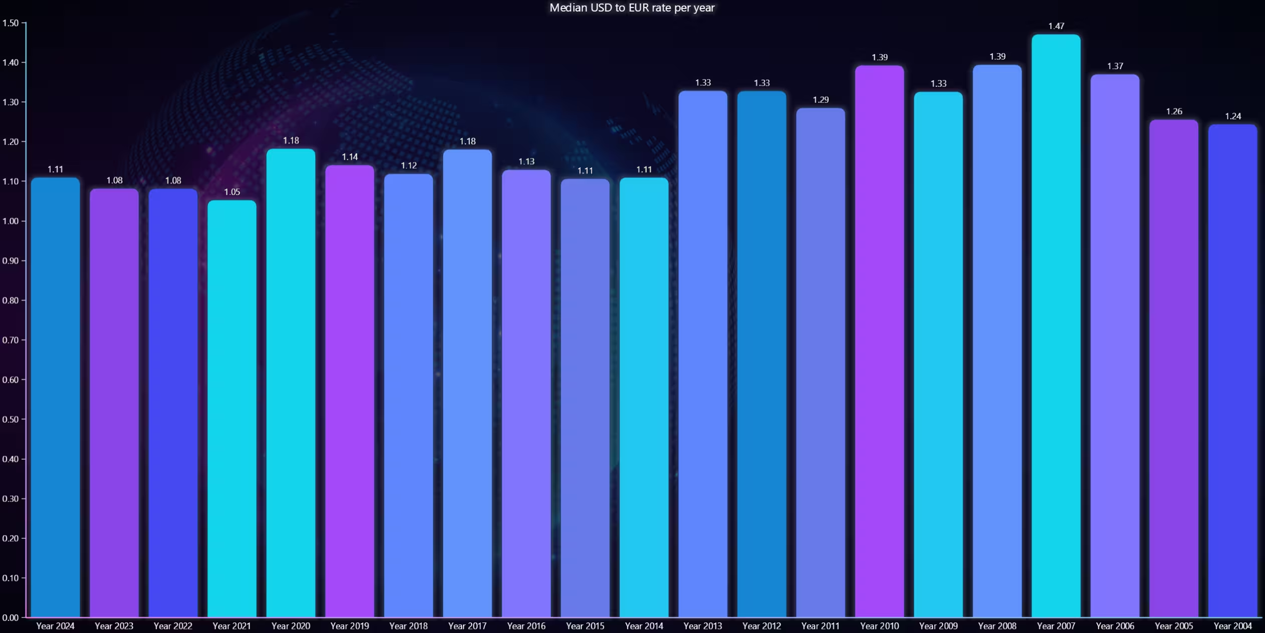
USD to EUR rate mean value per year 2024-2004
The following visualization for the FOREX technical analysis is a bar chart that measures the yearly mean of the exchange rate.
def chart4():

    new_chart = lc.BarChart(title='Median USD to EUR rate per year', theme=Themes.CyberSpace)
    USD_rate = exchange_dataframe[exchange_dataframe.currency == 'USD']
    bar_list = []
    bar_dict = {}

    # Yearly mean calculated for each bracket
    year_mean = 0
    # How many days or data points belong to that particular year
    date_count = 0
    # Current year
    df_year = 2025

    for date, rate in zip(USD_rate['date'], USD_rate['exchange_rate']):
        # Loop through the dataframe convert the date values to string
        # and compare them to current year
        str(date)
        if str(df_year) in date:
            # As long as the year matches increment date count and add rate to the count
            year_mean += rate
            date_count += 1
        else:
            # If the year doesn't match eg it has changed, calculate the mean from the current values
            # Decrement the year value by one and add the mean to a list
            year_mean = year_mean / date_count
            df_year -= 1
            bar_list.append({'category': f'Year {df_year}', 'value': year_mean})
            # Then reset the values
            year_mean = rate
            date_count = 1


    # Set the bar chart properties and dataset"""
    new_chart.set_data(bar_list)
    new_chart.set_sorting('disabled')
    new_chart.open()
chart4()
Analysis
How do the exchange rates of major currency pairs (e.g., USD_EUR, USD_JPY) trend over time?
Of the observed currency pairs, most exhibit lower volatility as time goes on. While the trends themselves vary
Is there a correlation between the movements of different currency pairs?
Of the chosen pairs, there doesn’t appear to be a strong correlation (par volatility)
How do the average exchange rates of selected currency pairs compare across different periods (e.g., months or years)?
As seen in the bar chart, the disparity between the currencies (USD and EUR) used to be larger. During 2013-2014, the disparity decreased by a noticeable amount and hasn’t risen since.
Conclusion
The currency data was imported from a Kaggle dataset into the LightningChart Python library using Pandas data frames. Data frames allowed easy sorting of the data, such as extracting specific currencies. After this FOREX technical analysis, different visualizations were easily made using LightningChart Python.
Continue learning with LightningChart

Trend Lines in Trading
Trend lines are among the simplest yet most powerful tools in technical analysis. They help traders visualize market direction, identify potential support and resistance levels, and make more informed trading decisions. Despite their simplicity, trend lines remain a...
Best Python Charting Library in 2026
Python's charting ecosystem is large, overlapping, and regularly misunderstood. Most comparison guides stop at Matplotlib, Plotly, and Seaborn. This one goes further: it covers what happens when your datasets grow large, your update rates increase, or your chart types...
Best TradingView Charting Library Alternative
TradingView's charting libraries are the most visible option for fintech developers. Visibility is not the same as capability. This guide is for developers who have hit the wall on candle count limits, watermark restrictions, branding requirements, real-time...



If you have any questions, feel free to contact us!
©LightningChart Ltd 2025. All rights reserved.