


LightningChart JSJavaScript Candlestick Chart
TutorialLearn how a JavaScript Candlestick chart can be used in Financial apps for technical analysis & create your own using LightningChart JS
Written by a human | Updated on April 11th, 2025
What is a JavaScript Candlestick Chart?
A candlestick chart is a type of price chart used in technical analysis, which shows a security’s high, low, open, and closing prices over a given time frame. It was initially used by Japanese rice merchants and traders to monitor market prices and the daily momentum of prices for a century. Candlesticks are made up of two components: the body and the wick. Each one can be customized.
Investors can determine whether the closing price was higher or lower than the opening price by looking at the wide portion of the candlestick, known as the “true body” (black or red if the stock finished lower than its opening price, white, or green if the stock closes higher than its opening price).
The wick of the candlestick shows the day’s highs and lows in comparison to the opening and closing prices. The shape of a candlestick is based on the relationship between the opening, closing, high, and low prices for the day. Trading professionals seeking chart patterns can use candlesticks charts for their analysis. Many traders consider candlestick charts to be easier to read and more visually appealing than conventional bar charts.
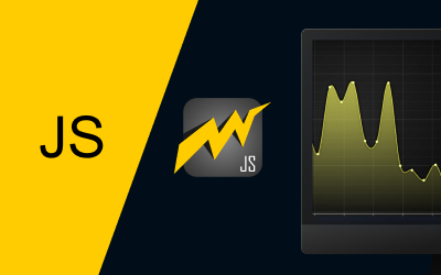
Below is an example of a JavaScript Candlestick chart application:

This type of JavaScript Candlestick chart is used to observe price fluctuations while trading. This makes it useful to dynamically display data for both longer and shorter intervals.

How to read a Candlestick chart?
Understanding the key components of a candle and what it stands for is crucial when analyzing candlestick charts for a trading strategy. When the price of the security starts at a specific price and then rises, the candlestick turns green. This is referred to as a green or bullish candle.

Conversely, the candlestick turns red when the price opens and then falls. This is known as a red or bearish candle.

The opening price of a security is the bottom of a green candlestick or the top of a red candlestick. On the other hand, the closing price of a security is the top of a green candlestick or the bottom of a red candlestick.

What does a Candlestick chart indicate?
As a stock price moves in one direction, individual candlesticks form various patterns which traders can use to identify and predict major support and resistance levels. Candlestick patterns are particularly useful because they visually reveal key information that is hidden from the chart. To find the high price of the security for the chosen period, look at the candlestick’s upper wick.

Look at the lower wick of the candlestick to get the security’s lowest price for the specified time period.

Each candlestick supplies a simple and visually appealing picture of price action. A trader can instantly compare the relationship between the open and close as well as the high and low prices. They can also be used to predict market reversals which can be extremely helpful for professional investors, brokers, etc.
Lightningchart is one of the greatest libraries for easily creating candlestick charts. With Lightningchart JS, you can instantly plot price variations in the form of candlesticks.
LightningChart JS Trader

Candlestick charts are available as a built-in feature in the new LightningChart JS Trader. The LightningChart JS Trader is a revolutionary Technical Analysis chart library that can be integrated into JavaScript-based software applications. LightningChart JS Trader arrives as the best trading charts solution for developing financial and stock trading applications that require sufficient processing power to run even microsecond-level stock price monitoring.
This is a technical analysis chart library that runs only at the fastest and highest performance powered by the LightningChart technology. LightningChart JS Trader features advanced technical chart types including CandleStick, Bar charts, Line charts, Mountain, Kagi, Renko, Point & Figure, and Heikin-Ashi price charts.
LightningChart JS Trader also features 100+ Technical indicators including Envelopes, Moving Averages, Oscillators, Statistics, Trend Indicators, Volatility, and more. Drawing Tools (30+) include Fibonacci, Trend Lines, Patterns, Channels, Measurement, Text, Shapes, and more. 2D, 3D, and real-time charts, GeoMaps, Customizable charts, and World-Leading Performance.
Note: financial and trading charts are no longer available in the main LightningChart JS library but require a LightningChart JSTrader license instead. Contact us for more information.
How to create a JavaScript Candlestick chart?
All the LightningChart functions and properties that we need to build charts are included in the IIFE.
1. LightningChart() constructor
Let’s get started creating the JavaScript Candlestick chart by initializing the chart by calling the LightningChart () constructor. Since we will be using a 2D XY chart we can initialize that using the ChartXY () constructor.
 const chart = lightningChart().ChartXY({
                theme: Themes.darkGold,
            })
2. Configuring the axis
Let’s configure the x-axis to show Date and Time information. DateTime data with irregular intervals can be shown on the DateTime category axis. For example, the business days alone can be represented in a week here. Decide on an origin for the Date Time axis. This origin date sets the starting point for the time range on the chart.
const dateOrigin = new Date(2018, 0, 1)3. DateTime axisTickStrategy
The below snippet shows the configuration of ticks with date and time origin for the JavaScript Candlestick chart application. We shall use the setTickStrategy() function on an axis. This is used to set the tick strategy for the axis, as well as styling elements of the tick strategy. The second parameter is a mutator and is optional, only used when styling or modifying elements of the tick strategy.
The tick strategy defines the positioning and formatting logic of axis ticks as well as the style of created ticks. Let’s use the DateTime axis tick strategy with the origin set to the current day or defined date.
chart
                .getDefaultAxisX()
                .setTickStrategy(
                    AxisTickStrategies.DateTime,
                    (tickStrategy) => tickStrategy.setDateOrigin(dateOrigin)
                )
4. Y-axis
In the below code, the user can change the title and behaviour of the Y-Axis according to requirements.
- setInterval() and setScrollStrategy() are optionally used here to set the axis interval and scrolling behaviour.
- Axis interval is the range of data values that are visible on the axis, they are referred to as start and end.
- By default, all axes fit the interval automatically to reveal all attached series. This behaviour is called the fitting scroll strategy.
- Automatic scrolling behaviour can be controlled by selecting the scroll strategy, with Axis.setScrollStrategy. This decides where the Axis scrolls based on the current view and series boundaries.
- `Axis.setScrollStrategies.fitting` (default) axis will automatically scroll to contain the boundaries of all attached series. `AxisScrollStrategies.expansion` same as ‘fitting’ but will never decrease the axis interval.
The following scroll strategies are supported: Fitting, Progressive, Regressive, etc.
chart.getDefaultAxisY()
                .setTitle('USD')
                .setInterval(90, 110)
                .setScrollStrategy(AxisScrollStrategies.expansion)
5. OHLC Series
OHLCSeries are created using the addOHLCSeries() method. We will also be setting Candlesticks as the figure to be used here. A data point in an OHLC series has four values open, high, low, and close. The candle sticks are plotted based on these four values to visualize price movement.
const series = chart.addOHLCSeries({ positiveFigure: OHLCFigures.Candlestick })OHLCSeries accepts data in the form of interface ‘XOHLC’.
6. Add() & XOHLC
add() can be called with a single XOHLC object or with an array of such objects.
const xohlc = [
    // X-position
    0,
    // Opening Y-value
    100,
    // Highest Y-value
    200,
    // Lowest Y-value
    50,
    // Closing Y-value
    75
]
series.add(xohlc)
7. xydata
The below snippet code is to generate some points using the ‘xydata’ library. The ‘xydata’ library provided by LightningChart, contains data generator functions that are used to generate sample data points in the form of x-data and y-data. This generator returns the object of OHLC data points. Each object in the chart can be interacted with, creating an animation that will aid in our understanding of the data shown.
 const dataSpan = 10 * 24 * 60 * 60 * 1000
 const dataFrequency = 1000 * 60
        createOHLCGenerator()
                .setNumberOfPoints(dataSpan / dataFrequency)
                .setDataFrequency(dataFrequency)
                .setStart(100)
                .generate()
                .toPromise()
                .then(data => {
                    series.add(data)
                })
Final JavaScript Candlestick Chart Application
Additionally, you can style or change the behavior of the AutoCursor following the below-mentioned steps:
- We can change the visual characteristics of the pointer over the chart using the [setAutoCursor] function.
- The auto cursor is a set of crosshair lines you see on the chart, along with a box that displays the value of the bars under the cursor.
- The Auto cursor is activated when the mouse is over the chart.
- It automatically solves the nearest data point to the mouse and displays it to the user over the chart in a result table.
- Since we are not interested in the y-crosshair now, we can remove y tick marker from the cursor by setting a style for the y-grid line as shown below.
chart.setAutoCursor(cursor => {
                cursor.disposeTickMarkerY()
                cursor.setGridStrokeYStyle(emptyLine)
            })
After configuring the auto-cursor behavior and styling it, we get the output shown in the second image. When hovering the plot area, it helps to gauge a precise position on the value scale, helps display tooltips for multiple series at a time, can be used as a zoom tool, as well as provides interactivity to the charts. The first image is showing to default cursor settings.

Conclusion
It is very easy to create interactive charts for apps and websites using specialized JavaScript tools for data visualization like LightningChart JS. Anyone with a basic understanding of coding can create professional interactive charts. I hope this JavaScript Candlestick chart tutorial was useful in outlining the easy steps needed to create your own initial JS candlestick chart. Speak to us if you are considering using JavaScript to create trading or stock chart applications and are concerned about performance.

Ajay Koli
LightningChart Team

Shweta Singh
LightningChart Team
Continue learning with LightningChart
React Charting Performance
Here's a scenario that plays out across development teams every few months. Someone builds a React dashboard, picks Recharts or Victory because they're popular, the devs love them, and the first demo looks great. Then the dataset gets bigger. Or the data starts...
Javascript Charting Library comparison 2026
Every year someone publishes a listicle of JavaScript charting libraries. They screenshot a demo, note the GitHub stars, paste in the npm install command, and call it a day. Then you follow their recommendation, get six months into your project, and discover that your...
Visualizing 10 Million Data Points in the Browser (2026): The Technical Deep-Dive
Ten Million Data Points in the Browser: How WebGL Makes Mass Datasets Interactive Ten million data points. That number used to mean a database problem, not a front-end problem. Now research teams want to explore it interactively in a browser. Trading desks want...


If you have any questions, feel free to contact us!
©LightningChart Ltd 2026. All rights reserved.