


LightningChart JSCreate a JavaScript Business Dashboard with LightningChart JS
TutorialCreate an interactive JavaScript business dashboard for visualizing key business data
Written by a human | Updated on April 14th, 2025
JavaScript Business Dashboard
In this article, I’ll be showing how to create a JavaScript business dashboard to visualize key business metrics from different departments. The dashboard is interactive and during the tutorial, you’ll learn about different parameters and LightningChart (LC JS) classes that you can fully customizable to adjust the dashboard to your needs.
Behind this business dashboard, you’ll learn how to use line series and bar charts which later you’ll add to a dashboard object. This is a great exercise if you want to have an interactive and advanced dashboard that supports a large number of data points, a perfect business intelligence tool.
Project Overview
We will use different line series and bar charts to create this JavaScript business dashboard. We will also implement interactivity between the bar chart and the line chart. The bar chart will help us to visualize in more detail the sales of each department, showing them as different lines for each one in the largest line chart. This JavaScript business dashboard is easy to create and is great for visualizing sales so let’s get started!
 Download the project to follow the tutorial
Local Setup
1. Download the template provided to follow the tutorial.
2. After downloading the template, you’ll see a file tree like this:

3. Open a new terminal and run the npm install command:
As usual in a NodeJS project, you need to run the npm install command. That would be everything for our initial setup. Let’s code.
CHART.ts
Inside this file, we will have all the logic needed to create our chart, configure animations, and format the data.
1. Declare the constant lcjs that will refer to our @arction/lcjs/xydata libraries.
// Import LightningChartJS
const lcjs = require('@arction/lcjs')

// Import xydata
const xydata = require('@arction/xydata'
2. Extract required classes from lcjs
const {
    lightningChart,
    SolidFill,
    SolidLine,
    UILayoutBuilders,
    UIElementBuilders,
    AutoCursorModes,
    AxisTickStrategies,
    emptyLine,
    emptyFill,
    AxisScrollStrategies,
    Themes,
} = lcjs
3. Creating the origin date, departments and resolution of points:
This is part of the JavaScript business dashboard where you’ll set the date frame, the departments in which numbers will be reported, and the point resolution.
const dateOrigin = new Date(2018, 0, 1)
const dateOriginTime = dateOrigin.getTime()

// Department names
const teams = ['Dev', 'Maintenance', 'Support', 'Sales', 'Marketing']
// 1 data-point per day
const pointResolution = 24 * 60 * 60 * 1000
4. Generating data
This is a progressive trace data generator that generates point data that has a progressive X-axis. The data is always derived from the previous point. You’ll create 365 points, one per each day of the year (2018).
The X values would be a calculation of resolution times the point number (i.e. day). The Y values would be a random value. In this way, every time the chart is refreshed, the data will change. In a real situation, you can create a JSON array with your X-Y values.
const budgets = Promise.all(
    teams.map((_, index) =>
        createProgressiveTraceGenerator()
            .setNumberOfPoints(365)
            .generate()
            .toPromise()
            // Map random generated data to start from a particular date with the frequency of dataFrequency
            .then((data) =>
                data.map((point) => ({
                    x: dateOriginTime + point.x * pointResolution,
                    y: index > 0 ? Math.abs(point.y) * 100 + 100 : Math.abs(point.y) * 50 + 1800,
                })),
            )
            // Shift the data by dateOriginTime
            .then((data) =>
                data.map((p) => ({
                    x: p.x - dateOriginTime,
                    y: p.y,
                })),
            ),
    ),
)
5. Creating the dashboard
The dashboard object will allocate the charts we want and you can customize the theme of this JavaScript business dashboard with default LightningChart JS themes. In this case, I’m using cyberSpace but there are many other themes available.
const db = lightningChart().Dashboard({
    theme: Themes.cyberSpace,
    numberOfRows: 3,
    numberOfColumns: 2,
})

const theme = db.getTheme()
const mainStrokeStyle = new SolidLine({
    thickness: 20 / window.devicePixelRatio,
    fillStyle: new SolidFill({ color: theme.examples.unfocusedDataColor }),
})
const selectedFillStyle = new SolidFill({ color: theme.examples.mainDataColor })
This dashboard will have 3 rows and 2 columns. The mainStrokeStyle and selectedFillStyle objects will help us set the colors to the bars within the bar chart. I’m using the base colors of the theme.
6. Creating the totalBudget object
const totalBudgetsPerTeam = budgets.then((teamBudgets) =>
    teamBudgets.map((budgetPerTeam) => budgetPerTeam.reduce((sum, v) => sum + v.y, 0)),
)
This object will store the totals from the budget object that we created before (i.e., random data). The reduce function will return a single value from the array object.
BarChart
1. Creating the bar chart
const barChart = db
    .createChartXY({
        columnIndex: 0,
        rowIndex: 0,
        columnSpan: 1,
        rowSpan: 2,
    })
    // Disable auto cursor
    .setAutoCursorMode(AutoCursorModes.disabled)
    // Set correct chart title
    .setTitle('Total expenses for 2018 per department')
    // Disable mouse interactions
    .setMouseInteractions(false)
To create the bar chart, we just need to use the createChartXY function. This will be used under the db (dashboard object). We also need to specify the index and row where the chart will be displayed. The barChart constant makes reference to the bar chart object and this will help us to extract and configure the properties of this chart.
2. Configuring the bar chart axes
const axisX = barChart.getDefaultAxisX()
// Modify X axis
axisX
    // Disable default ticks.
    .setTickStrategy(AxisTickStrategies.Empty)
    // Disable mouse interactions
    .setMouseInteractions(false)
    // Set static Axis range.
    .setInterval({ start: 0, end: 100 })
    // Disable auto scaling
    .setScrollStrategy(undefined)

// Modify Y axis
barChart
    .getDefaultAxisY()
    .setTitle('Expenses ($)')
    .setStrokeStyle((style) => style.setThickness(0))
    .setNibStyle(emptyLine)
    .setMouseInteractions(false)
We can have access to the X-Y axes by using the getDefaultAxis function. We can set a title to the axis, tick strategy, intervals, range, etc.
3. Creating the bar series
The addSegmentSeries is the method for adding a new SegmentSeries to the chart. For each bar, we need to add a gap. We can set a specific position on the X-axis and for this example, we are setting the value depending on the number of bars we have.
const bars = barChart.addSegmentSeries().setHighlightOnHover(false)
// Calculate
const numberOfGapsBetweenBars = teams.length + 1
// Create custom ticks to mark positions of different departments bars
const customTicks = teams.map((team, i) =>
    axisX
        // Add new custom tick
        .addCustomTick()
        // Set team name as marker text
        .setTextFormatter((_) => team)
        // Position custom tick in according with department index
        .setValue((100 / numberOfGapsBetweenBars) * (i + 1))
        // Disable gridstroke.
        .setGridStrokeStyle(emptyLine),
)
Line Chart
1. Creating the line chart
const lineChart = db
    .createChartXY({
        columnIndex: 0,
        rowIndex: 2,
        columnSpan: 2,
        rowSpan: 1,
    })
    .setPadding({ right: 40 })
// Set the row height for the third row to take 50% of view space.
db.setRowHeight(2, 2)
// Create simple line series
const lineSeries = lineChart
    .addLineSeries()
    .setName('Total Expenses')
    // Set selected fill color for the series
    .setStrokeStyle((style) => style.setFillStyle(selectedFillStyle))
To create a Line Chart, we will do the same process as previously with the bar chart. The main difference is that a line chart uses a Line Series instead of a Segment Series. The selectedFillStyle object was created at the beginning of the file. This returns the main color of the current theme.
2. Adding tick strategy
lineChart.getDefaultAxisX().setTickStrategy(AxisTickStrategies.DateTime, (tickStrategy) => tickStrategy.setDateOrigin(dateOrigin))To show dates as a tick, we need to use the type DateTime. The chart will adjust automatically the ticks by taking the date origin as the first reference.

Interactive Bar Chart
1. Creating bar for each department
const barCol = customTicks.map((tick, i) => {
        // Get custom tick position
        const pos = tick.getValue()
        // Add Line which represents bar
        // Line X position is based on custom tick value
        return bars.add({
            startX: pos,
            startY: 0,
            endX: pos,
            endY: values[i],
        })
    })
2. Cost distribution
lineChart.getDefaultAxisX().setTickStrategy(AxisTickStrategies.DateTime, (tickStrategy) => tickStrategy.setDateOrigin(dateOrigin))The current points in the line chart are removed and a new set of points is added. These new points come from the costsOfTeams parameter which comes from the budget promise object that we created at the beginning of this file. Remember that all those points were formatted and created randomly.
The rest of the code corresponds to the UI format. For example, the selected department bar is colored with the selectedFillStyle object that we created before.
barCol.forEach((bar, i) => {
        bar.onMouseEnter(() => selectedDepartment(i))
        bar.onTouchStart(() => selectedDepartment(i))
    })
    // Select the first department at initial value
    selectedDepartment(0)
With the aforementioned code, we can set a listener for each bar. When we select a bar, the selectedDepartment method will be executed. The parameter corresponds to the bar number. At the beginning of the project, the selected bar by default would be the index zero.
Text Area

1. Creating the text area with total amount
const column = db
    // Create a dashboard without any content,
    // but with possibility to host any UI element
    .createUIPanel({
        columnIndex: 1,
        rowIndex: 0,
        columnSpan: 1,
        rowSpan: 1,
    })
    // Add a column structure to the UI panel
    .addUIElement(UILayoutBuilders.Column)
    .setPosition({ x: 50, y: 50 })
    .setPadding({ right: 40 })
    .setBackground((background) => background.setFillStyle(emptyFill).setStrokeStyle(emptyLine))
You can create user interface panels within rows. These panels can work as an inner dashboard inside a row column. We can have access to this panel by using the column object.
totalBudgetsPerTeam.then((teamCosts) => {
    // Add the first row to the column
    const firstRow = column.addElement(UILayoutBuilders.Row)
    // Add a gap which allocates all empty space in front of text
    firstRow.addGap()
    // Add text element right after gap
    firstRow.addElement(
        UIElementBuilders.TextBox
            // Modify TextBox builder to style the text field
            .addStyler((textBox) =>
                textBox
                    // Define font settings for the text box
                    .setTextFont((fontSettings) => fontSettings.setSize(75 / window.devicePixelRatio))
                    // Define content of the text box
                    .setText('$' + teamCosts.reduce((sum, cost) => sum + cost, 0).toFixed()),
            ),
    )
    // Add a gap which allocates all empty space right after text
    firstRow.addGap()
    // Add a text box to the second row of the column
    column.addElement(
        UIElementBuilders.TextBox
            // Modify TextBox builder to style the text field
            .addStyler((textBox) =>
                textBox.setTextFont((fontSettings) => fontSettings.setSize(25 / window.devicePixelRatio)).setText('Total company expenses'),
            ),
    )
})
Once the totalBugetsPerTeam object is ready, we will use its data to feed our total amount label. A new row is added to the column (panel) object. One row will display the total amount and the other the total line chart. The rest of the code corresponds to the styling of the amount label.
2. Creating the Line Chart for total costs distribution per days
const totalCostsChart = db
    // Create a cartesian chart
    .createChartXY({
        columnIndex: 1,
        rowIndex: 1,
        columnSpan: 1,
        rowSpan: 1,
    })
    // Specify ChartXY title
    .setTitle('Total expenses per day')
    .setPadding({ right: 40 })

totalCostsChart.getDefaultAxisX().setTickStrategy(AxisTickStrategies.DateTime, (tickStrategy) => tickStrategy.setDateOrigin(dateOrigin))
This is basically the same process as we did before to create the main line chart. The only change is in the data and the location.
Adding line series
const totalCost = totalCostsChart
    // Add the smooth line
    .addSplineSeries()
    .setName('Total Expenses ($)')
    // Change the thickness of the stroke
    .setStrokeStyle((strokeStyle) => strokeStyle.setThickness(2))
3. Adding values to the chart
budgets.then((teamBudgets) => {
    // Calculate total amount of costs per day
    const totalCostsPerDays = new Array(365)
    for (let i = 0; i < 365; i++) {
        totalCostsPerDays[i] = {
            x: i * pointResolution,
            y: teams.reduce((sum, _, teamIndex) => sum + teamBudgets[teamIndex][i].y, 0),
        }
    }
    // Draw a smooth line for total amount of costs per day
    totalCost
        // Hide points
        .setPointFillStyle(emptyFill)
        // Add data
        .add(totalCostsPerDays)
})
The loop will get the value for each point of the year (365). All the points will be stored in the array totalCostsPerDays and added to the chart (totalCost).
4. Adding the table result to each data point
The setCursorResultTableFormatter will configure the formatting of the CursorResultTable when pointing at this series. The general syntax for setting the format of a ResultTable is shared across all string types. It specifies a callback function that receives a TableContentBuilder. Then the content of the table is set using the methods of the table builder.
The additional values that are supplied to the callback function vary per series, for example, the Line Series receives three extra parameters:
- Series: reference to the series itself.
- X: pointed data point X coordinate.
- Y: pointed data point Y coordinate.
- DataPoint: reference to the pointed data point as supplied by the user
Final JavaScript Business Dashboard App
This tutorial was a quick and easy introduction to creating dashboards using LightningChart JS components. Of course, these components were an example to create a JavaScript Business Dashboard but the range of charts available is wide.
For instance, LightningChart JS has more than 100 components ready for testing and evaluation. You can also integrate them within a dashboard. But for now, you now know how to code an interactive JavaScript business dashboard. See you in the next article!

Omar Urbano
Software Engineer
Continue learning with LightningChart
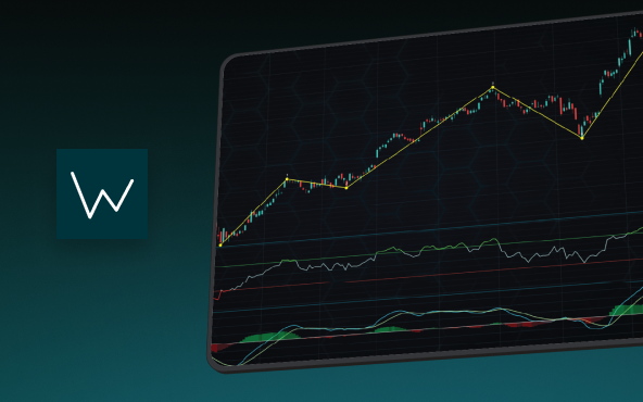
Elliott Wave Theory in Trading
Elliott Wave Theory in TradingFinancial markets often appear chaotic, but many traders believe that price movements follow recurring patterns driven by human psychology. One of the most influential approaches based on this idea is the Elliott Wave Theory. Developed...
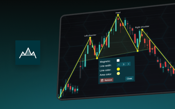
The Head and Shoulders Pattern in Technical Analysis
The Head and Shoulders Pattern in Technical Analysis The Head and Shoulders Pattern in Technical Analysis The Head and Shoulders pattern is one of the most recognized and widely used chart patterns in technical analysis. It is considered a reliable reversal pattern...

Best Telerik Charts Alternative in 2026: GPU Performance for WPF, WinForms, and Web
Telerik from Progress is a comprehensive UI component suite covering WPF, WinForms, ASP.NET, Blazor, and JavaScript. The charting components: RadChartView for WPF and WinForms, and Kendo UI Charts for web and Blazor, arrive bundled with the suite purchase. For teams...


If you have any questions, feel free to contact us!
©LightningChart Ltd 2026. All rights reserved.