.NET Data VisualizationHow to Create a Strip Chart Application
TutorialA step-by-step guide on how to create an XY strip chart application in .NET with LightningChart
What is a Strip chart application and what are the modern equivalents to it?
Before computers exist or were taking their first steps, a Strip chart was a way to visualize an analog electrical signal.
Voltage was moved by a needle or pen, and the trace was plotted on scrolling graph paper. The device was called a Strip chart recorder.
The typical applications were for example:
- Electrocardiogram (ECG), heart electric activity plot
- Seismography, earthquakes, and movement of tectonic plates activity monitoring
- Polygraphy tests, physiological measurements such as lie detector
- Electroencephalography (EEG), brain electric activity monitoring
- Any electrical signal change plotting, typically over time

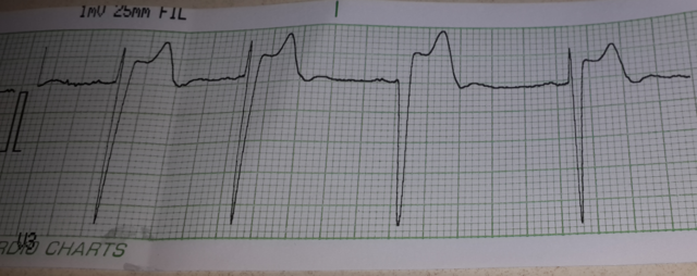
An analog Electroardiogram (ECG) strip chart.
The software application is receiving the data from the data acquisition device.
As there is an A/D converter involved, the data is sampled with a certain sampling frequency, making a data stream to the receiving computer or mobile device.
Strip chart applications are not typically plotted on paper anymore but are shown as waveform charts.

Vintage Strip machine recorder.
Nyquist Theorem
So, by the Nyquist sampling theorem, the sampling frequency must be at least 2x the highest frequency existing in the analog signal, otherwise, the information is not fully retained.
Some can argue that is 2x enough because visually a sine wave deteriorates and can’t be visually reproduced with full quality if simply connecting the data points with a polyline.
Therefore, a bit higher sampling frequency may be preferred, depending on the application.
A strip chart application is a real-time chart. Monitoring the data as it comes, rendering it on the screen, with the lowest possible latency.
With a computer, a smooth scrolling experience is challenging, especially when hundreds or thousands of signals are to be rendered at the same time with a high sampling frequency.
There are only a few chart technologies capable of doing that.
Human-oriented bio-signals such as ECG, EEG, and patients’ monitors, in addition to a scrolling view, are typically shown with a paging or a sweeping view, where the older page is kept on the back, and a new page is swept over it.
The data monitored is typically stored in a computer or cloud system, making the system a modern successor of the Strip chart application recorder, and much more.
The data can be opened and analyzed as a waveform chart, and detailed analytics performed with various algorithms and viewing tools, such as zooming and panning.
Scrolling waveform chart
Written by:
Pasi Tuomainen | Founder of LightingChart
Project overview
The next chart is a .NET visualization with several presets available from visualizing 1 million data points up to 8 billion data points.
The chart also features two different scroll modes that you can choose from, sweeping and scrolling.
Have a look at what you’ll create:
Download the project to follow the tutorial
Local Setup
- OS: 32-bit or 64-bit Windows Vista or later, Windows Server 2008 R2 or later.
- DirectX: 9.0c (Shader model 3 and higher) or 11.0 compatible graphics adapter.
- Visual Studio: 2010-2019 for development, not required for deployment.
- Platform .NET Framework: installed version 4.0 or newer.
Now go to the next URL and download LightningChart .NET, you’ll have 30 days to test out the library.

You will be redirected to the sign-in form. The process is very single, so after confirming your email you will have access to your own LC (LightningChart) account.
After signing in to your account, you’ll be able to download the SDK which is a 30-day free trial but it’ll get you access to important features.
After downloading the SDK, you’ll get a .exe file like this:

The installation will be a typical Windows process, so please continue with it until is finished. After the installation, you will see the following programs:

- License manager: In this application, you will see the purchase options. All the projects that you will create with this trial SDK, will be available for future developments with all features enabled.
- LightningChart .NET Interactive Examples: A window will open, and you will be able to see a very extensive chart catalog where you can interact with each of them.
Visual Studio Project
Now let’s work with Visual Studio. The main difference between using the LC visualizer and Visual Studio is that we will be able to analyze and experiment with many features in the source code.
Choose the 8 Billion Points Chart and run the example:

In the top-right zone of the windows, you will see the following options:

For the trial SDK, we will be able to use the WPF and WinForms frameworks. If you are fully related to Windows Forms, this option will be more comfortable.
In this case, I will use the Windows Presentation Foundation (WPF) framework.
After clicked the framework to use, we will need to specify a folder where the project will be created.
Finally, the project will be created and the Visual Studio will be opened and ready for execution:

Code Review
The main code will be wrapped inside MainWindow.xaml.cs. Here we will find the code for UI controls.
Inside the code we will check two methods that will create the properties that we need to draw the chart correctly.

CreateChart()
This main method will initialize many properties that are provided by the Lightning Chart .NET framework.
If you checked our previous JS articles, this part will be familiar.
The great advantage here is that, if you have C# knowledge, this syntax will be easier for you.
- _chart: The chart object will contain the Lightning Chart constructor… basically this will contain a new instance of a chart object.
- _chart – properties:
_chart.BeginUpdate();
_chart.ChartName = "8 Billion Points";
_chart.ChartRenderOptions.DeviceType = RendererDeviceType.AutoPreferD11;
_chart.ChartRenderOptions.LineAAType2D = LineAntiAliasingType.QLAA;

_chart.Title.Font.Size = 16;
_chart.Title.Text = "New Chart";
 _chart.Title.Color = Color.FromArgb(255, 255, 204, 0);
_chart.Title.Align = ChartTitleAlignment.TopCenter;- BeginUpdate(): Disables control repaints when updating the status of many properties or updating series points.
- ChartName: name of the chart.
- ChartRenderOptions:
- DeviceType: Type of rendering device to use, or selection logic for the engine to use.
- RendererDeviceType – AutoPreferD11: Enum Class with the options provided by Lightning Charts. Learn more about RenderDeviceType Enumeration.
- LineAAType2D: Anti-aliasing type of single pixel width anti-aliased lines. Applicable only on DX11 and when AntiAliasLevel is above 1. Lines thicker than 1 pixel are rendered using triangles and triangle drawing AA system. ALAA option generally produces the best-looking lines and is faster than QLAA.
- Title: refers to the object that contains properties for the chart title.
- Font.Size: Size of the font.
- Text: the string value for the title.
- Color: ARGB color.
- Align: Alignment for the title inside the chart object.
- Assigning type of chart: As we did in our previous articles; we need to specify what type of chart we want to render in our “dashboard” (_chart object). For this example, we will have to work with an +XY chart.
ViewXY view = _chart.ViewXY;XY chart properties
view.XAxes[0].ScrollMode = XAxisScrollMode.Scrolling;
view.XAxes[0].SweepingGap = 0;
view.XAxes[0].ValueType = AxisValueType.Number;
view.XAxes[0].AutoFormatLabels = false;
view.XAxes[0].LabelsNumberFormat = "N0";
view.XAxes[0].Title.Text = "Point number";
view.XAxes[0].SetRange(0, 100000);
view.XAxes[0].MajorGrid.Pattern = LinePattern.Solid;
view.XAxes[0].Units.Text = "Points";- ScrollMode: Scroll mode. In real-time monitoring, set ‘Scrolling’, ‘Sweeping’ or ‘Stepping’, and give the current monitoring position via ScrollPosition property. If not real-time monitoring, but displaying data normally, you should set this to ‘None’ (default).
- SweepingGap: Sweeping gap, percent of graph width. Used when ScrollType is set to Sweeping. Valid values: 0 to 20%.
- ValueType: Type of value to use, we can use numeric, time, or coordinate values.
- AutoFormatLabels: Automatically determines the number of decimals or time format.
- LabelsNumberFormat: Format of the numbers. Used when the value type is numeric.
- SetRange: Assign the minimum and maximum range for the X-Axis. 0 to 100000 will be the default value, and this could be changed using the UI controls.
- MajorGrid: Drawing patterns of the lines for the grid at major divisions.
- Units.Text: String of the units for the x Axis.
Setting old data destruction & layout settings
//Set real-time monitoring automatic old data destruction
	view.DropOldSeriesData = true;

//Set Axis layout to Segmented
	view.AxisLayout.YAxesLayout = YAxesLayout.Stacked;
	view.AxisLayout.SegmentsGap = 2;
	view.AxisLayout.YAxisAutoPlacement = YAxisAutoPlacement.LeftThenRight;
	view.AxisLayout.YAxisTitleAutoPlacement = true;

//fix margins to prevent Graph resize, which may take long time for Billion points
	view.AxisLayout.AutoAdjustMargins = false;
view.Margins = new Thickness(70, 17, 70, 34);- DropOldSeriesData: Automatically deletes series data, whose x value is less than the X-axis minimum. By setting this true, the performance is much better in real-time monitoring applications.
- YAxesLayout: Y-Axis mode: Stacked, Layered, Segmented.
- SegmentGap: When a stacked or segmented view is defined and there is more than one Y axis defined,
this is the gap in pixels between the segments of the graph.
- YAxisAutoPlacement: Auto placement of Y axis (enum): off, AllLeft, AllRight, LeftThenRight, RightThenLeft, Explicit.
- YAxisTitleAutoPlacement: Previous properties applied to the title if it’s true.
- AutoAdjustMargins: Calculate margins automatically.
- Margins: If the auto-adjust property is false, you can manually specify the thickness for the margin.
Create a dark sweeping gradient band for the old page
Band sweepBandDark = new Band(view, view.XAxes[0], view.YAxes[0])
{
BorderWidth = 0
};
sweepBandDark.Fill.Color = Color.FromArgb(255, 0, 0, 0);
sweepBandDark.Fill.GradientColor = Color.FromArgb(0, 0, 0, 0);
sweepBandDark.Fill.GradientFill = GradientFill.Linear;
sweepBandDark.Fill.GradientDirection = 0;
sweepBandDark.Binding = AxisBinding.XAxis;
sweepBandDark.AllowUserInteraction = false;
view.Bands.Add(sweepBandDark);
Band
For this case, the band object will only work as part of the UI. The dark Band will be bound to the X-axis.
We can create one or more bands and bind them to the axis that we want.
Bright sweeping gradient band for new page
Band sweepBandBright = new Band(view, view.XAxes[0], view.YAxes[0])
{
BorderWidth = 0
};
sweepBandBright.Fill.Color = Color.FromArgb(0, 0, 0, 0);
sweepBandBright.Fill.GradientColor = Color.FromArgb(150, 255, 255, 255);
sweepBandBright.Fill.GradientFill = GradientFill.Linear;
sweepBandBright.Fill.GradientDirection = 0;
sweepBandBright.Binding = AxisBinding.XAxis;
sweepBandBright.AllowUserInteraction = false;
view.Bands.Add(sweepBandBright);
Finish with Chart properties
_chart.EndUpdate();

gridMain.Children.Add(_chart);
Grid.SetRow(_chart, 0);
Grid.SetColumn(_chart, 1);
Start();- EndUpdate(): Enables control repaints.
- SetRow / SetColumn: Sets the value of the System.Windows.Controls.Grid.Row attached property to a given System.Windows.UIElement.
- Start: Executed the Start method. This will construct the data for our chart.
Start()
The method in charge to create and construct the series data for our chart. Here we will see new properties for data streaming.
Initializing variables
//Start
	_iRound = 0;
	_pointsAppended = 0;
	_framesRenderedCount = 0;

	_stopWatch.Stop(); //this is started in the CompositionTarget_Rendering in first round

	CompositionTarget.Rendering -= CompositionTarget_Rendering;
	CompositionTarget.Rendering += CompositionTarget_Rendering;
	buttonStartStop.Content = "Restart";

ViewXY v = _chart.ViewXY;- _iRound: Data feeding round.
- _pointsAppended: Points added so far.
- _framesRenderedCount: Frames rendered so far.
- stop():
- stopwatch class = Provides a set of methods and properties that you can use to accurately measure elapsed time.
- Stop(): Stops measuring elapsed time for an interval.
- CompositionTarget: Represents the display surface of your application.
-
- Rendering: Occurs just before the objects in the composition tree are rendered.
- CompositionTarget_Rendering: This method will append the processed points and series. We will see the result on the interface, as follows:
-

Getting values from UI Text boxes

//Read series count
	try
  {
  _seriesCount = int.Parse(textBoxSeriesCount.Text);
  }
  catch
  {
  MessageBox.Show("Invalid series count text input");
  return;
  }

//Read append count / round
	try
  {
  _appendCountPerRound = int.Parse(textBoxAppendCountPerRound.Text);
  }
  catch
  {
  MessageBox.Show("Invalid append count");
  return;
  }

//Read X axis length
	try
  {
  _xLen = double.Parse(textBoxXLen.Text);
  }
  catch
  {
  MessageBox.Show("Invalid X-Axis length text input");
  return;
  }
Create input data
_data = CreateInputData(_seriesCount, _appendCountPerRound);private float[][] CreateInputData(int seriesCount, int appendCountPerRound)
{
//Create input data for all series.
float[][] data = new float[seriesCount][];
//System.Threading.Tasks.Parallel.For(0, seriesCount, (seriesIndex) =>
for(int seriesIndex = 0; seriesIndex < seriesCount; seriesIndex++)
{
int dataPointCount = PreGenerateDataForRoundCount * appendCountPerRound;
float[] seriesData = new float[dataPointCount];
float seriesIndexPlus1 = seriesIndex + 1;
Random rand = new Random((int)DateTime.Now.Ticks / (seriesIndex + 1));
double y = 50;
for (int i = 0; i < dataPointCount; i++)
{
y = y - 0.05 + rand.NextDouble() / 10.0;
if (y > YMax)
{
y = YMax;
}
if (y < YMin)
{
y = YMin;
}
seriesData[i] = (float)y;
}
data[seriesIndex] = seriesData;
}//);
return data;
}The CreateInputData() method will create random data (for this example), as long as _seriesCount is greater than the loop count (seriesIndex).
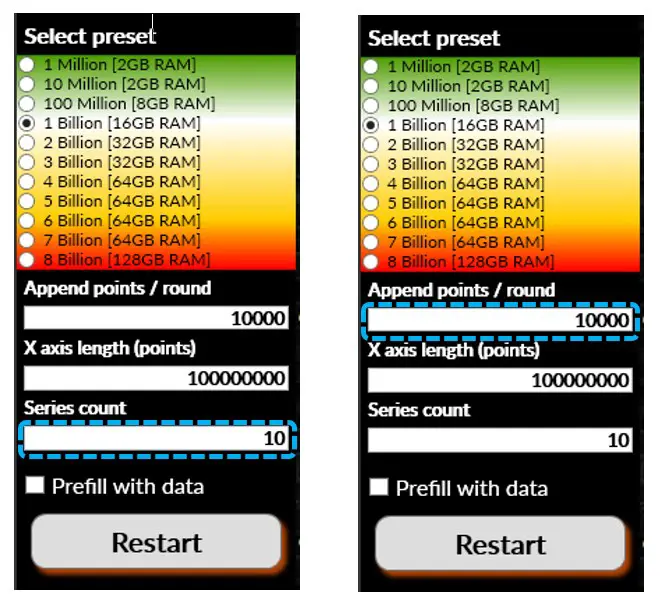
The _seriesCount and the _appendCountPerRound will have the value specified in the UI text box:

_chart.BeginUpdate();
_chart.ViewXY.AxisLayout.AutoShrinkSegmentsGap = true;
	//Clear Data series
		DisposeAllAndClear(v.SampleDataBlockSeries);
	//Clear Y axes
		DisposeAllAndClear(v.YAxes);
Before updating the current chart with the newly gotten data, we must disable the repaints control using the BeginUpdate() method.
If we want to automatically shrink the segment gap, we must set the value to true so that all segments can fit in the chart.
To recreate the Line Series and Axes with new data, we must clear them.
The SampleDataBlockSeries is a list that contains the current line series. YAxes contains a list of all Y axis in the XY chart.
for (int seriesIndex = 0; seriesIndex < _seriesCount; seriesIndex++)
{
	Color lineBaseColor = DefaultColors.SeriesForBlackBackgroundWpf[seriesIndex % DefaultColors.SeriesForBlackBackgroundWpf.Length];

	AxisY axisY = new AxisY(v);
	axisY.SetRange(YMin, YMax);

	axisY.Title.Text = string.Format("Ch {0}", seriesIndex + 1);
	axisY.Title.Angle = 0;
	axisY.Title.Color = ChartTools.CalcGradient(lineBaseColor, System.Windows.Media.Colors.White, 50);
	axisY.Units.Visible = false;
	axisY.AllowScaling = false;
	axisY.MajorGrid.Visible = false;
	axisY.MinorGrid.Visible = false;
	axisY.MajorGrid.Pattern = LinePattern.Solid;
	axisY.AutoDivSeparationPercent = 0;
	axisY.Units.Text = "mV";
	axisY.Visible = true;
	axisY.MajorDivTickStyle.Alignment = seriesIndex % 2 == 0 ? Alignment.Near : Alignment.Far;
	axisY.Title.HorizontalAlign = seriesIndex % 2 == 0 ? YAxisTitleAlignmentHorizontal.Left : YAxisTitleAlignmentHorizontal.Right;
To finish with the main code, we must add properties to each series while the counter is minor to the series count specified in the UI.
We checked almost all those properties before. As you can see, with those properties, we are “drawing” and “coloring” each series.

NOTE: to use the Prefill with Data option, use the PrefillChartWithData method:
//Prefill with data, this may take several seconds
	if (checkBoxPrefill.IsChecked == true)
  	{
  	PrefillChartWithData();
  	}
_chart.EndUpdate();
That method will set the data almost till the end, so it will reach the end and start scrolling quickly.
So, the series will start to scroll until the entire data has been loaded.
With all the properties and data created, we can call the EndUpdate() method, to enable and refresh the control repainting.
Conclusion
In the past, a strip chart was a graphical representation of data plotted on a continuous strip of paper but now, high-performance strip chart applications are available for integration in data-driven applications.
This type of chart is often used to track changes in data over time, such as temperature or heart rate.
Strip charts are useful for spotting trends or patterns that might otherwise be missed.
In conclusion, strip charts are a great way to visualize extensive data in .NET. They are easy to create and offer a lot of flexibility in terms of customization.
We hope that this guide has been helpful in showing you how to create your own strip chart with LightningChart .NET. See you in the next article!


