


Visualize Commodity Prices Using LightningChart Python Trader
Tutorial
Written by a Human
Learn how to effectively visualize commodity prices in Python using LightningChart Python Trader for data analysis and insights.
Mikael Virtanen
Data Science Python Developer

Introduction
This article demonstrates how to visualize commodity prices using the charting features of the LightningChart Python Trader (PT) library. It includes a simple pipeline example where real-world commodity data sourced from Alpha Vantage’s commodities API is fetched and then displayed using the library.
The API – Alpha Vantage
The Alpha Vantage API provides free access to most of its APIs with a limit of 25 API calls per day. This includes data on stocks, options, forex and crypto from several exchanges, with historical data covering the last 20 years. Both adjusted and unadjusted data are available in their stock API. This demonstration will focus on their commodities API exclusively.
There is a 15-minute delay in the stock data for the free and cheapest premium subscriptions, thus putting one at a disadvantage if wanting visualize data in real-time. Additionally, the limit of 25 calls per day can be problematic when testing the functionality of the API. The premium subscriptions start at $50 / month (75 API calls per minute).
Data for commodities is provided in flexible time ranges. Including: daily, weekly, monthly, and quarterly. The commodities API offers data for the following goods: Crude oil prices (WTI and Brent), Natural gas, Copper, Aluminium, Wheat, Corn, Cotton, Sugar, Coffee. Data from the global commodities index is also available. The data is returned as a JSON string that can be easily worked with programming languages such as Python, C#, .NET, NodeJS. Python will be used in the examples.
Plotted variables
Python trader requires Open, High, Low, Close (O, H, L, C) values to work (as well as a date). However, the API only returns close and a date. A workaround for this will be presented later on in the article.
LightningChart Python Trader
LightningChart’s Python Trader (PT) provides extensive charting solutions with a high degree of customizability through its easy-to-use UI and built-in functionalities. Since the library is built for Python, it’s also possible to use other Python libraries if necessary.
As with all Lightningchart products, Performance has been a high priority when developing the library, even when working with large amounts of data, thus removing possible bottlenecks in this area.
Overview of the UI

Above is the PT user interface with stock data charted using the default candlestick chart. On the top left are controls used to customize the chart and work with datasets. Here is the explanation for all the UI controls:

Charting features
These are chart types of Python trader provides out of the box.

Chart types can be changed with the the UI or with the set_price_chart_type(chart_type) command. Available ones are ‘CandleStick’, ‘Bar’, ‘Line’, ‘Mountain’, ‘HeikinAshi’, ‘Renko’, ‘Kagi’, and ‘PointAndFigure’. For example, a mountain creating a mountain chart using the following methods:
trader.set_price_chart_type('Mountain')
trader.add_data_array(data)
trader.open()
Chart visuals can be customized using the Python trader UI. Below are available settings for chart and indicator colours, background colour/image etc.


Default chart colours.

Background and indicator colours changed

Chart customization
Customisation can also be done with code, using the built-in methods. The code below changes the background image and the chart colours to the ones seen in the right image. But why use code for customisation, since working with UI is easier?
trader.set_color_theme('cyberSpace')
# Changing the indicator colours for the candlesticks
trader.set_positive_body_color('#0fdf0c')
trader.set_positive_wick_color('#33d7a0')
trader.set_negative_body_color("#f3eb16")
trader.set_negative_wick_color('#b85900')
When the customization is applied on code level there’s no need to change any settings or load a template. Meaning you won’t have to make the changes every time when opening a chart. Python trader supports the use of templates for customization, and these files can be loaded in with code.
However, you still need to manually select the file, and in case you want to share the chart the template file would also need to be shared. When the changes are done in code, only it needs to be shared to get the same results.
Technical indicators
Python trader supports over 100 technical indicators. These include ones such as Relative Strength Index (RSI), Bollinger bands, Moving averages (SMA, EMA etc), Oscillators for money flow and price, Fibonacci retracements, as well as statistical ones like Standard deviation. Technical indicators can be added to a chart easily with the trader UI, their properties (period count, standard dev) can also be changed the same way.

These indicators can also be added and customized via code.
trader.add_simple_moving_average(period_count=14)
trader.add_bollinger_band(period_count=14)
Indicators such as the Fibonacci patterns can be added with the built-in draw tools. Other markers can also be added this way. To see all the indicators, refer to the documentation.

Setting Up Python Environment
Next off let’s look at how to visualize the data from the commodities API using Python Trader. The data will be in Json format; however, the API has an option to return the data in CSV format. While Python trader can work with CSV files, this will not be the scope of this article. For more information regarding CSV files please consult the documentation about reading data from CSV files. First off make sure the Python Trader library is installed. You will also need a license key to use it, as well as one for the API.
import requests
from lightningchart_trader import TAChart
license_key_path = "Python-Trader_License_key.txt"
# Load the license key and initializing Python trader
license_key = open(license_key_path).read()
trader = TAChart(license_key)
# api_name is the APi you wish to use for data eg: TIME_SERIES_DAILY. 'ticker' is the ticker specific stock eg: AAPL
# key is your Alphavantage API key
# https://www.alphavantage.co/query?function=api_name&symbol=ticker&apikey=key
api_key_path = "API-key.txt"
# Load the license key
key = open(api_key_path).read()
trader = TAChart(license_key)
# List for adding data to the chart
data = []
Finally, set the data list as the chart’s source, and then everything is ready.
Get commodities data from the API
def getData(api_name: str, data_interval: str):
    """Make an API call using the following parameters """

    data_list = []
    # APi returns data as JSON thats converted into a Python dictionary
    call_url = f'https://www.alphavantage.co/query?function={api_name}&interval={data_interval}&apikey={key}'
    api_response = requests.get(call_url).json()
    print(api_response)
    # Parsing the data from the API
    data_list = []
    for entry in api_response['data']:
      date = entry['date']
      # Some entries are empty thus should not be processed.
      if entry['value'] != '.':
         price_data = float(entry['value'])
         # Python trader requires open,high,low,close and a date to work properly.
         # The commodities API doesn't return all of them only single price value and a date
         # This can be circumvented, just remember that some charts/indicators won't work
         # Add the new dictionary to a list
         data_list.append({'open': price_data,
                           'high': price_data,
                           'low': price_data,
                           'close': price_data,
                           'date':date})
    trader.set_chart_title(f'{api_response['name']} data {data_interval}')
    # Import the list of dictionaries to Python Trader
    trader.set_data(data_list)
Visualizing Commodity Prices
Mountain chart of crude oil (Brent) prices in monthly intervals. This type of chart works well even without the OHLC values, as its purpose is not to provide detailed info for each data point, compared to for example candlesticks.

def oil_chart_one():
    getData('BRENT', 'monthly')
    trader.set_color_theme('cyberSpace')
    trader.set_line_color("#B69E00")
    trader.set_price_chart_type('Mountain')
    trader.open()
Same as the last chart, but with weekly instead of monthly interval. Due to the long time frame the visualization appears, bit cluttered.

def oil_chart_two():
    getData('BRENT', 'weekly')
    trader.set_color_theme('cyberSpace')
    trader.set_line_color("#B69E00")
    trader.set_price_chart_type('Mountain')
    trader.open()
Crude oil prices (WTI)
As line charts also work very similarly to mountain charts they can also be used with limited values.

Line chart with technical indicators (std, historical volatility) added through Python Trader UI.

def oil_chart_three():
    getData('WTI', 'monthly')
    trader.set_color_theme('cyberSpace')
    trader.set_line_color("#B62A00")
    trader.set_price_chart_type('Line')
    trader.add_standard_deviation()
    trader.add_historical_volatility_index()
    trader.open()
Quarterly copper price trends
Kagi chart plotting copper prices in quarterly interval.

Same data, but with a line chart.

def copper_chart():
    getData('COPPER', 'quarterly')
    trader.set_color_theme('turquoiseHexagon')
    trader.set_line_color("#0EE92B")
    trader.set_price_chart_type('Kagi')
    kagi = trader.get_kagi_instance()
    kagi.set_thick_line_color("#11e787")
    kagi.set_thin_line_color("#31553b")
    trader.open()
Annual coffee price trend analysis using a Renko chart
As Renko charts are used to track price movements rather than price change over time (although the latter can be done to a certain extent with them), they can be useful when analysing trends over longer time periods.

def coffee_chart():
    getData('COFFEE', 'annual')
    trader.set_color_theme('light')
    trader.set_positive_body_color("#1d5a1c")
    trader.set_negative_body_color("#6a1717")
    trader.set_price_chart_type('Renko')
    trader.open()
Conclusion
Due to Python Trader needing the OHLC values, plotting data that does not have all of them can be tricky. It is possible to overcome this issue and still make a meaningful visualization. As long as one keeps in mind that some of the charts and indicators might give an incorrect view due to this.
It’s also important to consider using multiple kinds of charts to get a better understanding of a market situation. Some charts (such as the Renko chart) help to reduce the noise that’s present in others. It’s also important to consider the interval between data points when plotting data from a sizable time range.
Continue learning with LightningChart
7 Best Plotly.js Alternatives in 2026: Faster, Lighter, No Context Limits
Plotly.js holds a unique position in the JavaScript charting ecosystem. Data scientists already know it from Python, when Plotly.py generates a chart in a Jupyter notebook, it's Plotly.js rendering it in the browser. That continuity between languages is genuinely...
7 Best Highcharts Alternatives in 2026: Faster, Cheaper, and More Capable
Highcharts has been a reliable workhorse for enterprise JavaScript charts since 2009. Solid documentation, broad chart type coverage, WCAG accessibility that's genuinely best-in-class. A lot of teams have built a lot of dashboards on it over the years. But teams also...
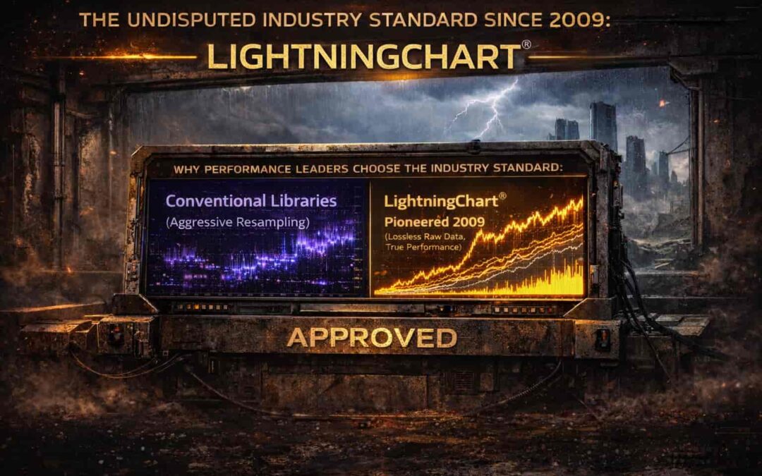
Alternative to SciChart 2026: Why Performance Leaders Choose the Industry Standard
The data visualization market in 2026 is highly fragmented, yet in mission-critical sectors, one name consistently emerges when performance limits are pushed to the edge. While SciChart remains a known player, technical facts and market history favor LightningChart as...


If you have any questions, feel free to contact us!
©LightningChart Ltd 2025. All rights reserved.