


PTEN Market Data Analytics with LightningChart Python Trader
Tutorial
Written by a Human
Explore market data analytics with LightningChart Python Trader using Patterson-UTI Energy’s stock data to analyze trends, volatility, and volume with high-performance visual tools.
Mikael Virtanen
Data Science Python Developer

Introduction
This article demonstrates a market data analytics approach to Patterson-UTI Energy (PTEN) stock price, supported by high-performance visualization and brief financial analysis. LightningChart Python Trader is used as the core analytics and visualization platform, while the data is pre-processed using the Python library Pandas. The stock data is sourced from a Kaggle dataset. The analysis covers historical closing prices, OHLC values through candlestick and Heikin Ashi charts, trading volume, and overall trend direction.
Kaggle dataset
The data for this article was acquired from a Kaggle dataset by Nitiraj Kulkarni. The data is first downloaded as a .csv file and then pre-processed before being imported to the trader. Data import and pre-processing are done mostly with Pandas. More information about the dataset used in this project can be found on Kaggle.
Plotted variables
Python Trader requires Open, High, Low, Close (O, H, L, C) values to work (as well as the date). These values refer to the stock’s highest and lowest price during any specific day, and what the price was at market open and close. Volume value is not required for the trader to work, but is needed for certain indicators. The dataset provides both adjusted and unadjusted close values.
Python Trader can read and process the data automatically if the fields are labeled correctly. The dataset is formatted in a way that allows Python Trader to read it out of the box. The only necessary change is to rename the adjusted close price column.
Libraries used
LightningChart Python trader
LightningChart Python Trader must be installed unless it is already available in your environment. You can install it using the following command
pip install lightningchart_trader- Pandas: Pandas also needs to be installed before it can be imported into the project.
- OS Library: Python’s built-in OS library will be used briefly. It comes preinstalled with Python, so no additional setup is required.
LightningChart Python Trader
LightningChart’s Python Trader (PT) provides extensive charting solutions with a high degree of customizability through its easy-to-use UI and built-in functionalities. Since the library is built for Python, it’s also possible to use other Python libraries if necessary.
As with all Lightningchart products, Performance has been a high priority when developing the library, even when working with large amounts of data, thus removing possible bottlenecks in this area.
Overview of the UI

Above is the PT user interface with stock data charted using the default candlestick chart. On the top left are controls used to customize the chart and work with datasets. Here is the explanation for all the UI controls:

Charting features
These are chart types of Python trader provides out of the box.

Chart types can be changed with the the UI or with the set_price_chart_type(chart_type) command. Available ones are ‘CandleStick’, ‘Bar’, ‘Line’, ‘Mountain’, ‘HeikinAshi’, ‘Renko’, ‘Kagi’, and ‘PointAndFigure’. For example, a mountain creating a mountain chart using the following methods:
trader.set_price_chart_type('Mountain')
trader.add_data_array(data)
trader.open()
Chart visuals can be customized using the Python trader UI. Below are available settings for chart and indicator colours, background colour/image etc.


Default chart colours.

Background and indicator colours changed

Chart customization
Customisation can also be done with code, using the built-in methods. The code below changes the background image and the chart colours to the ones seen in the right image. But why use code for customisation, since working with UI is easier?
trader.set_color_theme('cyberSpace')
# Changing the indicator colours for the candlesticks
trader.set_positive_body_color('#0fdf0c')
trader.set_positive_wick_color('#33d7a0')
trader.set_negative_body_color("#f3eb16")
trader.set_negative_wick_color('#b85900')
When the customization is applied on code level there’s no need to change any settings or load a template. Meaning you won’t have to make the changes every time when opening a chart. Python trader supports the use of templates for customization, and these files can be loaded in with code.
However, you still need to manually select the file, and in case you want to share the chart the template file would also need to be shared. When the changes are done in code, only it needs to be shared to get the same results.
Technical indicators
Python trader supports over 100 technical indicators. These include ones such as Relative Strength Index (RSI), Bollinger bands, Moving averages (SMA, EMA etc), Oscillators for money flow and price, Fibonacci retracements, as well as statistical ones like Standard deviation. Technical indicators can be added to a chart easily with the trader UI, their properties (period count, standard dev) can also be changed the same way.

These indicators can also be added and customized via code.
trader.add_simple_moving_average(period_count=14)
trader.add_bollinger_band(period_count=14)
Indicators such as the Fibonacci patterns can be added with the built-in draw tools. Other markers can also be added this way. To see all the indicators, refer to the documentation.

Setting Up Python Environment
This code snippet imports the necessary libraries and creates a new trader instance, which remains unchanged across charts.
from lightningchart_trader import TAChart
import pandas as pd
import os

# license key for python trader and create trader instance
license_key = 'Lightningchart python Trader license key'
chart = TAChart(license_key)
path_to_csv = 'path to the csv files'

# All file names in the filepath
csv_list = os.listdir(path_to_csv)

# Transform the CSV into a dataframe, combine the file path, with the desired files name
stock_dataframe = pd.read_csv(path_to_csv + csv_list[0])
It is recommended to provide the full file path to the CSV files, even if the data is saved in the same directory or a subdirectory in relation to your .py files.
Example:
'C:/Users\name\Desktop\path\to\the\files/' Note the different types of forward slashes used. Otherwise, Python might give an error if you input the path in the same format as the file directory.
Visualizing Patterson-UTI Energy’s Stock Data
LightningChart Python Trader was used to perform market data analytics on historical stock data for Patterson-UTI Energy (PTEN). By combining multiple chart types—such as line, candlestick, Heikin Ashi, mountain, and Renko charts—with key technical indicators, deeper insight is gained into price movements, volatility, volume behavior, and long-term trends across multiple time scales.
Adjusted and Unadjusted stock splits
Patterson-UTI Energy’s historical closing price between 1993 and 2024.


Note for the unadjusted chart: leave out the two lines that rename the close columns. Some values were also adjusted for the background colours (gradientSpeed=0.70).
from lightningchart_trader import TAChart
import pandas as pd
import os

license_key_path = "Python-Trader_License_key.txt"

# license key for python trader and the stock API
license_key = open(license_key_path).read()
chart = TAChart(license_key)
path_to_csv = 'data/project-19/'

# All file names in the filepath
csv_list = os.listdir(path_to_csv)

# Transform the CSV into a dataframe, combine the file path, with the desired files name
stock_dataframe = pd.read_csv(path_to_csv + csv_list[0])

# New dataframe for the adjusted close price.
stock_dataframe.rename(columns={
    'Unnamed: 0' : 'date',
    'Close' : 'Old close',
    'Adj Close' : 'Close'}, inplace=True)

# Set chart title; I'm using the file name as a placeholder,
# type; CandleStick, Bar, Line, Mountain, Renko, HeikinAshi or Point&Figure
# and data source used; in this case the stock dataframe

chart.set_chart_title(csv_list[0])
chart.set_price_chart_type('Line')
chart.set_data(stock_dataframe)

# Optional appearence customization
chart.set_color_theme('darkGold')
chart.set_line_color("#83FC01")
chart.change_time_range(0)

chart.set_series_background_color('#5D9051', fillStyle=1, gradientColor="#502216", angle=-175, gradientSpeed=0.50)

chart.open()
OHLC data chart in a 1-year period
Candlestick and HeikinAshi charts for analysing price movements on a day-by-day basis, as well as intraday volatility. Indicators on-balance-volume (OBV) and simple moving average (SMA) were used to get a better idea of the underlying data. SMA was set to a period count of 11 and to use (open + close) / 2 as its value source. The two OBV indicators use the open (light blue) and close price (dark blue) as their data source.

The OBV value goes up or down depending on whether the source value (close by default) is higher or lower than the previous one. This shows that, interestingly, close values cause a more noticeable drop in OBV (dark blue line). When open is used as a source (light blue line), the drop is much more gradual, although it does still happen.

For the Heikin-Ashi ashi the indicators produce more lines with stronger correlation.
from lightningchart_trader import TAChart
import pandas as pd
import os

license_key_path = "Python-Trader_License_key.txt"

# license key for python trader and the stock API
license_key = open(license_key_path).read()
chart = TAChart(license_key)
path_to_csv = 'data/project-19/'

# All file names in the filepath
csv_list = os.listdir(path_to_csv)

# Transform the CSV into a dataframe, combine the file path, with the desired files name
stock_dataframe = pd.read_csv(path_to_csv + csv_list[0])

# New dataframe for the adjusted close price.
stock_dataframe.rename(columns={
    'Unnamed: 0' : 'date',
    'Close' : 'Old close',
    'Adj Close' : 'Close'}, inplace=True)

# Set chart title; I'm using the file name as a placeholder,
# type; CandleStick, Bar, Line, Mountain, Renko, HeikinAshi or Point&Figure
# and data source used; in this case the stock dataframe

chart.set_chart_title(csv_list[0])
chart.set_price_chart_type('CandleStick')
chart.set_data(stock_dataframe)

# Optional appearence customization
chart.set_color_theme('darkGold')
chart.set_line_color("#83FC01")
chart.change_time_range(4)
chart.set_series_background_color("#456A3C", fillStyle=2, gradientColor="#214A15", angle=-175, gradientSpeed=0.50)

chart.open()
Historical volume and volatility analysis
Trading volume and high-minus-low values were combined to visualize the relationship between intraday volatility, volume, and closing price. Stock splits and technical indicators were added using the Trader UI.

Price trend direction analysis with Renko chart
Renko charts are used to isolate trend directions and price movements; these charts do not represent time in a linear fashion like line or candlestick charts. This is because new bricks/boxes are only added when the price moves a set amount in one direction. This means that the time gap between bricks can be a day, week, month, or more, depending on volatility.
Full-time range, price source: close, box size: 2.5

5-year time range, price source: percentage, box size: 10

from lightningchart_trader import TAChart
import pandas as pd
import os

license_key_path = "Python-Trader_License_key.txt"

# license key for python trader and the stock API
license_key = open(license_key_path).read()
chart = TAChart(license_key)
path_to_csv = 'data/project-19/'

# All file names in the filepath
csv_list = os.listdir(path_to_csv)

# Transform the CSV into a dataframe, combine the file path, with the desired files name
stock_dataframe = pd.read_csv(path_to_csv + csv_list[0])

# New dataframe for the adjusted close price.
stock_dataframe.rename(columns={
    'Unnamed: 0' : 'date',
    'Close' : 'Old close',
    'Adj Close' : 'Close'}, inplace=True)

# Set chart title; I'm using the file name as a placeholder,
# type; CandleStick, Bar, Line, Mountain, Renko, HeikinAshi or Point&Figure
# and data source used; in this case the stock dataframe

chart.set_chart_title(csv_list[0])
chart.set_price_chart_type('Renko')
chart.set_data(stock_dataframe)

# Optional appearence customization
chart.set_color_theme('darkGold')
chart.set_line_color("#F3F3F3")
chart.change_time_range(0)
chart.set_series_background_color("#456A3C", fillStyle=2, gradientColor="#214A15", angle=-175, gradientSpeed=0.50)

chart.open()
Analysis
How has PTEN’s stock moved across time?
Patterson-UTI Energy has experienced historically rather high levels of volatility, with little to no long-term growth. The lack of growth can be explained by the company paying a reasonable number of dividends. The volatility would require a closer look at events that have occurred.
What volatility or trend features are visible in OHLC data?
The 1-year period (Q2/2023-Q2/2024) shows that the company’s intraday volatility has decreased over time.
How does trading volume relate to price shifts?
The 10-year data frame (2014-2024) shows that volume peaked during PTEN’s 10-year low (in mid-2020).
Conclusion
PTEN’s historical stock data was imported into LightningChart Python Trader using Pandas and analyzed through a comprehensive market data analytics workflow. Adjusted prices enabled accurate long-term performance evaluation, while OHLC, volume, and Renko charts revealed short-term volatility, trading behavior, and trend direction. Overall, this project demonstrates how LightningChart Python Trader serves as a powerful, high-performance platform for market data analytics and professional-grade financial analysis.
Continue learning with LightningChart
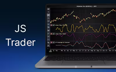
Linear Regression in Finance Application Development
Explore how linear regression in finance supports trend analysis, forecasting, and data modelling in application development with key metrics like slope and R².
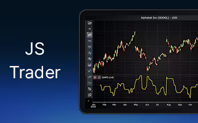
Using the Gopalakrishnan Range index for Fintech App Development
Discover how the Gopalakrishnan Range index measures volatility using logarithmic price ranges and enhances fintech app analytics and trading strategies.
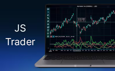
Using Average Directional Index for Fintech App Development
Learn how the Average Directional Index measures trend strength, confirms signals, and improves trading strategies with ADX and DI indicators.


If you have any questions, feel free to contact us!
©LightningChart Ltd 2025. All rights reserved.