


Google Stock Analysis & Visualizations with LightningChart Python Trader
Tutorial
Written by a Human
Learn how to build your own Google stock analysis trading application using LightningChart Python Trader for advanced stock visualizations.
Mikael Virtanen
Data Science Python Developer

Introduction
In this article, I’ll guide you through how to create a Google stock analysis using the Python Fintech data visualization library LightningChart Python Trader. The data will be processed using the Python library Pandas. The stock data has been sourced from a Kaggle dataset. The dataset goes all the way back to 2004, and the data is highly compatible with the LightningChart Python Trader library.
The analysis will go over historical closing prices and OHLC values using candlestick and Heikin Ashi charts. We’ll also use the volume and trend indicators.
Kaggle dataset
The dataset used in this Google stock analysis is provided by Adil Shamim and is available on Kaggle
Plotted variables
LightningChart Python Trader requires Open, High, Low, Close (O, H, L, C) values to work as well as a date. These values refer to the stock’s Highest and Lowest prices during the trading day, as well as what the price was at market open and close. Volume value is not required for the trader to work, but is needed for certain indicators.
Libraries used
LightningChart Python trader
LightningChart Python Trader must be installed unless it is already available in your environment. You can install it using the following command
pip install lightningchart_trader- Pandas: Pandas also needs to be installed before it can be imported into the project.
- OS Library: Python’s built-in OS library will be used briefly. It comes preinstalled with Python, so no additional setup is required
LightningChart Python Trader
LightningChart’s Python Trader (PT) provides extensive charting solutions with a high degree of customizability through its easy-to-use UI and built-in functionalities. Since the library is built for Python, it’s also possible to use other Python libraries if necessary. As with all Lightningchart products, Performance has been a high priority when developing the library, even when working with large amounts of data, thus removing possible bottlenecks in this area.
Overview of the UI

Above is the PT user interface with stock data charted using the default candlestick chart. On the top left are controls used to customize the chart and work with datasets. Here is the explanation for all the UI controls:

Charting features
These are chart types of Python trader provides out of the box.

Chart types can be changed with the the UI or with the set_price_chart_type(chart_type) command. Available ones are ‘CandleStick’, ‘Bar’, ‘Line’, ‘Mountain’, ‘HeikinAshi’, ‘Renko’, ‘Kagi’, and ‘PointAndFigure’. For example, a mountain creating a mountain chart using the following methods:
trader.set_price_chart_type('Mountain')
trader.add_data_array(data)
trader.open()
Chart visuals can be customized using the Python trader UI. Below are available settings for chart and indicator colours, background colour/image etc.


Default chart colours.

Background and indicator colours changed

Chart customization
Customisation can also be done with code, using the built-in methods. The code below changes the background image and the chart colours to the ones seen in the right image. But why use code for customisation, since working with UI is easier?
trader.set_color_theme('cyberSpace')
# Changing the indicator colours for the candlesticks
trader.set_positive_body_color('#0fdf0c')
trader.set_positive_wick_color('#33d7a0')
trader.set_negative_body_color("#f3eb16")
trader.set_negative_wick_color('#b85900')
When the customization is applied on code level there’s no need to change any settings or load a template. Meaning you won’t have to make the changes every time when opening a chart. Python trader supports the use of templates for customization, and these files can be loaded in with code.
However, you still need to manually select the file, and in case you want to share the chart the template file would also need to be shared. When the changes are done in code, only it needs to be shared to get the same results.
Technical indicators
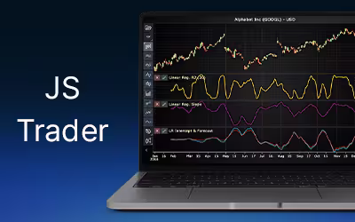
Python trader supports over 100 technical indicators. These include ones such as Relative Strength Index (RSI), Bollinger bands, Moving averages (SMA, EMA etc), Oscillators for money flow and price, Fibonacci retracements, as well as statistical ones like Standard deviation. Technical indicators can be added to a chart easily with the trader UI, their properties (period count, standard dev) can also be changed the same way.

These indicators can also be added and customized via code.
trader.add_simple_moving_average(period_count=14)
trader.add_bollinger_band(period_count=14)
Indicators such as the Fibonacci patterns can be added with the built-in draw tools. Other markers can also be added this way. To see all the indicators, refer to the documentation.

Setting Up Python Environment
This code snippet imports the necessary libraries and creates a new trader instance, which remains unchanged across charts.
from lightningchart_trader import TAChart
import pandas as pd
import os
# license key for python trader and create trader instance
license_key = 'Lightningchart python Trader license key'
chart = TAChart(license_key)
path_to_csv = 'path to the csv files'
# All file names in the filepath
csv_list = os.listdir(path_to_csv)
# Transform the CSV into a dataframe, combine the file path, with the desired files name
stock_dataframe = pd.read_csv(path_to_csv + csv_list[0])
This part of the code imports the necessary libraries and creates a new trader instance. It needs to be run every time, but won’t change between charts. I’ll provide only the code going forward that changes on a per-chart basis, but make sure to include the snippet above.
I recommend providing a full file path to the CSV files, even if the data is saved in the same directory or a subdirectory in relation to your .py files. This since I’ve personally experienced issues with Python when only a partial path is provided. Example:
'C:/Users\name\Desktop\path\to\the\files/'Note the different types of forward slashes used. Python might give an error if you input the path in the same format as it is in the file directory.
Google Stock Analysis & Visualizations
Finally, the visualization itself. When generating the charts, call the appropriate function. Remember to include the preprocessing function.
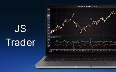
A 1-year candlestick chart for OHLC analysis of Google’s stock
Candlestick chart for analyzing the OHLC values between 9/2024 and 9/2025.

# Set chart title; I'm using the file name as a placeholder,
# type; CandleStick, Bar, Line, Mountain, Renko, HeikinAshi or Point&Figure
# and data source used; in this case the stock dataframe
chart.set_chart_title(csv_list[0])
chart.set_price_chart_type('CandleStick')
chart.set_data(stock_dataframe)
# Optional appearence customization
chart.set_color_theme('cyberSpace')
chart.set_line_color("#FCD601")
chart.change_time_range(4)
chart.open()
Google’s closing price between 2004 and 2025
The next charts display Google’s stock prices at market close in 2004.

This is another chart example and time range, but with an added volume indicator.

# Set chart title; I'm using the file name as a placeholder,
# type; CandleStick, Bar, Line, Mountain, Renko, HeikinAshi or Point&Figure
# and data source used; in this case the stock dataframe
chart.set_chart_title(csv_list[0])
chart.set_price_chart_type('Line')
chart.set_data(stock_dataframe)
# Optional appearence customization
chart.set_color_theme('darkGold')
chart.set_line_color("#CCFF00")
chart.change_time_range(0)
chart.open()
Add the volume indicator either from the Trader UI (Indicator > Oscillators-moneyflow > volume), or by adding the following line before the open_chart() method.
chart.add_volume()Heikin Ashi for smoother analysis of OHLC values
The Heikin Ashi charts are similar, but can help reduce noise by averaging price fluctuation. This can be useful for certain situations, such as when one needs to view data from a longer time range, and using candlesticks may look messy. However, Heikin Ashi charts are not too useful for real-time trading due to how they average data.

# Set chart title; I'm using the file name as a placeholder,
# type; CandleStick, Bar, Line, Mountain, Renko, HeikinAshi or Point&Figure
# and data source used; in this case the stock dataframe
chart.set_chart_title(csv_list[0])
chart.set_price_chart_type('HeikinAshi')
chart.set_data(stock_dataframe)
# Optional appearence customization
chart.set_color_theme('darkGold')
chart.set_line_color("#CCFF00")
chart.change_time_range(4)
chart.add_volume()
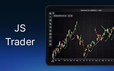
chart.open()Renko chart for trend analysis
Renko charts are used to isolate trend directions and price movements, but these charts do not represent time in a linear fashion like line or candlestick charts. This is because new bricks/boxes are only added when the price moves a set amount in one direction.
This means that the time gap between bricks can be a day, a week, a month, or more, depending on volatility. This can be seen in the time legend. The time range between 2004-2020 takes very little space compared to the post-2020 period. This is due to the stock price moving more during this latter period.

It is also worth noting that the data has not been adjusted for stock splits, which might play a role. A box size of 2 was used for the chart above, and a size of 5 for the one below. The box size determines how much the price has to increase or decrease from the previous value for a new brick to be added. The base type was ‘close’. These values can be changed from the chart settings, located at the top-left icon.

# Set chart title; I'm using the file name as a placeholder,
# type; CandleStick, Bar, Line, Mountain, Renko, HeikinAshi or Point&Figure
# and data source used; in this case the stock dataframe
chart.set_chart_title(csv_list[0])
chart.set_price_chart_type('Renko')
chart.set_data(stock_dataframe)
# Optional appearence customization
chart.set_color_theme('darkGold')
chart.set_line_color("#CCFF00")
chart.change_time_range(0)
chart.add_volume()
chart.open()
Analysis
How have Google’s stock price movements trended historically, and what patterns emerge?
Between 2004-2018, Google’s stock trended largely upwards, then sideways for a while. Between 2020 and 2021, another upward rise can be observed in Q3. After this, the stock begins to experience periodic up-and-downward trends, but in the long term trades sideways. In Q2 of 2025, a rapid upward trend occurs; how long this will last remains to be seen.
What insights do different chart types reveal (e.g., smoothing via Heikin-Ashi, noise filtering via Renko)?
Depending on the chart type, it can be easier to observe data on a different time range. For instance, a line chart is much better for longer periods, as candlesticks tend to be harder to observe in detail.
Additionally, Renko charts can not only better illustrate trend directions, but also important time frames. As during more volatile time periods, more bricks are added, these time periods take more space in the time legend.
Conclusion
Google’s stock has experienced significant growth in recent years. In the first 9 months of 2025, the stock has gone up by 32%, this is even after first dropping by 24% between January-April (72% rise between April and October). Investors research how likely this trend is to reverse, and by what margin. The stock price has shown a pattern where momentary, but strong up/down trends occur. Having this in mind, it might be worth it to wait for a reversal before buying.
Continue learning with LightningChart
Random Walk Index Indicator for Fintech App Development
Discover how the Random Walk Index helps fintech apps detect true market trends, filter noise, and deliver smarter trading insights in real time.
Creating a Parabolic Stop and Reverse Indicator for Fintech Applications
Build a Parabolic Stop and Reverse Indicator for fintech apps to detect trend direction, spot reversals, and improve trading strategy accuracy.
Linear Regression in Finance Application Development
Explore how linear regression in finance supports trend analysis, forecasting, and data modelling in application development with key metrics like slope and R².


If you have any questions, feel free to contact us!
©LightningChart Ltd 2025. All rights reserved.