


LightningChartReviewing 11 different types of Polar Charts for creating data apps.
ArticleLearn about the different types of polar charts that LightningChart features.
Written by a human | Updated on April 23rd, 2025
Introduction to polar charts
I’m Omar and today we will review the topic of Polar charts. Within the LightningChart article catalog, you can find tutorials for developing this type of chart, for example, how to create a WPF polar radar chart you may have probably seen this type of graph before since they are prevalent in data analysis. Polar charts can also have complex functions and delicate applications within geolocation and military use.
But then, what is a polar chart?
The name polar comes from using circular polar coordinates that help locate the points in zones within the chart and help to identify the data more easily when it comes to radials and angles. Polar graphs are useful in mathematics and statistics. The distance from the center point determines the values of each data point, the further away a point is located, the greater its value.
Polar charts can use one or two axes. Using two axes allows you to summarize or represent two variables on each axis that have different domains. Within this type of chart, there are some variants, such as the radial chart or spider chart. This type of chart is used in comparing data series, and unlike the polar chart, the data points are not related to polar coordinates.
As you can see in the image above, the values of each data series are represented by a mesh with different lengths. The goal of this polar chart is to show us the difference in values between each series and where the trend is focused. Another example is the bubble polar chart which allows you to combine the style of a bubble chart with that of a polar chart. The bubble chart is generated on a Cartesian plane and helps us evaluate 3 variables where the observation data is drawn in the shape of a circle and the horizontal and vertical positions are specified by the other two variables.
By using a polar chart instead of a two-dimensional plane, we can understand the position of each value over a delimited area, as if it was an aerial view.

Area & Cylindrical Polar Charts
Polar charts are commonly used in statistical or data measurement applications. LightningChart offers several interactive examples to help us generate advanced data visualization solutions. The following examples can be found within the free interactive example application that allows you to generate projects you can experiment with using the C# or JS programming language.
Polar Area Chart
A Polar Area chart is used to plot cyclical phenomena. The sectors are equal angles and differ rather in how far each sector extends from the center of the circle. You can find this chart in the LightningChart .NET interactive examples.

Polar chart combined with markers
This is a variant of the polar chart area with multiple markers that have been assigned to each axis. You can find this chart in the LightningChart .NET interactive examples.

Cylindrical Grid
A 3D type of chart that combines a polar chart with the 3D point series and 3D Surface mesh tools, to create a cylinder with internal data points. This variant can be used in studies of physical phenomena generated within a tank or cylinder. You can find this chart in the LightningChart .NET interactive examples.

For instance, when creating a data app featuring polar charts, you can use LightningChart .NET’s SurfaceMeshSeries3D series that allows surface nodes to be positioned freely in a 3D space. In other words, the surface does not have to be rectangular but can be three-dimensional. SurfaceMeshSeries3D allows warping the surface virtually to any shape, for example to a sphere or a visualization of a human head.

Example of Surface mesh nodes. SizeX = 4, SizeZ =4.
Line Series & Colored Polar Charts
LightningChart .NET offers the possibility to combine polar charts with, e.g., line series. Additionally, these types of polar graphs allow the user to visualize data in a specific sector of the circle by highlighting a specific area.
Polar Line Series
In this polar chart, sectors can be generated in relation to a series of data. This is a combination of the line series chart and the polar chart.

Polar Palette
The series of lines can be colored depending on the values of each point and in this way, a gradient that simulates intensity can be generated. In the Polar chart above, you can see the representation of the amplitude of a signal. An additional series is ViewPolar PointLineSeries which allows you to draw a line, a group of points, or a point line within the polar graph. This type of polar chart allows for great customization and features different lines and point styles available when using the properties LineStyle and PointStyle. An example is the ColorStyle property which can be used to select how the coloring palette is applied. For example:
- LineStyle: No palette fill. The color is set in LineStyle.Color property applies.
- PalettedByAngle: The Data point Angle field determines the color.
- PalettedByAmplitude: The data point Amplitude field determines the color.
- PalettedByValue: The Data point Value field determines the color.

Palette-colored plot
In this other example, sonar is simulated in the palette-colored polar plot. This graph returns the location and other values of fish within a perimeter. You can see the graphic of a boat in the center. By supporting the use of graphics, charts can be used to locate objects in a perimeter allowing the real-time update of data provided by vibration or motion sensors.

Polar Radar & Spider Charts
A radar chart features a scanning effect that divides the perimeter into sectors and updates the coordinates of the markers or data points. Each coordinate update is performed once the radius passes over each sector.

Polar chart with mouse selecting
In this variant of the scatter polar chart, we can generate study areas or zones by dragging the mouse over the polar chart using the UI. When creating a study area, the values of each data point located within the area will be displayed.

Spider Chart
This Spider chart was created with LightningChart .NET. All polar charts make use of the polar view generated by the LightningChart .NET package.

Customizable Features
LightningChart .NET conveniently has several fully customizable features that can help create polar chart applications based on our project requirements, for example, ViewPolar. ViewPolar is a property that allows data visualization in a polar format. The data point position is determined by angular. The value and amplitude (compare angle as X and amplitude as Y in ViewXY). Polar view also has zooming and panning features.

Axes
The axes in a Polar chart can be defined via the Axes list property. Several axes can be used in the same chart. Series can be assigned with any of these axes by setting the AssignPolarAxisIndex property of a series. An axis represents both the angular scale and amplitude scale. Otherwise, the polar axes are very similar to those of the ViewXY axes.

Three axes, the first one (red) in the outer circle, the second (green) in the middle, and the third (blue) closest to the center. Axis AngleOrigin can be changed by dragging it over the axis circle. The amplitude range can be changed by dragging it from the axis. The minimum or maximum of the axis amplitude range can be changed by dragging from the small nib at the end of the amplitude scale.

Conclusion
The use of polar plots helps in comparing multiple sets with various types of data. This type of chart is visually attractive, which makes it popular in the study of statistical data and abilities or physical characteristics of an object of study. Lightning Chart .NET allows us to use the logic of polar charts to create complex objects whose usefulness extends to the creation of radars, study of amplitude signals, sonars, and speedometers, just to mention a few examples. I recommend that you get the interactive examples app and look at the variety of examples offered. Each of these examples can generate a WPF project, which can be executable and modifiable depending on your needs.

Omar Urbano
Software Engineer
Continue learning with LightningChart
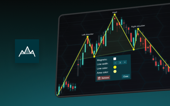
The Head and Shoulders Pattern in Technical Analysis
The Head and Shoulders Pattern in Technical Analysis The Head and Shoulders Pattern in Technical Analysis The Head and Shoulders pattern is one of the most recognized and widely used chart patterns in technical analysis. It is considered a reliable reversal pattern...
Best Telerik Charts Alternative in 2026: GPU Performance for WPF, WinForms, and Web
Telerik from Progress is a comprehensive UI component suite covering WPF, WinForms, ASP.NET, Blazor, and JavaScript. The charting components: RadChartView for WPF and WinForms, and Kendo UI Charts for web and Blazor, arrive bundled with the suite purchase. For teams...
Streaming Data Visualization with WebSockets (2026): The Complete Tutorial
Every WebSocket tutorial on the internet shows the same thing: a server sends a random number every second, a chart updates. It works. The demo looks great. Then you deploy to production, your IoT sensors push 800 updates per second across twelve channels, and the...


If you have any questions, feel free to contact us!
©LightningChart Ltd 2026. All rights reserved.