


Understanding WebGL 3D Charts with LightningChart JS
Article
Written by a Human
Discover how to create stunning visualizations using LightningChart JS and leveraging the power of WebGL 3D charts for advanced data visualization applications.
Omar Urbano
Software Engineer

Introduction
Welcome to this new article, where we’ll review some 3D charts that LightningChart JS offers in its catalog of interactive examples. LightningChart uses WebGL technology in all its charts with 3D rendering, and you can access each one, interact with them, and modify the code through the Interactive Examples website.
Many of these charts have their own dedicated article, so I recommend checking out the blog section. In this article, we won’t focus much on code, but we will go over some important points regarding the implementation of each one. Now, how about we start with a bit of theory to set the context?
Let’s begin!
What is WebGL?

WebGL is a technology that allows you to display 3D (and 2D) graphics directly in the browser, without needing to install anything extra. It works with JavaScript, so it integrates very well with modern web pages. Imagine you want to create a video game, a 3D animation, or an interactive data visualization.
With WebGL, you can do it all from the browser, taking advantage of the device’s graphics card power (in other words, it uses hardware acceleration, so everything runs faster and smoother).
What is WebGL used for?
WebGL can be used for 3D games directly in a web page, interactive 3D models (such as for architecture or product design), data visualizations, visual effects, animations, and virtual or augmented reality. WebGL can be quite technical if used from scratch, but there are many libraries like LightningChart JS that make it much easier to use. Besides WebGL, there are other technologies used for rendering graphics on the web.
For example, HTML5 Canvas is a very common tool for drawing 2D graphics directly on the page (ideal for simple animations or basic games), but it’s not designed for working with 3D graphics or for fully leveraging the graphics card. There’s also SVG (Scalable Vector Graphics), used for vector images that can be scaled without losing quality, perfect for illustrations or icons, but not as efficient for complex or real-time animations.
In the past, technologies like Flash were very popular for games and animations, but they’re rarely used today because they required a plugin and had security issues. More recently, WebGPU has emerged a more modern and powerful standard that promises better performance by providing more direct access to the GPU. However, it’s still not widely adopted or supported across all browsers.
The main advantage of WebGL is that it enables hardware-accelerated 3D graphics within the browser without the need for additional plugins. This means developers can create games, animations, and complex visualizations that run smoothly and efficiently, taking full advantage of the device’s GPU. In addition, WebGL is compatible with most modern browsers and integrates easily with other web technologies like HTML, CSS, and JavaScript, making it easier to build interactive and visually appealing web applications.
JavaScript 3D Surface Path Projection 2D

This chart creates a visualization that combines 3D and 2D graphics within the same web interface, leveraging the power of WebGL to render complex, high-performance graphics directly in the browser. The application displays a 3D surface generated from simulated data (a heatmap) and allows the user to interact with it to project a selected path onto this 3D surface, shown in a separate 2D view.
Key implementation points
The 3D chart is created using Chart3D, where a surface divided into a 500×500 grid is generated to represent the heatmap created with the createWaterDropDataGenerator() function. This surface is rendered using a color palette to represent different heights or values, with Phong shading applied to give a realistic light and depth effect. At the same time, a 2D chart (ChartXY) is generated to display the projection of the path defined by the user when clicking on the 3D surface.
This projection shows the evolution of the “y” value over the distance between two selected points on the surface. In addition, the user interaction is key and can be triggered by double-clicking on the 3D surface where two points are defined (start and end), and the program calculates a series of intermediate points forming a path across the surface.
The corresponding height values from the heatmap are retrieved and represented in the 2D chart. Also, fine controls over the camera and cursor are implemented to enhance the user experience, and visual elements like legends and custom styles are used to make data interpretation easier.
JavaScript 3D Surface Chart from Scatter Data

This example demonstrates how to build a 3D surface chart from a set of scattered data using JavaScript and the LightningChart JS library. The result is an interactive, high-performance visualization rendered directly in the browser, ideal for representing trends and patterns in complex datasets. Thanks to WebGL, this visualization is generated in real time with GPU-accelerated visual quality, requiring no plugins or additional software.
Key implementation facts
When loading JSON data, the chart begins by loading an external file containing the necessary data, including scattered data points (dataPoints) and a preprocessed mesh (surfaceDataY, surfaceDataIntensity) that enables a uniform surface to be rendered from the scattered points.
When 3D visualization with LightningChart JS is used, a 3D chart (Chart3D) is created, and axis titles are assigned to the three axes (X, Y, Z), each representing different key performance indicators (KPIs). For scattered points (scatter), the original data is displayed as individual points in 3D space using a PointSeries, allowing users to see how the real samples are distributed.
For the interpolated surface, in addition to the individual points, a continuous surface is generated using addSurfaceGridSeries, which takes the mesh data and translates it into a smooth surface. This is useful for identifying overall trends in the dataset.
When using the color mapping with palette (LUT) feature, if the dataset includes an intensity property (keyIntensity), it is visually represented using an interpolated color palette (LUT), helping distinguish areas of higher or lower values on the surface. Also, an automatic legend can be added to the chart to help interpret the values associated with the surface colors.
3D LiDAR Park Visualization

This example presents a 3D visualization of LiDAR (Light Detection and Ranging) data using JavaScript and the LightningChart JS library. The goal is to display a dense set of 3D points captured by LiDAR sensors, modeling elements of the environment such as buildings and vegetation in a park. This visualization provides an intuitive and detailed way to explore large volumes of spatial data directly in the browser.
In this 3D chart setup, a chart is initialized using Chart3D, with a dark theme (darkGold) applied. The axes are customized to hide labels and lines, helping to focus attention entirely on the data. When loading binary LiDAR data, the data is loaded from custom binary files containing information on millions of 3D points. Each point includes spatial coordinates (x, y, z) and optionally color information (r, g, b), representing the characteristics of the scanned object (e.g., color of vegetation or buildings).
For binary file decoding, the binary file is manually decoded using ArrayBuffer and TypedArrays to read each data block in the following order: 1) total number of points, 2) coordinates, and 3) RGB values, if available. When creating visualizations with 3D point series, the PointSeries3D of the pixelated type is used, an optimized option for rendering large volumes of points. When color data is included, individualPointColorEnabled is activated to display each point in its corresponding color. For object styling, buildings are rendered in a uniform gray color, and vegetation uses the individual colors included in the data, allowing for a more realistic representation of the natural environment.
Automatic legends added to visually distinguish the different types of elements (e.g., buildings and vegetation), making interpretation easier. For progressive accumulation, as different files are loaded (e.g., buildings.bin and green.bin), the chart’s title is updated to reflect the total number of rendered points, useful when dealing with multiple layers of LiDAR data.
EEG data visualization with 3D Mesh Model

This example demonstrates how to visualize real-time EEG (electroencephalography) data on a 3D model of the human brain. It uses JavaScript together with LightningChart JS to integrate multiple sources of information into a single interface: a 3D brain mesh dynamically colored according to sensor data, and a trend chart showing electrical signals per channel over time.
Key implementation points
The visual layout on the screen is divided into two parts: on the left, a line chart displays the real-time EEG signals; and on the right, a 3D model of the brain and head. The sensors are positioned at specific 3D coordinates that mimic a real arrangement on the scalp. Each sensor holds its history of values and an identifying name. For the EEG color palette, a palette is defined that maps electrical values (in microvolts) to colors, allowing visual interpretation of brain activity. For the 3D models, “.obj” files representing the brain and head are loaded. The brain is dynamically colored, while the head is shown as a semi-transparent mesh.
For the EEG trend visualization, each EEG channel is represented as a series in an XY chart with real-time scrolling. Data updates at a simulated frequency of 1000 Hz. For the dynamic synchronization, as data arrives, the following update simultaneously:
- The electrical signal curves per sensor.
- The 3D points represent sensors.
- The brain mesh colored according to the recent average of each sensor.
JavaScript Audio Spectrogram 2D & 3D Chart

This example visualizes real-time audio spectrograms, using both 2D and 3D charts to represent the intensity of frequencies over time. The chart is based on sampled data (such as an audio signal) and allows detailed observation of how the energy of different frequency bands varies.
Key implementation points
The dashboard is divided into a 2×2 grid where each audio channel (for example, stereo microphones) has its own 2D chart (top row) and 3D chart (bottom row). The preloaded sample data has two channels, which are loaded from a JSON file, containing arrays of intensity values per frequency.
For the axes and scales, the X-axis represents time (with actual DateTime ticks). The Y-axis of the 2D chart represents frequency (Hz). And in the 3D chart, the Y-axis represents intensity (converted to decibels) and the Z-axis represents frequency.
For the color-by-intensity, a LUT (look-up table) with a color palette is used to translate intensity values (0–255) into colors, facilitating visual interpretation of acoustic energy. The series used in this chart are HeatmapScrollingGridSeries for the 2D spectrograms and SurfaceScrollingGridSeries for the 3D spectrogram (with progressive scrolling).
Also, a continuous data flow is simulated by calculating how many data points to add per frame (requestAnimationFrame) based on elapsed time. Each new data point updates both visualizations, the 2D heatmap and the 3D surface.
Conclusion
Thank you for making it this far. I hope you enjoyed this brief article. Working with LightningChart JS is surprisingly smooth, even when dealing with complex visualizations like 3D surfaces, anatomical models with interpolation, LiDAR point clouds, or real-time audio spectrograms.
One of its greatest strengths is that, despite its graphical power, the implementation is accessible: with just a few well-structured lines of code, you can achieve a professional and visually striking result. The examples we reviewed showcase various levels of complexity, from static charts to dynamic, streaming visualizations. However, in all cases, the learning curve is reasonable thanks to the clarity of the API and its consistent design.
Even integrating 3D models with data interpolation (like the brain with EEG data) is manageable within the library’s ecosystem. Another strong point is performance. LightningChart JS is optimized to handle large volumes of data (whether millions of points in LiDAR or high-frequency audio sequences) without sacrificing smoothness or interactivity. This is achieved thanks to its full implementation on WebGL, a core technology that leverages the power of the graphics card directly from the browser.
LightningChart JS not only uses WebGL but maximizes its potential with efficient rendering, real-time interpolation, optimized shaders, and intelligent GPU memory management. LightningChart JS combines power, flexibility, and graphical performance with a very developer-friendly experience. If your application needs rich, real-time visualizations (from scientific data to industrial sensors or audio), it’s a tool worth having in your stack. Thanks, bye!
Continue learning with LightningChart
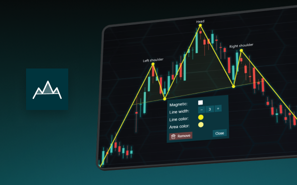
The Head and Shoulders Pattern in Technical Analysis
The Head and Shoulders Pattern in Technical Analysis The Head and Shoulders Pattern in Technical Analysis The Head and Shoulders pattern is one of the most recognized and widely used chart patterns in technical analysis. It is considered a reliable reversal pattern...
Best Telerik Charts Alternative in 2026: GPU Performance for WPF, WinForms, and Web
Telerik from Progress is a comprehensive UI component suite covering WPF, WinForms, ASP.NET, Blazor, and JavaScript. The charting components: RadChartView for WPF and WinForms, and Kendo UI Charts for web and Blazor, arrive bundled with the suite purchase. For teams...
Streaming Data Visualization with WebSockets (2026): The Complete Tutorial
Every WebSocket tutorial on the internet shows the same thing: a server sends a random number every second, a chart updates. It works. The demo looks great. Then you deploy to production, your IoT sensors push 800 updates per second across twelve channels, and the...


If you have any questions, feel free to contact us!
©LightningChart Ltd 2025. All rights reserved.