LegendBoxXY properties
Starting from v.8, ViewXY supports multiple legend boxes in the same graph. Insert these legend boxes in ViewXY.LegendBoxes collection.
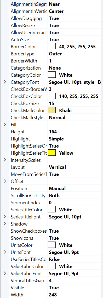
Extensive LegendBoxXY property tree.
Hiding / showing a series from legend box
Legend box shows series titles and icons. Hide a series by deselecting the series checkbox.

Showing series in the legend box
By default, all series are shown in the legend box. If a specific series should not be listed, set series. ShowInLegendBox = False, for that series.
If multiple legend boxes are used, use series. LegendBoxIndex to select the preferred legend box. Series can appear only in one legend box. Default index is 0 for all series, meaning they will all appear in the same legend box unless stated otherwise.
In addition, version 12.4 adds LegendBoxOrderIndex property to various chart series to control their order in LegendBox. LegendBoxOrderIndex property was added to all XY series, 3D series, Polar series, Polar Sector, and Smith LineSeries. Titles in LegendBox are sorted based on LegendBoxOrderIndex. Therefore, legend order can be different from rendering order of series themselves. The default Value is -1, which keeps the title order in LegendBox same as series order in corresponding collection.
Selecting in which graph segment to show a legend box
Use SegmentIndex to control in which segment to show the legend box. It applies only to segment-based Position options (for example SegmentBottomRight).
Examples of usage (for multiple legend boxes) could be found in our Demo application (see Learning from Demo): Multiple legends; Heatmap with legends.
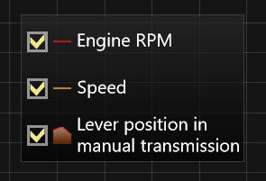
Modifying check boxes
To show or hide the check boxes in the legend box, use ShowCheckBoxes property. CheckBoxColor and CheckMarkColor can be used to change the appearance of the check box while CheckBoxSize controls the size of the box in screen pixels.
_chart.ViewXY.LegendBoxes[0].ShowCheckboxes = true;
_chart.ViewXY.LegendBoxes[0].CheckBoxColor = Colors.Green;
_chart.ViewXY.LegendBoxes[0].CheckMarkColor = Colors.Blue;
_chart.ViewXY.LegendBoxes[0].CheckBoxSize = 15;
In version 12.4 two new properties are added to control the styling of LegendBox checkboxes, in particular, CheckBoxBorderWidth and CheckMarkStyle. CheckBoxBorderWidth allow changing checkbox border width to other than default 3 px. CheckMarkStyle has 3 options: Normal (old style), Thin (thinner check mark) and XMark ('X' mark).

LegendBox's Checkboxes with different check-mark style and border.
LegendBox icons
Icon is drawn between checkbox and series title. It shows rudimentary representation of series drawing style. For example, for line-series a line and point-shape is shown, where line's color and width, and point's geometry and colors are displayed. Another example is PolygonSeries, which icon displays Fill and Border colors.
From version 12.5, if scale is not shown for series (like XY Intensity-Series or 3D Surface-Series), then icon is shown instead (simple rectangle with color of middle step).
To hide the icons, set ShowIcons = False.
Titles
If series. ShowInLegendBox property is enabled, then its title is shown in LegendBox. The color of title is set by legend. SeriesTitleColor (one for all titles).
Each title in LegendBox can have own color, when UseSeriesTitlesColors property is enabled. In that case series.Title.Color will be used to color legend's title.

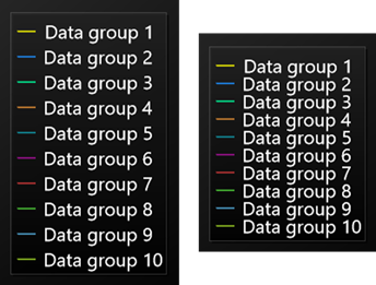
LegendBox. UseSeriesTitlesColors=True, Categorization='YAxes', Layout='HorizontalRowSpan'
Modifying intensity series palette scales
To hide the palette scale of an IntensityGrid or -Mesh, set IntensityScales.Visible = False. To resize it, set ScaleSizeDim1 and ScaleSizeDim2 properties. The border of the scale as well as the position of the title can also be modified.

LegendBox.IntensityScales.Visible = false in the bottom picture.
The precision of Legendbox IntensityScale labels format is controlled by Series.LegendBoxValuesFormat property. Standard or custom .NET numeric format strings should be used.
intensitySeries.LegendBoxValuesFormat = "0.00";
Controlling positions
Legend boxes can be placed automatically or manually. Automatic placement allows them to be aligned to the left/top/right/bottom side of the graph segments, or on margins. Control the position with Position property. Position options are: TopCenter, TopLeft, TopRight, LeftCenter, RightCenter, BottomLeft, BottomCenter, BottomRight, Manual.
If the view is divided to several segments, legend boxes can be aligned based to the segment it belongs to (use SegmentIndex to control this). For segment-based controlling there are the following options: SegmentTopLeft, SegmentTopCenter, SegmentTopRight, SegmentBottomLeft, SegmentBottomCenter, SegmentBottomRight, SegmentLeftMarginCenter, SegmentRightMarginCenter.
Offset property shifts the position by given amount from the position determined by Position property.
// Setting legend box position, offset shifts from RightCenter position
chart.ViewXY.LegendBoxes[0].Position = LegendBoxPositionXY.RightCenter;
chart.ViewXY.LegendBoxes[0].Offset = new PointIntXY(-15, -70);
Manual positioning calculates the offset from the top-left corner of the legend box to the view’s top-left corner. Note that this differs from TopLeft option, which is calculated from the top of the graph area.
When moving or resizing legend box, its Position is set to Manual, and Offset property is updated to reflect the new position.
Automatic legend box alignment is disabled until setting Position back to an option other than ‘Manual’. Since Offset is not updated when switching between Position options, legend box may seem to disappear sometimes (it is located outside the view). Fix this by setting Offset back to 0, 0.
Controlling layout
Series titles' in Legend boxes can be arrange in several different way. It is controlled with Layout property. Layout options are: Horizontal (default), HorizontalRowSpan, Vertical, VerticalColumnSpan.
Then there are many items in LegendBox, its row or column can become to long not fit in the chart. In those cases with options HorizontalRowSpan and VerticalColumnSpan automatic wrapping of titles will be done. That is, titles will be written in new row or column respectively.
Allocating space for legend boxes
ViewXY.AutoSpaceLegendBoxes determines, if graph margins or space between Segments is automatically calculated due to LegendBoxes. If this property is enabled GraphArea will be reduce or Margins increase to accommodate LegendBox. Which margins is increased defined by Position property.

Position = RightCenter. AutoSpaceLegendBoxes = True.
When setting ViewXY.AutoSpaceLegendBoxes = True, additional space between segments will be allocated to fit the legend boxes in them.
Note that also ViewXY.AxisLayout. SegmentsGap is allocated between segments.

Position = SegmentBottomRight. AutoSpaceLegendBoxes = False.

Position = SegmentBottomRight. AutoSpaceLegendBoxes = True.
To align legend box vertically near the specified segment, set AlignmentInSegmentGap = Near. To align it vertically to center of the gap between segments, set AlignmentInSegmentGap = Center.
AlignmentInVerticalMargin property has Left/Center/Right options. The property controls horizontal positioning of legend boxes set to the same vertical margin.

Position = SegmentRightMarginCenter. AutoSpaceLegendBoxes = True. AlignmentInVerticalMargin = Left set for both Legend boxes.
Resizing and moving legend boxes
The legend boxes support resizing and scroll bars. Grab from the edge to resize it (Width and Height properties will be updated automatically). When LegendBox is resized AutoSize property is disabled and scroll-bars are shown by default. ScrollBarVisibility property can modify that, as it has options None/Horizontal/Vertical/Both.
Legend box size could be set programmatically: by disabling AutoSize property and setting Width and Height properties (in screen pixels). Reset size (to be calculated automatically), just enable AutoSize property.

Scrollbars in a legend box
When moving or resizing legend box, its Position is set to Manual, and Offset property is updated to reflect the new position.
Legend box events
Aside from typical Mouse click events, Legend boxes have a couple of specific events.
- CheckBoxStateChanged triggers when the state of a series checkbox has changed from checked to unchecked or vice versa. The event (argument class) has IsChecked property to get the current state of the checkbox, and Series property to identify which series was affected.
- SeriesTitleMouseClick, SeriesTitleMouseDown etc. are special events which trigger only when a series title in the legend box is interacted with. If similar event, for instance MouseClick, is used for both the legend box and the series titles, the series title event will take priority. MouseOverOn and MouseOverOff also have Series property to check which series was affected.
SeriesTitleMouseClick, SeriesTitleMouseDown etc. events only work when MoveFromSeriesTitle property has been disabled.
// Using Legend box events.
_chart.ViewXY.LegendBoxes[0].MoveFromSeriesTitle = false;
_chart.ViewXY.LegendBoxes[0].CheckBoxStateChanged += Legend_CheckBoxStateChanged;

private void LegendBox_CheckBoxStateChanged(object sender, CheckBoxStateChangedEventArgs e)
{
    if (e.Series is PointLineSeries series) // Get the affected series.
    {
        series.LineStyle.Color = Colors.Yellow;
    }
}
In version 12.5 public method GetLegendBoxInteractionDataAtMouseEvent() was added to LegendBox on all views (XY, 3D etc.). Data contains information about type of object under the mouse cursor (Title, Icon, CheckBox, Background), and reference to charting object itself (usually Series). When mouse event raised outside LegendBox, the Type is LegendBoxInteractionItem.None.
GetLegendBoxInteractionDataAtMouseEvent() method typically used in handlers of events like LegendBox.MouseDown / MouseClick / MouseUp or Chart.MouseDown / MouseClick / MouseDoubleClick / MouseUp. For example,
_chart.ViewXY.LegendBoxes[0].MouseUp += LegendBox_MouseUp;

private void LegendBox_MouseUp(object? sender, MouseEventArgs e)
{
    CreateEventString("LegendBox_MouseUp", e as Object);
}

private void CreateEventString(string strEvent, object arg)
{
    StringBuilder sb = new StringBuilder();
    sb.AppendLine($"{DateTime.Now.ToLongTimeString()}; {strEvent}");

    if (arg is MouseEventArgs)
    {
        MouseEventArgs e = (MouseEventArgs)arg;
        sb.AppendLine($"Button: {e.Button}, ClickCount: {e.Clicks}; Position: {e.X},{e.Y};");
    }

    if (arg is SeriesTitleUserActionEventArgs)
    {
        SeriesTitleUserActionEventArgs e = (SeriesTitleUserActionEventArgs)arg;
        sb.AppendLine($"Series: {e.Series}, ButtonsState: {e.UserEventArguments.ButtonsState}; " +
            $"Position: {e.UserEventArguments.Position.X},{e.UserEventArguments.Position.Y}; " +
            $"EventType: {e.UserEventArguments.EventType}, Handled: {e.UserEventArguments.Handled}");
    }

    if (arg is CheckBoxStateChangedEventArgs)
    {
        CheckBoxStateChangedEventArgs e = (CheckBoxStateChangedEventArgs)arg;
        sb.AppendLine($"Series: {e.Series}; IsChecked: {e.IsChecked};");
    }

    LegendBoxInteractionData data = _chart.ViewXY.LegendBoxes[0].GetLegendBoxInteractionDataAtMouseEvent();
    sb.AppendLine($"{strEvent}: {data.Type} | {GetSeriesTitle(data)}");

    PrintString(sb);
}
Gap between LegendBox's titles
In version 12.5 new property, VerticalTitlesGap, was added. It controls minimum gap between LegendBox's titles (when layout is vertical). Units are DPI (not PX). Default value 0 DPI, and it should look as before. Value can be set negative (as low as -8 px). Note, that even negative gap values the titles are not overlap and it maybe even be substantial distance, if text does not have ascender or descender parts. Larger checkbox or icon may also increase distance between titles.
Normal versus reduced vertical gap.
Multi-line Series' title
From version 12.5 LegendBox supports titles with multiple lines. Series' title can have text in multiple lines. Legendbox will allocated space for such text and prevent overlap of adjacent titles. Note that LegendBox's row size is fixed, and its height and width are set based on largest values from all legend titles.
Series' title can have text in multiple lines, and it will be fit automatically in LegendBox.