Custom controls – Half Donut
HalfDonut, also known as half pie or semi circle, is a custom polar chart, which has been pre-configured to a half donut shape. Although a regular polar chart could be used to create similar half donut charts, using this custom control significantly reduces the steps user needs to do when implementing these charts.
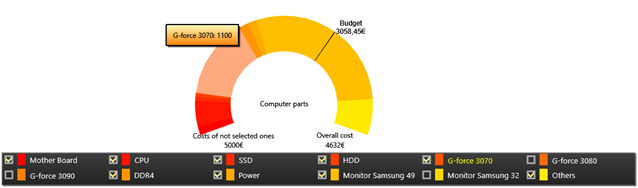
Half donut example.
Construction and adding
HalfDonut can be added to an application the same way as LightningChart objects. First create a new HalfDonut object, then add it to a container element, Grid for instance. Configure the chart within BeginUpdate() and EndUpdate() calls to reduce the number of frames needed to be rendered.
HalfDonut donut = new HalfDonut();
(Content as Grid).Children.Add(donut);
donut.BeginUpdate();
// Configure half donut chart here
donut.EndUpdate();
Adding/removing data
Data can be added to a HalfDonut by calling AddSlice() -method.
// Adding a slice to a donut.
donut.AddSlice(100, "Electricity", Colors.Yellow);
Individual slices can be removed via RemoveSlice() -method.
// Removing a slice at index 1.
donut.RemoveSlice(1);
Alternatively, use HideSlice() to hide and show the slices.
// Hiding the first slice.
donut.HideSlice(0, false);

// Showing the first slice.
donut.HideSlice(0, true);
Configuring Half Donut charts
HalfDonut charts have several configure options. Texts, start and end angles, as well as colorings can be fully modified. The needle and the marker line can also be adjusted or hidden.
// Modifying texts
donut.Title = "Chart title";

// Using custom texts
donut.EndAndStartPointText = HalfDonut.EndAndStartPointTexts.Custom;
donut.CustomLeftSideText = "New text string";
donut.CustomNeedleText = "Needle text";
// Disable needle
donut.ShowNeedle = true;
Color palette is controlled by SelectedColorPalette property. There are three coloring scales available for donuts: HSV, HSVA and Slice. When using HSV or HSVA colorings, adjust the individual channels, then use ColorStep to modify the color differences between the slices.
// Setting colors.
donut.SelectedColorPalette = HalfDonut.ColorScale.HSVA;
donut.ColorStep = 5;
donut.Saturation = 0.9;
donut.StartingColorValue = 30;
donut.Value = 0.6;
donut.Alpha = 0.4;
When SelectedColorPalette is set to Slice, colors are assigned when the slices are added via AddSlice(), apply.
GetInternalChart() method can be used to access the internal LightningChart component. This is useful when the donut chart’s own properties are not comprehensive enough.
// Modifying the legend box.
donut.GetInternalChart().ViewPolar.LegendBox.Fill.Color = Colors.SkyBlue;
Alternatively, use various Get -methods, which allow accessing and modifying the internal LightningChart components, such as Annotations, directly.
// Changing the internal annotation object.
donut.GetLeftSideText().TextStyle.Color = Colors.LimeGreen;
HalfDonutControlPanel
HalfDonutControlPanel is a UI-element designed to modify HalfDonut properties while application is running. Adding the control panel to an application works similarly to adding a HalfDonut chart. Create a new HalfDonutControlPanel object and add it to a UI-container. After that, it is possible to add one or more HalfDonut objects to the control panel. The panel can then be used to modify the added donut charts.
// Creating a HalfDonutControlPanel
HalfDonutControlPanel cp = new HalfDonutControlPanel();

// Adding to a grid element
_controlGrid.Children.Add(cp);

// Add an existing half donut object.
cp.HalfDonuts.Add(donut);
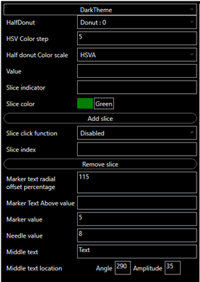
HalfDonutControlPanel, dark theme has been selected.
Examples
To see feature demonstration as example, check HalfDonut from our Demo.