Bar Chart
Chart type for visualizing categorical data as Bars. Supports Positive and Negative data sets (baseline 0), and Bipolar data sets. These are automatically detected.
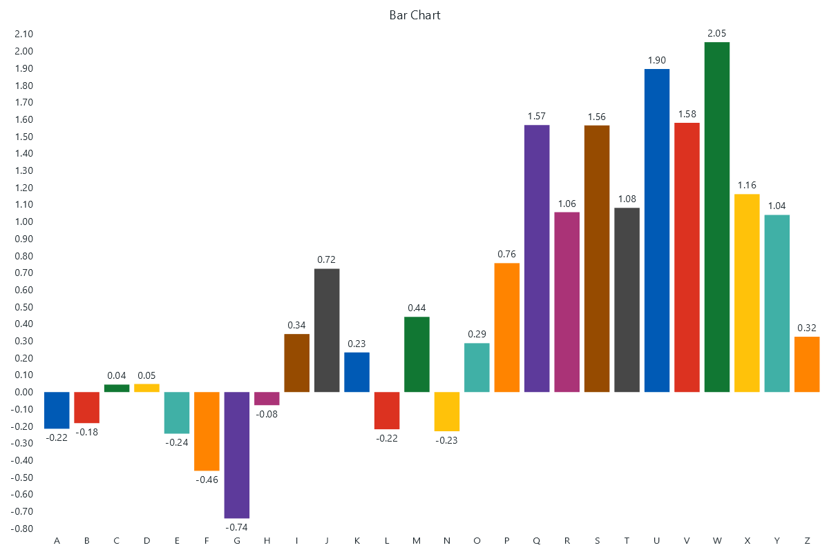
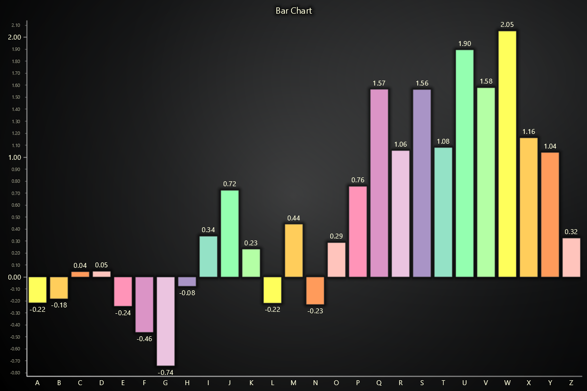
Creating Bar Chart
import lightningchart as lc

chart = lc.BarChart(vertical=True, theme=lc.Themes.Light, title='Bar Chart')
Basic Bar Chart
Use set_data([{ category, value, color? }]) to create a simple bar chart with one value per category.
You can optionally provide a color field per item to override the default bar color.
chart.set_data([
  {'category': 'Apples', 'value': 42, 'color': '#ff0000'},
  {'category': 'Bananas', 'value': 34, 'color': '#ffff00'},
  {'category': 'Oranges', 'value': 27, 'color': '#ffa500'},
])
Stacked Bar Chart
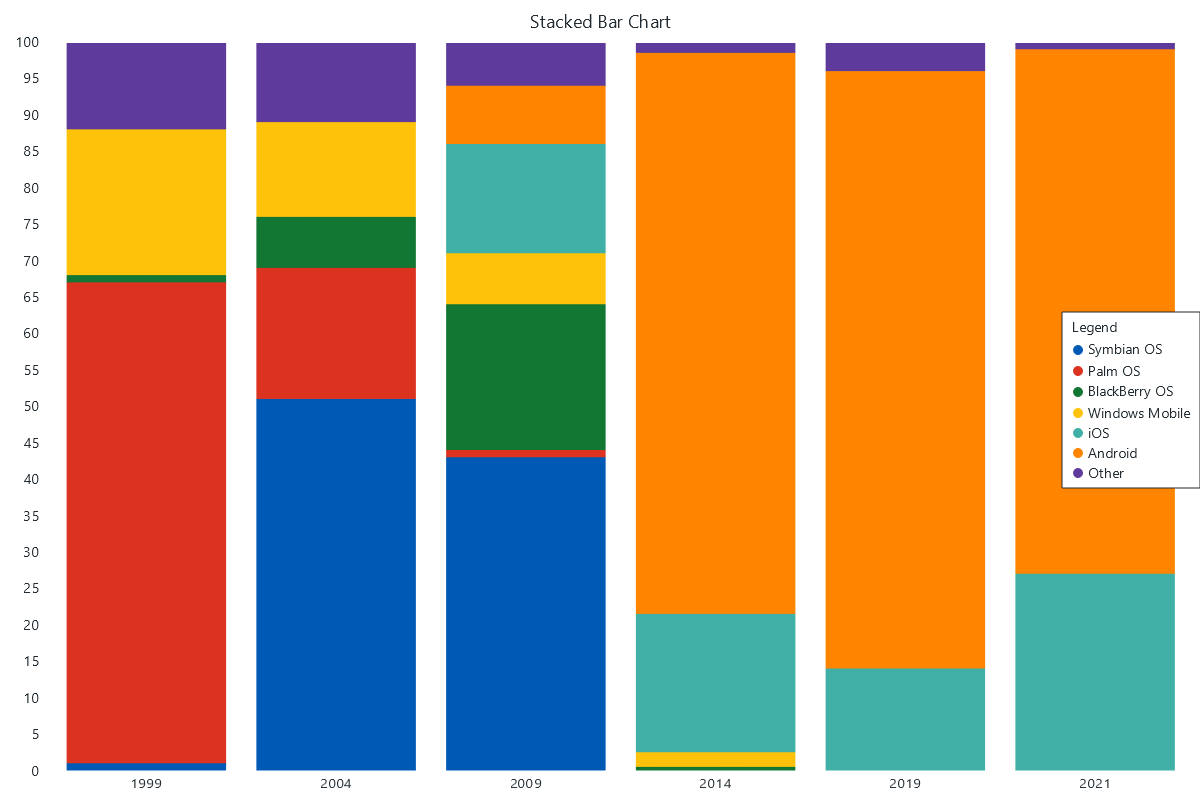
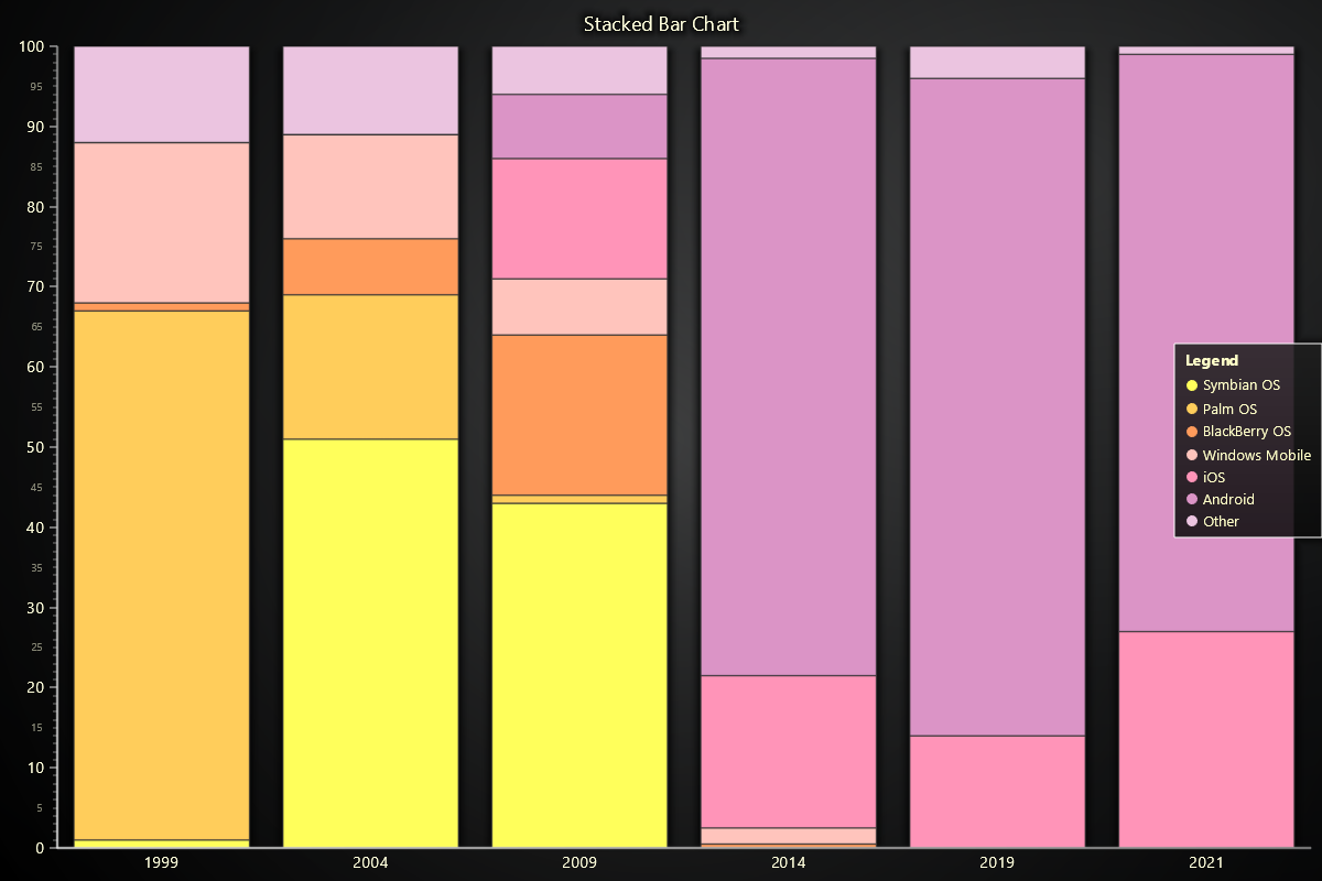
Use set_data_stacked(categories, data) to create stacked bar charts. Useful for visualizing part-to-whole relationships. Each subcategory can optionally define a color to control the bar segment color.
chart.set_data_stacked(
  ['Q1', 'Q2'],
  [
    {'subCategory': 'Product A', 'values': [20, 35], 'color': '#1f77b4'},
    {'subCategory': 'Product B', 'values': [15, 25], 'color': '#ff7f0'},
  ]
)
Grouped Bar Chart
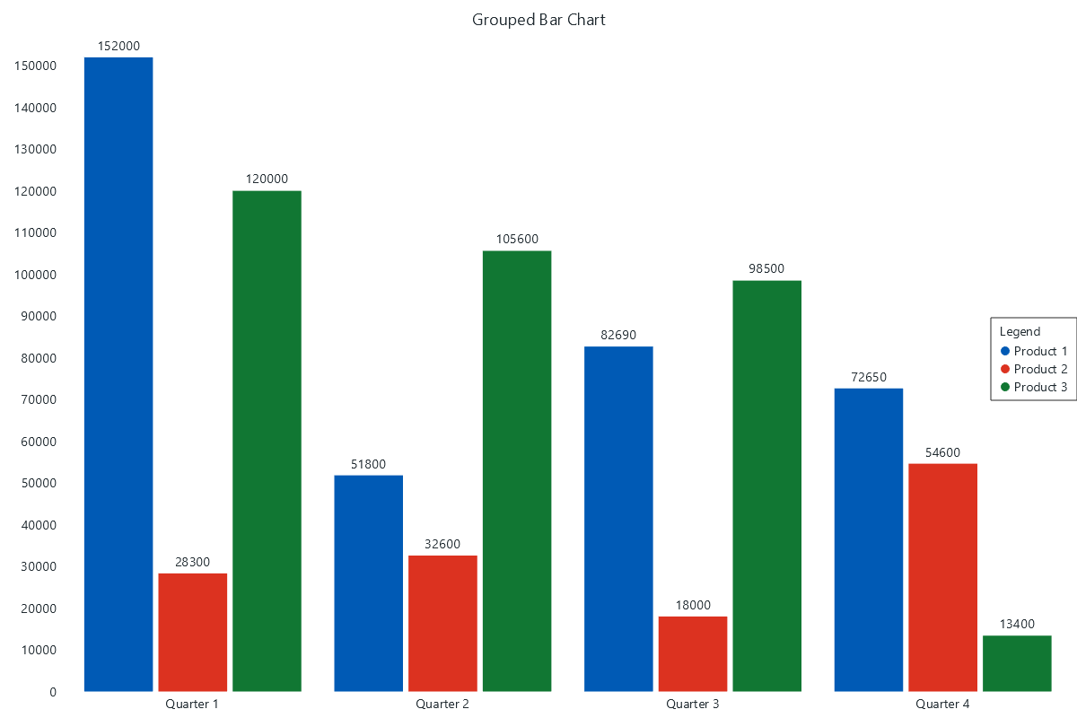
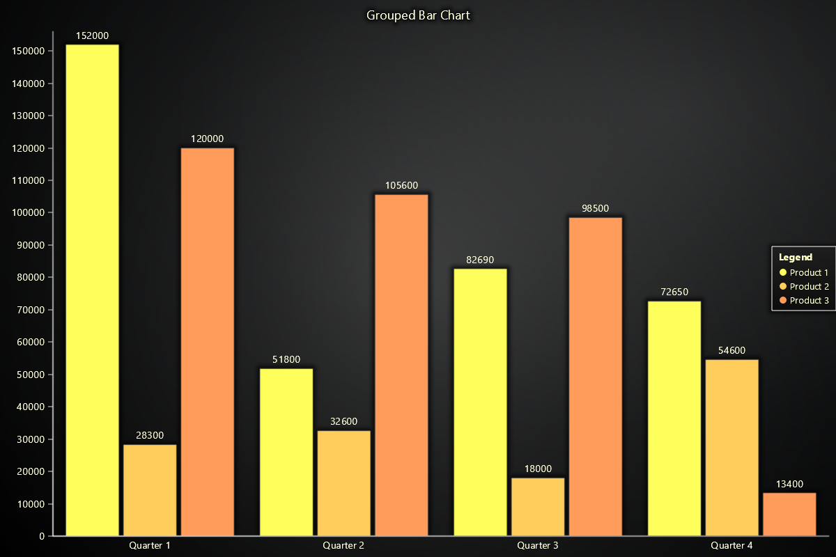
Use set_data_grouped(categories, data) for grouped bars to compare subcategories side-by-side. Each subcategory can optionally define a color to control the bar color.
chart.set_data_grouped(
  ['2023', '2024'],
  [
    {'subCategory': 'North', 'values': [120, 140], 'color': '#1f77b4'},
    {'subCategory': 'South', 'values': [90, 110], 'color': '#ff7f0'},
  ]
)
Histogram
To visualize frequency distributions, treat bar chart data as histogram bins.
values = np.random.normal(0, 1, 100000)
counts, bin_edges = np.histogram(values, bins=100)

bar_data = [
  {"category": f"{bin_edges[i]:.2f}–{bin_edges[i+1]:.2f}", "value": int(count)}
  for i, count in enumerate(counts)
]

chart.set_data(bar_data)


Horizontal Bar Charts
Bar charts are vertical by default, but they can be rotated by supplying an option during creation time:
chart = lc.BarChart(
    vertical=False,
    theme=lc.Themes.Light,
    title='Bar Chart'
)
Real-time data
To connect real-time data to a Bar Chart, simply call set_data (or set_data_stacked / set_data_grouped) repeatedly to update previously displayed data.
Appearance Customization
Customize the look and layout of your Chart using the following methods.
Title
chart.set_title_color('#3498db')
chart.set_title_font(size=20, weight='bold')
chart.set_title_margin(10)
chart.set_title_rotation(0)
chart.set_title_effect(True)
Padding
Adjusts the space around the chart's plot area.
chart.set_padding(10)  # Uniform padding
chart.set_padding(left=10, top=15)  # Specific sides
chart.set_padding(left=10, top=15, right=20, bottom=25)  # All sides
Background Color
Sets the background fill color of the chart.
chart.set_background_color("#ffffff")
Background Stroke
Defines the border (stroke) around the chart's background.
chart.set_background_stroke(2, "#cccccc")
Value Labels
Bar labels could be configured using set_value_labels methods:
chart.set_value_labels(enabled=True, position="after-bar", format_type="currency")
Sorting
By default, Bar charts sort data in Descending order. This can be selected using chart.set_sorting("descending") method:
chart.set_sorting("descending")
Automatic Label Fitting
To enable or disable automatic label fitting:
chart.set_label_fitting(True)
Bar Appearance
Effects and Colors
chart.set_bars_effect(True)
chart.set_subcategory_color('Q1', 'Product A', '#00ff00')
Margins and Animation
chart.set_bars_margin(0.1)
chart.set_animation_values(True)
chart.set_animation_category_position(True)
Palette Coloring
Use value-based palette coloring to apply stepped color based on data values.
chart.set_palette_colors(
    steps=[
        {'value': 0, 'color': (0, 128, 255), 'label': 'Min'},
        {'value': 5, 'color': (0, 255, 0)},
        {'value': 10, 'color': (255, 128, 0), 'label': 'Max'},
    ],
    look_up_property='y',
    percentage_values=False,
)
Bar Colors
Set a uniform color for all bars or specific colors for each category.
chart.set_bars_color("#3498db")            # Global color
chart.set_bar_color("Oranges", "#f39c12")  # Specific category color
Axes Configuration
Bar chart axes are separated into two groups: Value axis and Category axis. Here is how they could be configured:
Category Axis
Style the category axis tick labels and ticks. Supports font family/size/weight/style, color, rotation, alignment, margins, and tick styling.
# Bold labels with custom color
chart.set_category_axis_labels(size=12, weight="bold")

# Full customization
chart.set_category_axis_labels(
    size=16,
    family='Arial, Helvetica, sans-serif',
    style='italic',
    weight='bold',
    color='#ff6600',
    rotation=30,
    alignment=0,
    margin=8,
    shadow='#00000020',
    tick_length=8,
    tick_style={'thickness': 2, 'color': '#0000FF'},
)
Value Axis
Configure the Y-axis tick labels major/minor font size, family, style, weight, major/minor color, rotation and numeric formatting (style, precision, unit suffix, scaling) for Y-axis tick labels.
chart.set_value_axis_labels(major_size=12)
chart.value_axis.set_tick_strategy('Numeric')
chart.value_axis.set_decimal_precision(2)

# Compact thousands with unit
chart.set_value_axis_labels(
    format_type='thousands',   # 1.2K, 3.4M, 5.6B...
    precision=1,
    unit=' items',
)

# Currency with two decimals
chart.set_value_axis_labels(
    format_type='currency',    # e.g., 1,234.56 €
    precision=2,
    unit=' €',
    major_size=13,
    major_color='#333',
)
Coordinate Transformation
Bar charts use category-based coordinates. Transformations enable precise positioning and mouse interaction handling.
# Bars coordinates to relative pixels
relative = chart.translate_coordinate(
    {'iCategory': 0, 'value': 50},
    target='relative',
    source='bars'
)

# Relative to bars coordinates
bars = chart.translate_coordinate(
    {'x': 200, 'y': 300},
    target='bars',
    source='relative'
)

# Client to bars (auto-detect source)
bars = chart.translate_coordinate(
    {'clientX': 500, 'clientY': 400},
    target='bars'
)
- bars: Category index (
iCategory) and value along value axis - relative: Pixels from chart edges
- client: Browser viewport pixels
Disable/Enable animations
# To disable or enable all animations of the Chart
chart.set_animations_enabled(True)
Add TextBox
Please see common TextBox section.
Cursors
Please see common Cursors section.
Legend
Please see common legend section.