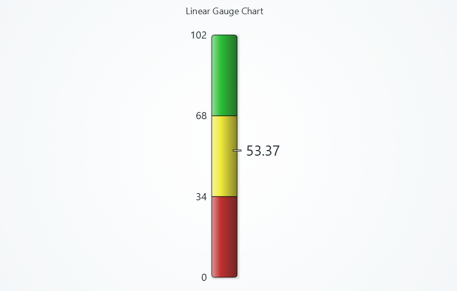
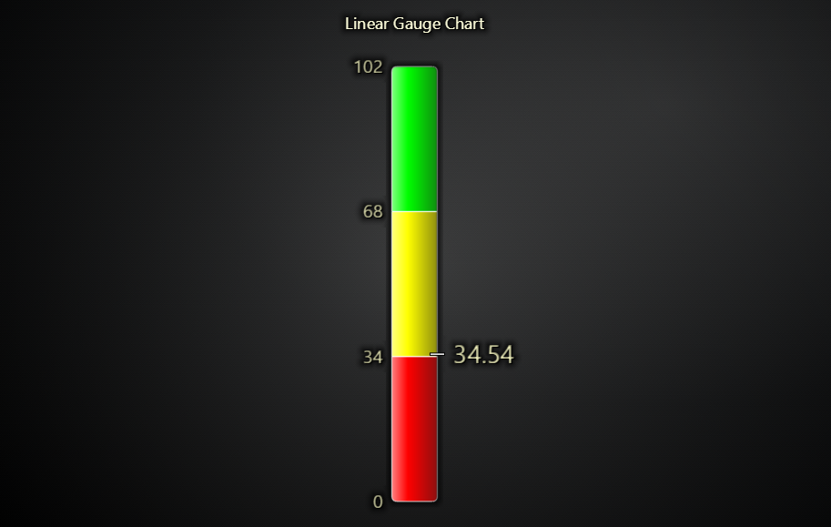
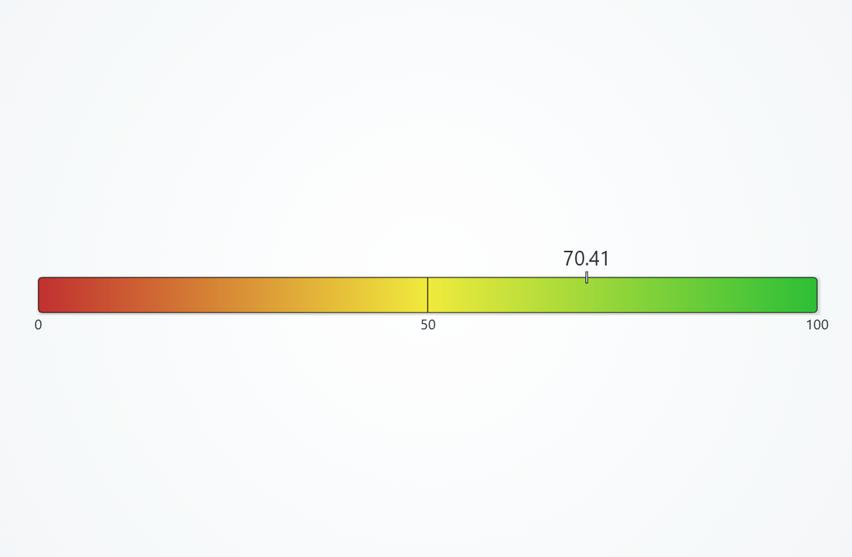
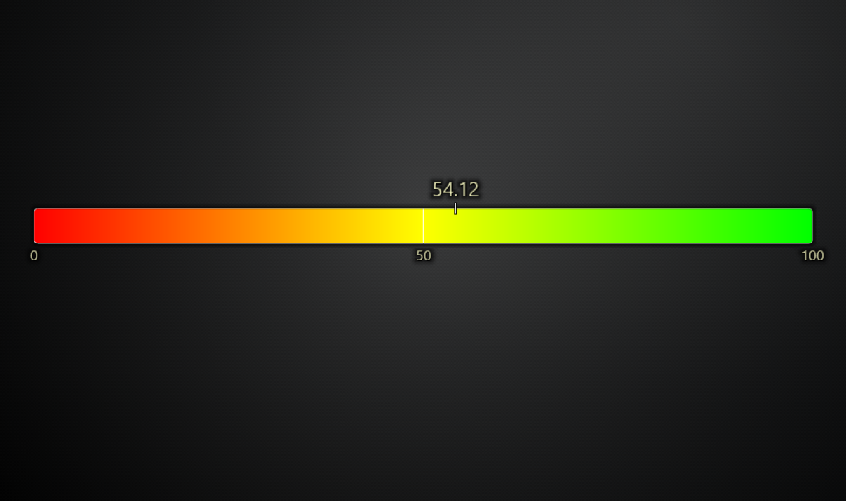
Gauge Chart (Linear)
Gauge is used to display a single data value (number) on a straight horizontal or vertical scale.
// Creation of Linear Gauge
const lc = lightningChart()
const gauge = lc.LinearGauge()
Gauge ranges
Linear gauge has two main different use cases. Either solid stepping gauge (like in picture above), or interpolated gauge. Generally, you configure gauge ranges slightly differently between the two use cases:
// Solid stepping gauge
gauge.setRanges([
    { start: 0, color: ColorCSS('red') },
    { start: 4, color: ColorCSS('green') },
    { start: 7, end: 10, color: ColorCSS('blue') },
])
gauge.setColorInterpolation(false)
// Interpolated gauge
gauge.setRanges([
    { start: 0, color: ColorCSS('red') },
    { start: 5, color: ColorCSS('green') },
    { start: 10, color: ColorCSS('blue') },
])
gauge.setColorInterpolation(true)
Setting gauge value
gauge.setValue(50)
By default, value transition is animated. This can be disabled with:
gauge.setValueAnimation(false)
Gauge orientation
Orientation is specified when the chart is created.
const gauge = lc.LinearGauge({
    orientation: 'horizontal' // or 'vertical'
})
Gauge thickness
// Thickness in pixels
gauge.setBarThickness(80)
Enable color interpolation
gauge.setColorInterpolation(true)
Disable automatic gradients
Automatic gradients are applied by default, if color interpolation is disabled.
gauge.setGradients(false)
Disable rounded edges
gauge.setRoundedEdges(false)
Value label
Value label is a text element that displays the current value along the gauge scale.
gauge
    .setValueFormatter((value) => `${value.toFixed(1)} €`)
    .setValueLabelFont(font => font.setSize(10))
    .setValueLabelFillStyle(new SolidFill({ color: ColorRGBA(255, 0, 0) }))
    // Alignment controls value label positioning; 1 = right edge of bar, 2 = 50% bar thickness away from right edge of bar
    .setValueLabelAlignment(2)
Value marker
In addition to value label, there is also a marker that displays some shape/icon at the current values location along the gauge scale. By default, this is a small line "-" that moves along the scale.
// Below would display a red star at the center of the gauge
gauge
    .setValueMarkerShape(PointShape.Star)
    .setValueMarkerSize(25)
    .setValueMarkerFillStyle(new SolidFill({ color: ColorRGBA(255, 0, 0) }))
    .setValueMarkerStrokeStyle(new SolidLine({ thickness: 1, fillStyle: new SolidFill({ color: ColorRGBA(0, 0, 0) }) }))
    .setValueMarkerRotation(0)
    .setValueMarkerAlignment(0)
Value marker can also be a custom image. This works similarly as showing Pictures in XY Chart. If using Icon approach, pass Icon as value marker shape. If using ImageFill approach, configure value marker fill style.
Ticks
gauge
    .setTickFormatter((value) => value.toFixed(1))
    .setTickFillStyle(new SolidFill({ color: ColorRGBA(255, 0, 0) }))
    .setTickFont((font) => font.setSize(10))
Chart title
gauge
    .setTitle('Voltage')
    .setTitleFont(font => font.setSize(10).setFamily('Segoe UI'))
    .setTitleFillStyle(new SolidFill({ color: ColorRGBA(255, 0, 0) }))
Background style
gauge.setBackgroundFillStyle(new SolidFill({ color: ColorRGBA(255, 0, 0) }))
Space around chart
gauge.setPadding({ left: 10, right: 10, top: 10, bottom: 10 })
Disable animations
const gauge = lc.Gauge({ animationsEnabled: false })
Positioning charts
Please see common Positioning charts section.
Color themes
Please see common Color themes section.