/*
 * LightningChartJS example that showcases the creation and styling of box series.
 */
// Import LightningChartJS
const lcjs = require('@arction/lcjs')

// Extract required parts from LightningChartJS.
const {
    lightningChart,
    emptyTick,
    ColorHEX,
    SolidFill,
    SolidLine,
    AxisTickStrategies,
    AutoCursorModes,
    PointShape,
    UIElementBuilders,
    Themes,
} = lcjs

// ----- Define data for application -----
const allData = [
    {
        name: 'Software developer',
        data: {
            lowerExtreme: 17.5,
            lowerQuartile: 19.6,
            median: 21.2,
            upperQuartile: 28.5,
            upperExtreme: 48.1,
            outliers: [50.1],
        },
    },
    {
        name: 'Cashier',
        data: {
            lowerExtreme: 14.0,
            lowerQuartile: 19.5,
            median: 20.1,
            upperQuartile: 26.7,
            upperExtreme: 41.6,
            outliers: [52.2, 59.9],
        },
    },
    {
        name: 'Janitor',
        data: {
            lowerExtreme: 15.2,
            lowerQuartile: 18.5,
            median: 22.7,
            upperQuartile: 34.1,
            upperExtreme: 41.0,
            outliers: [],
        },
    },
]

// ----- Create a XY Chart -----
const chart = lightningChart()
    .ChartXY({
        // theme: Themes.darkGold
    })
    .setTitle('Age distribution across professions')
    // Disable interactions.
    .setAutoCursorMode(AutoCursorModes.disabled)

// ----- Setup axes -----
const axisX = chart
    .getDefaultAxisX()
    .setTitle('Profession')
    // No default ticks.
    .setTickStrategy(AxisTickStrategies.Empty)
    // Disable interactions.
    .setMouseInteractions(false)

// Style the default Y Axis
const axisY = chart
    .getDefaultAxisY()
    .setTitle('Age')
    // Set Y-view manually.
    .setScrollStrategy(undefined)
    .setInterval({ start: 10, end: 63, stopAxisAfter: false })
    // Disable interactions.
    .setMouseInteractions(false)

// ----- Map over per each data item -----

allData.forEach((profession, i) => {
    const data = profession.data
    // ----- Create series for rendering this data item -----
    // Create BoxSeries.
    const boxSeries = chart.addBoxSeries().setDefaultStyle((figure) => figure.setBodyWidth(0.7).setTailWidth(0.7))

    // Create PointSeries for outliers.
    const pointSeries = chart
        .addPointSeries({
            pointShape: PointShape.Circle,
        })
        .setPointSize(20)

    // ----- Setup shared highlighting between box and point series -----
    boxSeries.onMouseEnter((_, cp) => pointSeries.setHighlight(true))
    boxSeries.onMouseLeave((_, cp) => pointSeries.setHighlight(false))
    pointSeries.onMouseEnter((_, cp) => boxSeries.setHighlight(true))
    pointSeries.onMouseLeave((_, cp) => boxSeries.setHighlight(false))

    // ----- Compute X positions for BoxFigure -----
    const start = i * 1
    const end = start + 1
    const middle = (start + end) / 2

    // ----- Render BoxFigure -----
    boxSeries.add({
        start,
        end,
        lowerExtreme: data.lowerExtreme,
        lowerQuartile: data.lowerQuartile,
        median: data.median,
        upperQuartile: data.upperQuartile,
        upperExtreme: data.upperExtreme,
    })

    // ----- Render outliers -----
    data.outliers.forEach((outlier) => {
        pointSeries.add({
            x: middle,
            y: outlier,
        })
    })

    // ----- Create CustomTick on X-Axis for displaying name of profession -----
    axisX
        .addCustomTick()
        .setValue(middle)
        .setTextFormatter(() => profession.name)
        .setGridStrokeLength(0)
})
JavaScript Box and Whiskers Chart - Editor
Example creates a traditional Box and Whiskers Chart using ChartXY, BoxSeries and PointSeries for outliers.
Box and Whiskers Chart provides a compact way of visually displaying distribution of data through quartiles.
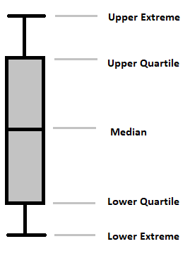
Anatomy
The lines extending parallel from the boxes are known as the "whiskers", which are used to indicate variability outside the upper and lower quartiles.
Outliers are sometimes drawn as individual dots that are in-line with the whiskers.
Here are the types of observations one can make from viewing a Box And Whiskers Chart:
- What the key values are, such as: average, median, 25th percentile etc.
- If there are any outliers and what their values are.
- Is the data symmetrical.
- How tightly is the data grouped.
- If the data is skewed and if so, in what direction.