Real-time scrolling
Real-time scrolling
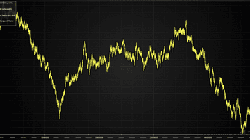
Example showcasing the use of Line Series. Also known as Line Graph and Line Chart.

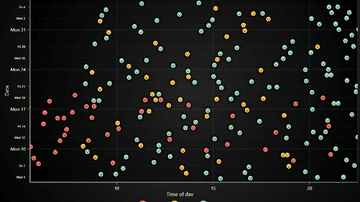
Using a point series to display a Point Graph. Also known as a Scatter Graph, Scatter Series, Point Graph, Scatter diagram or Scattergram.
Example showing how to draw and style Spline Series.
Basic use of Point Line Series. Also known as a Line Series, Line Graph, Line Chart, and Line with Markers.
Example plotting a million data points using progressive Line Series.
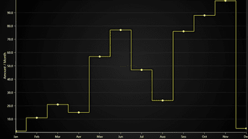
Example showing the use of a Step Series with different preprocessing modes. Also known as a Step Graph or Step Chart.
Example showing how to create clusters of differently colored points. Using Point Series.
Shows how to combine multiple series in to one chart.

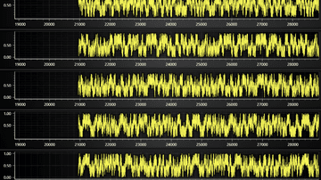
Example on how to deal with high-resolution data - for example, measurements in microseconds precision.
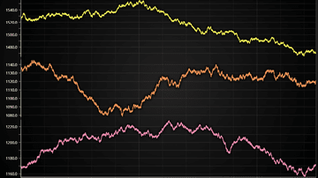
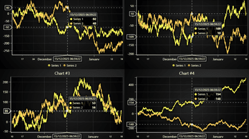
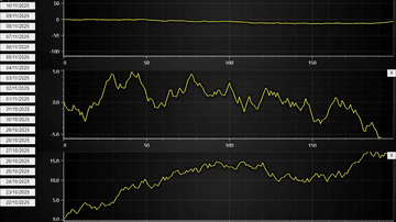
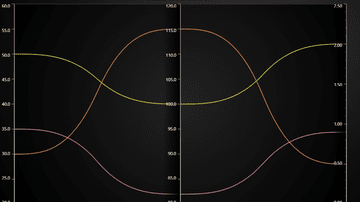
Several AxesXY chart can be used to compare or see several graphs.
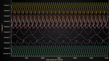
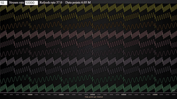
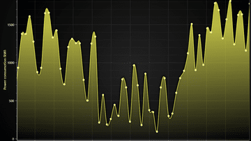
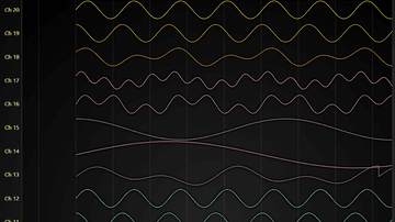
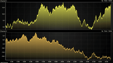
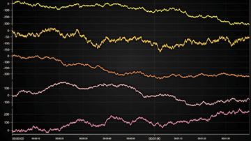
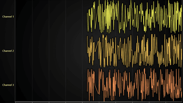
Lightning-fast Line Chart visualization over multiple channels that progress on the same X and Y Axes
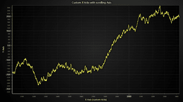
Custom tick positioning logic on a scrolling Axis.
Example showcasing the TimeTickStrategy feature which is ideal for displaying timestamp data between couple days all the way down to microseconds level.
Example showcasing the TimeTickStrategy feature with scrolling data and axis
Example showcasing the High Precision Axis XY feature which allows zooming of microseconds precision without any dirty data transforming

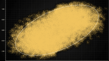
Example showcasing visualization of XY confidence ellipse widely used in statistics field
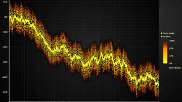
Example visualization of large scatter chart (> million data points)

Example visualization of large line chart (several million data points)
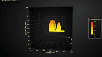
Example for Chart with 2D spectrogram + dynamic projections on mouse interaction.
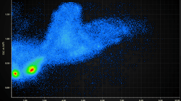
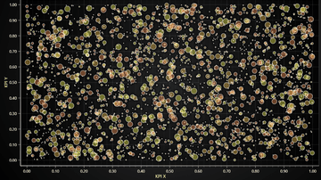
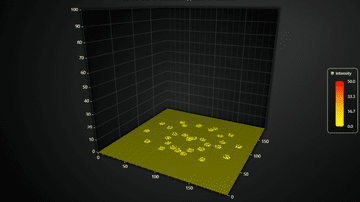
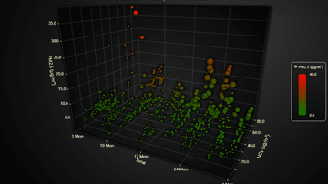
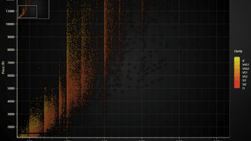
Visualization of a Flow Cytometry data set (FSC + SSC properties)
Example for creation of a DateTime Axis. DateTime axis can present time.
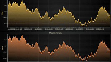
Example showcases using origin with Axis TickStrategies.
Dynamic 2D points coloring by arbitrary user data set.
Showcases Line Chart with refreshing data, where older samples are displayed for a while, slowly decaying out.
Next-generation charts in web. LightningChart JS supports plotting of even 1 microsecond resolution data
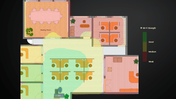
Example showcasing LightningChart interactions with external images and icons in context of office layout data visualization.
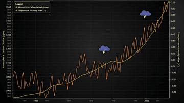
Visualization of Temperature Anomaly Index and CO2 amount for period from 1880 to 2020. Showcases animated video icons
Example how Y axis fitting to visible data can be achieved in scrolling line chart applications
Lightning-fast Line Chart visualization over multiple channels that progress on the same X Axis
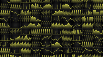
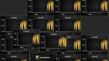
Showcases how to fit a large number of charts into 1 by utilizing HTML scroll bars
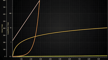
Example showcasing logarithmic Axis with LineSeries.
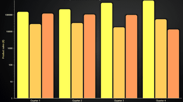
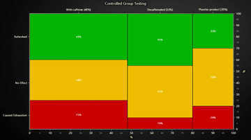
Example showcasing grouped bars chart with Logarithmic Y Axis
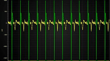
Showcases sweeping ECG line chart with LightningChart JS
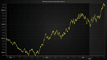
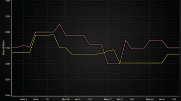
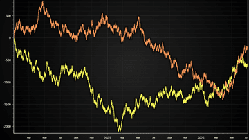
Example showcasing use of DashedLine style to reflect a projected (or predicted) time trend.
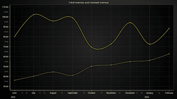
Example showcasing use of DashedLine style in a chart with two time series trends along the same Y axis.
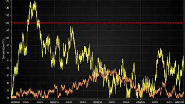
Example showcasing use of ConstantLine and DashedLine style in a threshold indicator.
Example of using LightningChart PointSeries for an interactive Bubble Chart with individual point sizes and data grouping to different colors.
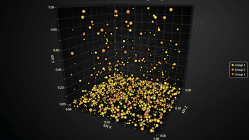
Example of using LightningChart PointSeries3D for an interactive 3D Bubble Chart with individual point sizes and data grouping to different colors.

High-performance real-time audio visualization JavaScript with LightningChart JS. This example helps visualize MP3s audio files in real-time.
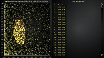
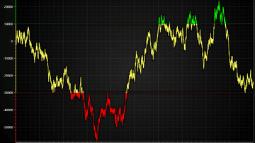
Example showcasing a custom ChartXY interaction for highlighting selected data points
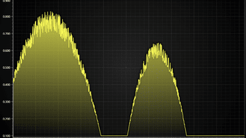
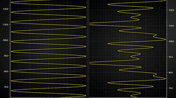
Showcases simple real-time sweeping charts with LightningChart JS
Showcase of axis layout capabilities of LightningChart JS

Example showcasing a custom ChartXY interaction for selecting range of data points
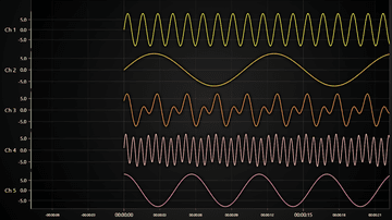
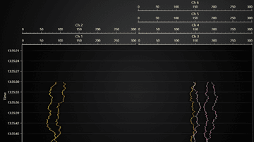
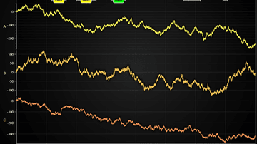
Example of commonly required layout with several channels, shared time axis and HTML interoperation. Also showcases implementation of a Sticky X Axis.
Example of displaying annotations in a time series line chart. Annotations can be deleted, added and moved with custom user interactions.
Demonstration of loading time series data with 1 nanosecond step to LightningChart JS.
Example of synchronizing cursors across several time series in separate charts
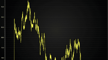
Minimal example of showing time-series line chart with LightningChart JS
Example showcasing Line Series feature for coloring line dynamically based on X coordinates
Example showcasing Line Series feature for coloring line dynamically based on Y coordinates
Example showcasing Line Series feature for coloring line dynamically based on separate Value data set
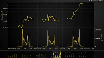
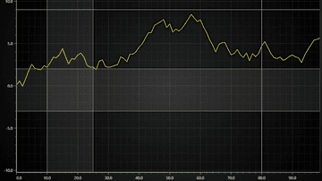
Example showcasing how data gaps can be handled XY series. Particularly highlights line and area series in a trading use case

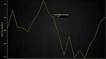
Example showcasing custom events display in a time-series XY chart
Example showing how a time-series chart where user can drag and drop annotations
Example of displaying scatter data sets with custom pictures
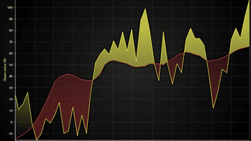
Example showcasing basic use of an Area Range Series. Also known as a Area Graph, Area Chart or Range Area Chart.
Layered Area Chart done by layering multiple Area Series on top of each other. Also known as a Layered Area Graph, Layered Area Chart or Multiple Area Charts.
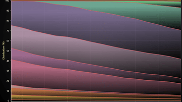
Stacked Charts are a popular visual aid for comparing parts of a whole. Also known as Stacked Area Graph or Stacked Areas.
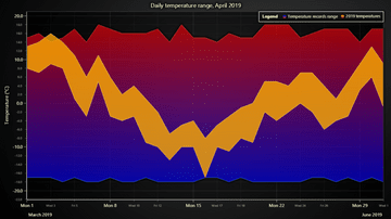
The example shows the basic usage of Area Range series to display variation in temperature.

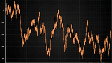
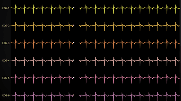
This example shows a simulated electrocardiogram(ECG)-signal by using a Line Series in a XY Chart.
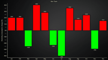
Bar Charts show discrete numerical comparisons across categories, where the value represents the height of a bar. Also known as Bar Graph, Column Chart or Column Graph.
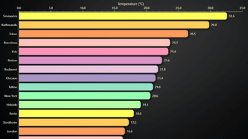
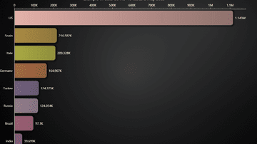
Horizontal variant of a Bar Chart. Also known as Bar Graph, Column Chart or Column Graph.
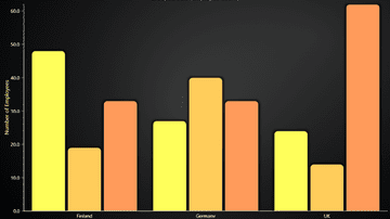
Grouped bars for better categorizing than normal bar chart. Also known as Multi-set and Clustered Bar Chart.
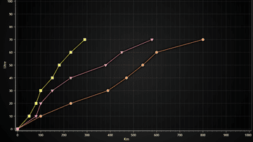
Also known as a Range Bar, Column Graph, Floating Bar Graph, Difference Graph, High-Low Graph.
Mosaic Chart can be used to compare observation counts of groups across different categories. Also known as Marimekko Chart.
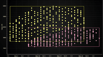
Bar chart race shows the dynamics of the Covid-19 spread.
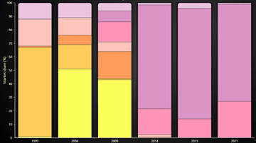
This example shows the creation of a Stacked Bars Chart with LightningChart JS.
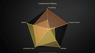
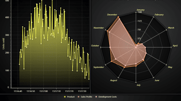
This example shows the basic use of Spider Chart. Also known as Radar Chart, Web Chart, Polar Chart, Star Series.
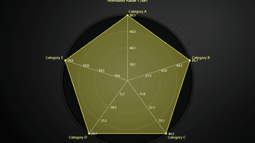
This example shows creation of a Radar Chart with animated transitions by using a suitably styled SpiderChart.
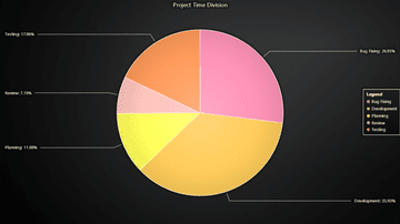
Pie Chart (or a Circular Chart) is a chart used to show statistical graphic.
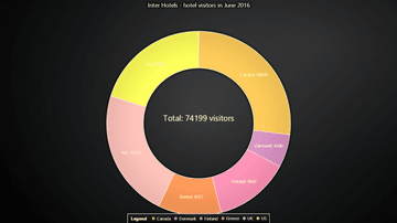
Donut Chart is a variation of Pie chart - functionally it's the same, visually it's only missing the center.
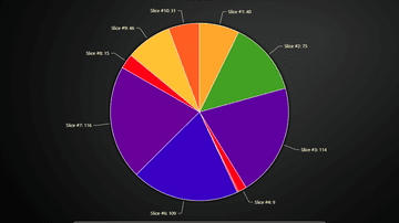
Example showcasing the use of Lookup Table with a Pie Chart.
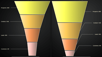
Funnel Chart is a chart used to show statistical graphic. Funnel Chart is divided into slices, with each slice illustrating the numerical portion of the Funnel.
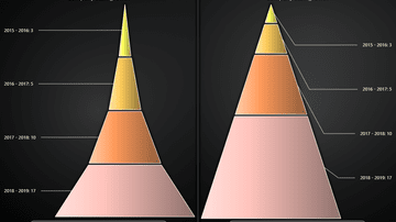
Pyramid Chart is a chart used to show statistical graphic. The Pyramid chart is divided into slices, with each slice illustrating the numerical portion of the whole Pyramid.
Example showing a dashboard with multiple chart types and Legend Panel.
Example for a dashboard with multiple progressive channels of data. Using progressive Line Series.
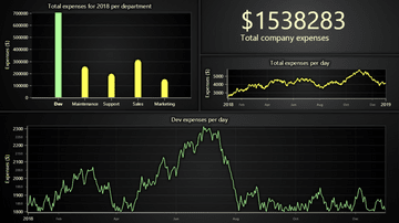
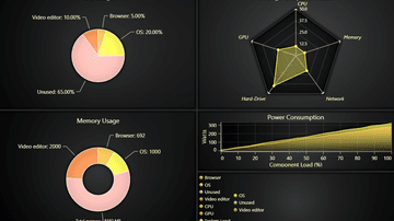
This example shows the specific business case to visualize the costs of a imaginary company across all the departments combined in a single interactive dashboard.
This example shows different progressive data-patterns, scrolling strategies, custom axes and function generators inside a dashboard.
This example shows different kinds of charts inside a dashboard.

This example showcases a real life application used in Fiber Analysis
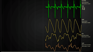
Example of a Medical Dashboard with ECG/EKG, blood pressure, flow volume and oxygen saturation.
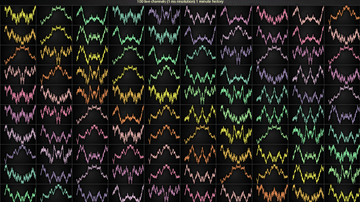
Intensive multi-channel real-time application example with LightningChart
Example on how a dynamic chart dashboard can be created with LightningChart JS
Example of a Dashboard with several channels which you can re-arrange with drag & drop and hide/show at will.
Intensive multi-channel real-time application example with LightningChart
Example of a freeform canvas where you can have any number of charts with free control over draw order and positioning
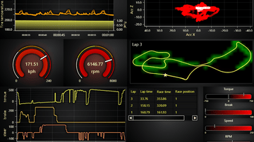
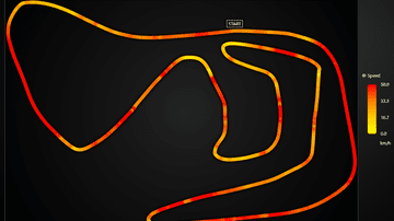
Motorsports industry inspired LightningChart JS real-time dashboard example
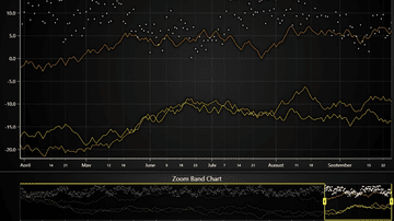
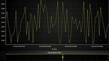
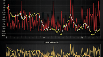
This example shows the creation of a Zoom Band Chart.
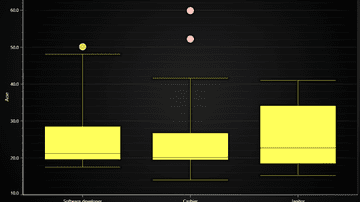
Example creates a traditional Box and Whiskers Chart using ChartXY, BoxSeries and PointSeries for outliers.
This example shows usage of BoxSeries in extravagant manner.
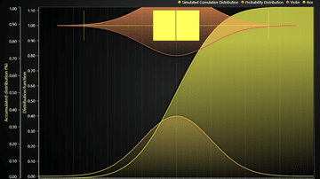
This example shows usage of Bands and ConstantLines in XY Charts.
Example showcasing custom cursor implementation with LCJS UI
Example showcasing custom cursor implementation with HTML & CSS
On Screen Menu showcase

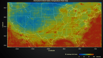
Example showcasing simple usage of Heatmap Grid Series.
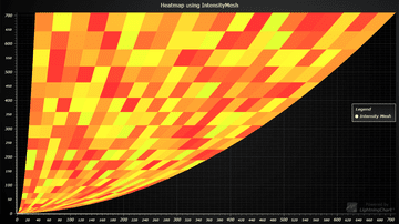
Example showcasing simple use-case for Mesh-type Heatmap

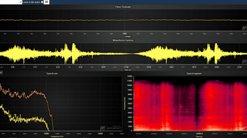
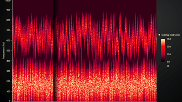
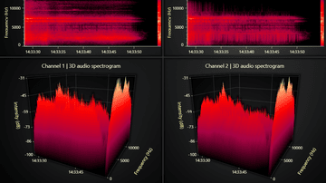
Example showcasing 2D audio analysis spectrogram with LightningChart JS

Example showcasing simple usage of Scrolling Heatmap Grid Series
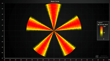
Example shows visualization of intensity in circle-based mesh chart.
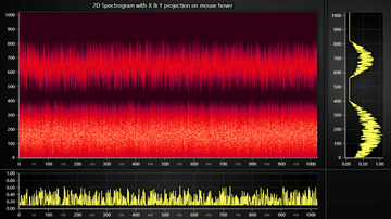
Example for Chart with 2D spectrogram + dynamic projections on mouse interaction.
Example for Sweeping Heatmap Chart using HeatmapGridSeries
Example that showcases the pixel interpolation mode feature of 2D Heatmaps.

Example showcasing the use of 3D point series. Also known as scatter plot.
Example showcasing the use of 3D Line Series.
Example showcasing the use of BoxSeries3D to render a scrolling 3D spectrogram.
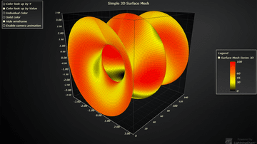
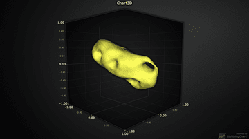
Example showcasing simple usage of 3D Surface Mesh Series
Example showcasing simple usage of BoxSeries3D and the rounded edges feature.
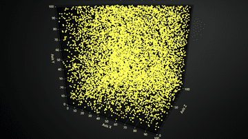
Example showcasing the use of 3D point series in a high performance application, with constantly changing data.
Example showcasing the use of 3D line series in a high performance application, with constantly changing data.
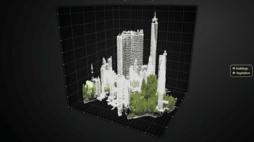
Example showcasing visualization of a 3D LiDAR scanned park with over million data points
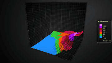
Example showcasing the visualization of LiDAR scanned 3D topography
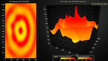
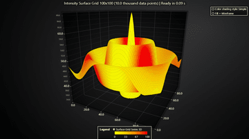
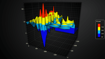
Example showcasing the Surface Grid Series feature of LightningChart JS.
Example showcasing the Surface Scrolling Grid Series feature of LightningChart JS.
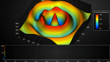
Example showcasing the Surface Grid Series feature of LightningChart JS with separate data sets for height and Intensity
Example showcasing the partial data invalidation feature of Surface Grid Series
Example showcasing how large Surface Charts can be loaded in several small parts instead of 1 large data set
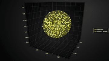
Example showcasing 3D variant of popular 2D statistics data visualization method of confidence ellipses

Example showcasing visualization of a 3D scatter data set using a Surface Chart
Example of a simple custom user interaction in a 3D surface chart
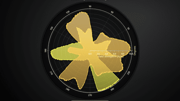
PolarChart showcase with LineSeries
PolarChart showcase with AreaSeries
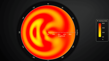
Basic Polar Heatmap showcase
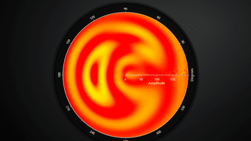
Polar Radar Heatmap example
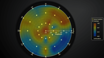
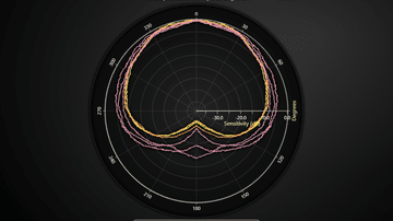
Example of Polar Sensor data visualization in real-time
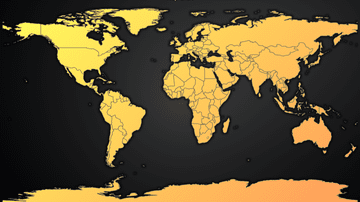
Simple overview of the Map Chart feature
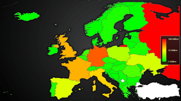
Example of using MapChart with real data set and dynamic region coloring
Example on using MapChart with animated real-time data set
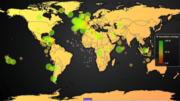
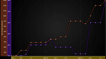
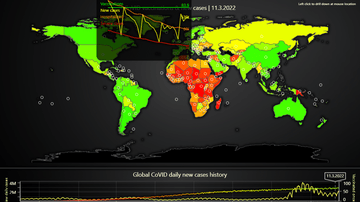
Animated map chart that visualizes the progression of first round of CoVID-19 vaccination coverage per country
Example on geographical data visualization by laying a 2D heatmap over a picture of a map.
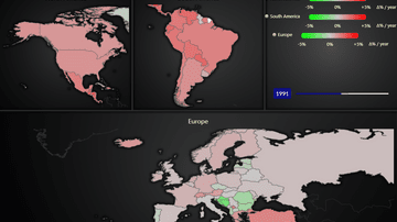
In-depth example of map dashboard with data drill-down. Visualizes relations between CoVID vaccinations and cases
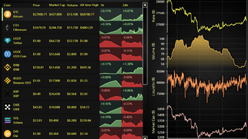
Example of Data Grid in Cryptocurrency Dashboard use case with drilldown.
Example of Data Grid in real-time monitoring use case.

Example of Data Grid in real-time monitoring use case with dynamic cell coloring heatmap
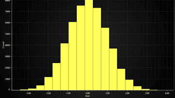
Example of a LightningChart JS Histogram chart.
Example of a static 3D Mesh Model.
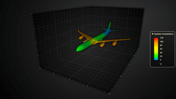
Example of realtime coloring a 3D Mesh Model.

Visualization of EEG data with 3D Mesh Model and line charts
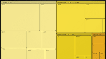
Simple overview of the TreeMapChart.
Drilldown TreeMapChart.
Dynamic TreeMapChart.
This example shows the new reworked gauge chart.
This example shows the use of value indicators in a gauge chart.
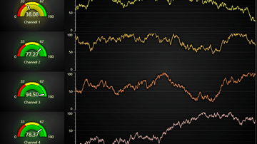
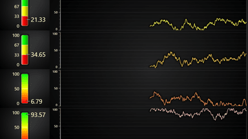
This example shows gauge charts on a dashboard with real-time data.
This example shows linear gauge charts on a dashboard with real-time data.
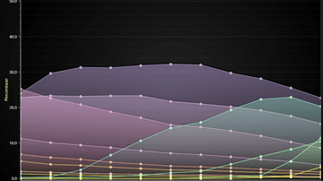
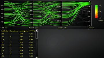
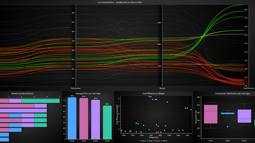
Basic example of Parallel coordinate chart feature
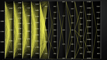
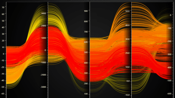
Example of displaying a large data set with Parallel coordinate chart
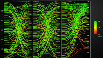
Example of using the built-in color by value feature of Parallel coordinate chart
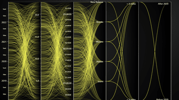
Example of Category and Date-Time Axes with Parallel coordinate chart
Example of common use case to display value thresholds on different axes. E.g. which value range is _bad_ and which is _good_.
Example showcasing Range Selectors feature
Example of changing Parallel coordinate chart data in real-time.
Example showcasing Range Selectors and Chart Interactions
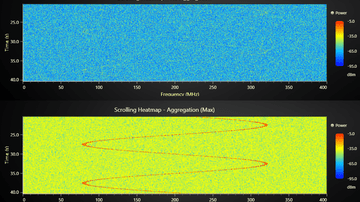
Example showcasing Heatmap Aggregation
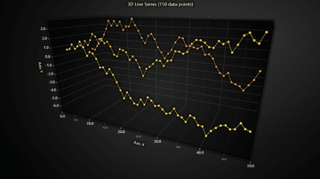
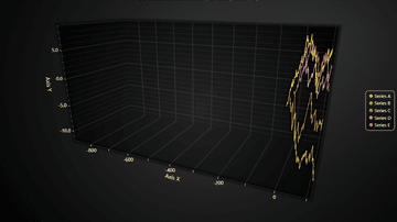
Example showcasing the use of 3D Time Series.
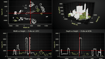
Example of interactive slicing of 3D chart with planes.
Scatter chart example featuring an integrated zoom overlay.
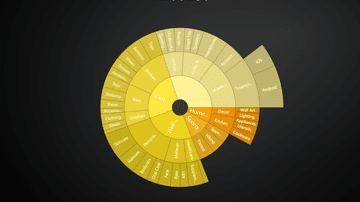
Simple SunBurst chart example.
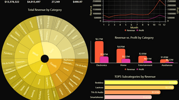
Interactive SunBurst chart dashboard example.
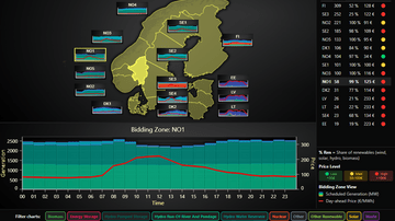
Interactive dashboard for the Nord Pool day-ahead market. Links geospatial overviews with deep statistics on regional energy production.